ADV @ UNDERCONSIDERATION Peek here for details
BROWSE
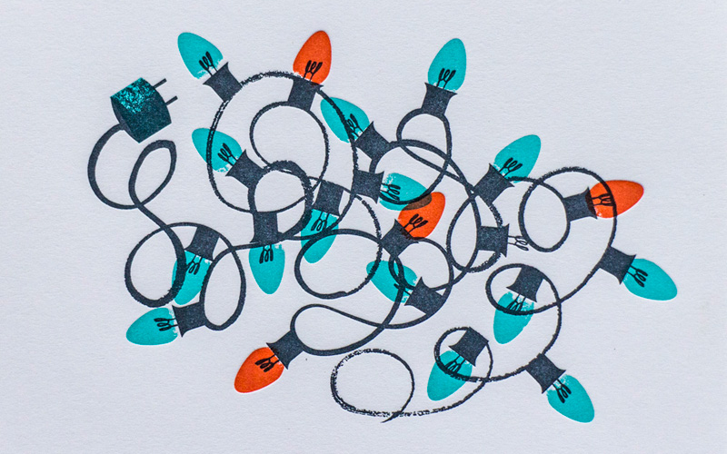
Everlovin’ Press Christmas Cards
Production Method
Letterpress
Design
Tom Froese
Printing
Everlovin' Press
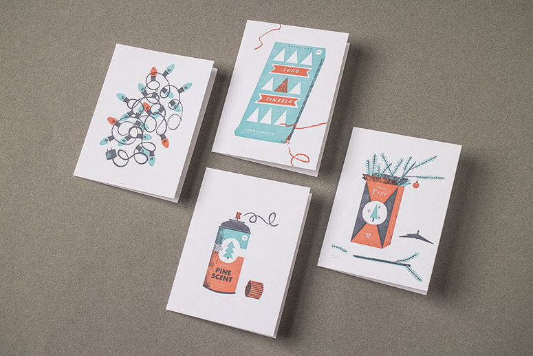
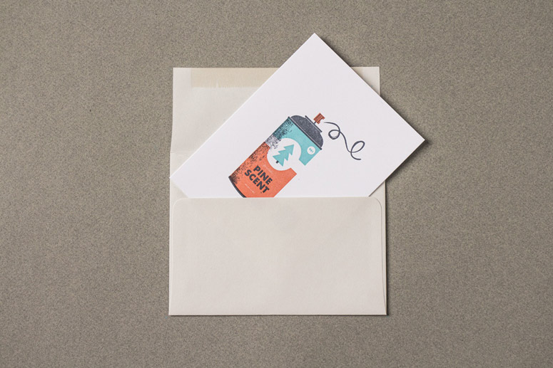
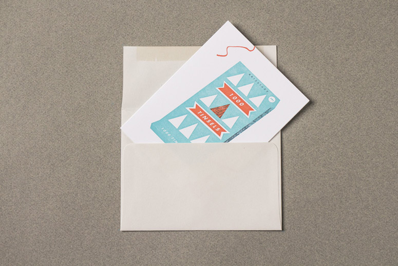
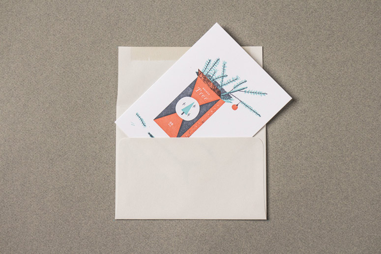
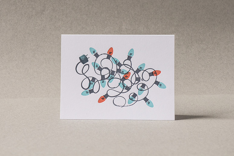
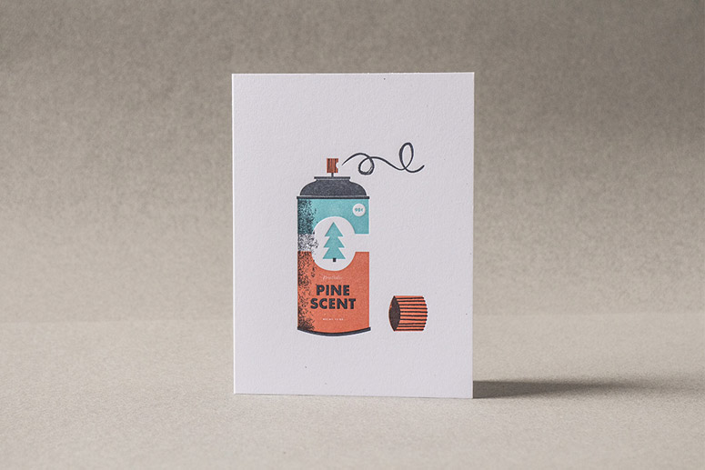
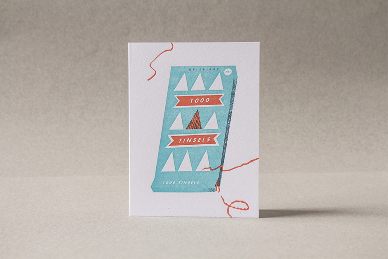
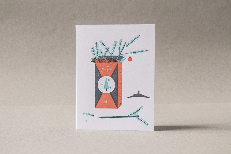
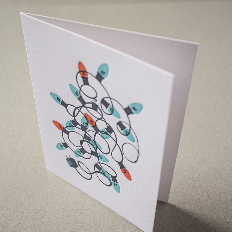
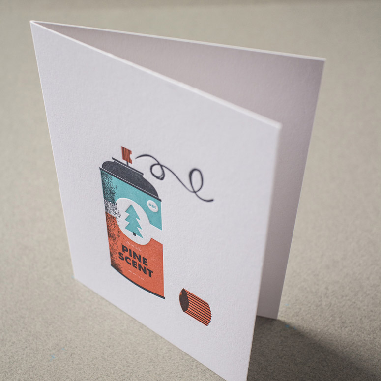
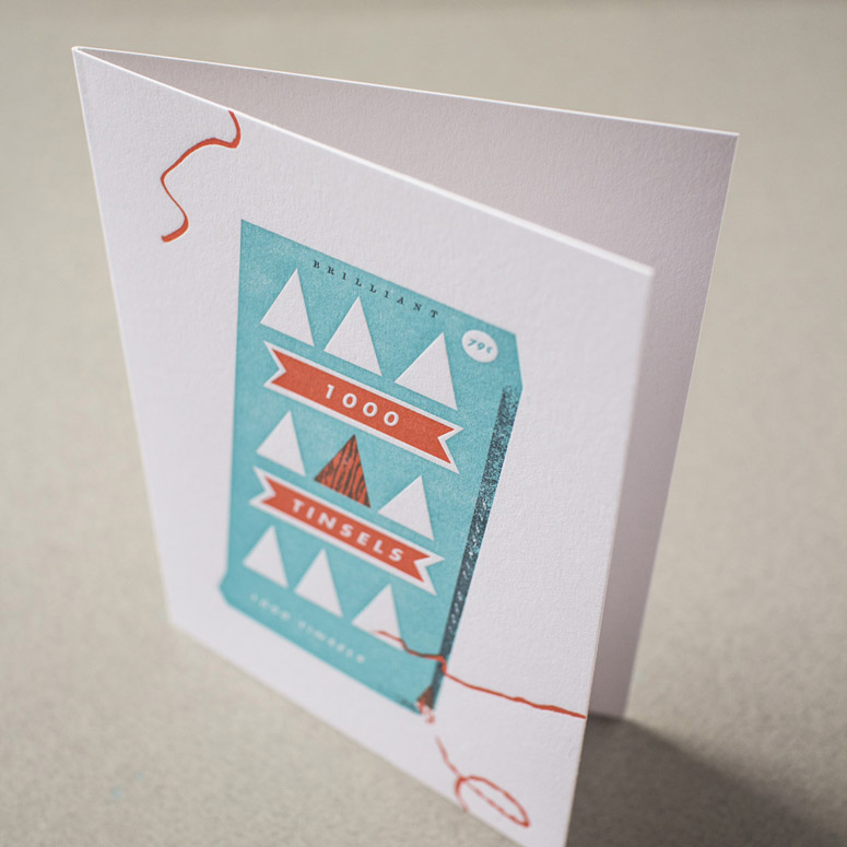
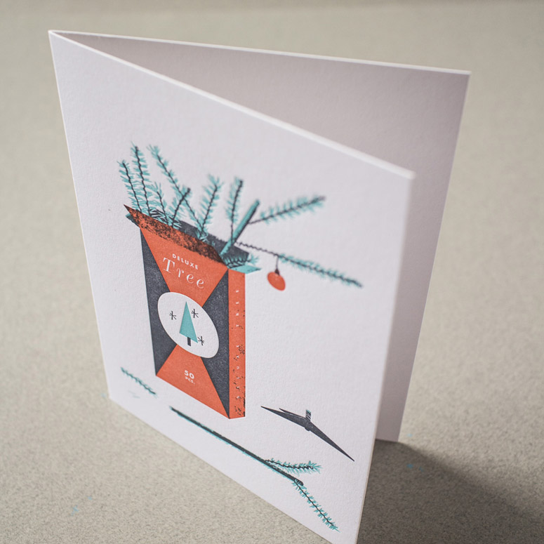
Nostalgic illustrations in 3-color letterpress acknowledge the oh-so-worth-it frustrations of the holidays with love and warmth.
Dimensions (Width × Height × Depth)
4.125 × 5.5 in
Page Count
–
Paper Stock
Coronado / Bright White / Vellum Finish / 130
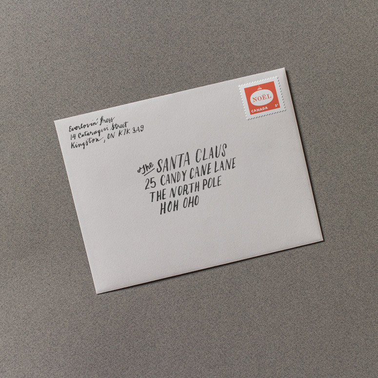
French Paper Co. / Grout Grey / Envelopes
Number of Colors
3
Varnishes
–
Binding
–
Typography
Futura Bold Futura Book Monotype Modern Wide Italic

Project Description
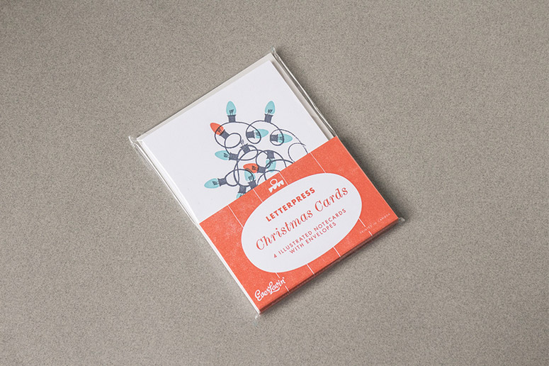
Inspired by the artifice and sentimentality of vintage Christmas decoration packaging, these cards are a collaboration between illustrator Tom Froese and letterpress printer Everlovin' Press. Simplistic and idiosynchratic illustrations aim to impart the real spirit of the holidays–ephemerality and disappointment with a tinge of that particular frustration that accompanies trying to put your string of lights back in the box the way they came. The set includes four notecards, each with a unique illustration. Each card is also available as a single.Production Lesson(s)
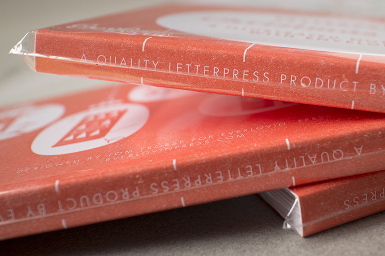
I used Futura Book at 5pt for some text on the packaging, which ended up turning out a bit too thin in print. I'd probably just use bold. I also feel that the Grout Grey of the envelopes was just a tad too light to feel different from the white stock of the cards–I'd go for something a little darker, but which still made for decent visibility of the address when written on the front.
Post Author

Jessica Mullen
Writer for UnderConsideration LLC.
More: Online / On Twitter
Date Published
December 15, 2014
Filed Under
Holiday Card
Letterpress
Tagged with
cards
christmas
envelopes
futura
holiday card
letterpress
stationery
About
FPO (For Print Only), is a division of UnderConsideration, celebrating the reality that print is not dead by showcasing the most compelling printed projects.
FPO uses Fonts.com to render Siseriff and Avenir Next.
FPO is run with Six Apart’s MovableType
All comments, ideas and thoughts on FPO are property of their authors; reproduction without the author’s or FPO’s permission is strictly prohibited
Twitter @ucllc
Sign-up for Mailing List
Mailing list managed by MailChimp
Thanks to our advertisers
About UnderConsideration
UnderConsideration is a graphic design firm generating its own projects, initiatives, and content while taking on limited client work. Run by Bryony Gomez-Palacio and Armin Vit in Bloomington, IN. More…
blogs we publish
Brand New / Displaying opinions and focusing solely on corporate and brand identity work.
Art of the Menu / Cataloguing the underrated creativity of menus from around the world.
Quipsologies / Chronicling the most curious, creative, and notable projects, stories, and events of the graphic design industry on a daily basis.
products we sell
Flaunt: Designing effective, compelling and memorable portfolios of creative work.
Brand New Conference videos / Individual, downloadable videos of every presentation since 2010.
Prints / A variety of posters, the majority from our AIforGA series.
Other / Various one-off products.
events we organize
Brand New Conference / A two-day event on corporate and brand identity with some of today's most active and influential practitioners from around the world.
Brand Nieuwe Conference / Ditto but in Amsterdam.
Austin Initiative for Graphic Awesomeness / A speaker series in Austin, TX, featuring some of the graphic design industry's most awesome people.
also
Favorite Things we've Made / In our capacity as graphic designers.
Projects we've Concluded / Long- and short-lived efforts.
UCllc News / Updates on what's going at the corporate level of UnderConsideration.




Related entries
Black Sheep Studio Business Cards and Promotional Items
Herbst & Spungen Wedding Invitation Suite
Cranky Bucks Promotion
Seegno Business Cards
“Miniature Views” Promotion