ADV @ UNDERCONSIDERATION Peek here for details
BROWSE
Le Parcel Packaging System
Production Method
Silkscreen
Design
Seven Fifty Five
Andrew Capener: Design / Art Direction
Elise Lauren: Photography
Printing
Squarepeg
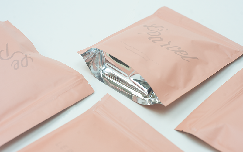
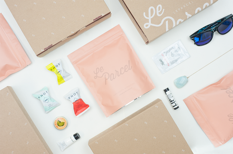
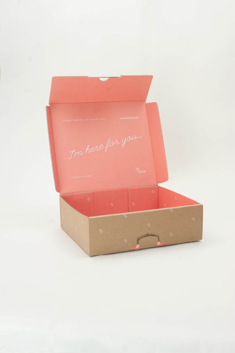
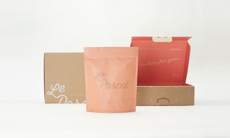
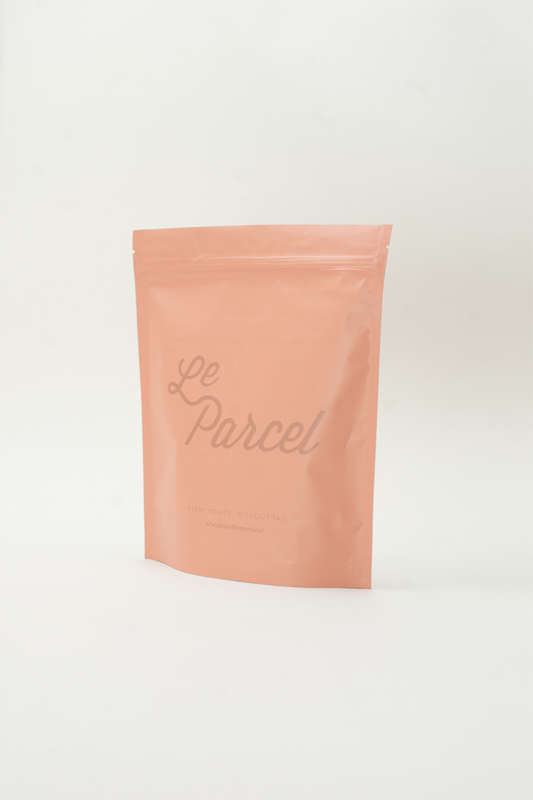
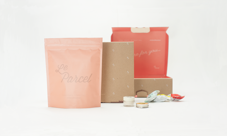
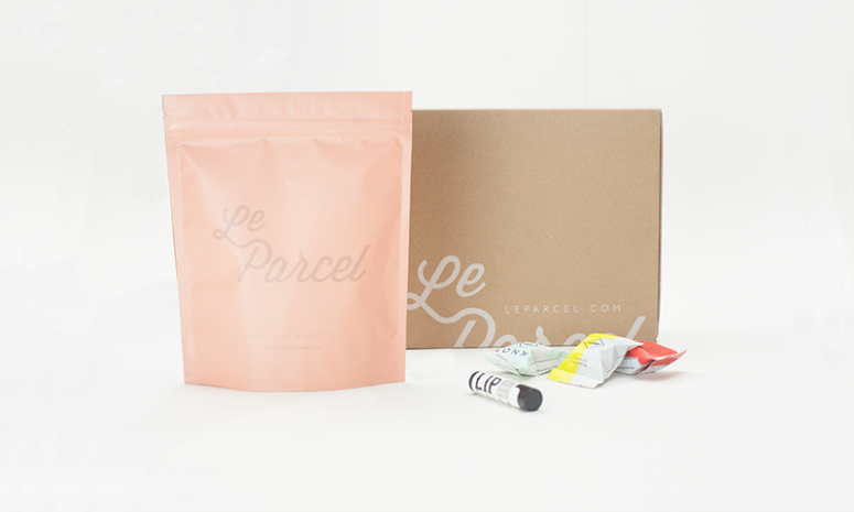
The third in a series of package system designs for Le Parcel—a monthly delivery service for “that time of the month”—this iteration includes a lighter-weight box, heat sealed bags, and a bright pink interior.
Dimensions (Width × Height × Depth)
–
Page Count
–
Paper Stock
–
Number of Colors
2
Varnishes
–
Binding
–
Typography
Tisa
P22 Underground
Project Description
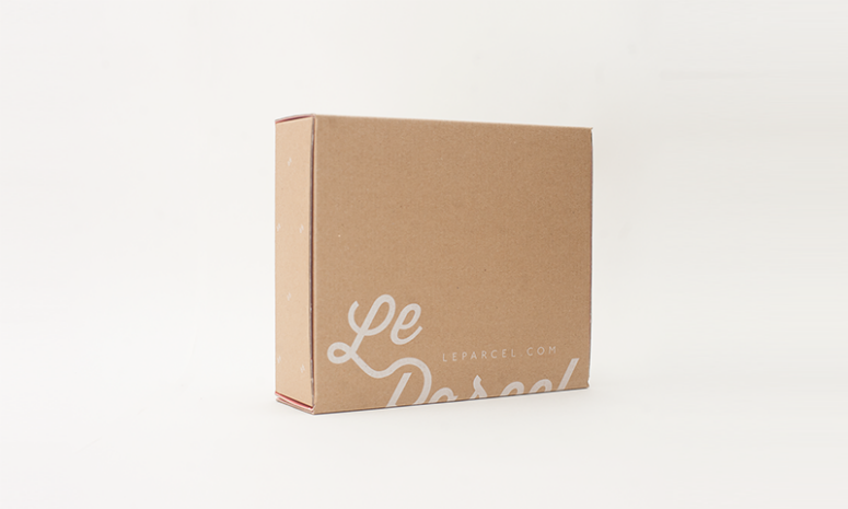
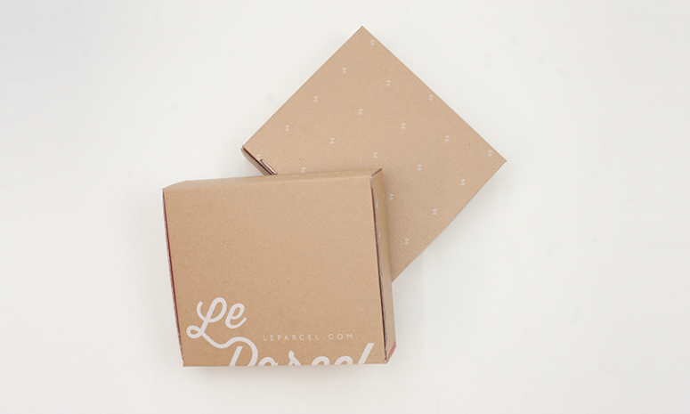
The 2015 Le Parcel packaging system is the 3rd round of packaging systems Seven Fifty Five has created for Le Parcel. Each iteration serving a new purpose; a response to challenges faced by the company's subscription business model.The challenges to address with this edition of Le Parcel's packaging was first, weight. To accommodate this need the framework of the box had to be completely redesigned, including the use of a lighter-weight cardboard box. Graphics, including the bold pink interior, are silk screened rather than printed on a paper label - a typical graphic application.
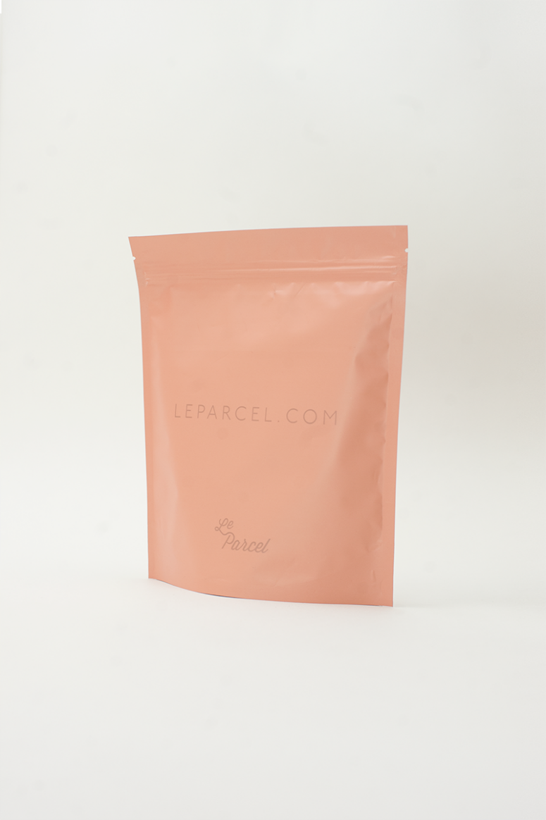
The second issue to address in this round of packaging was organization within the box. The heat sealed bag brings both order to the box, but also an element of cleanliness. The bag is also easy to stash on the go, or under the counter, and has a resealable zipper lock.
Le Parcel has always been adamant that their boxes should feel like opening a much-anticipated gift. The bright pink interior and bag as well as the messaging act as an instigator of celebration. The Le Parcel experience is to make periods more enjoyable, the box plays a part in that process reminding subscribers that as Le Parcel - "We are here for you".
Production Lesson(s)
Stumbling upon a cardboard that had white on one side and a cardboard surface on the other was a game changer for this project. This allowed us to do a 1 color silkscreen run on both sides of the cardboard box. On the exterior is a white silkscreen, on the interior is a silk screened pink overlay. This gave us a very cost effective outcome rather than having to use a two color run on the interior.
Post Author

Kelly Cree
Writer for UnderConsideration LLC.
More: Online / On Twitter
Date Published
September 8, 2014
Filed Under
Packaging
Silkscreen
Tagged with
bag
cardboard
silver
About
FPO (For Print Only), is a division of UnderConsideration, celebrating the reality that print is not dead by showcasing the most compelling printed projects.
FPO uses Fonts.com to render Siseriff and Avenir Next.
FPO is run with Six Apart’s MovableType
All comments, ideas and thoughts on FPO are property of their authors; reproduction without the author’s or FPO’s permission is strictly prohibited
Twitter @ucllc
Sign-up for Mailing List
Mailing list managed by MailChimp
Thanks to our advertisers
About UnderConsideration
UnderConsideration is a graphic design firm generating its own projects, initiatives, and content while taking on limited client work. Run by Bryony Gomez-Palacio and Armin Vit in Bloomington, IN. More…
blogs we publish
Brand New / Displaying opinions and focusing solely on corporate and brand identity work.
Art of the Menu / Cataloguing the underrated creativity of menus from around the world.
Quipsologies / Chronicling the most curious, creative, and notable projects, stories, and events of the graphic design industry on a daily basis.
products we sell
Flaunt: Designing effective, compelling and memorable portfolios of creative work.
Brand New Conference videos / Individual, downloadable videos of every presentation since 2010.
Prints / A variety of posters, the majority from our AIforGA series.
Other / Various one-off products.
events we organize
Brand New Conference / A two-day event on corporate and brand identity with some of today's most active and influential practitioners from around the world.
Brand Nieuwe Conference / Ditto but in Amsterdam.
Austin Initiative for Graphic Awesomeness / A speaker series in Austin, TX, featuring some of the graphic design industry's most awesome people.
also
Favorite Things we've Made / In our capacity as graphic designers.
Projects we've Concluded / Long- and short-lived efforts.
UCllc News / Updates on what's going at the corporate level of UnderConsideration.




Related entries
Um Caminho para Santiago CD Package and Diary
36 Days of Type Poster
CNN Digital New Hire Kit
Alivu EVOO Packaging
Ministry of Environment in Colombia Poster