ADV @ UNDERCONSIDERATION Peek here for details
BROWSE
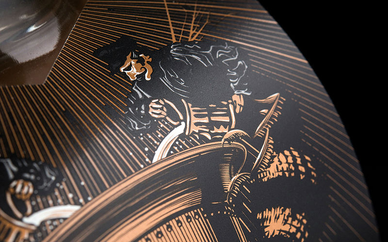
Unruly Gin/Vodka Packaging
Production Method
Offset
Design
Hired Guns Creative
Photography: Sean Fenzl
Printing
Okanagan Label & Print
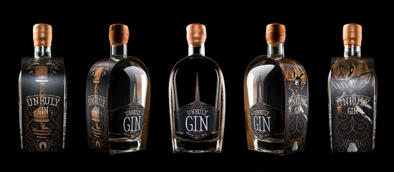
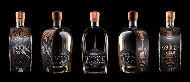
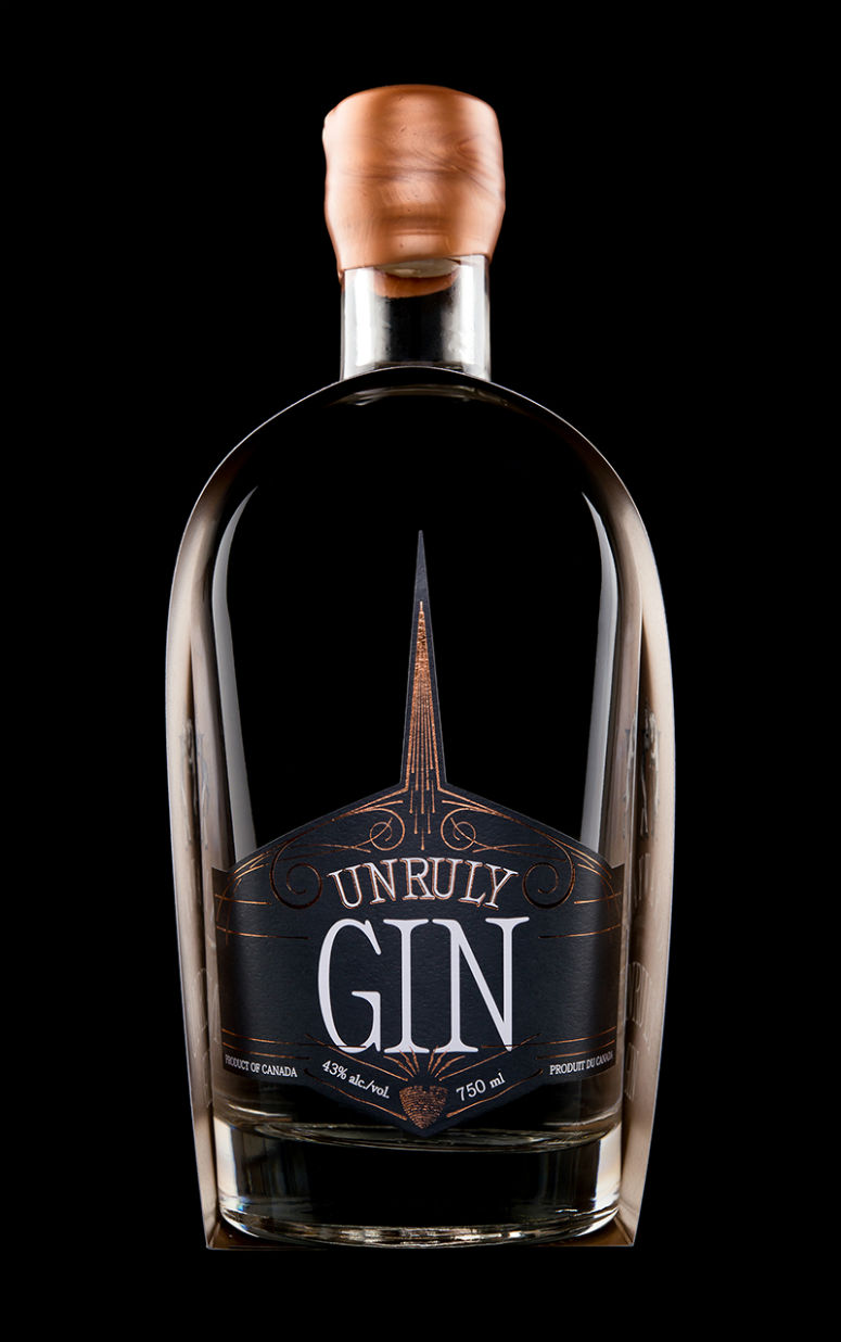
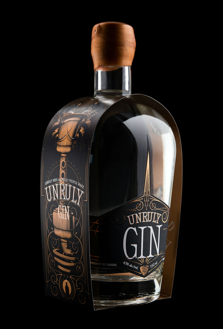
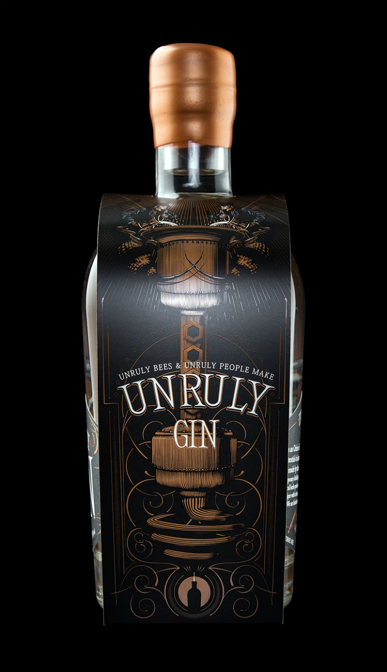
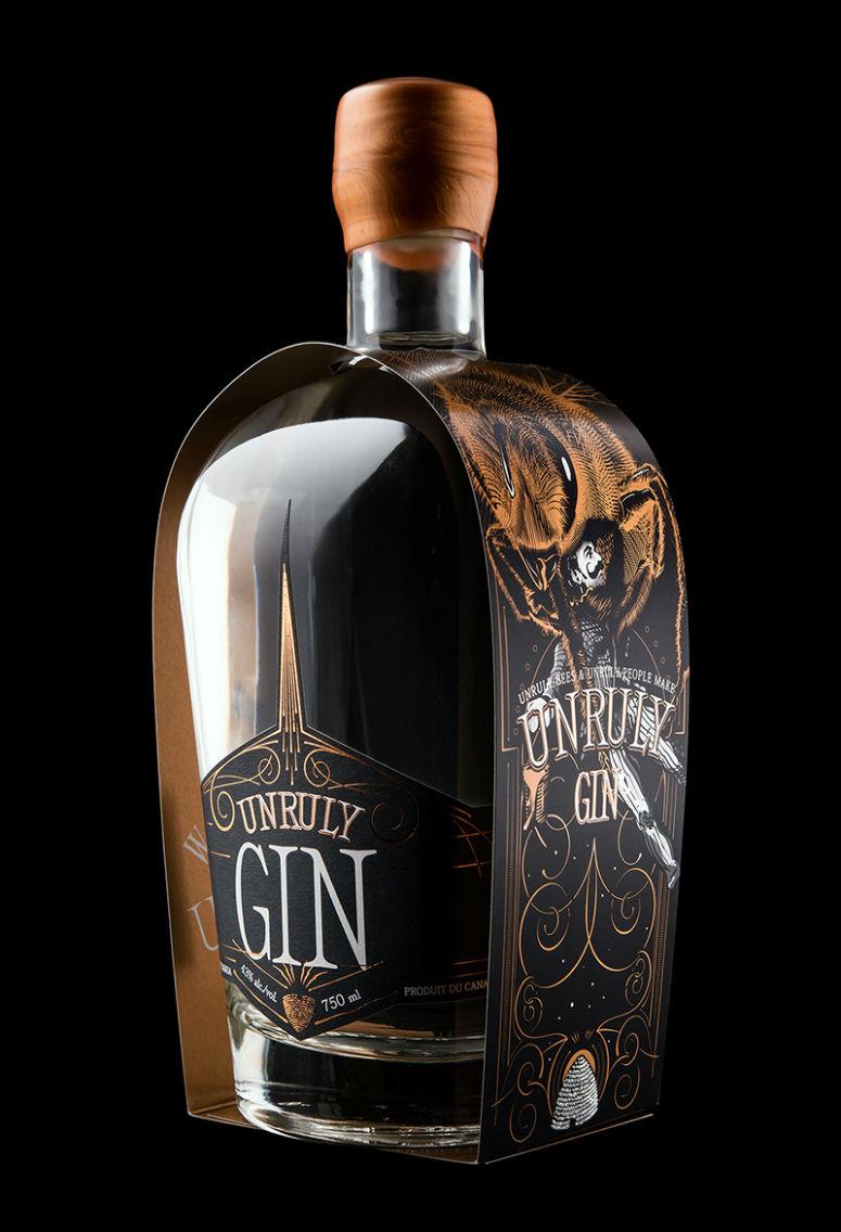
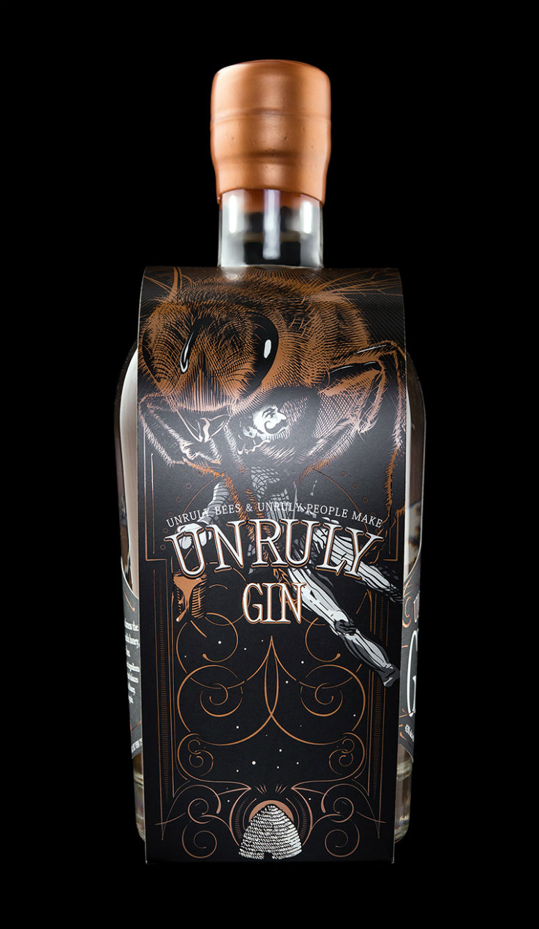
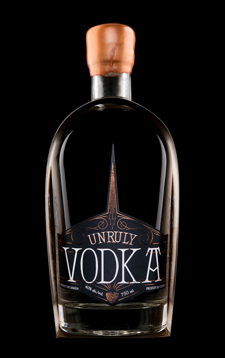
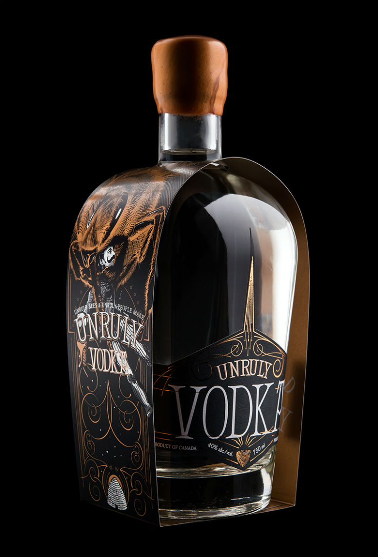
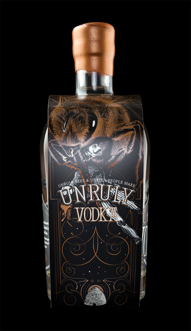
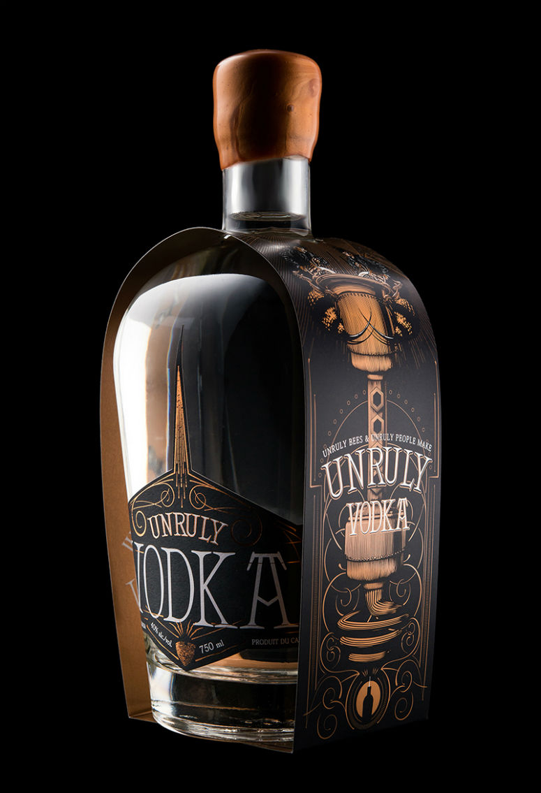
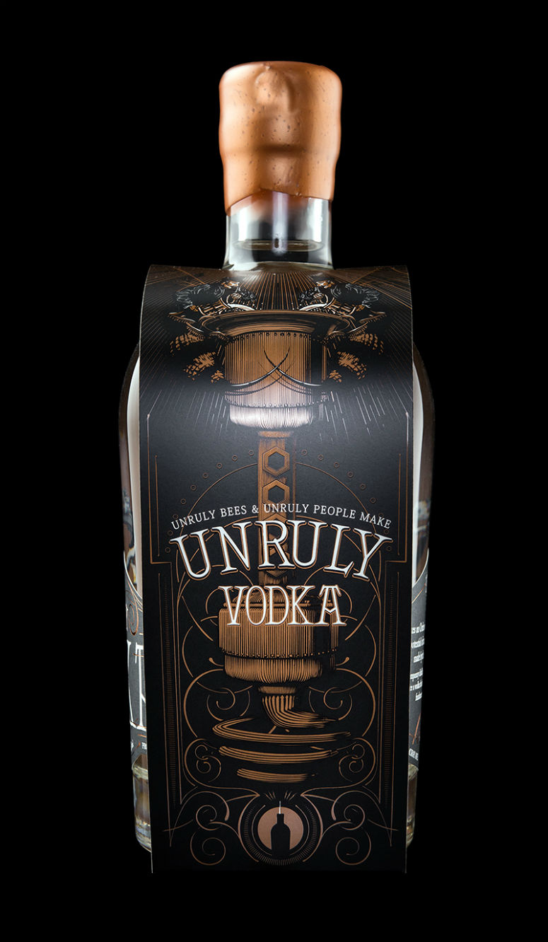
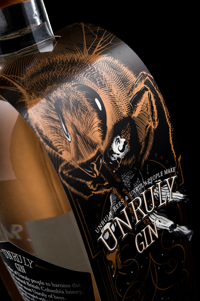
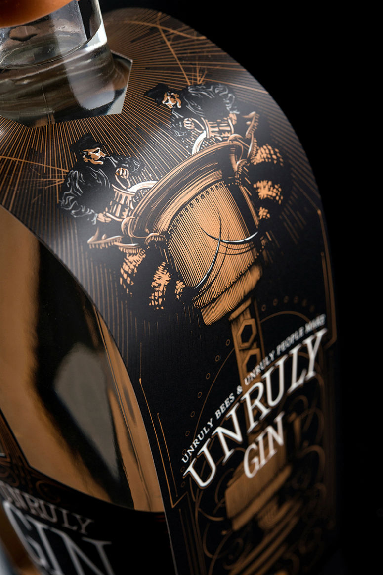
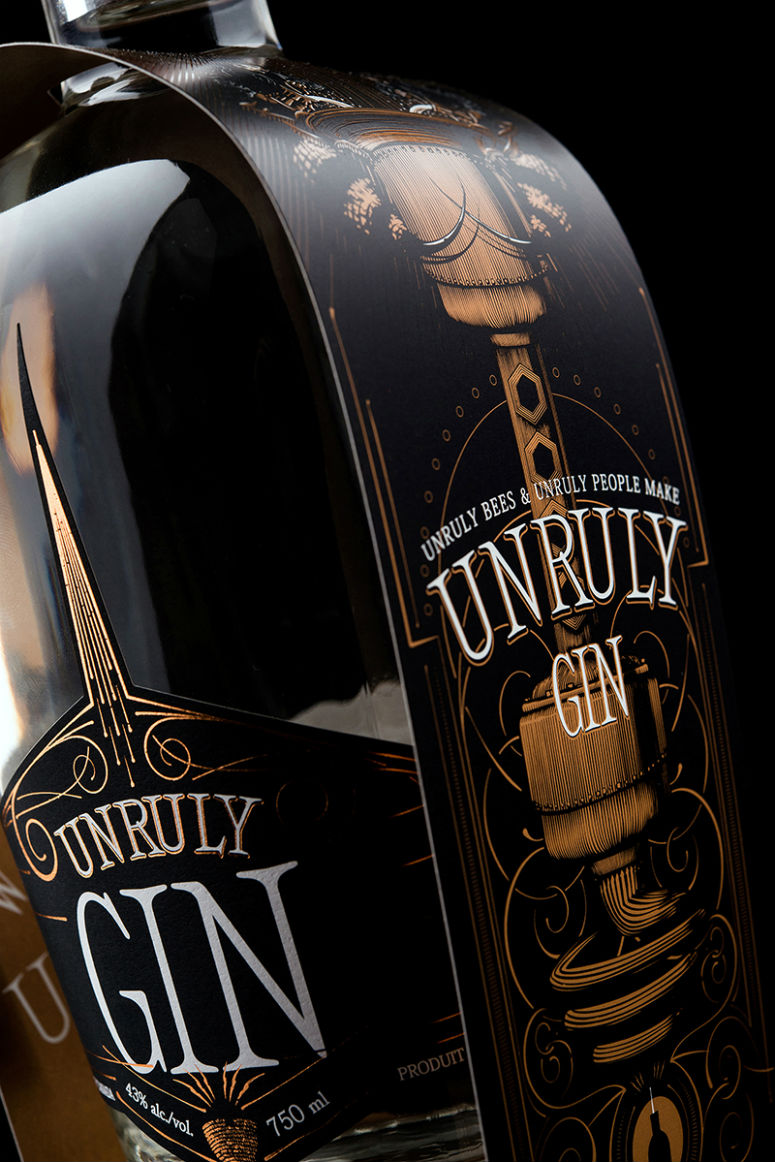
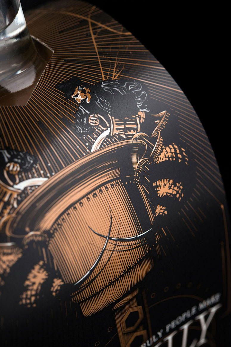
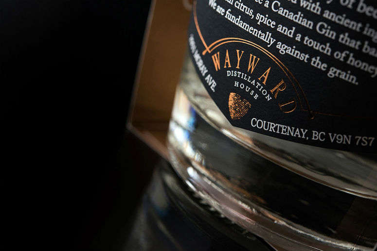
Symbolizing the Unruly relationship between Wayward Distillers and the bees whose honey they use as the base for their spirits, Hired Guns Creative’s bottle packaging and housing uses combinations of UV varnishes to heighten contrast.
Client
Wayward Distillation House
Quantity Produced
300 label sets
3,000 bottle housings
Production Cost
–
Production Time
3 weeks
Dimensions (Width × Height × Depth)
Front Label: 4 × 4.6 in.
Back Label: 3.27 × 2.67 in.
Bottle Housing: 3 × 22.12 in.
Page Count
–
Paper Stock
Fasson / Estate Label No. 8 / White
Chromolux C1s Cover / 12 point
Number of Colors
3 colours + Copper Foil
Varnishes
–
Binding
–
Typography
–
Project Description
Wayward Distillation House is the only distillery in Canada using honey as the base material for their spirits, rather than the more traditional options like barley, potatoes, or corn. Their packaging needed to emphasize this without appearing as though the products taste like honey (because they don't.)We took Wayward's packaging beyond a simple front / back label and created a housing for the bottle that illustrates the the Unruly partnership that exists between this Wayward distiller and the bees.
The custom vector illustration on these bottles is sure to set them apart in a retail setting and should help create significant buzz about their products as they build up to their September launch.
Production Lesson(s)
Our first inclination was to foil stamp all of the copper-coloured design elements on the bottle housing, but this turned out to be pushing the boundaries of foil stamping past the point of predictability. We then worked with the Heidelberg UV press to try and replicate the look of foil as closely as possible. In the end, the bottle housing was printed on a reflective stock using something Hemlock calls their "Strike-Through Contrast Varnish" method: a Spot UV Gloss on the copper-coloured design elements and a Spot Matte on all the other design elements to enhance the contrast between the two.
Post Author

Kelly Cree
Writer for UnderConsideration LLC.
More: Online / On Twitter
Date Published
August 21, 2014
Filed Under
Offset
Packaging
Tagged with
Heidelberg
spot dull varnish
spot uv
UV press
About
FPO (For Print Only), is a division of UnderConsideration, celebrating the reality that print is not dead by showcasing the most compelling printed projects.
FPO uses Fonts.com to render Siseriff and Avenir Next.
FPO is run with Six Apart’s MovableType
All comments, ideas and thoughts on FPO are property of their authors; reproduction without the author’s or FPO’s permission is strictly prohibited
Twitter @ucllc
Sign-up for Mailing List
Mailing list managed by MailChimp
Thanks to our advertisers
About UnderConsideration
UnderConsideration is a graphic design firm generating its own projects, initiatives, and content while taking on limited client work. Run by Bryony Gomez-Palacio and Armin Vit in Bloomington, IN. More…
blogs we publish
Brand New / Displaying opinions and focusing solely on corporate and brand identity work.
Art of the Menu / Cataloguing the underrated creativity of menus from around the world.
Quipsologies / Chronicling the most curious, creative, and notable projects, stories, and events of the graphic design industry on a daily basis.
products we sell
Flaunt: Designing effective, compelling and memorable portfolios of creative work.
Brand New Conference videos / Individual, downloadable videos of every presentation since 2010.
Prints / A variety of posters, the majority from our AIforGA series.
Other / Various one-off products.
events we organize
Brand New Conference / A two-day event on corporate and brand identity with some of today's most active and influential practitioners from around the world.
Brand Nieuwe Conference / Ditto but in Amsterdam.
Austin Initiative for Graphic Awesomeness / A speaker series in Austin, TX, featuring some of the graphic design industry's most awesome people.
also
Favorite Things we've Made / In our capacity as graphic designers.
Projects we've Concluded / Long- and short-lived efforts.
UCllc News / Updates on what's going at the corporate level of UnderConsideration.




Related entries
2017 Brand New Conference Program
Severe(d): A Creepy Poetry Collection by Holly Riordan
Um Caminho para Santiago CD Package and Diary
BOYCO Classpack® Book
Antes de Perder la Esperanza Book