ADV @ UNDERCONSIDERATION Peek here for details
BROWSE
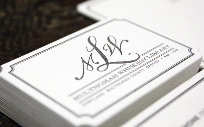
Multnomah Whiskey Library Stationery
Production Method
Letterpress
Design
Pail Design
Printing
KeeganMeegan & Co
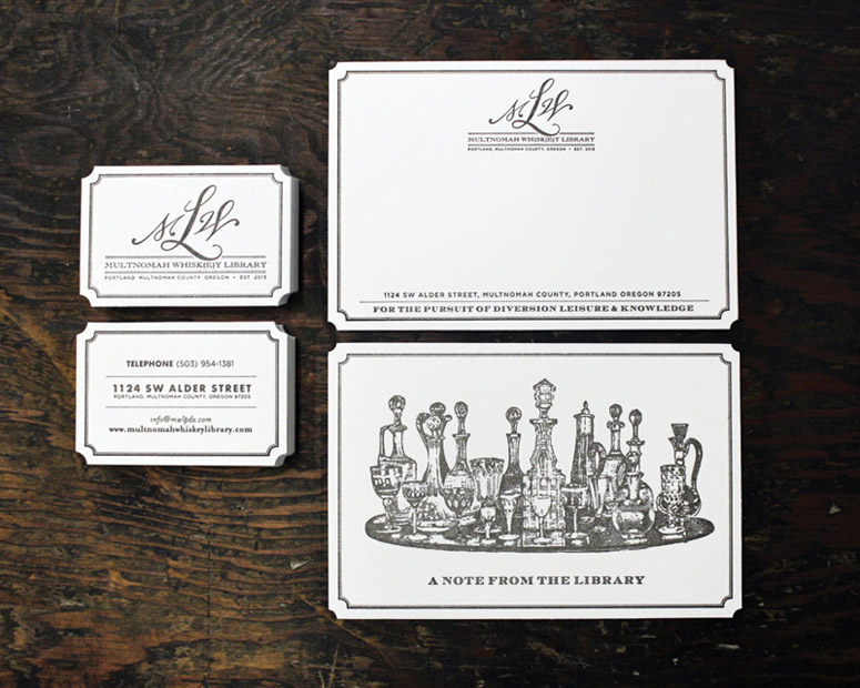
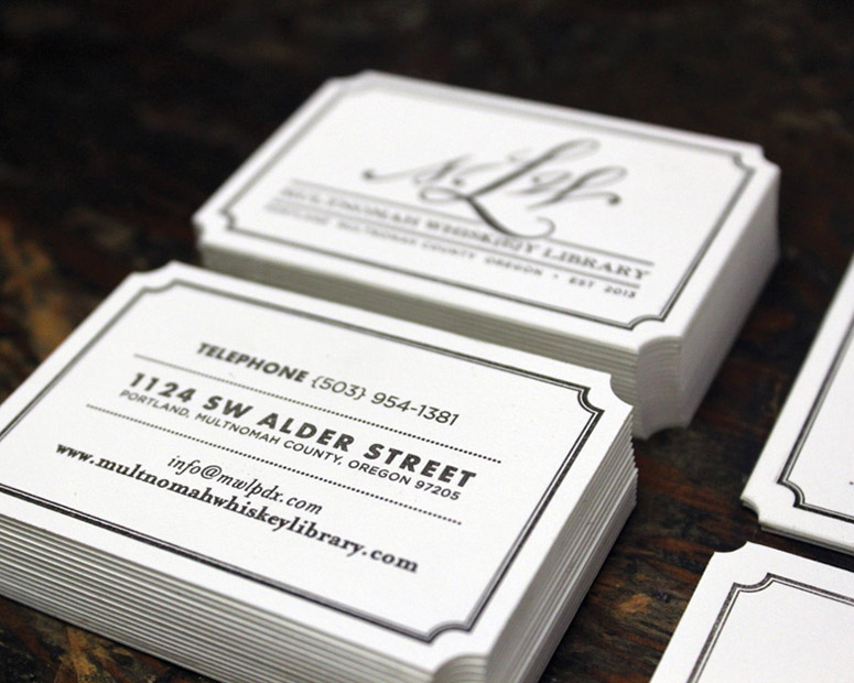
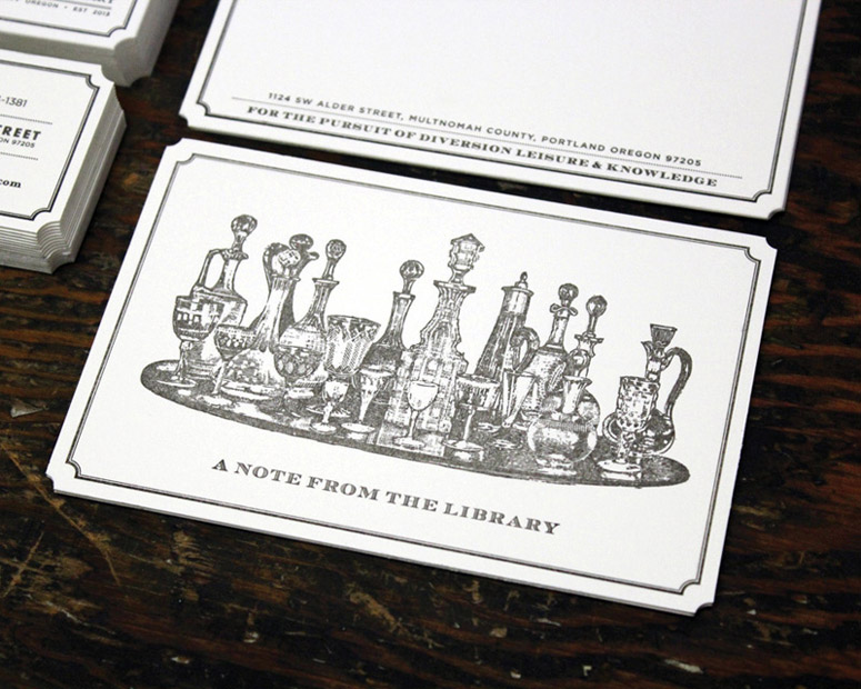
Mix a precise die-cut border with luxurious Lettra and a bar full of whiskey, and you’ve got a system that makes people actually want to take notes at the Library.
Client
Multnomah Whiskey Library
Quantity Produced
5,000+ / On Going Order
Production Cost
–
Production Time
12 business days
Dimensions (Width × Height × Depth)
–
Page Count
–
Paper Stock
220 DTC
Number of Colors
1
Varnishes
–
Binding
–
Typography
–
Project Description
We were honored to be the printer for the paper items supplied to MWL. Below is the design concept by Pail Design based in Portland.The Multnomah Whisk{e}y Library, (The Library) was just named one of the top 22 whiskey bars in America. It boasts over 1,500 spirit offerings, lined up against brass rails and led by curator and talented spirits director, Tommy Klus. The interior environment was created by the Library's co-founder, Alan Davis and Elk Collective's Kelly Ogden. This collaboration results in a luxurious British lounge and an old classic library feel, for an experience that makes you warm and cozy before taking your first sip.
The Library needed to communicate the feel of exclusivity, without being pretentious, and yet set themselves apart as a place of enjoyment, education and extensive spirit knowledge. Whilst a membership to the Library is available for a nominal fee to receive additional perks, the establishment opens its doors to anyone and everyone. To accomplish this, we set out to balance the brand language by combining vintage bits of humor with old-world-charm that speaks to a broad customer base. Materials needed to be, rich in texture and color (leather, brass, letterpressed paper items, brushed linen edges), and styled as 'traditionally classic' (through typography and imagery) to communicate a historic vibe. We created the brand concepts–Whiskey and Whisk{e}y, for the pursuit of diversion leisure and knowledge–and the short-name, The Library. This supports the brand objectives with a sophisticated palate that uses humor from old whiskey quotes combined with sketches and rich textures.
Production Lesson(s)
Much like a fine whiskey it's the little details that matter the most. The suite for Multnomah Whiskey Library is a good example of this ethos. Designed by Pail Design and printed on Lettra 220# in Black 4U with a scallop die cut. Provided that business cards are 2-by-3 and the 4-by-6 note card each have a unforgiving tight border when printing our math had to be perfect once going to die cut. Any mis-registration in the 3 passes would be terribly obvious and let down our reputation as a Type A :) print shop. Also on that note Black 4U is a orange black that is hard to stabilize across a print suite, once the ink fountain is dialed in best not to mess with it.
Post Author

Jessica Mullen
Writer for UnderConsideration LLC.
More: Online / On Twitter
Date Published
August 7, 2014
Filed Under
Letterpress
Stationery
Tagged with
business cards
letterpress
stationery
thank you
thank you note
About
FPO (For Print Only), is a division of UnderConsideration, celebrating the reality that print is not dead by showcasing the most compelling printed projects.
FPO uses Fonts.com to render Siseriff and Avenir Next.
FPO is run with Six Apart’s MovableType
All comments, ideas and thoughts on FPO are property of their authors; reproduction without the author’s or FPO’s permission is strictly prohibited
Twitter @ucllc
Sign-up for Mailing List
Mailing list managed by MailChimp
Thanks to our advertisers
About UnderConsideration
UnderConsideration is a graphic design firm generating its own projects, initiatives, and content while taking on limited client work. Run by Bryony Gomez-Palacio and Armin Vit in Bloomington, IN. More…
blogs we publish
Brand New / Displaying opinions and focusing solely on corporate and brand identity work.
Art of the Menu / Cataloguing the underrated creativity of menus from around the world.
Quipsologies / Chronicling the most curious, creative, and notable projects, stories, and events of the graphic design industry on a daily basis.
products we sell
Flaunt: Designing effective, compelling and memorable portfolios of creative work.
Brand New Conference videos / Individual, downloadable videos of every presentation since 2010.
Prints / A variety of posters, the majority from our AIforGA series.
Other / Various one-off products.
events we organize
Brand New Conference / A two-day event on corporate and brand identity with some of today's most active and influential practitioners from around the world.
Brand Nieuwe Conference / Ditto but in Amsterdam.
Austin Initiative for Graphic Awesomeness / A speaker series in Austin, TX, featuring some of the graphic design industry's most awesome people.
also
Favorite Things we've Made / In our capacity as graphic designers.
Projects we've Concluded / Long- and short-lived efforts.
UCllc News / Updates on what's going at the corporate level of UnderConsideration.




Related entries
Black Sheep Studio Business Cards and Promotional Items
Herbst & Spungen Wedding Invitation Suite
Cranky Bucks Promotion
Seegno Business Cards
“Miniature Views” Promotion