ADV @ UNDERCONSIDERATION Peek here for details
BROWSE
Typeforce 3
Production Method
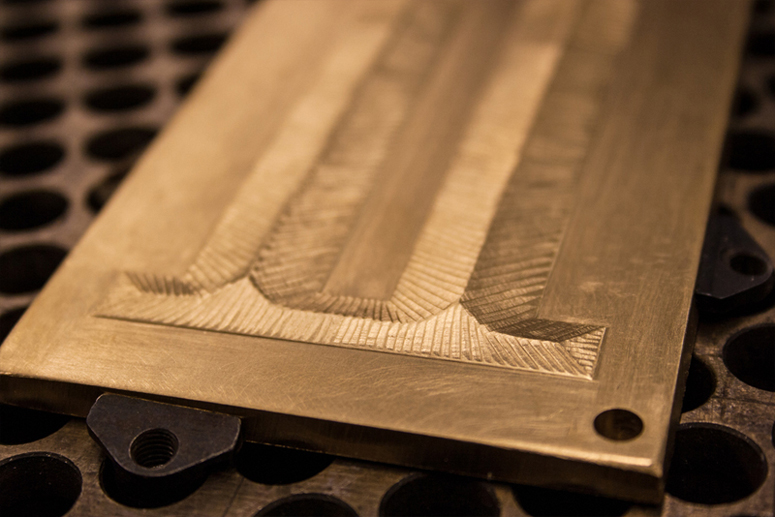
Emboss
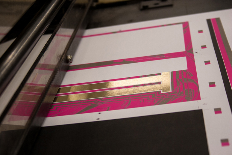
Foil stamp
Offset
Design
Firebelly Design
Will Miller, Creative Director
Nick Adam, Designer
Ohn Ho, Designer
Greg Calvert, Designer
Printing
Graphic Arts Studio Inc.
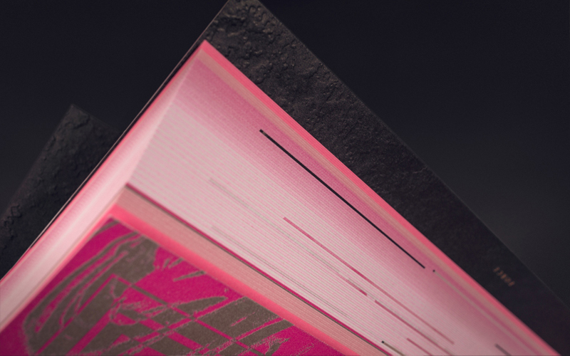
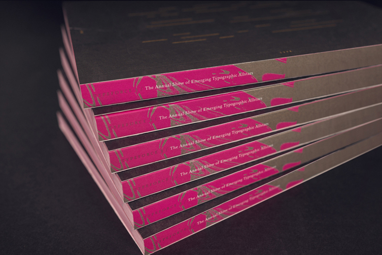
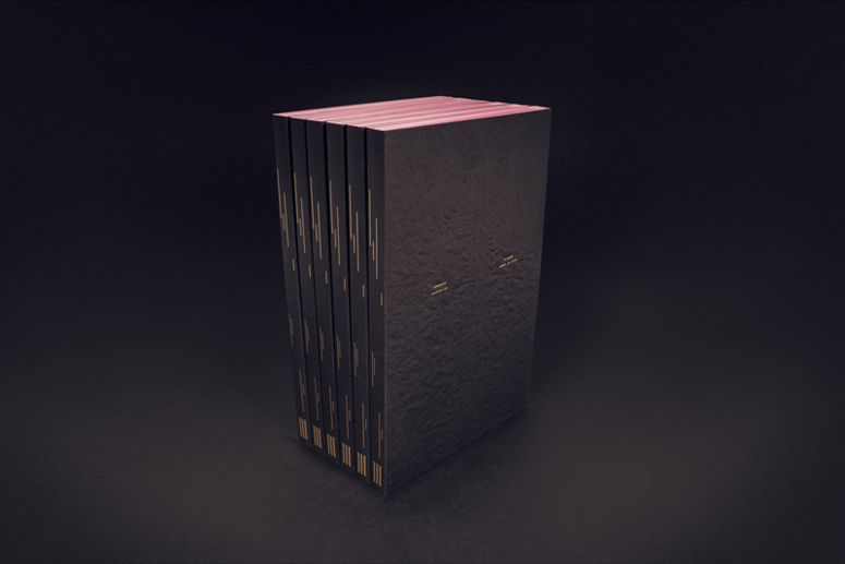
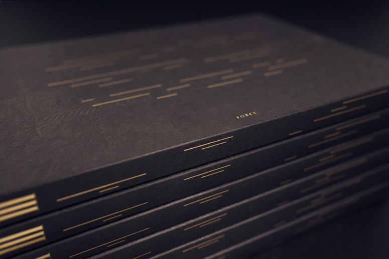
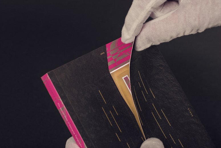
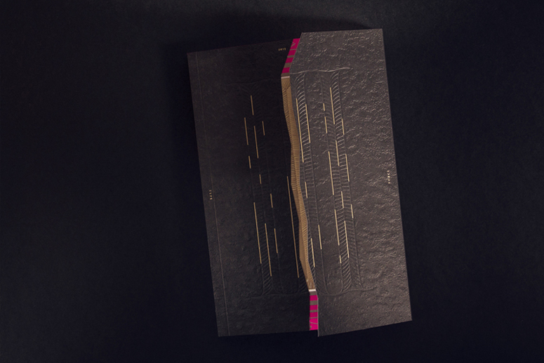
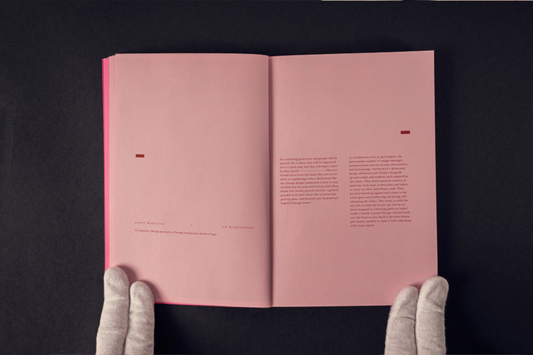
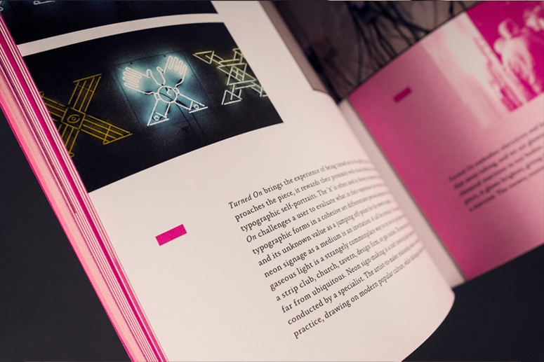
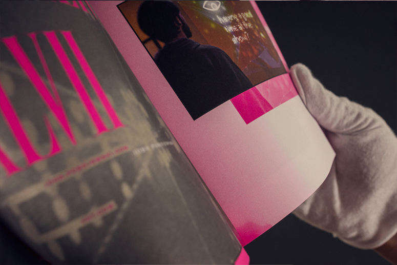
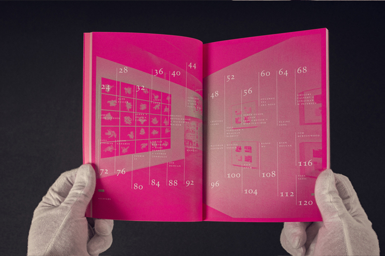
Heavily embossed, glimmering with foil stamp and inviting your hands to tear open the mystery, this type exhibition catalog invites deep exploration like a psychedelic Egyptian tome.
Client
The Public Media Institute
Quantity Produced
1,500
Production Cost
Donated
Production Time
5 weeks
Dimensions (Width × Height × Depth)
5.25 × 7.875 × .5 in.
Page Count
140
Paper Stock
Domtar / Cougar / Smooth White, Vellum Pink, Vellum Fushia / 80T+ 100C, 60 T
Number of Colors
CMYK + 2 spot
Varnishes
–
Binding
Perfect
Typography
Absara (Xavier Dupré)
Hard Times, custom (Firebelly Design)
Project Description
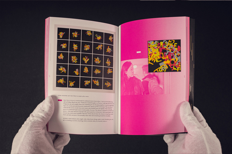
Can an exhibition catalog capture and provide the physical excitement of a moment while honoring tradition, the showcased typographic artistry and artists individual conceptual narratives? By taking a UI approach to the book's design we capture the physical energy of being one of the 1,000-plus attendees discovering new works at the opening reception.Each year Firebelly redefines this task by guiding the reader's attentiveness in an effort to honor and celebrate each of the canonized artists. The studio's third Typeforce catalogue explores new heights in fundamentals by uniting history with the discovery of contemporary methods. Honored typographic traditions, simple mark making and hand-carved stone forms are complemented with emerging glimmers of light, moments of resounding reflection and bursting brilliance.
Production Lesson(s)
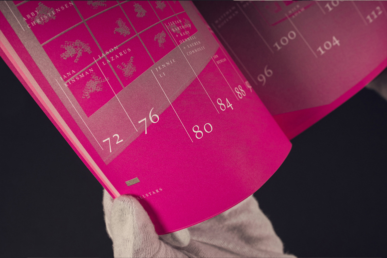
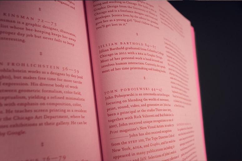
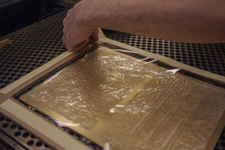
The interior is paginated by content types, using multiple paper stocks gave visual cues guiding the reader across sections. This meant using three different CMYK mixes to ensure our reds were identical across the three paper types.Our emboss plates needed to accomplish very different effects, communicating our intent with the craftsmen hand-tooling these pieces took place outside of files and offline. We'd discuss examples of naturally rough stone that had been embossed and shared videos of chisels hitting solid-slabs achieving dimensional cuts. This illustrated to the die-markers the specific techniques need to accomplish the detailed finish.
The catalogue's true cover is completely sealed by a hand-affixed wrap. To open the book and get to the contents the reader must crack open the wrap. There are strategically sized and placed die cuts that allow the cover to achieve a clean snap only when bent. Figuring out these die cuts took testing and adjusting. There was a round that did not yield a clean snap, one that would hold form for 12 hours then would snap due to the the physics of the binding, another snapped based upon the amount of shake within a shipping box. All of this was tested for and solved.
Across all of these challenges what rang true each time was that we were working with the best printer and finishing house around. If there is one lesson, work with experts and invite their expertise and thoughts into the design process. Working together in a truly collaborative fashion will lead to the best product.

Post Author

Jessica Mullen
Writer for UnderConsideration LLC.
More: Online / On Twitter
Date Published
April 14, 2014
Filed Under
Catalogues
Emboss
Foil stamp
Offset
Tagged with
blind emboss
catalogue
custom type
foil stamp
offset
About
FPO (For Print Only), is a division of UnderConsideration, celebrating the reality that print is not dead by showcasing the most compelling printed projects.
FPO uses Fonts.com to render Siseriff and Avenir Next.
FPO is run with Six Apart’s MovableType
All comments, ideas and thoughts on FPO are property of their authors; reproduction without the author’s or FPO’s permission is strictly prohibited
Twitter @ucllc
Sign-up for Mailing List
Mailing list managed by MailChimp
Thanks to our advertisers
About UnderConsideration
UnderConsideration is a graphic design firm generating its own projects, initiatives, and content while taking on limited client work. Run by Bryony Gomez-Palacio and Armin Vit in Bloomington, IN. More…
blogs we publish
Brand New / Displaying opinions and focusing solely on corporate and brand identity work.
Art of the Menu / Cataloguing the underrated creativity of menus from around the world.
Quipsologies / Chronicling the most curious, creative, and notable projects, stories, and events of the graphic design industry on a daily basis.
products we sell
Flaunt: Designing effective, compelling and memorable portfolios of creative work.
Brand New Conference videos / Individual, downloadable videos of every presentation since 2010.
Prints / A variety of posters, the majority from our AIforGA series.
Other / Various one-off products.
events we organize
Brand New Conference / A two-day event on corporate and brand identity with some of today's most active and influential practitioners from around the world.
Brand Nieuwe Conference / Ditto but in Amsterdam.
Austin Initiative for Graphic Awesomeness / A speaker series in Austin, TX, featuring some of the graphic design industry's most awesome people.
also
Favorite Things we've Made / In our capacity as graphic designers.
Projects we've Concluded / Long- and short-lived efforts.
UCllc News / Updates on what's going at the corporate level of UnderConsideration.




Related entries
KitchenAid Limited Edition Cards
BOYCO Classpack® Book
Herbst & Spungen Wedding Invitation Suite
Fracas Productions Business Cards
Gunnel Wåhlstrand Exhibit Book