ADV @ UNDERCONSIDERATION Peek here for details
BROWSE
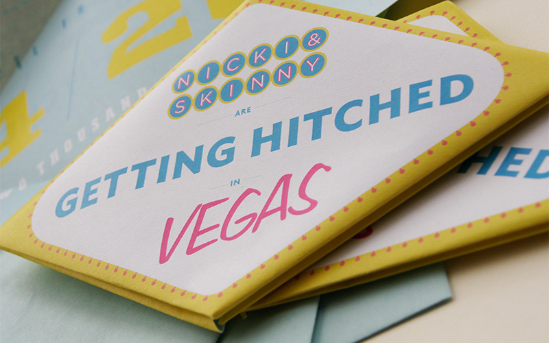
Nicki & Skinny’s Vegas Wedding Invites
Production Method
Digital
Design
Jacob Halton
Printing
Lazare Printing
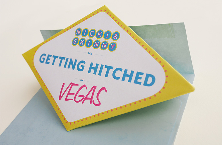
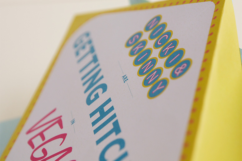
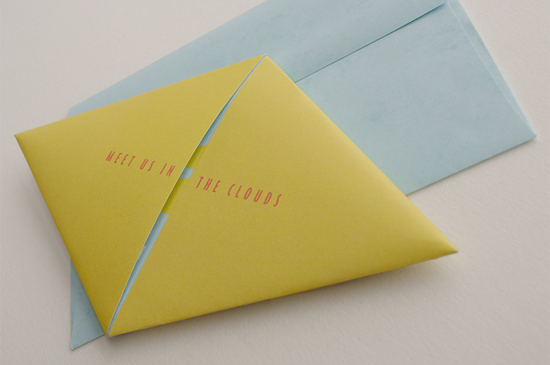
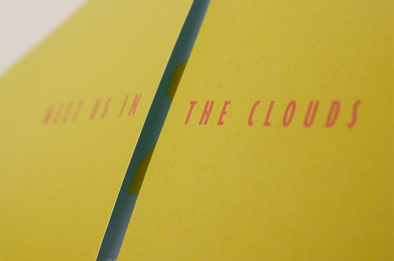
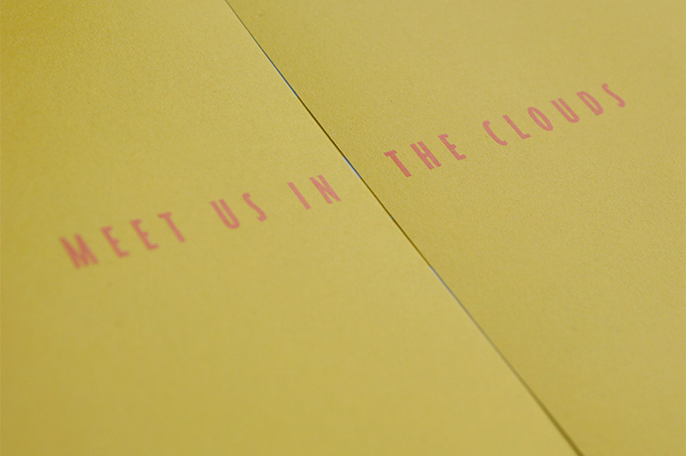
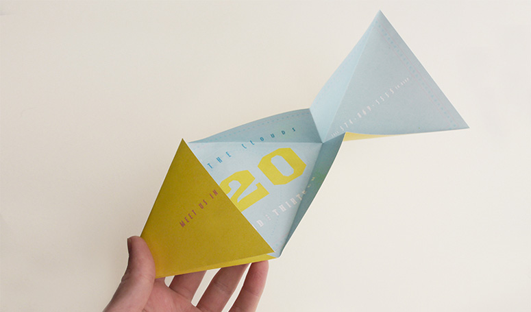
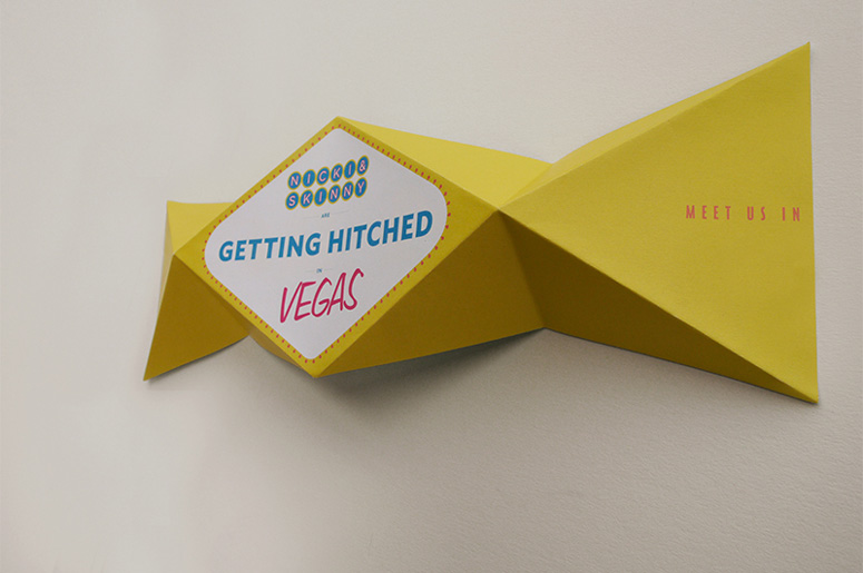
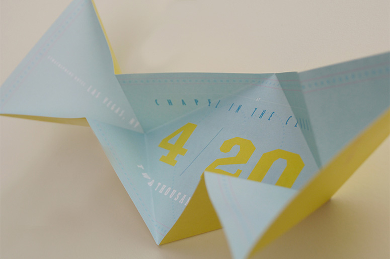
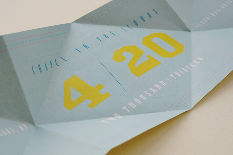
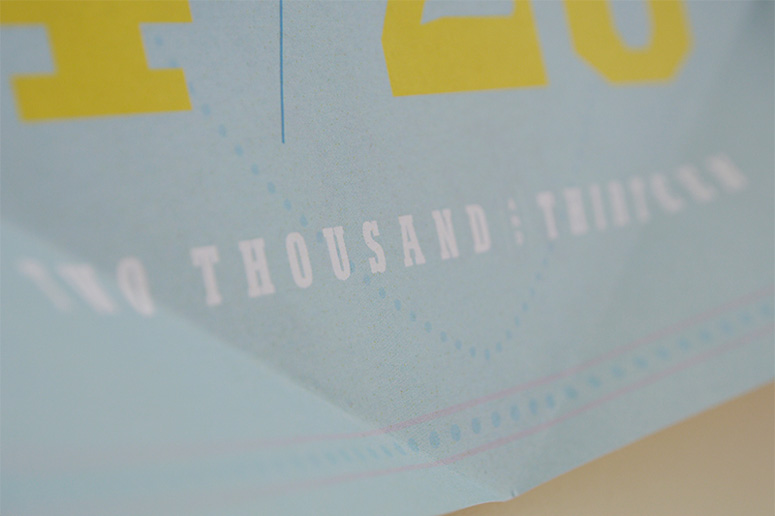
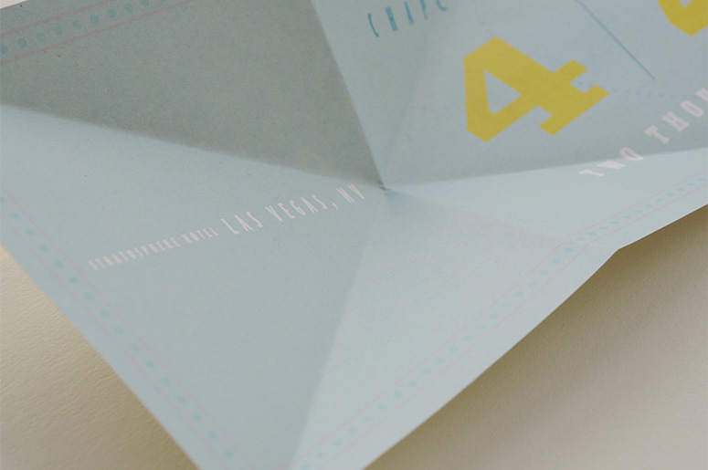
These wedding invites play on Vegas clichés, but do not go too far down that rabbit hole: keeping the invitations fun and interactive, yet classy and tasteful. The folding method and paper choice were well worth the extra effort and research, because if they did not work or were done poorly the whole idea could have been overshadowed by hasty choices. Instead, the folds and paper weight seem to work perfectly.
Dimensions (Width × Height × Depth)
15.875 × 4.625 in
Page Count
1
Paper Stock
Rolland Hitech 70lb. White offset / French Paper Dur-O-Tone Butcher Extra Blue Envelopes
Number of Colors
4
Varnishes
–
Binding
Hand Folding
Typography
Gotham Rounded
Ironmonger Extended
Bodega Sans Medium
Freehand 575
Egyptian
Neutraface
Project Description
My friends, Nicki and Skinny (it's been his nickname since forever) are both people with a great sense of humor and their Las Vegas wedding reflects that. I wanted their invites to not only have the look and feel of Las Vegas to get everyone excited about going, but also be a fun and interactive way to read the info, while balancing enough class in the design to keep it from looking too gaudy.Once the concept of using the "Welcome to Las Vegas" sign (cliché, yes, but that's what Las Vegas is all about) was decided, the tricky part was figuring out how to make the shape of the invite fit the sign and fold in a stable way with enough space for a good layout. A lot of failed tests sketching and folding scrap paper led to the final version.
Production Lesson(s)
It was difficult to find the right type of printing and folding combination. At first, I tried a folding machine and thick paper, which proved to be too pricey for the folds, which would score the paper and cut through the print making it look terrible. Another option was laminating the print with a gloss, which became extremely costly and made the piece not stay folded. In the end it was best to go with a light but strong paper and digital press that kept the print intact. Hand folding was far more precise than the machine and didn't take much time at all.
Post Author

Duncan Robertson
Former intern at UnderConsideration LLC.
More: Online / On Twitter
Date Published
February 6, 2014
Filed Under
Digital
Invitations
Wedding materials
Tagged with
Las Vegas
neutraface
yellow
About
FPO (For Print Only), is a division of UnderConsideration, celebrating the reality that print is not dead by showcasing the most compelling printed projects.
FPO uses Fonts.com to render Siseriff and Avenir Next.
FPO is run with Six Apart’s MovableType
All comments, ideas and thoughts on FPO are property of their authors; reproduction without the author’s or FPO’s permission is strictly prohibited
Twitter @ucllc
Sign-up for Mailing List
Mailing list managed by MailChimp
Thanks to our advertisers
About UnderConsideration
UnderConsideration is a graphic design firm generating its own projects, initiatives, and content while taking on limited client work. Run by Bryony Gomez-Palacio and Armin Vit in Bloomington, IN. More…
blogs we publish
Brand New / Displaying opinions and focusing solely on corporate and brand identity work.
Art of the Menu / Cataloguing the underrated creativity of menus from around the world.
Quipsologies / Chronicling the most curious, creative, and notable projects, stories, and events of the graphic design industry on a daily basis.
products we sell
Flaunt: Designing effective, compelling and memorable portfolios of creative work.
Brand New Conference videos / Individual, downloadable videos of every presentation since 2010.
Prints / A variety of posters, the majority from our AIforGA series.
Other / Various one-off products.
events we organize
Brand New Conference / A two-day event on corporate and brand identity with some of today's most active and influential practitioners from around the world.
Brand Nieuwe Conference / Ditto but in Amsterdam.
Austin Initiative for Graphic Awesomeness / A speaker series in Austin, TX, featuring some of the graphic design industry's most awesome people.
also
Favorite Things we've Made / In our capacity as graphic designers.
Projects we've Concluded / Long- and short-lived efforts.
UCllc News / Updates on what's going at the corporate level of UnderConsideration.




Related entries
Black Sheep Studio Business Cards and Promotional Items
E.A.S.E. Stationery Set
“A to Z Letters for Sale” Promo
End of Work iPad and Notebook Cases
CNN Digital New Hire Kit