ADV @ UNDERCONSIDERATION Peek here for details
BROWSE
Florecast Magazine
Production Method
Offset
Design
Sam Roberts
See extended credits after the project description
Printing
The Newspaper Club
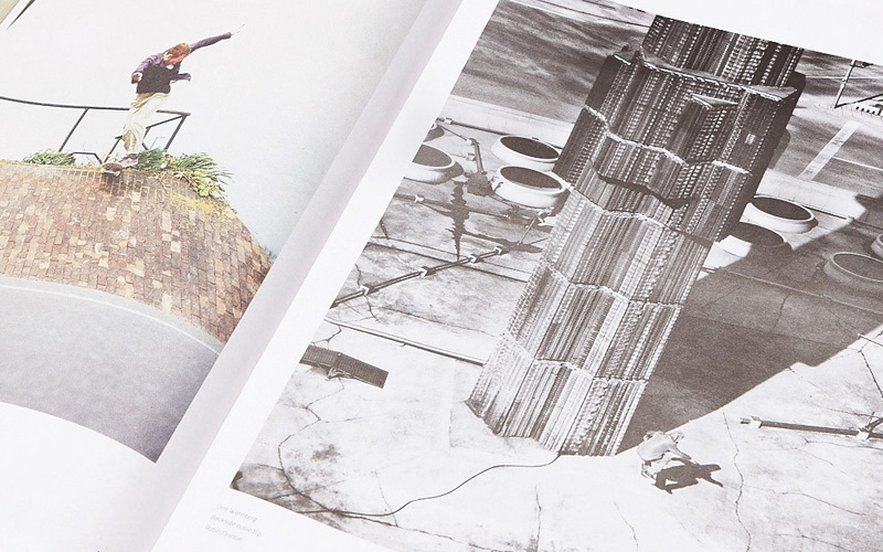
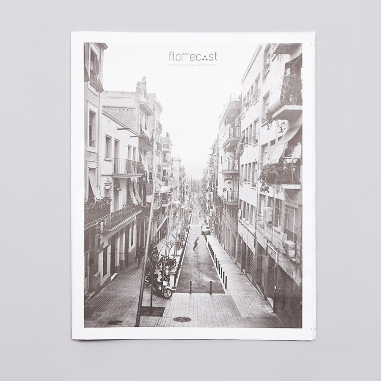
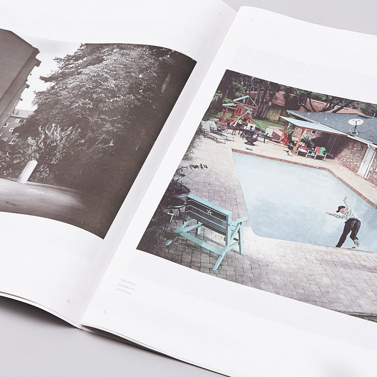
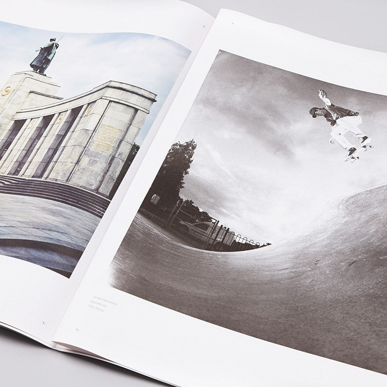
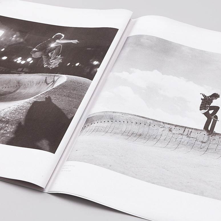
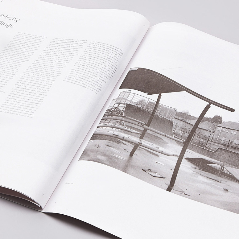
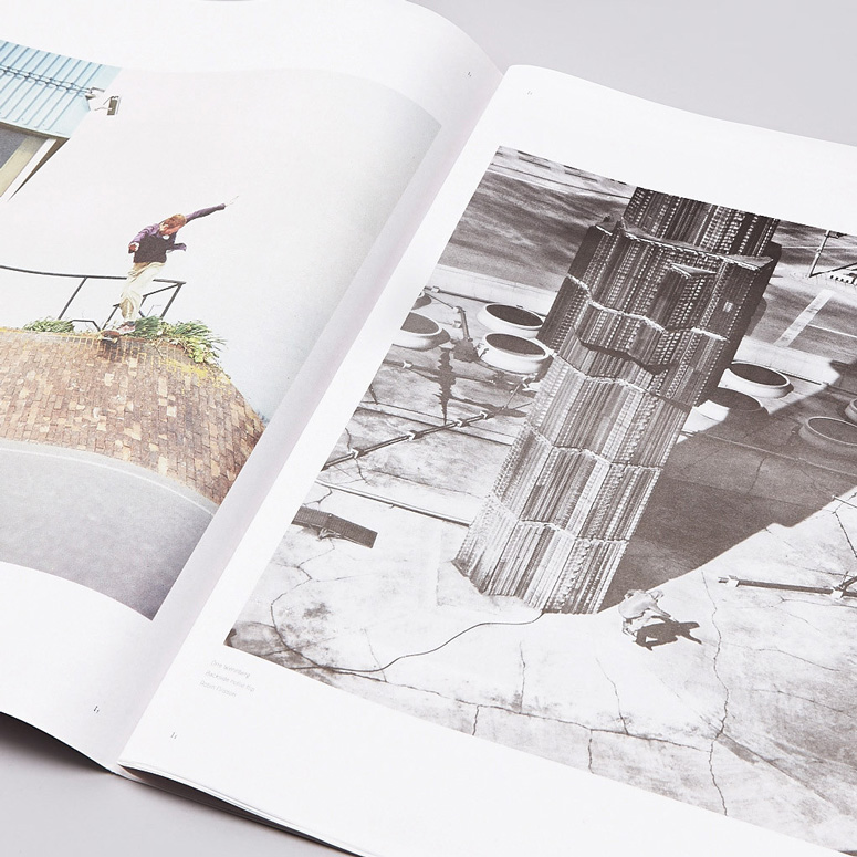
Florecast skateboarding magazine is printed on tabloid-size newsprint to allow large scale printing of the photographs—which were all originally shot on film. A clever design decision, which is elegantly executed through the beautiful large images, smart use of white space, and sensible typography.
Dimensions (Width × Height × Depth)
11.77 × 14.57 in
Page Count
32
Paper Stock
Improved newsprint / 52gsm
Number of Colors
4
Varnishes
–
Binding
Loose leaf
Typography
XXII Menga
Adobe Garamond Pro
Project Description
Florecast is a print-based, limited edition publication, documenting skateboarding through non-digital photography.The whole idea behind the publication and its format is to act as a canvas to showcase and reward the work of skateboard photographers who still find the time, effort and cash to work with film as a medium.
The tabloid newspaper format was used to allow the images to be printed at a much larger size than most standard formats, and the newsprint stock lends itself well to the film grains and colouring. Also, the loose leaf format means you can remove pages to use as stand alone poster prints.
Meteorological weather symbols are used as substitutes to letters within headline words, which acts as a visual link to the title of the publication—which was based on forecasting the conditions to go skateboarding:
"So why Florecast? Well the name came from a friend of mine whom I called up one dull morning after a night of rain. Asking whether he wanted to go skating, he said he’d just go and check the “weather florecast”. Slightly confused, I asked what he meant, and it was basically the act of looking out of your window at a patch of concrete or pavement outside your house, and if it’s dry, then experience says so are the street spots—and therefore skating is on. I think we’ve all used this technique, only gained from the experience of different weather conditions and types of surfaces."
Photography included in the publication by:
Guillaume Perimony (FRA),
Sergej Vutuc (GER),
Reece Leung (UK),
Graham Tait (UK),
Robin Nilssen (SWE),
Eric van Rijsingen (HOL),
Bertrand Trichet (SPA),
Nicolas Lebeau (FRA),
Sam Roberts (UK),
Matt Thomas (UK),
Rich West (UK),
Jeff DeMarco (USA),
Joel Peck (UK)
and Rob Salmon (UK)
Production Lesson(s)
I would use larger margin spacing due to colour bars, grip perforations and registration marks been quite tight to the content.Show through isn't too much of a problem, but I can limit its impact next time by choosing the photo placement differently.

Post Author

Duncan Robertson
Former intern at UnderConsideration LLC.
More: Online / On Twitter
Date Published
December 12, 2013
Filed Under
Magazines
Offset
Tagged with
custom type
film
newsprint
skateboard
About
FPO (For Print Only), is a division of UnderConsideration, celebrating the reality that print is not dead by showcasing the most compelling printed projects.
FPO uses Fonts.com to render Siseriff and Avenir Next.
FPO is run with Six Apart’s MovableType
All comments, ideas and thoughts on FPO are property of their authors; reproduction without the author’s or FPO’s permission is strictly prohibited
Twitter @ucllc
Sign-up for Mailing List
Mailing list managed by MailChimp
Thanks to our advertisers
About UnderConsideration
UnderConsideration is a graphic design firm generating its own projects, initiatives, and content while taking on limited client work. Run by Bryony Gomez-Palacio and Armin Vit in Bloomington, IN. More…
blogs we publish
Brand New / Displaying opinions and focusing solely on corporate and brand identity work.
Art of the Menu / Cataloguing the underrated creativity of menus from around the world.
Quipsologies / Chronicling the most curious, creative, and notable projects, stories, and events of the graphic design industry on a daily basis.
products we sell
Flaunt: Designing effective, compelling and memorable portfolios of creative work.
Brand New Conference videos / Individual, downloadable videos of every presentation since 2010.
Prints / A variety of posters, the majority from our AIforGA series.
Other / Various one-off products.
events we organize
Brand New Conference / A two-day event on corporate and brand identity with some of today's most active and influential practitioners from around the world.
Brand Nieuwe Conference / Ditto but in Amsterdam.
Austin Initiative for Graphic Awesomeness / A speaker series in Austin, TX, featuring some of the graphic design industry's most awesome people.
also
Favorite Things we've Made / In our capacity as graphic designers.
Projects we've Concluded / Long- and short-lived efforts.
UCllc News / Updates on what's going at the corporate level of UnderConsideration.




Related entries
2017 Brand New Conference Program
Severe(d): A Creepy Poetry Collection by Holly Riordan
Um Caminho para Santiago CD Package and Diary
BOYCO Classpack® Book
Antes de Perder la Esperanza Book