ADV @ UNDERCONSIDERATION Peek here for details
BROWSE
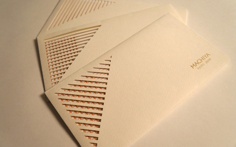
Machiya Corporate Stationery
Production Method
Engraving
Laser-Cut
Design
Yuki Fujiwara
Printing
Yuki Fujiwara
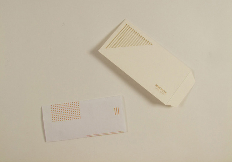
Machiya are Japanese traditional wooden townhouses, which typically have lattice windows. Yuki Fujiwara’s use of laser cutting to reference the lattice windows in these envelopes is inspired, and the resulting interactivity adds a layer of fun to this beautiful stationery set.
Dimensions (Width × Height × Depth)
–
Page Count
–
Paper Stock
yuki
Number of Colors
1
Varnishes
–
Binding
–
Typography
Original Font
Project Description
A series of brand identities for the NPO which has preserved and promoted Japanese traditional architecture called "MACHIYA".- Envelopes
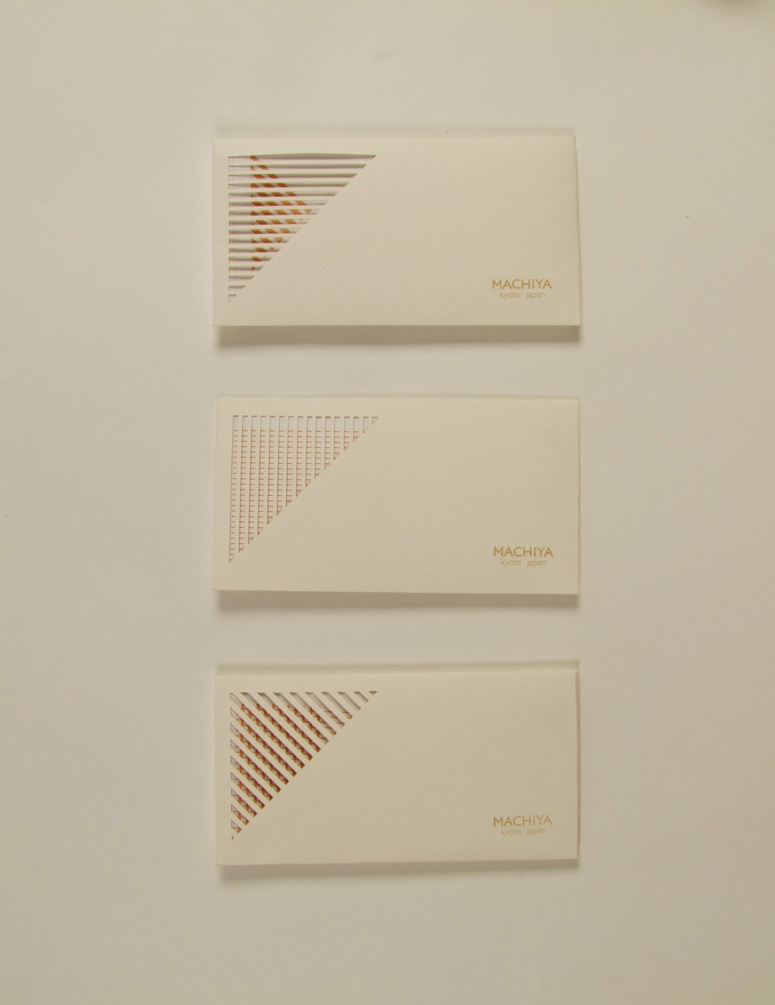
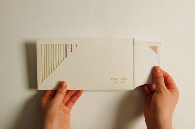
The lattice windows of MACHIYA slightly obscure our views, but this then creates a desire in the viewer to see more inside. I used a similar window on the envelope through laser cutting to provide the same experience for people, bringing their attention to the information inside. Through the cut-out part, we can see a paper pattern and overlapping layers create a new patterns.
In Japanese architecture, we open doors by sliding them. To imitate this action when we open an envelope and remove the paper from inside, I made a flap on the side of the envelope instead of on top on it.
You can enjoy different patterns through the window by changing the folding of the inside paper.
- Business Cards
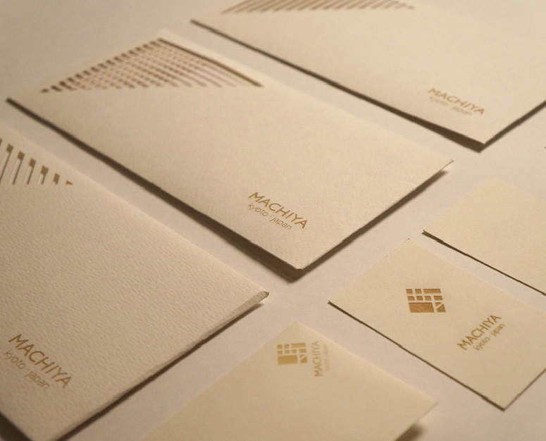
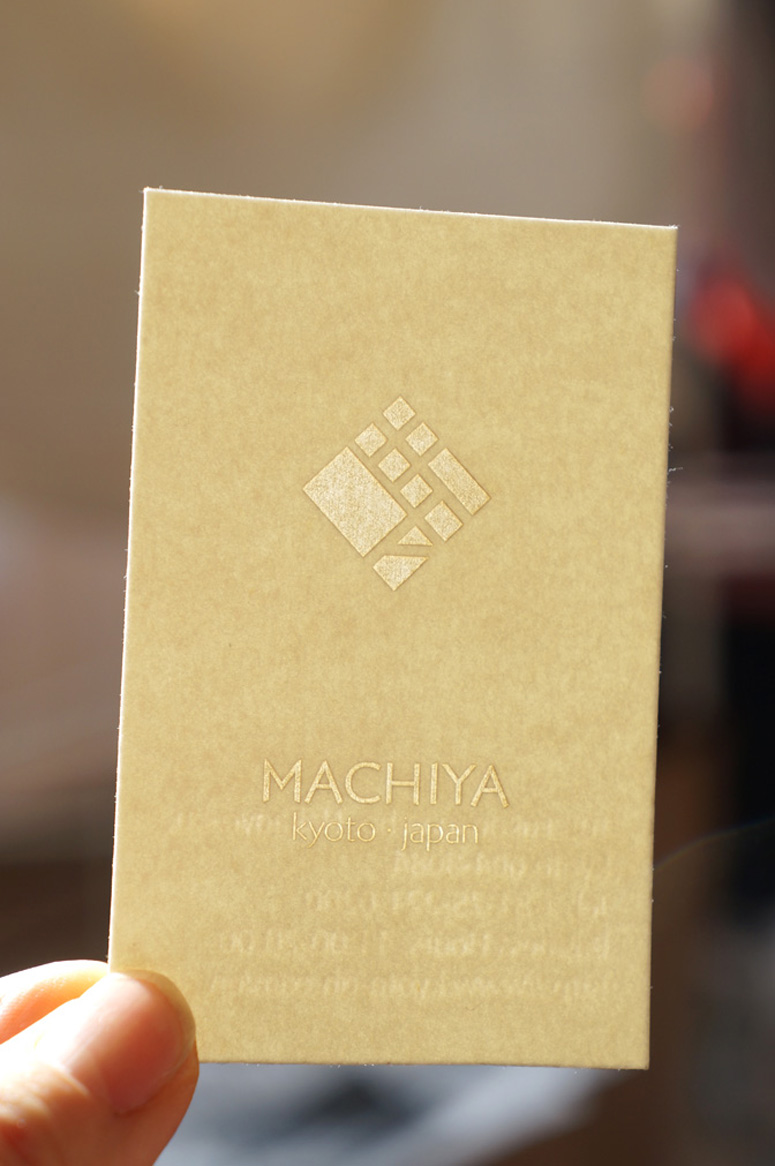
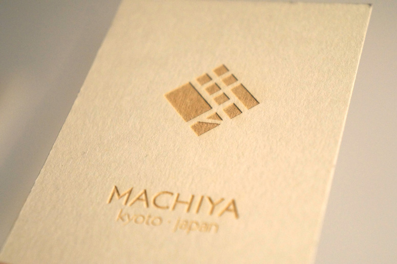
The business cards have an engraved surface to show the logo and information. The engraved parts, which show a subtle change in colour based on light angles, sometimes looks brown (made by burning paper), and sometimes translucent because of its thinness.
The precise laser-cut design represents the accurate and delicate beauty of MACHIYA which is an essential element embodying the brand identity.
Production Lesson(s)
Throughout this project, I used two different techniques when using a laser-cutting machine: cutting and engraving. Although accurate cutting is obviously the strong point of laser-cutting, I also found a lot of possibilities regarding accurate engraving, which enabled me to create subtle and fine design effects, even though we used quite thin materials, such as paper.We have a lot of finishing techniques to provide special touches to a print job which could produce eye-catching designs. However, delicate uneven surface textures and translucent effects on paper -- which are caused by engraving -- are a unique attribute of laser design, which is impossible to realize by other methods such as embossing or letterpress.
The kind of process/technique we should choose depends on what kind of effect we want to create to achieve our design concept and brand identity. This project gave to me an opportunity to discover new effects, to expand my range of expression in graphic design.

Post Author

Duncan Robertson
Former intern at UnderConsideration LLC.
More: Online / On Twitter
Date Published
November 1, 2013
Filed Under
Business Cards
Engraving
Laser-Cut
Stationery
Tagged with
architecture
custom type
japanese
window
About
FPO (For Print Only), is a division of UnderConsideration, celebrating the reality that print is not dead by showcasing the most compelling printed projects.
FPO uses Fonts.com to render Siseriff and Avenir Next.
FPO is run with Six Apart’s MovableType
All comments, ideas and thoughts on FPO are property of their authors; reproduction without the author’s or FPO’s permission is strictly prohibited
Twitter @ucllc
Sign-up for Mailing List
Mailing list managed by MailChimp
Thanks to our advertisers
About UnderConsideration
UnderConsideration is a graphic design firm generating its own projects, initiatives, and content while taking on limited client work. Run by Bryony Gomez-Palacio and Armin Vit in Bloomington, IN. More…
blogs we publish
Brand New / Displaying opinions and focusing solely on corporate and brand identity work.
Art of the Menu / Cataloguing the underrated creativity of menus from around the world.
Quipsologies / Chronicling the most curious, creative, and notable projects, stories, and events of the graphic design industry on a daily basis.
products we sell
Flaunt: Designing effective, compelling and memorable portfolios of creative work.
Brand New Conference videos / Individual, downloadable videos of every presentation since 2010.
Prints / A variety of posters, the majority from our AIforGA series.
Other / Various one-off products.
events we organize
Brand New Conference / A two-day event on corporate and brand identity with some of today's most active and influential practitioners from around the world.
Brand Nieuwe Conference / Ditto but in Amsterdam.
Austin Initiative for Graphic Awesomeness / A speaker series in Austin, TX, featuring some of the graphic design industry's most awesome people.
also
Favorite Things we've Made / In our capacity as graphic designers.
Projects we've Concluded / Long- and short-lived efforts.
UCllc News / Updates on what's going at the corporate level of UnderConsideration.




Related entries
Fum Fum Fum Christmas Cards
Walt & June Wedding Invitation
Bocanegra Studio Identity Materials
2016 Brand Nieuwe Conference Program
Studio Pression 2016 Greeting card