ADV @ UNDERCONSIDERATION Peek here for details
BROWSE
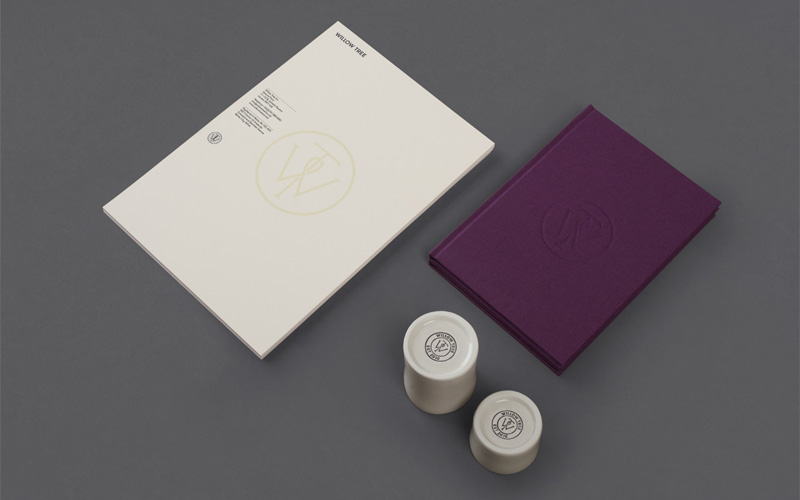
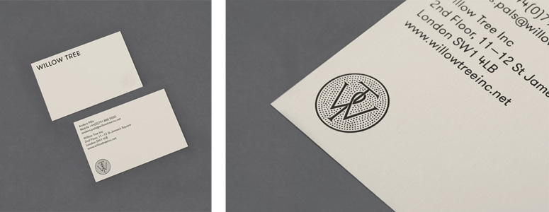
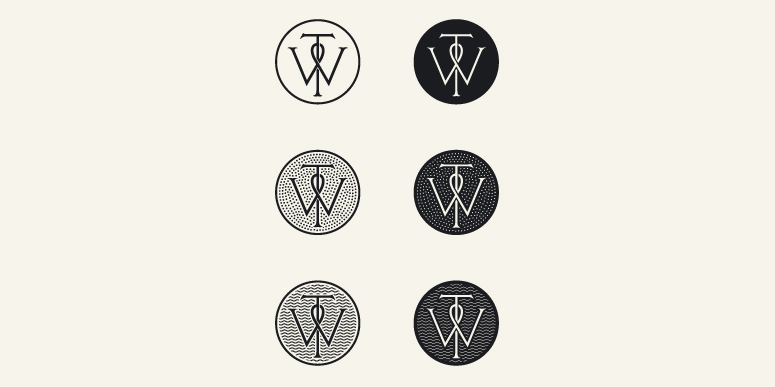
The application and design of these pieces feel like it strikes a balance between traditional arts and crafts movement expressions and minimal modern miens. The verging-on-decorative monogram harkens back to the arts and crafts movement, while minimalism reins in the sans serif wordmark and overall applications.
Client
Willow Tree Stationery, Notebooks, Coffee Pottery
Quantity Produced
Business Cards: 2 different cards, 250 each
Letterheads: 500
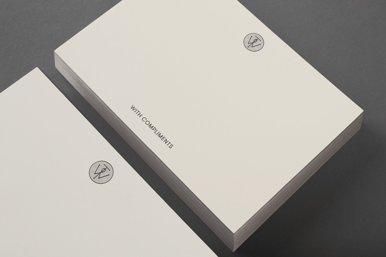
With Compliment Slips: 2 different cards, 250 each
Envelopes: 250
Notebooks: 2 different notebooks, 100 each
Coffee Pottery: 2 sizes, 50 each
Production Cost
$5,652
Production Time
3 weeks
Dimensions (Width × Height × Depth)
Business Cards: 3.35 × 2.17 in
Letterhead: 8.27 × 11.69 in
With Compliment Slips: 5.83 × 4.13 in
Envelopes: 9.02 × 12.76 in
Notebooks: 5.83 × 8.27 in
Coffee Pottery: 3.15 × 2, 2 × 2
Page Count
Notebooks: 100 pages / 50 sheets
Paper Stock
Fedrigoni Sirio Color Sabbia (140 & 350 gsm)
Number of Colors
1 (black)
Varnishes
–
Binding
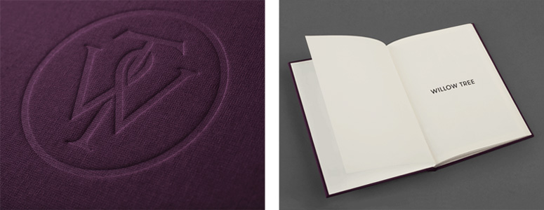
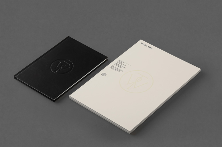
A mix of embosses, carved in seals and simulated watermarks—achieved with an oil-based ink—across purple cloth, black leather, slightly structured Fedrigoni Sirio Color stock and handmade coffee pottery
Typography
GT Walsheim



Project Description
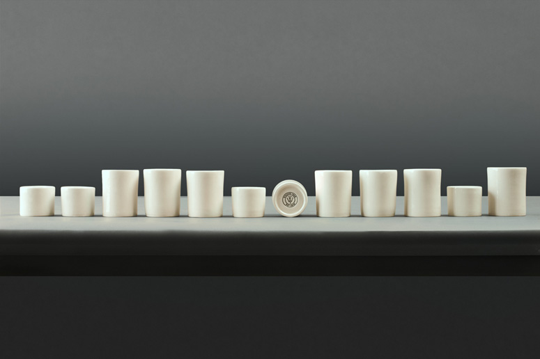
Bunch has designed a new but traditional looking identity for Willow Tree, London's leading business consultancy.Bunch worked in close collaboration with typographer Spencer Charles to develop a bespoke WT monogram, which was executed as a mix of embosses, carved in seals and simulated watermarks—achieved with an oil-based ink—across purple cloth, black leather, slightly structured Fedrigoni Sirio Color stock and handmade coffee pottery, the solution embraces a crafted sensibility alongside a more contemporary use of space and type.
The mark functions well as a distinctive, well illustrated and uniting element that appropriately utilises the traditional crafted origins of the monogram to convey a more personal and individualised business practice.
Production Lesson(s)
Lesson 01:Seeing that we were only doing a small run, we had to create a simulation of the watermark, instead of the real one. This had be done by using special oil based litho colour on letterheads. We found the letterheads had to be printed both sides because of the thick 140 gsm stock.
Lesson 02:
Coffee pottery production was an interesting process. Custom made pottery is not that hard to manufacture. We had a good handmade setup and we were able to produce quickly. Carved-in seals were created and used at the bottom of the cup, and in the end they all seemed quite compliant, but getting the inside matt colour was an issue. Matt colours are hard to get by, and tests didn't prove to work that well, so we decided to keep them as they were.

Post Author

Duncan Robertson
Former intern at UnderConsideration LLC.
More: Online / On Twitter
Date Published
October 8, 2013
Filed Under
Business Cards
Collateral
Emboss
Offset
Stationery
Tagged with
business card
monogram
notebook
notecards
purple
stationery
About
FPO (For Print Only), is a division of UnderConsideration, celebrating the reality that print is not dead by showcasing the most compelling printed projects.
FPO uses Fonts.com to render Siseriff and Avenir Next.
FPO is run with Six Apart’s MovableType
All comments, ideas and thoughts on FPO are property of their authors; reproduction without the author’s or FPO’s permission is strictly prohibited
Twitter @ucllc
Sign-up for Mailing List
Mailing list managed by MailChimp
Thanks to our advertisers
About UnderConsideration
UnderConsideration is a graphic design firm generating its own projects, initiatives, and content while taking on limited client work. Run by Bryony Gomez-Palacio and Armin Vit in Bloomington, IN. More…
blogs we publish
Brand New / Displaying opinions and focusing solely on corporate and brand identity work.
Art of the Menu / Cataloguing the underrated creativity of menus from around the world.
Quipsologies / Chronicling the most curious, creative, and notable projects, stories, and events of the graphic design industry on a daily basis.
products we sell
Flaunt: Designing effective, compelling and memorable portfolios of creative work.
Brand New Conference videos / Individual, downloadable videos of every presentation since 2010.
Prints / A variety of posters, the majority from our AIforGA series.
Other / Various one-off products.
events we organize
Brand New Conference / A two-day event on corporate and brand identity with some of today's most active and influential practitioners from around the world.
Brand Nieuwe Conference / Ditto but in Amsterdam.
Austin Initiative for Graphic Awesomeness / A speaker series in Austin, TX, featuring some of the graphic design industry's most awesome people.
also
Favorite Things we've Made / In our capacity as graphic designers.
Projects we've Concluded / Long- and short-lived efforts.
UCllc News / Updates on what's going at the corporate level of UnderConsideration.




Related entries
2017 Brand New Conference Program
Severe(d): A Creepy Poetry Collection by Holly Riordan
Um Caminho para Santiago CD Package and Diary
BOYCO Classpack® Book
Antes de Perder la Esperanza Book