ADV @ UNDERCONSIDERATION Peek here for details
BROWSE
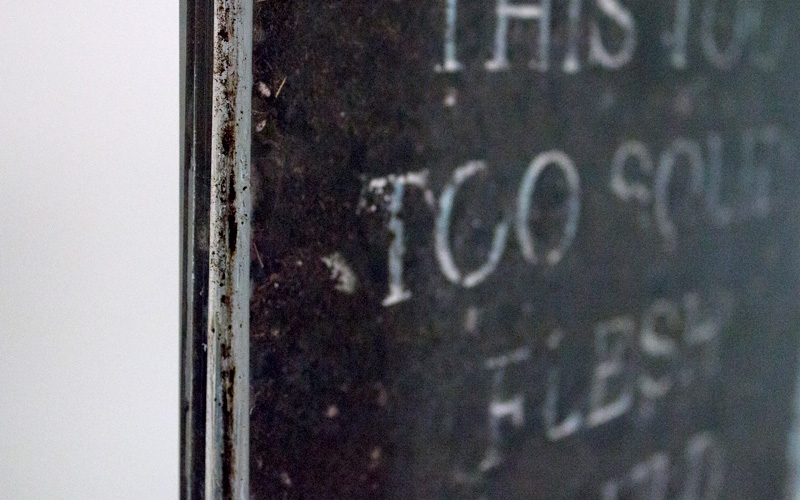
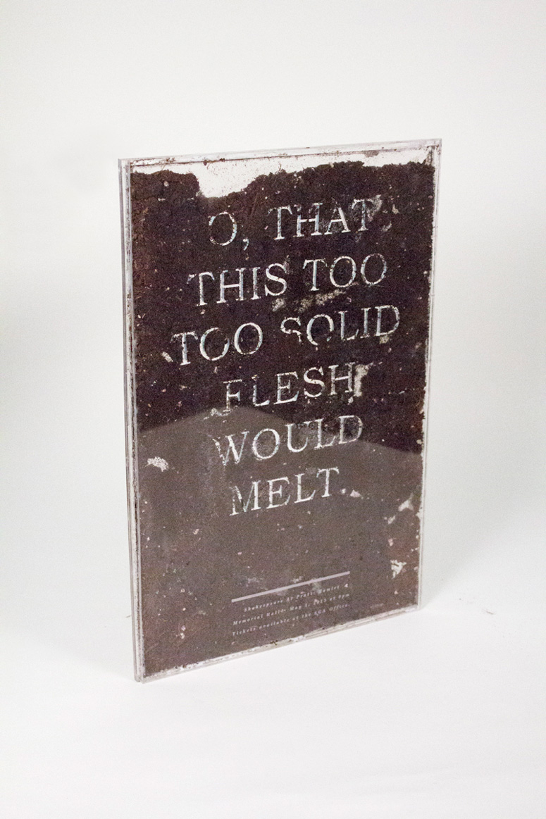
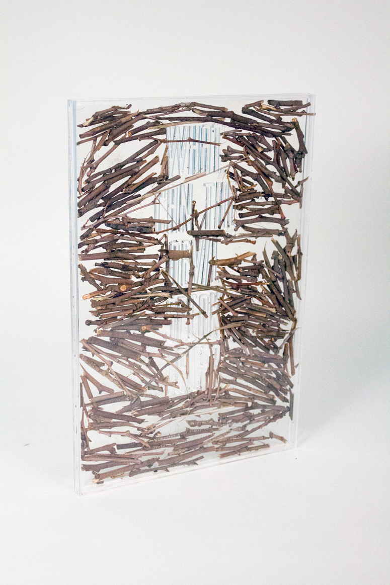
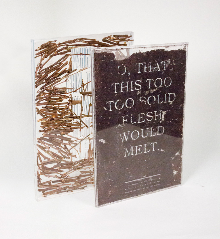
These posters are crafted from laser-cut plexiglass and found natural elements. In each poster, a quote from the Shakespeare plays it promotes is embedded in natural elements, which tie into aspects of the stories.
Client
–
Quantity Produced
3
Production Cost
$200
Production Time
2 weeks
Dimensions (Width × Height × Depth)
12 × 18 × .5 in
Page Count
–
Paper Stock
–
Number of Colors
–
Varnishes
–
Binding
–
Typography
Miller
Giotto
Book Antiqua
Project Description
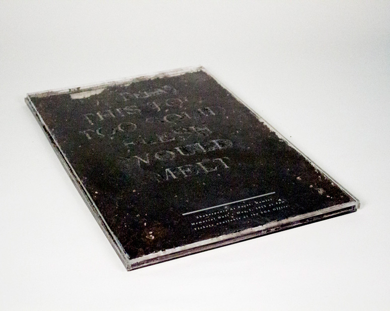
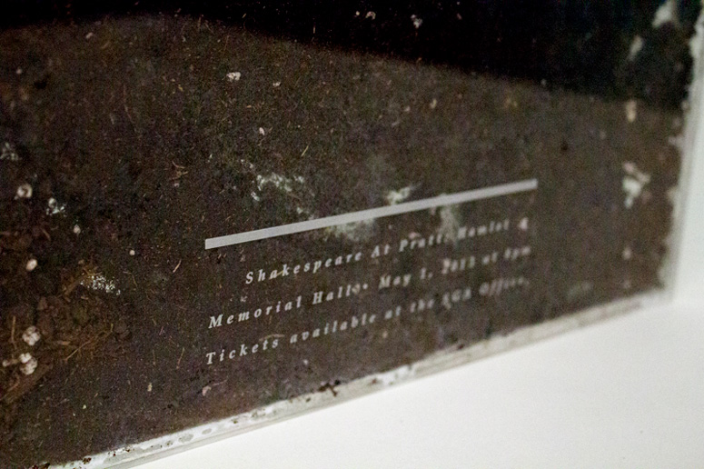
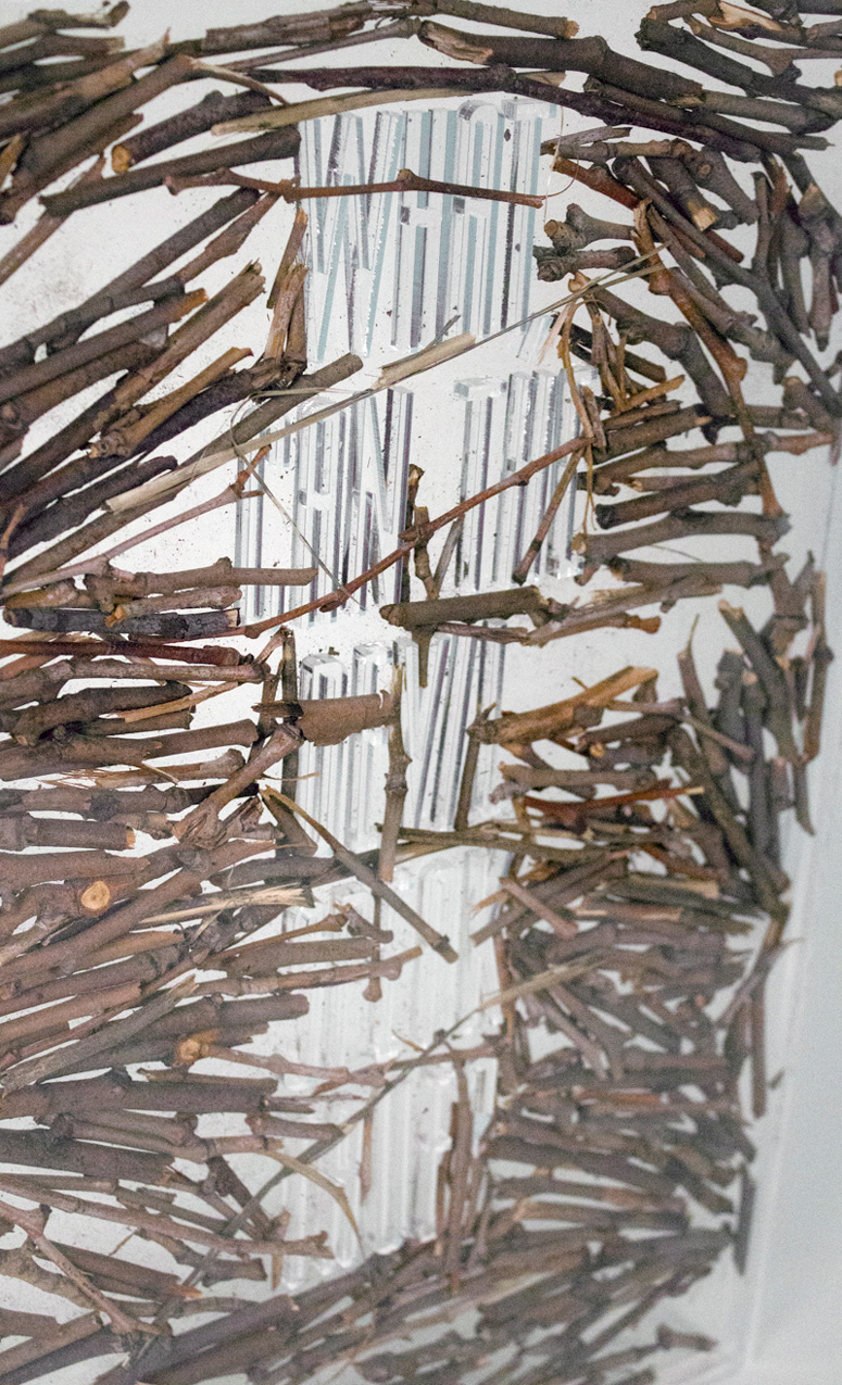
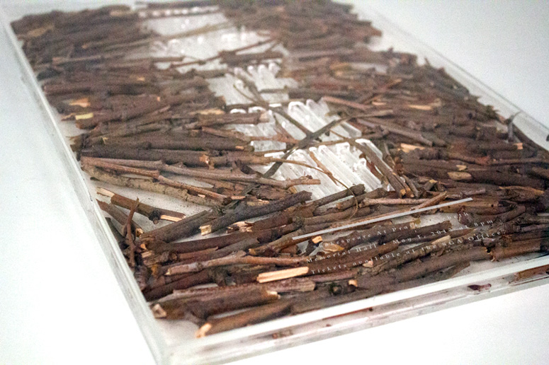
This is a two-part poster series for Shakespeare at Pratt for the two plays Hamlet and Macbeth. The posters are three dimensional and are made of plexiglass cases, each half an inch thick with some sort of natural element within the case that relates to the play. Because of Pratt's natural and green campus, I wanted to create posters that utilized materials from the earth, dirt and sticks respectively. The letters are cut from plexiglass and within the case, so that the quotations appear immersed in the natural element. The information about each play is laser etched on the surface.Hamlet: "O, that this too too solid flesh would melt."
This quotation is from Hamlet's first soliloquy and is about death, a theme that is very present throughout the play. The cemetery dirt that surrounds the type is meant to bury the type.
Macbeth: "What, can the devil speak true?"
This quotation touches on the many prophecies that exist in the play. The initial prophecy telling Macbeth that will become king. Then the final prophecy states that his crown is safe until the Birnam Woods move, which he believes will never happen, but as the opposing army attacks Macbeth, they bring sticks from the Birnam Woods, thus moving the forest and that is when Macbeth knows that his reign is over. The type is meant to look attacked by the sticks within the case.
Production Lesson(s)
There were very many challenges with creating an air tight case with plexi as well as laser cutting letters out of plexi. First, creating the case was very difficult because we had to make sure all the measurements and angles of each side was perfect. I ended up having a lot of problems with the measurements and required sealant to ensure that dirt wouldn't fall out of the case. The case for the Macbeth poster was much more forgiving because small holes did not cause a huge problem. Also, there was the problem of how to glue together the pieces. Super glue left chemical residue and what was required was special glue for plexi. I used one called "Plastic Surgeon" which was fast drying and clear, which was great. I also tried Weld On which was good, but took 5 minutes to dry and hold in place. I eventually used weld on to get the letters to stick to the backs of the case so they wouldn't move.Another major problem was laser cutting the letters individually. Not only did it take a long time, a lot of the letters also did not cut through so it was a process of constantly recutting and carefully pushing the letters out without breaking them.
Finally, I had a major problem with the Hamlet (dirt) poster because soil is moist, it leads to condensation in a enclosed case and that caused many problems. But in the end, I drilled air holes at the top so that there was some sort of breathing room.

Post Author

Duncan Robertson
Former intern at UnderConsideration LLC.
More: Online / On Twitter
Date Published
September 5, 2013
Filed Under
Laser-Cut
Posters
Tagged with
natural
plexiglass
shakespeare
student
About
FPO (For Print Only), is a division of UnderConsideration, celebrating the reality that print is not dead by showcasing the most compelling printed projects.
FPO uses Fonts.com to render Siseriff and Avenir Next.
FPO is run with Six Apart’s MovableType
All comments, ideas and thoughts on FPO are property of their authors; reproduction without the author’s or FPO’s permission is strictly prohibited
Twitter @ucllc
Sign-up for Mailing List
Mailing list managed by MailChimp
Thanks to our advertisers
About UnderConsideration
UnderConsideration is a graphic design firm generating its own projects, initiatives, and content while taking on limited client work. Run by Bryony Gomez-Palacio and Armin Vit in Bloomington, IN. More…
blogs we publish
Brand New / Displaying opinions and focusing solely on corporate and brand identity work.
Art of the Menu / Cataloguing the underrated creativity of menus from around the world.
Quipsologies / Chronicling the most curious, creative, and notable projects, stories, and events of the graphic design industry on a daily basis.
products we sell
Flaunt: Designing effective, compelling and memorable portfolios of creative work.
Brand New Conference videos / Individual, downloadable videos of every presentation since 2010.
Prints / A variety of posters, the majority from our AIforGA series.
Other / Various one-off products.
events we organize
Brand New Conference / A two-day event on corporate and brand identity with some of today's most active and influential practitioners from around the world.
Brand Nieuwe Conference / Ditto but in Amsterdam.
Austin Initiative for Graphic Awesomeness / A speaker series in Austin, TX, featuring some of the graphic design industry's most awesome people.
also
Favorite Things we've Made / In our capacity as graphic designers.
Projects we've Concluded / Long- and short-lived efforts.
UCllc News / Updates on what's going at the corporate level of UnderConsideration.




Related entries
Fum Fum Fum Christmas Cards
Walt & June Wedding Invitation
Bocanegra Studio Identity Materials
2016 Brand Nieuwe Conference Program
Studio Pression 2016 Greeting card