ADV @ UNDERCONSIDERATION Peek here for details
BROWSE
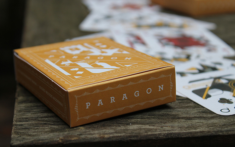
Paragon’s Holiday Mailer: Elemental Deck of Cards
Production Method
Die-cut
Design
James, Donaldson, Paragon Design Group
Susan Isaacs: Art Director, Production Coordinator
Andrew Davies: Creative Director
Printing
Rapid Press, Inc
There is an undeniable passion and obsession that comes through in the details on projects where the designer “went full nerd.” On this project in particular, the precision achieved through collaboration between the designer and the printer on these cards is a testament to fostering relationships with production partners.
Dimensions (Width × Height × Depth)
Cards: 2.5 × 3.5 in
Box: 2.625 × 3.625 × 0.875 in
Page Count
54 cards + Box
Paper Stock
Reich Paper / Shine / Pearl / 107 C
Number of Colors
2
Varnishes
–
Binding
–
Typography
Archer by HF&J
Gotham by HF&J
Project Description
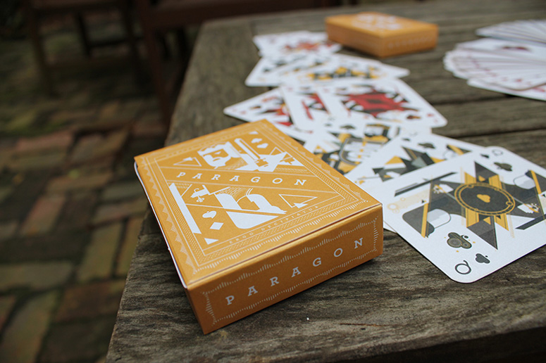
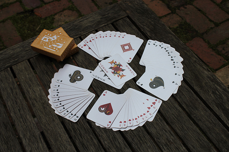
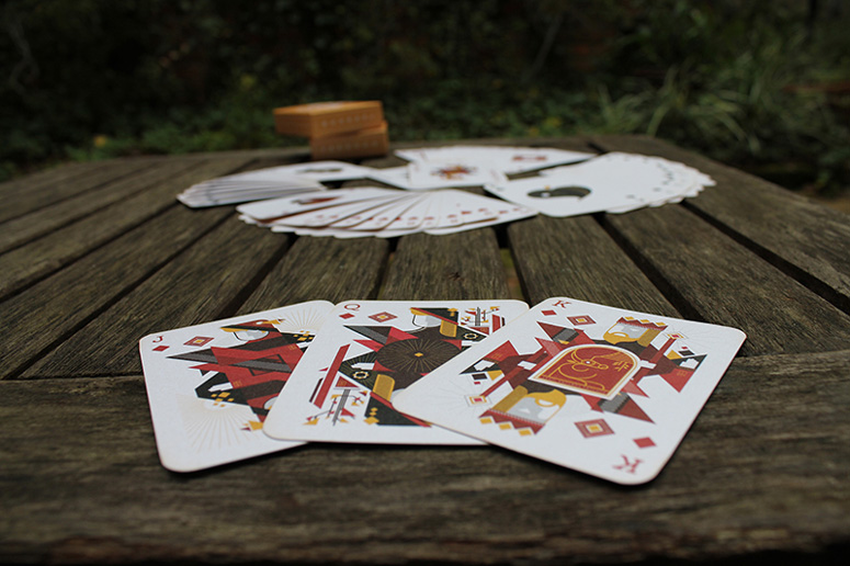
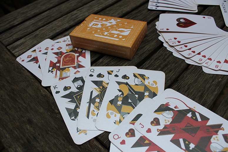
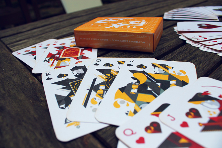
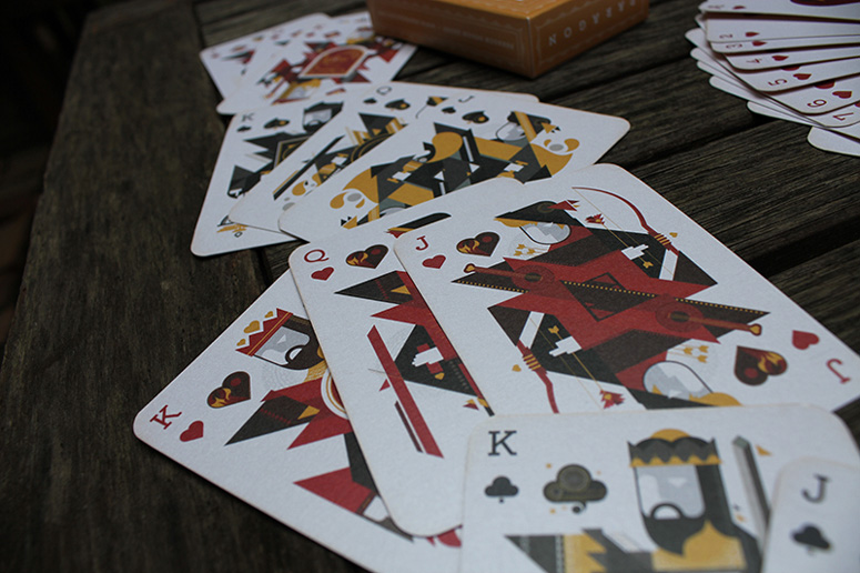
For the 2012 Paragon Annual Holiday Mailer we opted to design a collectible, entirely custom deck of playing cards.The goal was to incorporate the symbolism and philosophies surrounding the Classical Greek Elements of Earth, Air, Fire and Water and once we began digging into the rich history of these concepts, we decided the only way to do it right was to allow each traditional kingdom to represent the corresponding elements. Earth took Diamonds, Air Clubs, Hearts became Fire and Spades Water.
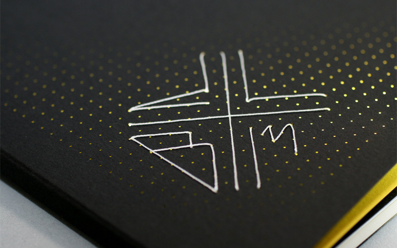
Traditional icons were incorporated into the face cards as well as new embellishments like Latin text and the complex visual language of the elements. The backs of the cards featured a graphic pattern created using our logo mark. Both the deck and custom box were printed on Shine paper appropriate for the Holiday Season.
Production Lesson(s)
This project was ambitious from the start. Researching and developing the themes for the deck and then illustrating all 54 cards and doing a box design should have been a few months in the making, and instead James burned the candle at both ends to make this design happen in 2.5 weeks.With lots of sketching and careful pre-planning he created a formula to speed up the basic layout of each card so that he could spend more time painstakingly adding the essential details to make each one truly unique while honoring the classic symbolism of playing cards. As a collector of decks himself, he went “full-nerd” on this project as it was very important to him to get each card just right, and for the deck to make sense as a collection.
The production process as a collaborative effort between our team and our printers, particularly in perfecting a box that was the perfect snugness for the cards based upon the precise caliper measurements of the paper stock chosen. It's worth mentioning that our printers were very careful in ensuring that each deck was assembled with the cards in the industry standard progression for insertion into the box. It pays to have a trusted partner in your printer – it can make all the difference when you're tackling a challenging project with no margin for error.

Post Author

Duncan Robertson
Former intern at UnderConsideration LLC.
More: Online / On Twitter
Date Published
September 23, 2013
Filed Under
Die-cut
Self promotion
Tagged with
archer
holiday promo
pearlescent
playing cards
About
FPO (For Print Only), is a division of UnderConsideration, celebrating the reality that print is not dead by showcasing the most compelling printed projects.
FPO uses Fonts.com to render Siseriff and Avenir Next.
FPO is run with Six Apart’s MovableType
All comments, ideas and thoughts on FPO are property of their authors; reproduction without the author’s or FPO’s permission is strictly prohibited
Twitter @ucllc
Sign-up for Mailing List
Mailing list managed by MailChimp
Thanks to our advertisers
About UnderConsideration
UnderConsideration is a graphic design firm generating its own projects, initiatives, and content while taking on limited client work. Run by Bryony Gomez-Palacio and Armin Vit in Bloomington, IN. More…
blogs we publish
Brand New / Displaying opinions and focusing solely on corporate and brand identity work.
Art of the Menu / Cataloguing the underrated creativity of menus from around the world.
Quipsologies / Chronicling the most curious, creative, and notable projects, stories, and events of the graphic design industry on a daily basis.
products we sell
Flaunt: Designing effective, compelling and memorable portfolios of creative work.
Brand New Conference videos / Individual, downloadable videos of every presentation since 2010.
Prints / A variety of posters, the majority from our AIforGA series.
Other / Various one-off products.
events we organize
Brand New Conference / A two-day event on corporate and brand identity with some of today's most active and influential practitioners from around the world.
Brand Nieuwe Conference / Ditto but in Amsterdam.
Austin Initiative for Graphic Awesomeness / A speaker series in Austin, TX, featuring some of the graphic design industry's most awesome people.
also
Favorite Things we've Made / In our capacity as graphic designers.
Projects we've Concluded / Long- and short-lived efforts.
UCllc News / Updates on what's going at the corporate level of UnderConsideration.




Related entries
Legion Paper All National Stationery Show Promotion
Ministry of Environment in Colombia Poster
Wakeboarding Magazine Athelete Award
“Let’s bite Till Die” Book
Twist Packaging