ADV @ UNDERCONSIDERATION Peek here for details
BROWSE
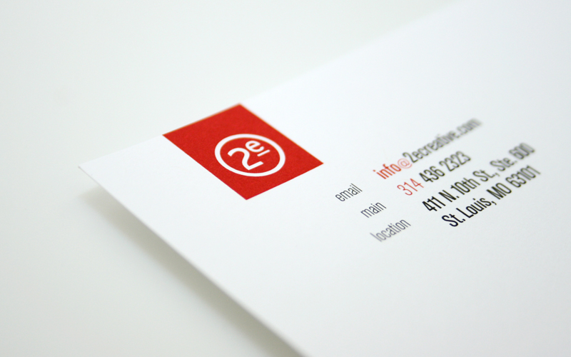
2e Stationery
Production Method
Digital
Offset
Design
2e Creative
Joe Toohey, Creative Director
Lynda McClure, Creative Director
Dana Muhlke, Creative Director
Simon Lam, Art Director and Designer
Matt Bender, Designer
Devon Hirth, Designer
Michael Piasecki, Copywriter
Printing
Stolze Printing
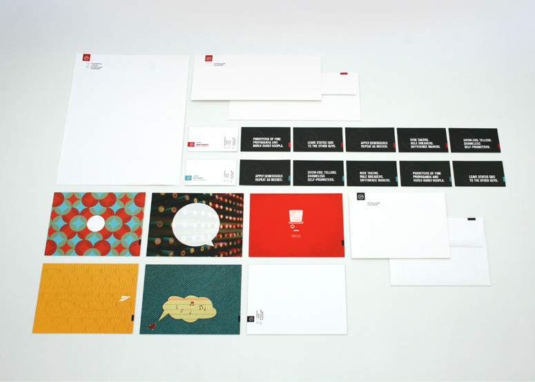
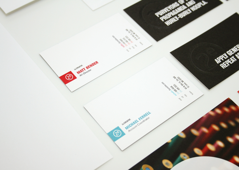
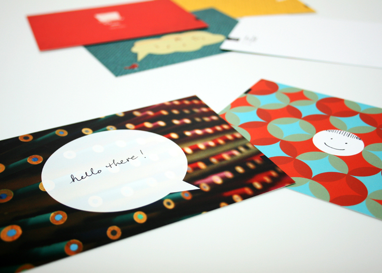
The concept behind the 2e brand focuses on the balance of traditionally right-brained and left-brained dualities of a creative business. For example, blue is for the analytical business side and red is for the emotional creative side. The business cards are even roll-specific with red ink for the art director and blue ink for the accountant.
Client
Self-promotion
Quantity Produced
Business Cards: 7,000
Letterhead: 5,000
Envelope: 3,000
Notecards: 250
Production Cost
–
Production Time
–
Dimensions (Width × Height × Depth)
–
Page Count
–
Paper Stock
Mohawk / Superfine Eggshell / Ultrawhite / 130 DTC
Mohawk / Superfine Eggshell / Ultrawhite / 80 text
Mohawk / Superfine Eggshell / Ultrawhite / #10 envelopes w/square flap
Mohawk / Superfine Smooth (digital ready) / Ultrawhite / 120 cover
Number of Colors
2 spots, black and CMYK (notecards)
Varnishes
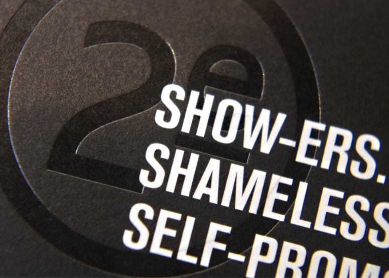
Clear Foil
Binding
–
Typography
Berthold Akzidenz Grotesk
Project Description
We undertook a massive rebranding initiative that began with the development of a new 2eCreative.com. The site was developed to have 2 distinct sides—left brain and right brain, i.e. business and creativity—represented by a blue/red color scheme. This new brand was applied across a variety of collateral materials, creating a fresh, uncluttered look that spoke to our dual nature, both sides working in harmony to develop simple, smart creative for our clients.Production Lesson(s)
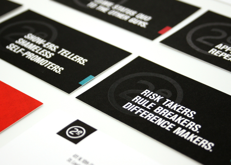
The business cards were just painful. The clear foil was the main challenge because we insisted to have this done not only on both sides of the cards, but also in the same spot. After the first hit, it weakened the paper for the second hit on the other side, and therefore caused some issues. After that issue was fixed, we ran into trimming issues as the back was hit twice with black on uncoated and it was cracking on some edges. Seriously, we are just happy and relieved to have a great looking card.
Post Author

Duncan Robertson
Former intern at UnderConsideration LLC.
More: Online / On Twitter
Date Published
September 27, 2013
Filed Under
Business Cards
Collateral
Digital
Offset
Tagged with
Akidenz Grotesk
blue
flexible
red
About
FPO (For Print Only), is a division of UnderConsideration, celebrating the reality that print is not dead by showcasing the most compelling printed projects.
FPO uses Fonts.com to render Siseriff and Avenir Next.
FPO is run with Six Apart’s MovableType
All comments, ideas and thoughts on FPO are property of their authors; reproduction without the author’s or FPO’s permission is strictly prohibited
Twitter @ucllc
Sign-up for Mailing List
Mailing list managed by MailChimp
Thanks to our advertisers
About UnderConsideration
UnderConsideration is a graphic design firm generating its own projects, initiatives, and content while taking on limited client work. Run by Bryony Gomez-Palacio and Armin Vit in Bloomington, IN. More…
blogs we publish
Brand New / Displaying opinions and focusing solely on corporate and brand identity work.
Art of the Menu / Cataloguing the underrated creativity of menus from around the world.
Quipsologies / Chronicling the most curious, creative, and notable projects, stories, and events of the graphic design industry on a daily basis.
products we sell
Flaunt: Designing effective, compelling and memorable portfolios of creative work.
Brand New Conference videos / Individual, downloadable videos of every presentation since 2010.
Prints / A variety of posters, the majority from our AIforGA series.
Other / Various one-off products.
events we organize
Brand New Conference / A two-day event on corporate and brand identity with some of today's most active and influential practitioners from around the world.
Brand Nieuwe Conference / Ditto but in Amsterdam.
Austin Initiative for Graphic Awesomeness / A speaker series in Austin, TX, featuring some of the graphic design industry's most awesome people.
also
Favorite Things we've Made / In our capacity as graphic designers.
Projects we've Concluded / Long- and short-lived efforts.
UCllc News / Updates on what's going at the corporate level of UnderConsideration.




Related entries
Black Sheep Studio Business Cards and Promotional Items
E.A.S.E. Stationery Set
“A to Z Letters for Sale” Promo
End of Work iPad and Notebook Cases
CNN Digital New Hire Kit