ADV @ UNDERCONSIDERATION Peek here for details
BROWSE
Upselling Upscale: Bellevue Towers Toolkit
Production Method
Deboss
Foil stamp
Offset
Design
GreenRubino
Creative Direction: Joe Quatrone
Design, Art Direction: Quinn Ianniciello
Copywriting: Jenn Maples
Production: Bob Bost
Printing
McCallum Print Group
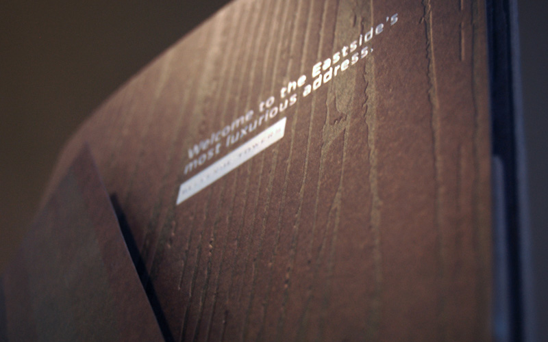
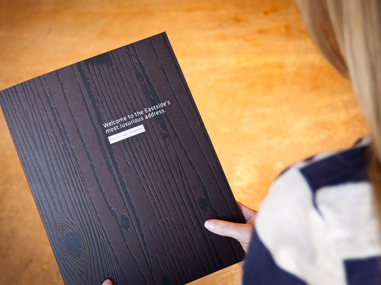
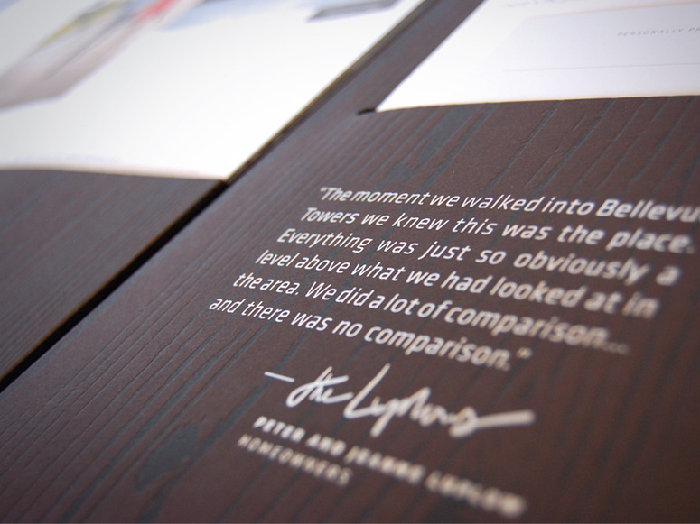
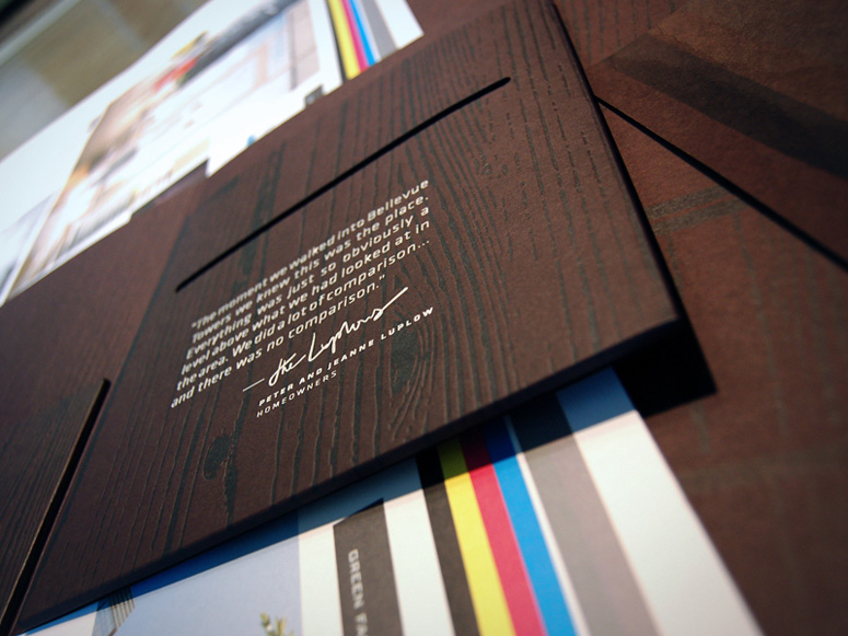
These marketing brochures adapt the design of the buildings they represent into printed collateral to make a powerful first impression to potential residents. The combination of woodgrain with more manufactured industrial elements as seen in high-end contemporary architecture was translated into design elements by way of pairing debossed woodgrain texture with the contemporary geometric Klavika type family.
Dimensions (Width × Height × Depth)
9 × 12 × 0.25 in
Page Count
–
Paper Stock
Mohawk / Premium / Mahogany / 100C
Number of Colors
Foil Stamp (Silver) Two Areas, 4C Interior Elements
Varnishes
Black, Satin Aqueous
Binding
–
Typography
Klavika
Bank Gothic
Project Description
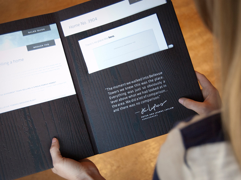
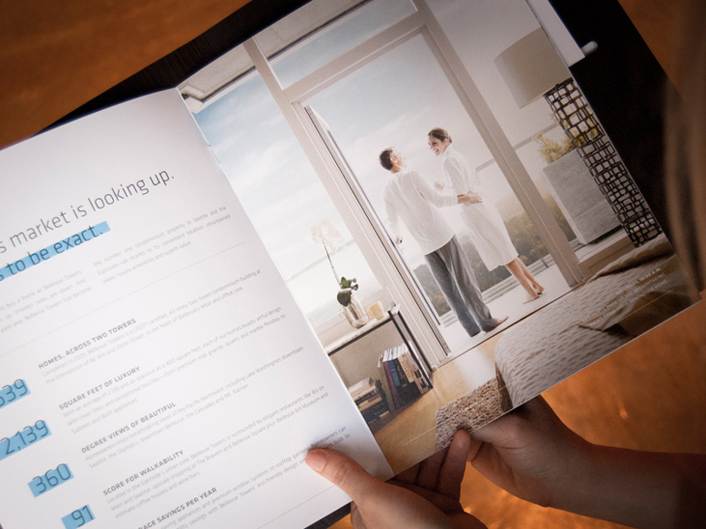
Bellevue Towers is one of the best-selling luxury condominium properties in the nation, and our task was simple: woo an elite group of brokers and clients to drive sales of the remaining homes. Every brand touchpoint had to make an impression (and fast), as well as draw attention to the property's LEED® Gold certification and luxurious natural finishes. (Ooh, ahh.) We developed this Broker Toolkit as an “everything-you-need" folder for someone in the market. Purpose: to support brokers and create a lasting first impression. Brokers are able to learn from elements in the kit, then personalize it and pass it along to their perspective buyers. The debossed wood grain design compliments the rich mahogany finishes found in many of the homes, while silver foil accents dial up the class and provide a necessary dose of “oooh shiny.”Bellevue Towers currently sit at 95% sold, but that last $6 million penthouse is still up for grabs—in case you were still looking for a Mother’s Day present.
Production Lesson(s)
Between finding the right paper, the right capacity of the pockets, and debossing a complex wood grain pattern over an entire sheet we learned quite a lot. Even further, we had trouble with foil stamping the logo (with such small type) and worked out a solution with our fantastic printer for a fine balance of pressure and matte aqueous coating, which also darkened the paper and added a a touch of richness. Top everything off with a complex hand-fold and insertion process to finish out the kits and this is a piece we're proud to say we won't forget.
Post Author

Duncan Robertson
Former intern at UnderConsideration LLC.
More: Online / On Twitter
Date Published
July 30, 2013
Filed Under
Collateral
Deboss
Foil stamp
Offset
Tagged with
capacity folds
toolkit
upscale
varnish
wood
About
FPO (For Print Only), is a division of UnderConsideration, celebrating the reality that print is not dead by showcasing the most compelling printed projects.
FPO uses Fonts.com to render Siseriff and Avenir Next.
FPO is run with Six Apart’s MovableType
All comments, ideas and thoughts on FPO are property of their authors; reproduction without the author’s or FPO’s permission is strictly prohibited
Twitter @ucllc
Sign-up for Mailing List
Mailing list managed by MailChimp
Thanks to our advertisers
About UnderConsideration
UnderConsideration is a graphic design firm generating its own projects, initiatives, and content while taking on limited client work. Run by Bryony Gomez-Palacio and Armin Vit in Bloomington, IN. More…
blogs we publish
Brand New / Displaying opinions and focusing solely on corporate and brand identity work.
Art of the Menu / Cataloguing the underrated creativity of menus from around the world.
Quipsologies / Chronicling the most curious, creative, and notable projects, stories, and events of the graphic design industry on a daily basis.
products we sell
Flaunt: Designing effective, compelling and memorable portfolios of creative work.
Brand New Conference videos / Individual, downloadable videos of every presentation since 2010.
Prints / A variety of posters, the majority from our AIforGA series.
Other / Various one-off products.
events we organize
Brand New Conference / A two-day event on corporate and brand identity with some of today's most active and influential practitioners from around the world.
Brand Nieuwe Conference / Ditto but in Amsterdam.
Austin Initiative for Graphic Awesomeness / A speaker series in Austin, TX, featuring some of the graphic design industry's most awesome people.
also
Favorite Things we've Made / In our capacity as graphic designers.
Projects we've Concluded / Long- and short-lived efforts.
UCllc News / Updates on what's going at the corporate level of UnderConsideration.




Related entries
2017 Brand New Conference Program
Erin and Brian Wedding Invitation
Singapore Teachers’ Academy for the Arts Box
MANA Journal 2016
From Eat Street, with Love Self-promotion