ADV @ UNDERCONSIDERATION Peek here for details
BROWSE
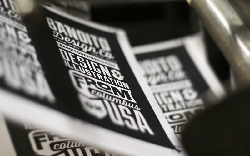
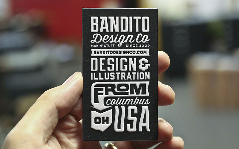
Bandito Design Co. Business Card
Production Method
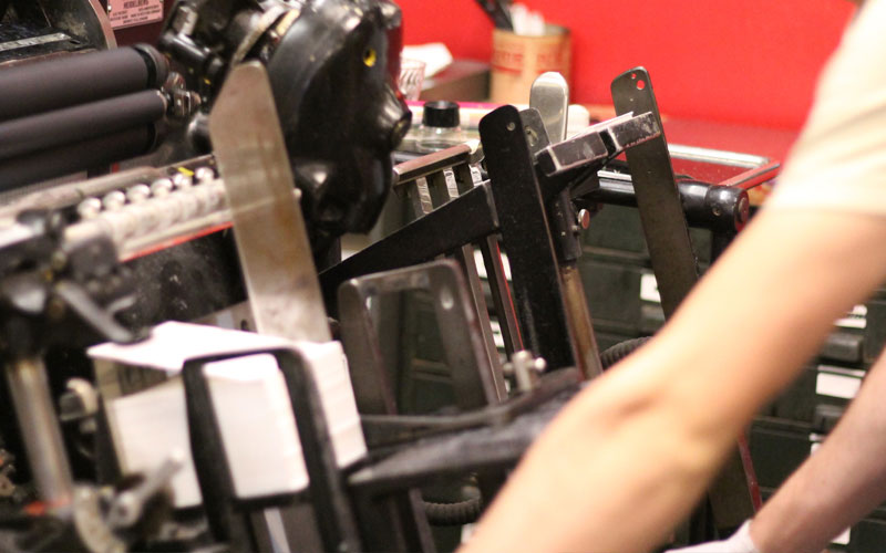
Letterpress
Design
Ryan Brinkerhoff
Printing
Mama's Sauce
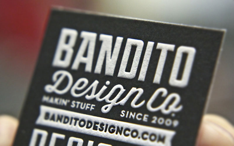
Black. White. Thick. Deep. Full. Quirky. All of the above and more can be found in this one small piece of extra thick paper turned business card.
Dimensions (Width × Height × Depth)
3.5 × 2 × 1/32 in.
Page Count
–
Paper Stock
Crane's Lettra / Fluorescent White / 220C
Number of Colors
1
Varnishes
–
Binding
–
Typography
Duke
Wisdom Script
Neutraface
Liberator
Ed Interlock
Project Description
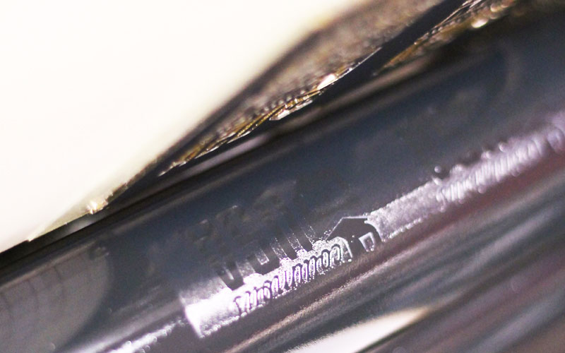
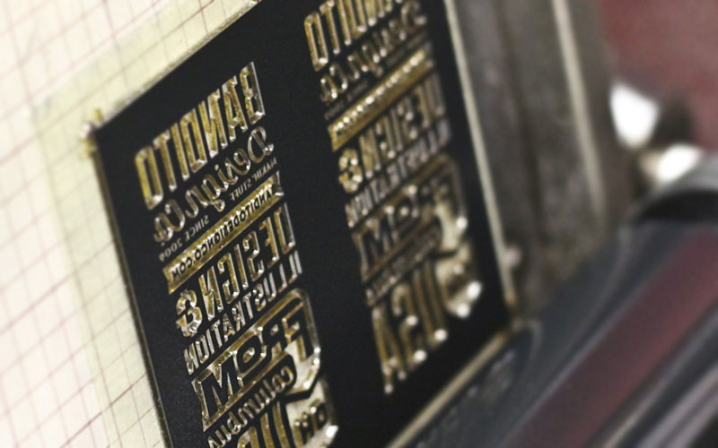
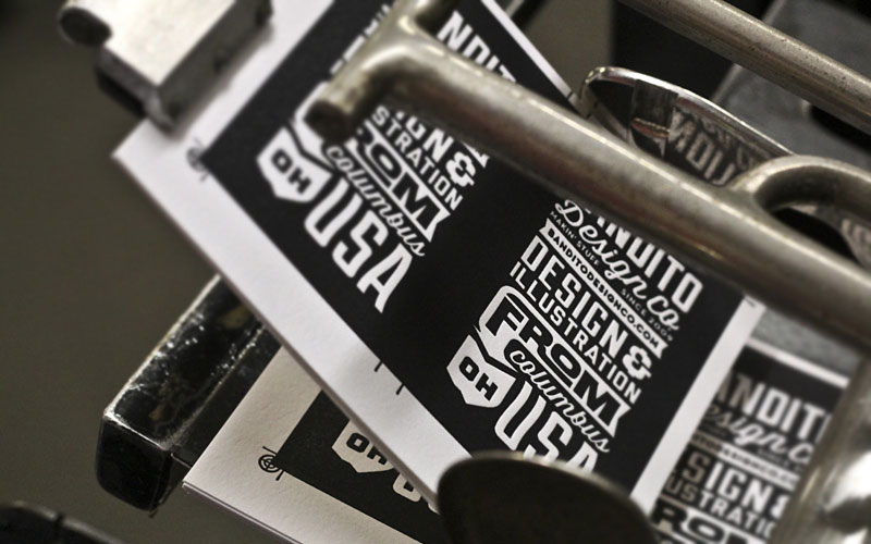
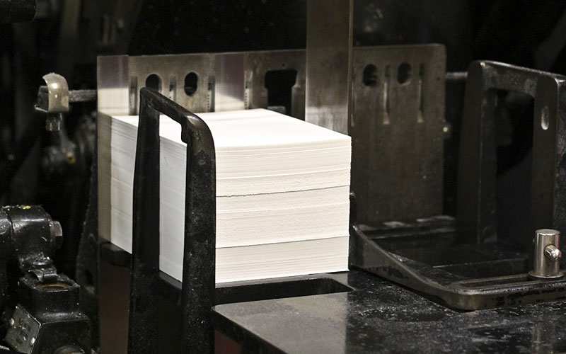
I wanted a super-thick card with some heavy duty impression.Production Lesson(s)
This is the second business card I have had Mama's Sauce letterpress for me. The first one was beautiful, but it lacked the thickness I wanted. Don't get me wrong, I loved the card and I got a great deal for them (they were running a 250 cards for $99 deal!). The impression was also really nice and deep. So this time around, I asked for their advice: "How do I maintain the impression quality of the last card, but increase the overall thickness?" After some discussion, Mama's Sauce suggested we use the 220C Lettra instead of the 110C. It made for a substantial increase in cost, but it was totally worth it. The new card is sturdy as Hell and the impression is even better than last time. They smushed it real good.
Post Author

Bryony Gomez-Palacio
Editor of FPO and co-founder of UnderConsideration LLC.
More: Online / On Twitter
Date Published
July 12, 2013
Filed Under
Business Cards
Letterpress
Tagged with
business card
crane lettra
letterpress
PMS
About
FPO (For Print Only), is a division of UnderConsideration, celebrating the reality that print is not dead by showcasing the most compelling printed projects.
FPO uses Fonts.com to render Siseriff and Avenir Next.
FPO is run with Six Apart’s MovableType
All comments, ideas and thoughts on FPO are property of their authors; reproduction without the author’s or FPO’s permission is strictly prohibited
Twitter @ucllc
Sign-up for Mailing List
Mailing list managed by MailChimp
Thanks to our advertisers
About UnderConsideration
UnderConsideration is a graphic design firm generating its own projects, initiatives, and content while taking on limited client work. Run by Bryony Gomez-Palacio and Armin Vit in Bloomington, IN. More…
blogs we publish
Brand New / Displaying opinions and focusing solely on corporate and brand identity work.
Art of the Menu / Cataloguing the underrated creativity of menus from around the world.
Quipsologies / Chronicling the most curious, creative, and notable projects, stories, and events of the graphic design industry on a daily basis.
products we sell
Flaunt: Designing effective, compelling and memorable portfolios of creative work.
Brand New Conference videos / Individual, downloadable videos of every presentation since 2010.
Prints / A variety of posters, the majority from our AIforGA series.
Other / Various one-off products.
events we organize
Brand New Conference / A two-day event on corporate and brand identity with some of today's most active and influential practitioners from around the world.
Brand Nieuwe Conference / Ditto but in Amsterdam.
Austin Initiative for Graphic Awesomeness / A speaker series in Austin, TX, featuring some of the graphic design industry's most awesome people.
also
Favorite Things we've Made / In our capacity as graphic designers.
Projects we've Concluded / Long- and short-lived efforts.
UCllc News / Updates on what's going at the corporate level of UnderConsideration.




Related entries
KitchenAid Limited Edition Cards
Black Sheep Studio Business Cards and Promotional Items
Seegno Business Cards
Fracas Productions Business Cards
Elegante Press Business card