ADV @ UNDERCONSIDERATION Peek here for details
BROWSE
The Starshaped Press Self Promotional Packet
Production Method
Letterpress
Offset
Design
Starshaped Press
Printing
Starshaped Press
Accucolor Plus
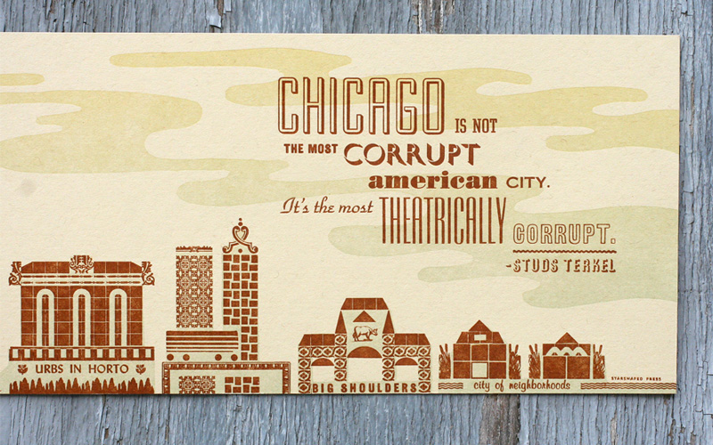
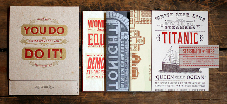
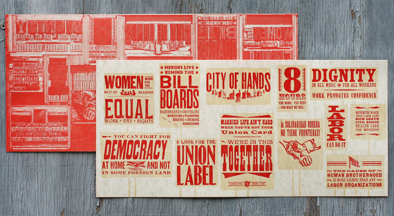
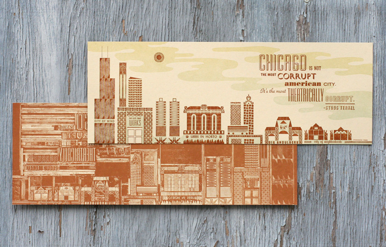
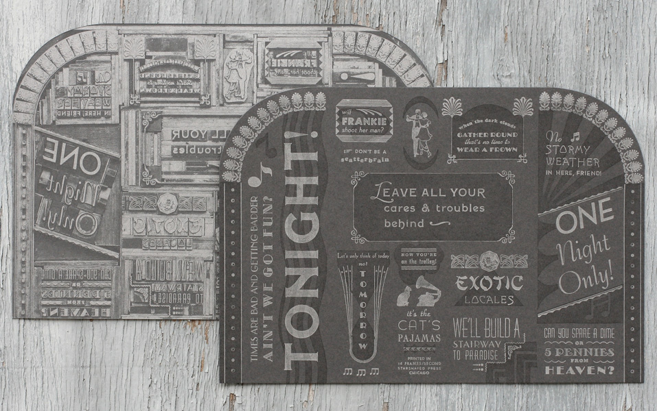
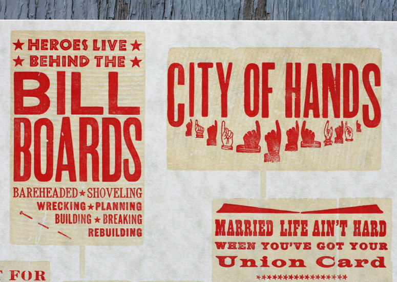
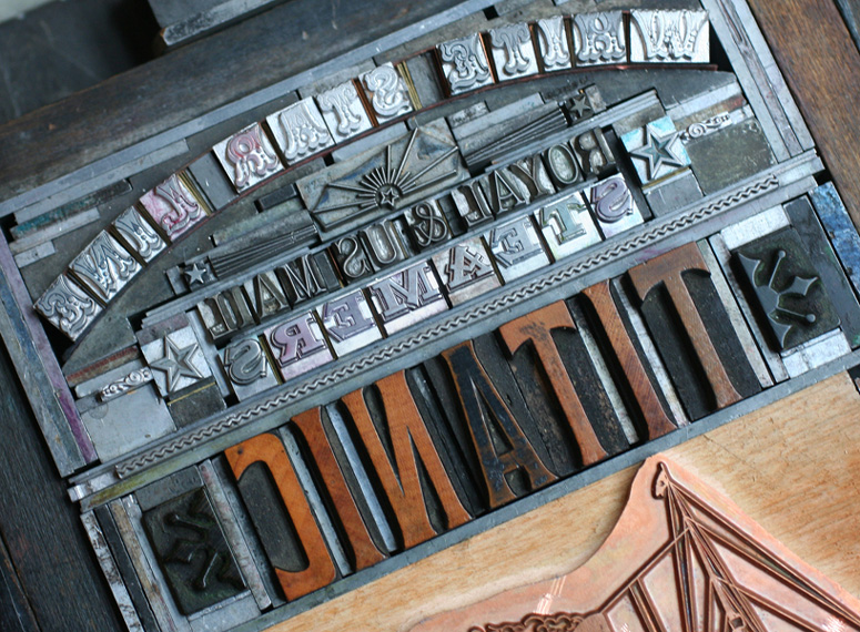
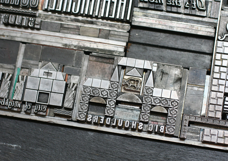
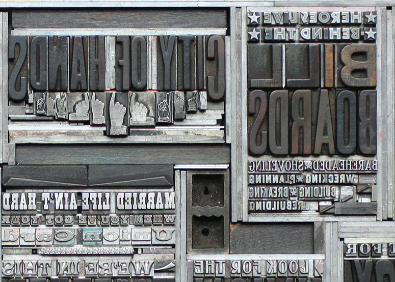
If you love letterpress—and it seems like everyone does these days—then this project is worth a closer look. Each card in this promotional packet highlights a different era of typography. One side of the card exhibits the finished, letterpressed piece while the reverse side displays the plate used to print that piece. Amazing that everything is actual fonts and printing bits.
Client
Self Promotion
Quantity Produced
200
Production Cost
$1,000 for materials and offset printing
Production Time
approx. 10 months
Dimensions (Width × Height × Depth)
5 × 7 in
Page Count
5
Paper Stock
French / Steel Gray / 100lb
French / Newspaper White / 80lb
French / Parchtone Aged / 80lb
French / Cement Green / 100lb
Number of Colors
2 per piece, 1 offset spot per piece
Varnishes
–
Binding
hand sewn folder
Typography
Sadly, there were so many used, it might take days to add them all up.

Project Description
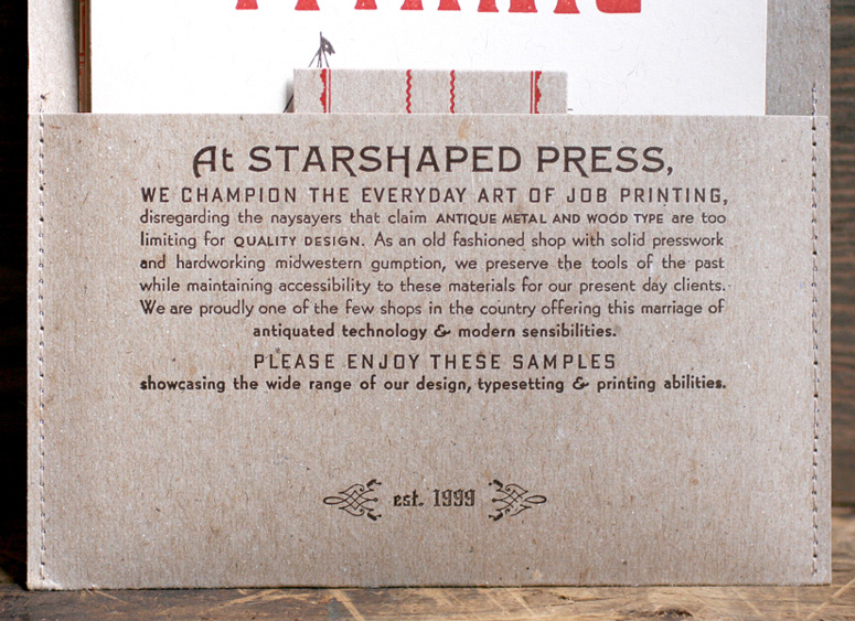
The Starshaped Self Promotional Packet was a year-in-the-making collection of prints designed to showcase all of the charms and strengths of working exclusively with antique metal and wood type, the chosen method for all custom projects designed and printed in the studio. Because our design work and type collection readily lend themselves to four main typographic approaches, there are four pieces that highlight each of these. The Titanic piece features type produced before 1912, the Chicago piece is more mid-century with type and ornaments representing that period, the ragtime/silent film-inspired piece focuses on phrases and type of the 20's, and the labor history piece takes a democratic approach to design, giving equal billing to the collections of popular quotes and ideas of the movement in a rally-inspired format. Each of the four inserts has a photograph of the form (the setup for the letterpress printing) offset printed on the backside so that the viewer can see exactly how it was created. The outer folder is hand sewn and holds all of the pieces and a business card, while including a short blurb on the importance of preserving and making these materials available to our clients now.Production Lesson(s)
I learned exactly what kind of typesetting I was capable of at the time of printing each piece. I pushed the boundaries of what metal and wood type can do in a small space, and attempted to work in as many 'tricks of the trade' of the artistic printers of the 1890s as possible. Many of these attempts initially failed, but were ultimately successful with trial and error, and occasionally walking away for a bit.
Post Author

Duncan Robertson
Former intern at UnderConsideration LLC.
More: Online / On Twitter
Date Published
May 20, 2013
Filed Under
Letterpress
Offset
Self promotion
Tagged with
1920s
chicago
metal type
wood type
About
FPO (For Print Only), is a division of UnderConsideration, celebrating the reality that print is not dead by showcasing the most compelling printed projects.
FPO uses Fonts.com to render Siseriff and Avenir Next.
FPO is run with Six Apart’s MovableType
All comments, ideas and thoughts on FPO are property of their authors; reproduction without the author’s or FPO’s permission is strictly prohibited
Twitter @ucllc
Sign-up for Mailing List
Mailing list managed by MailChimp
Thanks to our advertisers
About UnderConsideration
UnderConsideration is a graphic design firm generating its own projects, initiatives, and content while taking on limited client work. Run by Bryony Gomez-Palacio and Armin Vit in Bloomington, IN. More…
blogs we publish
Brand New / Displaying opinions and focusing solely on corporate and brand identity work.
Art of the Menu / Cataloguing the underrated creativity of menus from around the world.
Quipsologies / Chronicling the most curious, creative, and notable projects, stories, and events of the graphic design industry on a daily basis.
products we sell
Flaunt: Designing effective, compelling and memorable portfolios of creative work.
Brand New Conference videos / Individual, downloadable videos of every presentation since 2010.
Prints / A variety of posters, the majority from our AIforGA series.
Other / Various one-off products.
events we organize
Brand New Conference / A two-day event on corporate and brand identity with some of today's most active and influential practitioners from around the world.
Brand Nieuwe Conference / Ditto but in Amsterdam.
Austin Initiative for Graphic Awesomeness / A speaker series in Austin, TX, featuring some of the graphic design industry's most awesome people.
also
Favorite Things we've Made / In our capacity as graphic designers.
Projects we've Concluded / Long- and short-lived efforts.
UCllc News / Updates on what's going at the corporate level of UnderConsideration.




Related entries
Black Sheep Studio Business Cards and Promotional Items
Herbst & Spungen Wedding Invitation Suite
Cranky Bucks Promotion
Seegno Business Cards
“Miniature Views” Promotion