ADV @ UNDERCONSIDERATION Peek here for details
BROWSE
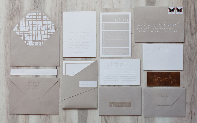
Sonoma Wedding Suite
Production Method
Letterpress
Silkscreen
Design
Sydney Newsom
Recipient Envelope Calligraphy: Mara Zepeda of Neither Snow
Printing
Mama's Sauce
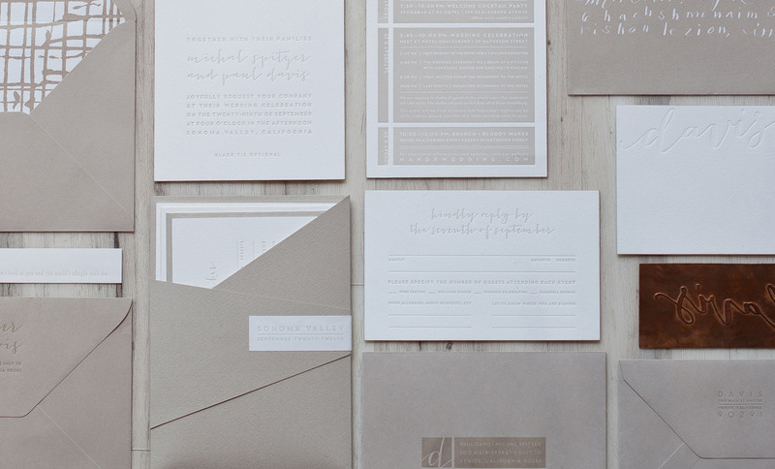
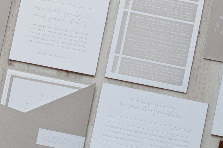
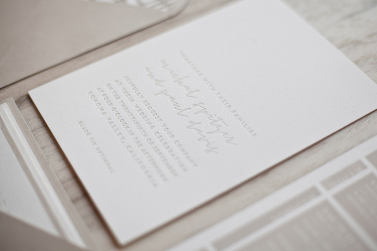
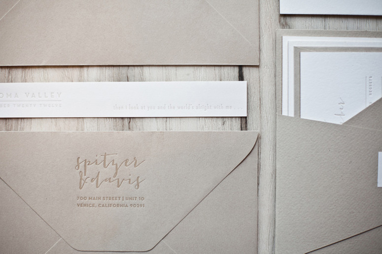
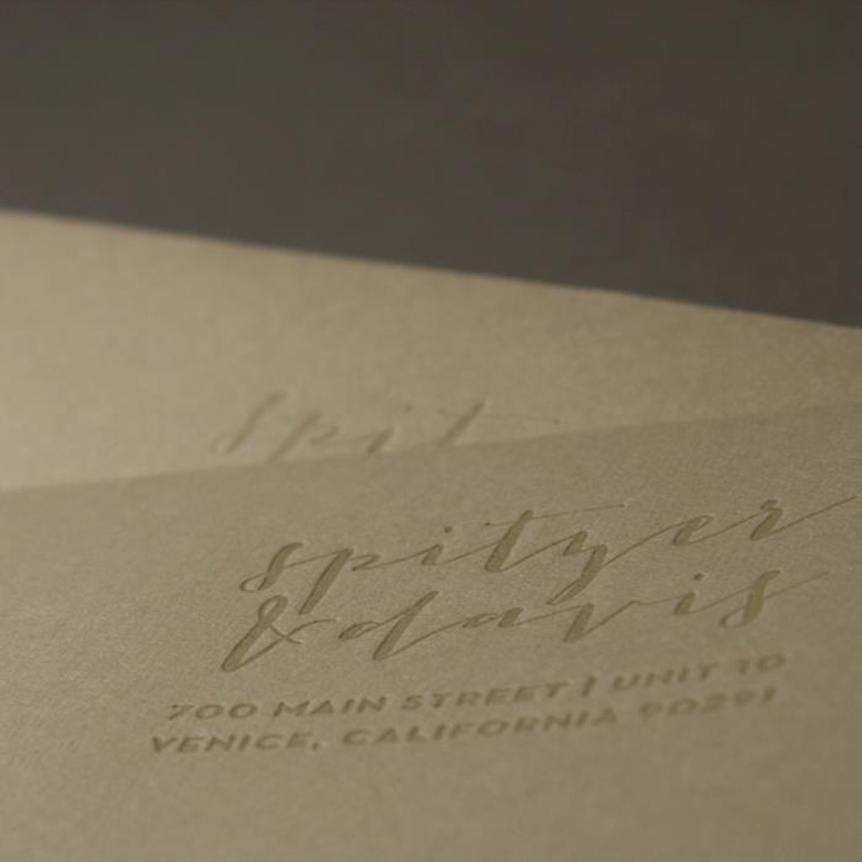
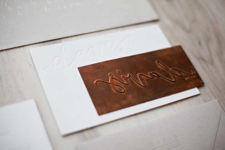
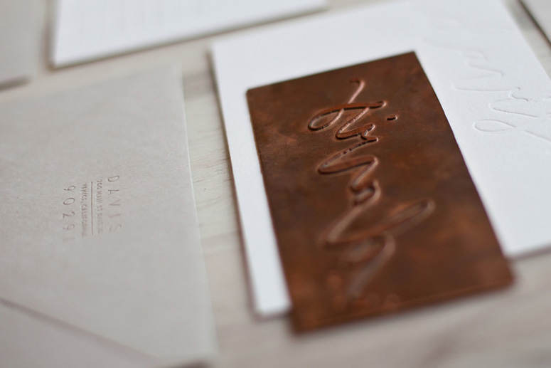
This wedding suite stands out against the current trend of modern, clean, and elegant letterpressed wedding invitations by going less complicated and reflecting a later modernism than its contemporaries. The attention to detail on every aspect of this project is commendable. For example, the decision to print with cold copper plates instead of the more common polymer plates. Just look at the details of the exemplary, crisp clarity achieved in the letterpress impressions.
Client
Michal Spitzer Davis (bride)
Quantity Produced
130
Production Cost
–
Production Time
1 month
Dimensions (Width × Height × Depth)
–
Page Count
10 separate printed pieces
Paper Stock
Crane / Crane's Lettra / Pearl White / 220 DTC
Number of Colors
1
Varnishes
1
Binding
–
Typography
Neutraface + Neutraface Condensed
Jacques & Gilles (modified)
Project Description
Wedding suite design and production for an elegant wedding celebration held at Annandel Winery in Sonoma Valley. The bride (an ongoing client) knew she wanted her wedding invitation to be letterpress printed on super-thick paper. She wanted the overall design to be modern, clean and elegant while reflecting a style that would be unique enough to stand-out amongst a sea of current wedding trends.The suite includes ten separate printed pieces including:
Letterpress cards; printed in one color on 220lb Pearl Lettra
1) 5.75” x 8” invitation
2) slightly smaller details card
3) reply card
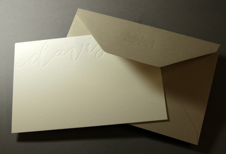
4) blank correspondent note card (blind impression)
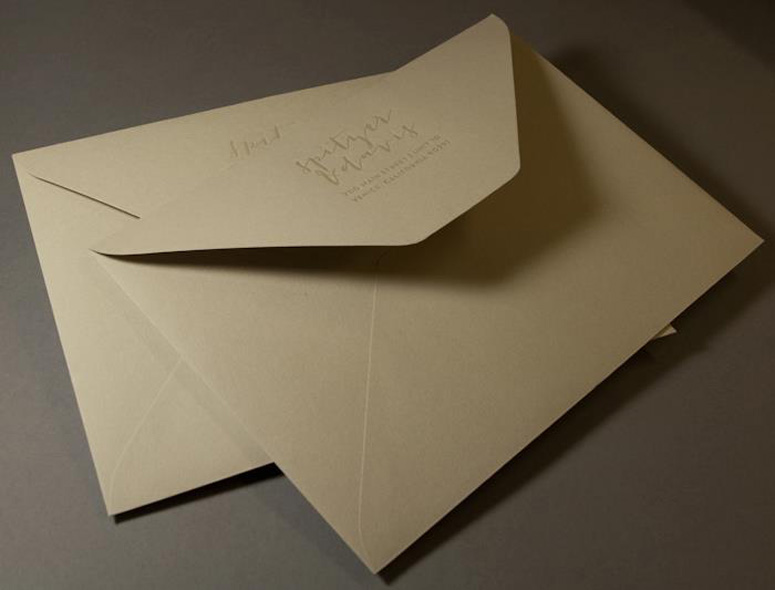
Arturo Stone Grey Envelopes (Large + Monarch size); Letterpress printed with a custom tinted varnish
5) outer envelope
6) reply envelope
7) note card envelope
Detailed Finishes
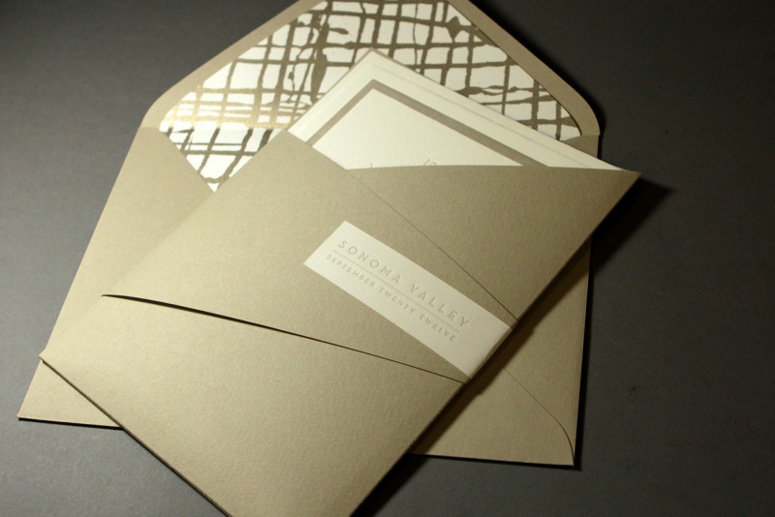
8) envelope liner, silkscreen printed in a metallic ink on Pearl Lettra text-weight paper;
9) custom die cut pocket wrap created with coordinating Arturo Stone Grey, cover-weight paper;
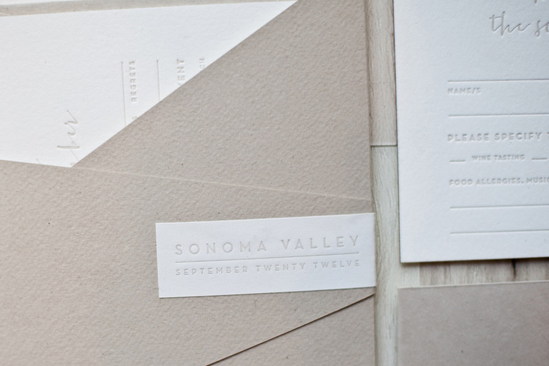
10) letterpress printed labels which wrap across the front of the pocket and wrap around the back side, securing the front flap, thus finishing the assembly of the pocket wrap.
Production Lesson(s)
I kept the design super-simple by using a tonal color palette, ample white space and clean typography in an effort to showcase the tactile properties of letterpress printing. In order to get the nice, crisp text I felt the greatness of the design relied upon, I worked with the printer to initiate a technique they were interested in but had yet to actually try; letterpress printing with cold copper plates in place of the more standard polymer plates. The difference in the definition and depth of the impression with the copper plates was outstanding to say the least. Copper plates were used for each letterpress printed piece throughout the entire suite. The crisp return address type/impression on the envelopes brings me great happiness which probably borderlines inappropriate.In order to include the bride’s love of abstract expressionist art, I created an original abstract ink illustration to be silkscreen printed on coordinating Lettra text-weight paper in a metallic shade which stayed true to the neutral warm grey/taupe tones carried throughout the suite. I then designed a custom die-cut folder/pocket to snugly house the contents of the suite while keeping the cards nicely stacked and organized. The unexpected lines and folds of the pocket, along with the graphical silkscreen liner injects the clean and simple design with a real sense of personality and depth it would have otherwise lacked.
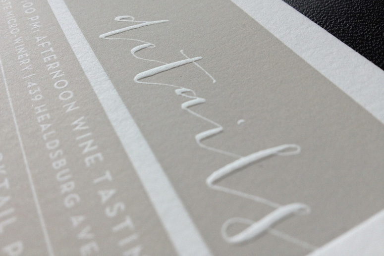
While only one custom mixed spot color was used throughout the cards, two plates for separate runs were created for the "Details Card". I wanted to be sure that the positive text would raise sufficiently from the solid ink areas while making sure that the solid ink coverage was satisfactory with minimal fading and show-through.

Post Author

Duncan Robertson
Former intern at UnderConsideration LLC.
More: Online / On Twitter
Date Published
May 10, 2013
Filed Under
Letterpress
Silkscreen
Wedding materials
Tagged with
calligraphy
copper plate
custom type
metallic ink
Pearl Lettra
About
FPO (For Print Only), is a division of UnderConsideration, celebrating the reality that print is not dead by showcasing the most compelling printed projects.
FPO uses Fonts.com to render Siseriff and Avenir Next.
FPO is run with Six Apart’s MovableType
All comments, ideas and thoughts on FPO are property of their authors; reproduction without the author’s or FPO’s permission is strictly prohibited
Twitter @ucllc
Sign-up for Mailing List
Mailing list managed by MailChimp
Thanks to our advertisers
About UnderConsideration
UnderConsideration is a graphic design firm generating its own projects, initiatives, and content while taking on limited client work. Run by Bryony Gomez-Palacio and Armin Vit in Bloomington, IN. More…
blogs we publish
Brand New / Displaying opinions and focusing solely on corporate and brand identity work.
Art of the Menu / Cataloguing the underrated creativity of menus from around the world.
Quipsologies / Chronicling the most curious, creative, and notable projects, stories, and events of the graphic design industry on a daily basis.
products we sell
Flaunt: Designing effective, compelling and memorable portfolios of creative work.
Brand New Conference videos / Individual, downloadable videos of every presentation since 2010.
Prints / A variety of posters, the majority from our AIforGA series.
Other / Various one-off products.
events we organize
Brand New Conference / A two-day event on corporate and brand identity with some of today's most active and influential practitioners from around the world.
Brand Nieuwe Conference / Ditto but in Amsterdam.
Austin Initiative for Graphic Awesomeness / A speaker series in Austin, TX, featuring some of the graphic design industry's most awesome people.
also
Favorite Things we've Made / In our capacity as graphic designers.
Projects we've Concluded / Long- and short-lived efforts.
UCllc News / Updates on what's going at the corporate level of UnderConsideration.




Related entries
Black Sheep Studio Business Cards and Promotional Items
Herbst & Spungen Wedding Invitation Suite
Cranky Bucks Promotion
Seegno Business Cards
“Miniature Views” Promotion