ADV @ UNDERCONSIDERATION Peek here for details
BROWSE
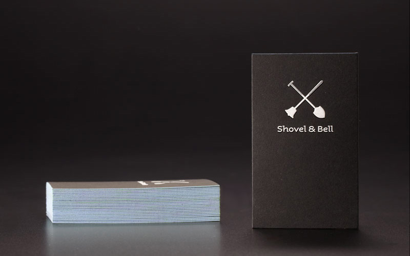
Shovel & Bell Identity Materials
Production Method
Emboss
Silkscreen
Design
Manic
Creative Director: Karen Huang
Art Director: Adeline Chong
Designers: Jenny Ji Jun, Wong Cheeyi
Printing
Kai Lian Printing
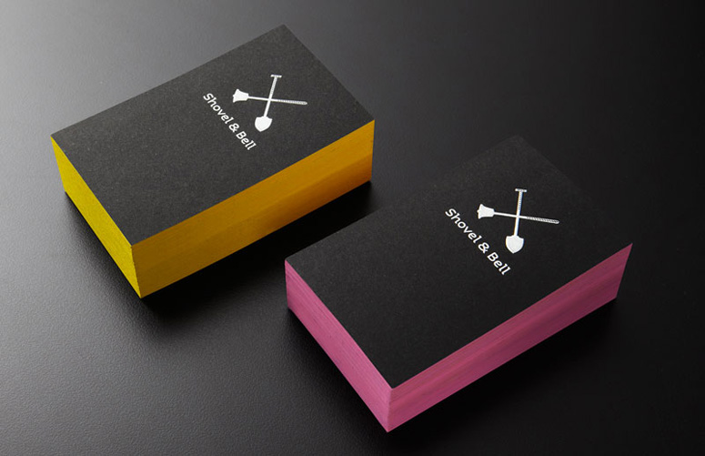
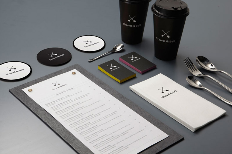
Every project has its own lessons. On this project Manic learned a lesson we can all file away: it’s not easy to edge-paint embossed business cards. Luckily, they found a way to solve this problem. If anyone else out there is facing the same issues, maybe they will be nice enough to share their solution.
Client
Shovel & Bell
Quantity Produced
Various
Production Cost
–
Production Time
–
Dimensions (Width × Height × Depth)
–
Page Count
–
Paper Stock
Sirio 80
Number of Colors
1
Varnishes
–
Binding
–
Typography
Aspect
Archer
Project Description
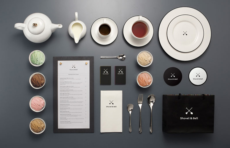
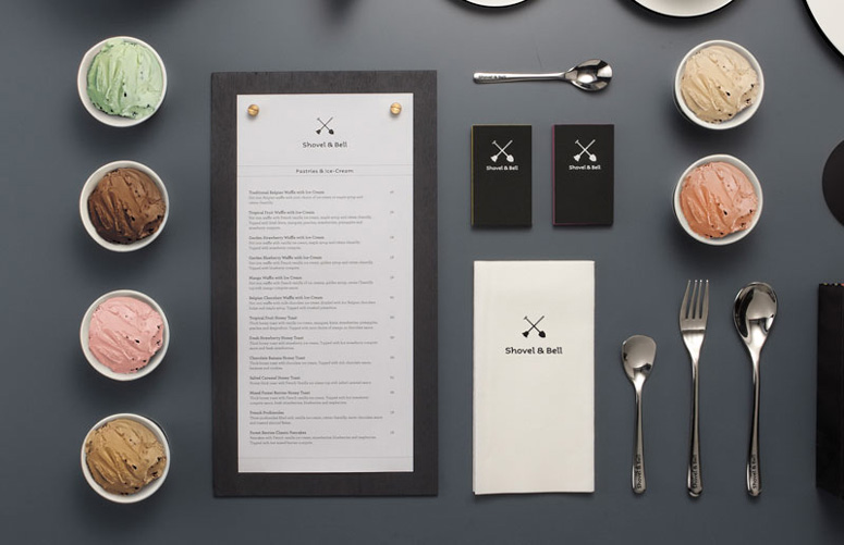
Shovel & Bell is the latest up-market gelateria and cafe in Guangzhou, China. Our identity project for them included naming, branding, store design, stationery, and packaging.Production Lesson(s)
The namecards gave us the hardest time! We had them silkscreened, embossed and then duplex-mounted. On top of that, we attempted to edge paint it ourselves. The embossing meant that no matter how tightly we clamped it, the fine airbrush paint would seep into the gaps. Also, the colour and texture of Sirio 80 meant that the surface of the card got dirtied quite easily. After much trial and error and persistence, we succeeded with their first batch of cards, consisting of total of nine tasty gelato-inspired colours!
Post Author

Duncan Robertson
Former intern at UnderConsideration LLC.
More: Online / On Twitter
Date Published
May 2, 2013
Filed Under
Business Cards
Collateral
Emboss
Packaging
Silkscreen
Tagged with
coasters
duplex
edge painting
menu
About
FPO (For Print Only), is a division of UnderConsideration, celebrating the reality that print is not dead by showcasing the most compelling printed projects.
FPO uses Fonts.com to render Siseriff and Avenir Next.
FPO is run with Six Apart’s MovableType
All comments, ideas and thoughts on FPO are property of their authors; reproduction without the author’s or FPO’s permission is strictly prohibited
Twitter @ucllc
Sign-up for Mailing List
Mailing list managed by MailChimp
Thanks to our advertisers
About UnderConsideration
UnderConsideration is a graphic design firm generating its own projects, initiatives, and content while taking on limited client work. Run by Bryony Gomez-Palacio and Armin Vit in Bloomington, IN. More…
blogs we publish
Brand New / Displaying opinions and focusing solely on corporate and brand identity work.
Art of the Menu / Cataloguing the underrated creativity of menus from around the world.
Quipsologies / Chronicling the most curious, creative, and notable projects, stories, and events of the graphic design industry on a daily basis.
products we sell
Flaunt: Designing effective, compelling and memorable portfolios of creative work.
Brand New Conference videos / Individual, downloadable videos of every presentation since 2010.
Prints / A variety of posters, the majority from our AIforGA series.
Other / Various one-off products.
events we organize
Brand New Conference / A two-day event on corporate and brand identity with some of today's most active and influential practitioners from around the world.
Brand Nieuwe Conference / Ditto but in Amsterdam.
Austin Initiative for Graphic Awesomeness / A speaker series in Austin, TX, featuring some of the graphic design industry's most awesome people.
also
Favorite Things we've Made / In our capacity as graphic designers.
Projects we've Concluded / Long- and short-lived efforts.
UCllc News / Updates on what's going at the corporate level of UnderConsideration.




Related entries
Rebecca Polewsky Stationery
Pendleton Directors’ Reserve Packaging
etcorporate Blank Journal
Arctic Paper Sample and Swatchbooks
Trópico Business Card