ADV @ UNDERCONSIDERATION Peek here for details
BROWSE
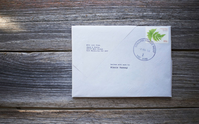
Jason & Yvette Wedding Invitation
Production Method
Letterpress
Design
The Hungry Workshop
Simon Hipgrave
Jenna Hipgrave
Printing
The Hungry Workshop
This wedding invitation delivers a bit of nostalgia, a whole lot of story, and works as launching pad for what is sure to be a memorable wedding.
Client
Jason & Yvette
Quantity Produced
40
Production Cost
–
Production Time
–
Dimensions (Width × Height × Depth)
148.5 × 105 mm
Page Count
16
Paper Stock
Crane / Crane's Lettra / 300gsm /
Stephen / Smart White / 140gsm /
Stephen / Scrambled White / 140gsm /
Optix / Grey / 110gsm /
Number of Colors
2
Varnishes
–
Binding
Sewn
Typography
Baskerville
Pica 10 Pitch
Project Description
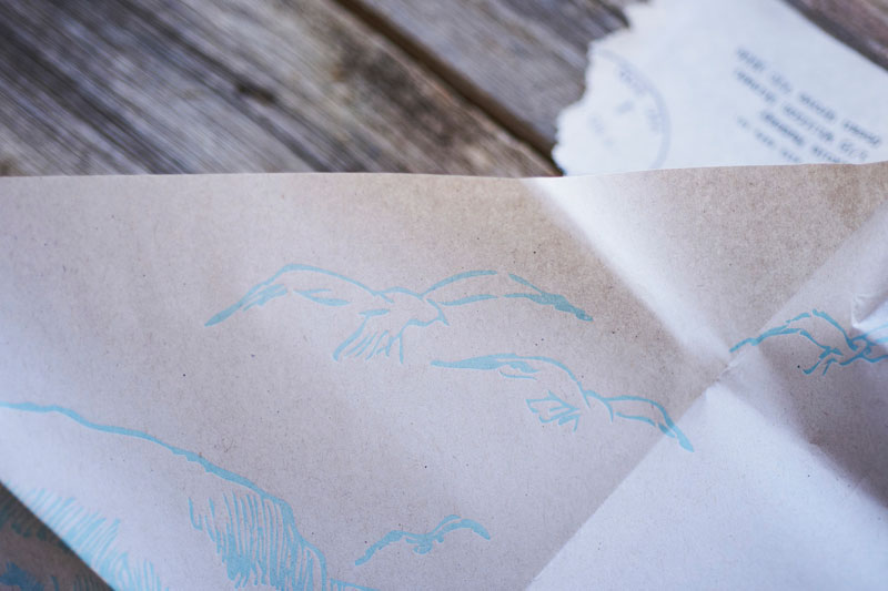
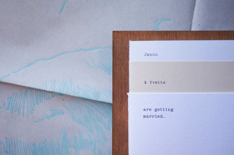
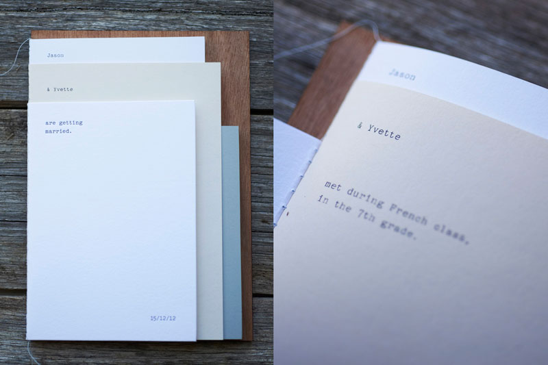
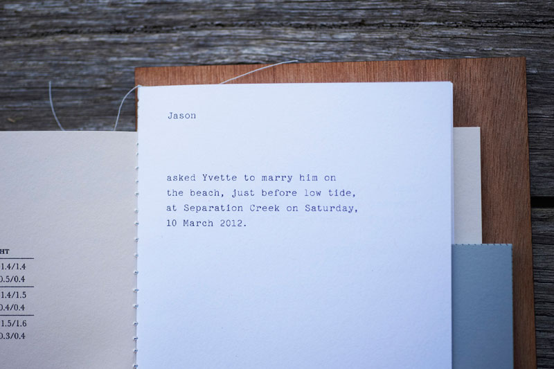
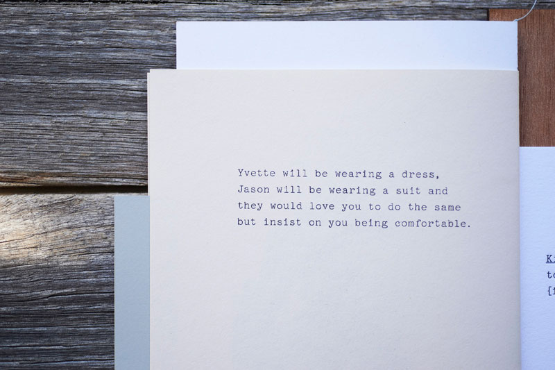
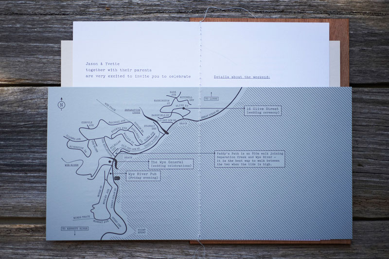
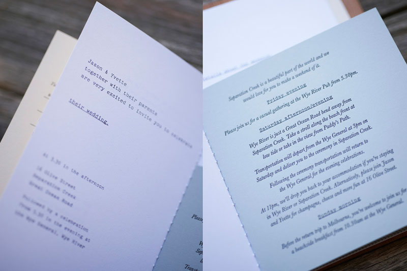
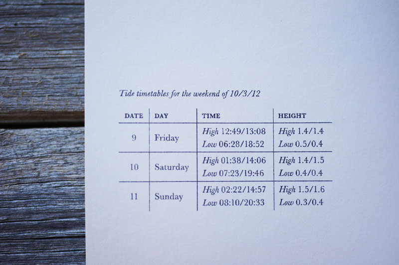
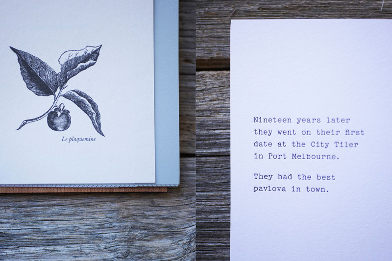
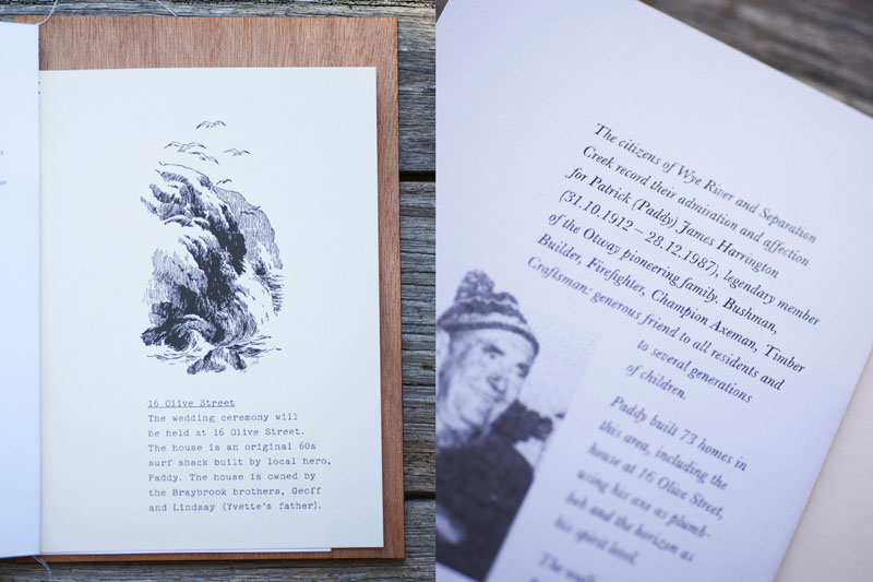
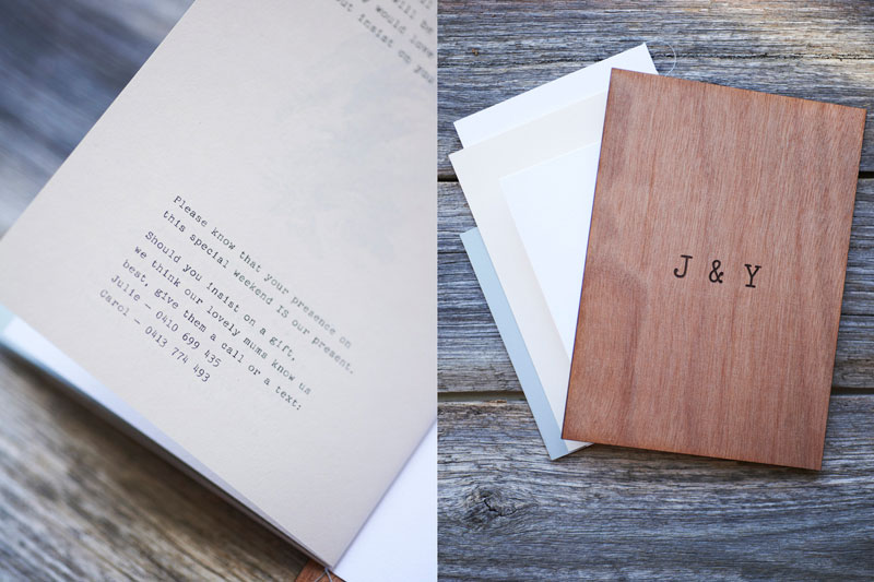
Just off the Great Ocean Road in Separation Creek sits a well loved surf shack. The place tells many stories. The shack was crafted by a local legend who wore a path through the scrub to the local. The shack has been in the family for generations, many people over many years have enjoyed this place. Dug into the brush next to the ocean, it is rich with texture and character, with warped glass, weathered wood and a misshapen profile. This was the place where Jason and Yvette were engaged and the place were they were to be married. The invitation is a collection of stocks, finishes and techniques. The envelope appears small, but is actually an A3 sheet of newsprint, letterpress printed by hand in a soft blue ink on our Asbern Proof Press. Tearing through the paper reflects peeling back the eucalyptus scrub to reveal the shack. Inside is a small booklet, with several sheet sizes thread-stitched along the spine, a mixture of Crane Lettra 300gsm, Stephen 140 gsm (Smart and Scrambled White) and Optix Grey 110gsm. There is also a mixture of printing techniques. The innermost and outermost sheets are letterpress printed on our Heidelberg Windmill, while the other two sheets were printed on the risograph by Dawn Press. Typeset in Baskerville and Pica 10 Pitch, the booklet tells Jason and Yvette's story as well as being peppered with facts. There is a history of Paddy the local legend who built the house, a map of the surrounding area, tide times from when they were engaged, as well as the weekend of the wedding and the story of how they met (in French class, in the 7th grade). The invitation is informative, direct, honest and personal— true reflection of their character.Production Lesson(s)
Don't let limiting factors like budget get in the way of communication. Mixing less expensive print techniques such as Riso helped us get the project over the line and enriched the communication.
Post Author

Bryony Gomez-Palacio
Editor of FPO and co-founder of UnderConsideration LLC.
More: Online / On Twitter
Date Published
May 28, 2013
Filed Under
Letterpress
Wedding materials
Tagged with
crane lettra
letterpress
risograph
wedding materials
About
FPO (For Print Only), is a division of UnderConsideration, celebrating the reality that print is not dead by showcasing the most compelling printed projects.
FPO uses Fonts.com to render Siseriff and Avenir Next.
FPO is run with Six Apart’s MovableType
All comments, ideas and thoughts on FPO are property of their authors; reproduction without the author’s or FPO’s permission is strictly prohibited
Twitter @ucllc
Sign-up for Mailing List
Mailing list managed by MailChimp
Thanks to our advertisers
About UnderConsideration
UnderConsideration is a graphic design firm generating its own projects, initiatives, and content while taking on limited client work. Run by Bryony Gomez-Palacio and Armin Vit in Bloomington, IN. More…
blogs we publish
Brand New / Displaying opinions and focusing solely on corporate and brand identity work.
Art of the Menu / Cataloguing the underrated creativity of menus from around the world.
Quipsologies / Chronicling the most curious, creative, and notable projects, stories, and events of the graphic design industry on a daily basis.
products we sell
Flaunt: Designing effective, compelling and memorable portfolios of creative work.
Brand New Conference videos / Individual, downloadable videos of every presentation since 2010.
Prints / A variety of posters, the majority from our AIforGA series.
Other / Various one-off products.
events we organize
Brand New Conference / A two-day event on corporate and brand identity with some of today's most active and influential practitioners from around the world.
Brand Nieuwe Conference / Ditto but in Amsterdam.
Austin Initiative for Graphic Awesomeness / A speaker series in Austin, TX, featuring some of the graphic design industry's most awesome people.
also
Favorite Things we've Made / In our capacity as graphic designers.
Projects we've Concluded / Long- and short-lived efforts.
UCllc News / Updates on what's going at the corporate level of UnderConsideration.




Related entries
Black Sheep Studio Business Cards and Promotional Items
Herbst & Spungen Wedding Invitation Suite
Cranky Bucks Promotion
Seegno Business Cards
“Miniature Views” Promotion