ADV @ UNDERCONSIDERATION Peek here for details
BROWSE
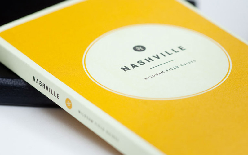
Wildsam Publishing Book
Production Method
Offset
Design
Metaleap Creative
Creative Director: Jose Reyes
Editor: Taylor Bruce
Design: Josh Baker
Illustrator: Lucinda Rogers
Production
Manager: Keith Williamson
Services: Nikolle Reyes
Printing
Colour 101
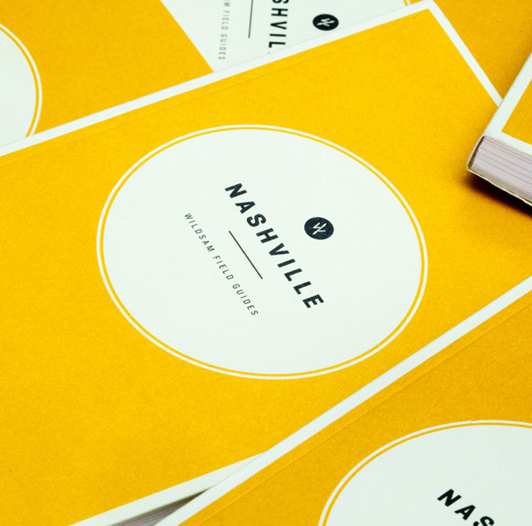
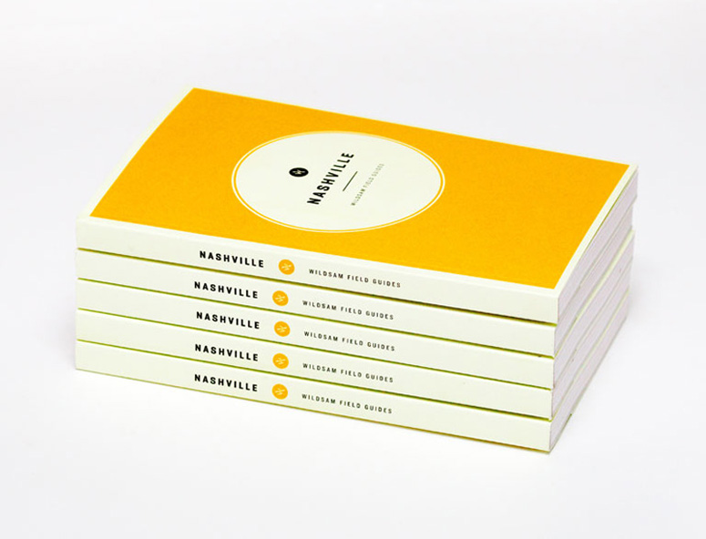
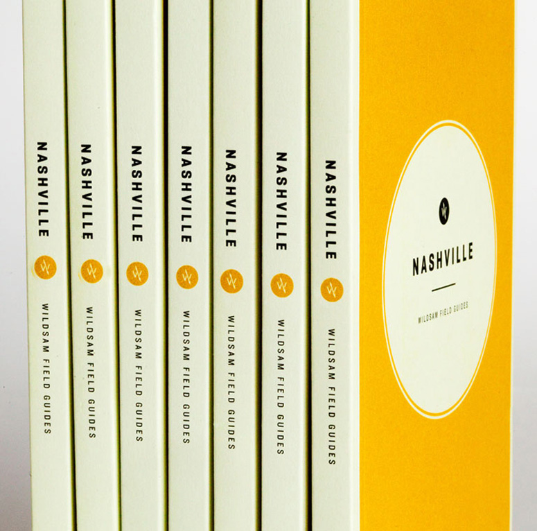
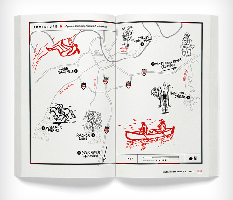
These pocket-size tour guides serve as an almanac for a city with the purpose to find the best-of-the-best and charm of the place. This specific one is for the city of Nashville and its simplicity makes it engaging to read. Covering cities as diverse as New York, the guide captivates the essence and spirit of where you travel —in 120 pages.
Dimensions (Width × Height × Depth)
4 in × 6.5 in × .3875 in
Page Count
120
Paper Stock
Mohawk / Via Vellum / Pure White / 100 C
Number of Colors
2
Varnishes
–
Binding
Perfect binding
Typography
Geogrotesque
Historical Fell Type Roman and Italic
Veneer
Bambola
Numbers Claimcheck
Knockout
Project Description
Launched in the fall of 2012, Wildsam is a series of American field guides, small books with a lot of soul, packed with local lore, interviews, a cultural almanac, vignetted memoirs, a best-of list, hand-drawn maps, and much more. These books are equal parts travel guide and tribute, for both weekender and native alike. Part almanac, part urban lore, part best-of, part memoir, the first Wildsam Field Guide focuses on Nashville, Tennessee. From illustrated maps of comfort food and music stops, to stories from Rosanne Cash, Tony Earley and Senator Bill Frist, Wildsam digs deep to find the taproots of the Music City.As one might imagine, the design for this guide as well as for future guides, needed to be highly utilitarian and functional. Covering cities as diverse as Nashville to New York, we wanted the design throughout to be clean, sparse, classic, soulful and enduring so that future guides will remain visually captivating and can easily build on the system we've created now.
Production Lesson(s)
We design quite a few publications in house and run on a pretty fast cycle, but we weren't anticipating the slow burn that is putting out a guide like this. The fact checking required is not for the feint of heart and thankfully, we had a really good editor as well as outside writers who could put time into the editorial side of things. From a design perspective, getting it right takes time and being able to live with the grid, typography, folios, rubrics and more over the course of 3 months was critical in making sure we had landed on a solid foundation for the future. We were constantly cutting away the pretty design moments in favor of more air, clarity, and cleanliness. All of this was in support of being able to replicate everything perfectly once we start designing future guides.
About
FPO (For Print Only), is a division of UnderConsideration, celebrating the reality that print is not dead by showcasing the most compelling printed projects.
FPO uses Fonts.com to render Siseriff and Avenir Next.
FPO is run with Six Apart’s MovableType
All comments, ideas and thoughts on FPO are property of their authors; reproduction without the author’s or FPO’s permission is strictly prohibited
Twitter @ucllc
Sign-up for Mailing List
Mailing list managed by MailChimp
Thanks to our advertisers
About UnderConsideration
UnderConsideration is a graphic design firm generating its own projects, initiatives, and content while taking on limited client work. Run by Bryony Gomez-Palacio and Armin Vit in Bloomington, IN. More…
blogs we publish
Brand New / Displaying opinions and focusing solely on corporate and brand identity work.
Art of the Menu / Cataloguing the underrated creativity of menus from around the world.
Quipsologies / Chronicling the most curious, creative, and notable projects, stories, and events of the graphic design industry on a daily basis.
products we sell
Flaunt: Designing effective, compelling and memorable portfolios of creative work.
Brand New Conference videos / Individual, downloadable videos of every presentation since 2010.
Prints / A variety of posters, the majority from our AIforGA series.
Other / Various one-off products.
events we organize
Brand New Conference / A two-day event on corporate and brand identity with some of today's most active and influential practitioners from around the world.
Brand Nieuwe Conference / Ditto but in Amsterdam.
Austin Initiative for Graphic Awesomeness / A speaker series in Austin, TX, featuring some of the graphic design industry's most awesome people.
also
Favorite Things we've Made / In our capacity as graphic designers.
Projects we've Concluded / Long- and short-lived efforts.
UCllc News / Updates on what's going at the corporate level of UnderConsideration.




Related entries
2017 Brand New Conference Program
Severe(d): A Creepy Poetry Collection by Holly Riordan
Um Caminho para Santiago CD Package and Diary
BOYCO Classpack® Book
Antes de Perder la Esperanza Book