ADV @ UNDERCONSIDERATION Peek here for details
BROWSE
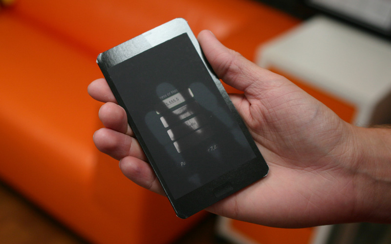
Sur-tec Brochure with Heat Sensitive Ink
Production Method
Offset
Silkscreen
Design
REACTOR design studio
Clifton Alexander, creative chuck norris
Chase Wilson, activator
Grant Gooding, consultant
Printing
Brochure: AC Printing, Olathe, KS
Heat sensitive ink: H&H Graphics, Chicago
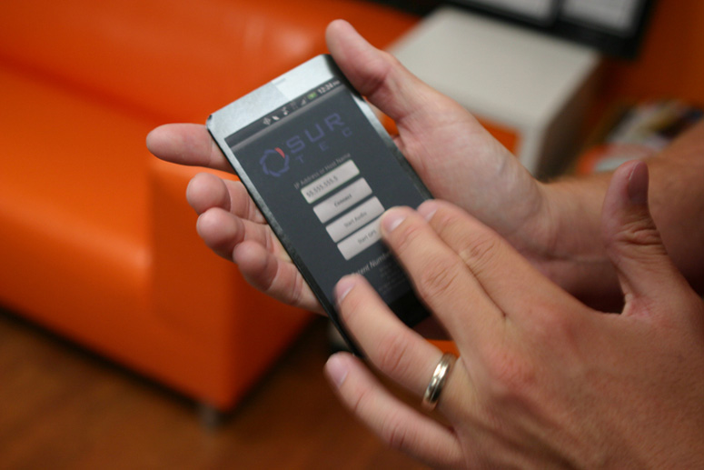
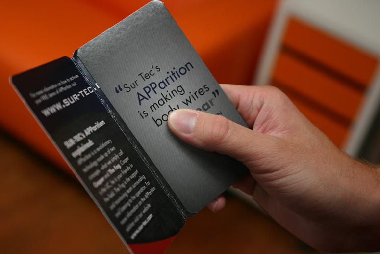
Thermochromatic ink mimics the functionality of an app designed for covert surveillance in this high-tech, complex print job designed and executed for an equally high-tech, sophisticated client. (Video of the ink in action at the bottom of the post).
Dimensions (Width × Height × Depth)
8.25 × 5 in
Page Count
–
Paper Stock
Carolina / 18PT / C2S Cover
Number of Colors
5/4 (5th color is black to clear thermographic ink)
Varnishes
Overall Gloss Varnish
Binding
–
Typography
–
Project Description
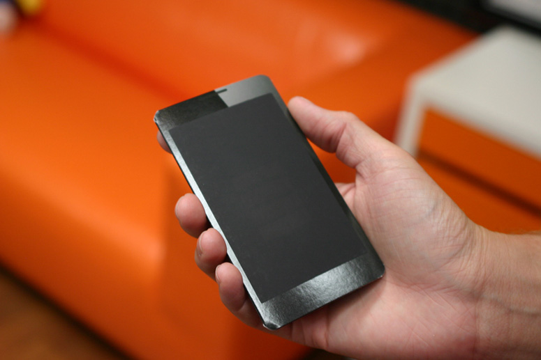
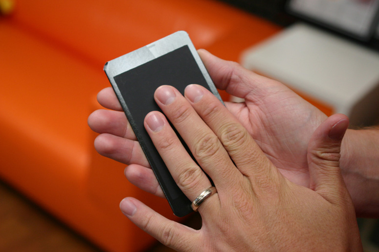
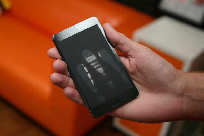
This brochure and specifically the heat-sensitive ink, is designed to mimic the experience of using the mobile app that Sur-tec has developed. Designing a brochure that looks like a cell-phone is nothing new, but the app itself runs on a mobile device completely undetected and is used for undercover officers in place of a body wire. It streams hi-def audio and geo-positioning back to the support teams. We wanted a high impact way to show that the "phone" will look and act as a normal phone if the officer is searched. The black opaque ink covers up the fact that there is an audio-recording app running on the phone. Only when you apply heat to the ink, does it reveal the home screen of the app on the brochure. In a similar way, the app runs undetected and can only be accessed if you know it's there.Production Lesson(s)
This was a learning process for all of us involved! We hadn't worked with thermochromatic ink before and were under a tight deadline working with two different printers in two states.The thermo ink is VERY sensitive to ambient temperature. It looks best and most opaque when it's in a colder room and the color change is more dramatic as well. We had no idea what the room would be like at the trade show where these brochures were handed out so we advised our client to bring a cooler or some similar storage container for the brochures. That way they could have maximum impact when handing them to potential clients.
We also found out that the opaqueness of the ink was much better with two hits. Although it's difficult to tell when printing because in a warm print shop the ink will be mostly clear when printing. H&H Graphics was definitely up for the challenge and advised us along the way!
The brochure printing was done by our local printer in Kansas City using conventional methods. We then shipped the brochures to Chicago to have the thermo ink silk-screened in place. The sheets were shipped back to KC for finishing.
We also had to test the exact paper and specific varnish being used on the brochure with the thermo ink to make sure it would stick.

Post Author

Duncan Robertson
Former intern at UnderConsideration LLC.
More: Online / On Twitter
Date Published
February 27, 2013
Filed Under
Brochures
Offset
Silkscreen
Tagged with
About
FPO (For Print Only), is a division of UnderConsideration, celebrating the reality that print is not dead by showcasing the most compelling printed projects.
FPO uses Fonts.com to render Siseriff and Avenir Next.
FPO is run with Six Apart’s MovableType
All comments, ideas and thoughts on FPO are property of their authors; reproduction without the author’s or FPO’s permission is strictly prohibited
Twitter @ucllc
Sign-up for Mailing List
Mailing list managed by MailChimp
Thanks to our advertisers
About UnderConsideration
UnderConsideration is a graphic design firm generating its own projects, initiatives, and content while taking on limited client work. Run by Bryony Gomez-Palacio and Armin Vit in Bloomington, IN. More…
blogs we publish
Brand New / Displaying opinions and focusing solely on corporate and brand identity work.
Art of the Menu / Cataloguing the underrated creativity of menus from around the world.
Quipsologies / Chronicling the most curious, creative, and notable projects, stories, and events of the graphic design industry on a daily basis.
products we sell
Flaunt: Designing effective, compelling and memorable portfolios of creative work.
Brand New Conference videos / Individual, downloadable videos of every presentation since 2010.
Prints / A variety of posters, the majority from our AIforGA series.
Other / Various one-off products.
events we organize
Brand New Conference / A two-day event on corporate and brand identity with some of today's most active and influential practitioners from around the world.
Brand Nieuwe Conference / Ditto but in Amsterdam.
Austin Initiative for Graphic Awesomeness / A speaker series in Austin, TX, featuring some of the graphic design industry's most awesome people.
also
Favorite Things we've Made / In our capacity as graphic designers.
Projects we've Concluded / Long- and short-lived efforts.
UCllc News / Updates on what's going at the corporate level of UnderConsideration.




Related entries
2017 Brand New Conference Program
Severe(d): A Creepy Poetry Collection by Holly Riordan
Um Caminho para Santiago CD Package and Diary
BOYCO Classpack® Book
Antes de Perder la Esperanza Book