ADV @ UNDERCONSIDERATION Peek here for details
BROWSE
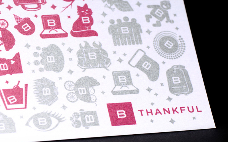
BAKER Holiday Card
Production Method
Offset
Design
BAKER Design
Design Direction: Trent Johnson
Icon Design: Everyone at BAKER
Production: Cindy Oman
Printing
Jessen Press
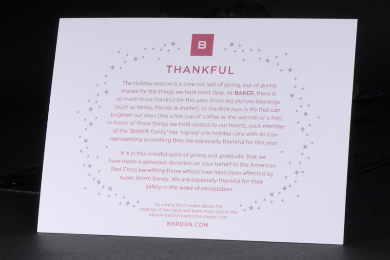
A collective effort within BAKER to showcase all of those things the entire team is thankful for comes together to also share with you their collective gift towards those in need.
Dimensions (Width × Height × Depth)
7 × 5 × in.
Page Count
–
Paper Stock
Arjo Wiggins / Curious Touch / Milk / 111 C
Number of Colors
2
Varnishes
–
Binding
–
Typography
Gotham Rounded (Hoefler & Frere-Jones)
Project Description
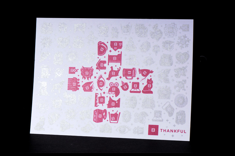
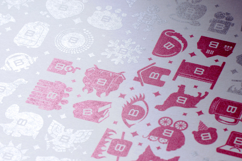
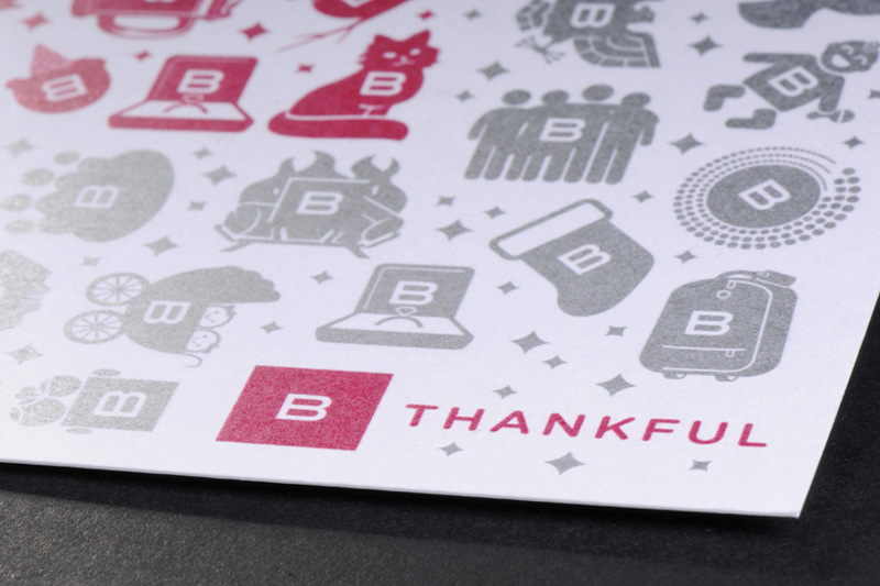
"Creativity is at our core and it's in everything we do." Since setting that phrase as our mantra during our identity redesign in 2010, BAKER has challenged itself to live up to an exceptionally high bar creatively. As a culture of creative individuals, where everyone is inherently unique in their own way though invariably part of the larger collective whole, we pride ourselves on our differences as well as our similarities. It is with this lofty level of careful consideration that we set out to design a holiday card that would not only put a meaningful twist on the traditional seasonal mailer, but also encompass our entire creative community. From creative to accounting, everyone at BAKER was invited to creatively 'sign' the card by developing an icon based on the idea of something for which they were thankful. A variety of ideas were submitted ranging from big picture blessings to life's little pleasures with a wide breadth of icons making up our final selections. Collectively, the icons were then artfully arranged to make up a unifying red cross in honor of the donation we have made to help the victims affected by Super Storm Sandy. In addition to the final printed piece, a behind the scenes video was then also produced internally and posted on bkrdsn.com, showcasing the people who make BAKER what it is and adding an extra layer of personal connection to the meaning behind each individual icon.Production Lesson(s)
Though seemingly simple on the surface, there was much learning to be had during the production process of this card. While we were initially aware that the combination of Pantone premium metallics (PMS Silver + PMS 10171) on the Curious Touch paper would effect the overall luster of the inks it was difficult to know to what degree. Due to this detail it was imperative that the text side of the card be printed on the softer touch side of the card allowing the metallics to achieve a slightly more luminous sheen on the icon-laden front side of the card. In addition, the inks took up to 3 times longer to dry due to the paper stock, adding an extra element of planning to the production timeline. Once completed, however, we are extremely happy with the end results and want to specifically thank Jessen Press for working hand in hand with BAKER to achieve the desired overall effect.
Post Author

Bryony Gomez-Palacio
Editor of FPO and co-founder of UnderConsideration LLC.
More: Online / On Twitter
Date Published
January 10, 2013
Filed Under
Holiday Card
Offset
Tagged with
curious touch
holiday card
offset
PMS
About
FPO (For Print Only), is a division of UnderConsideration, celebrating the reality that print is not dead by showcasing the most compelling printed projects.
FPO uses Fonts.com to render Siseriff and Avenir Next.
FPO is run with Six Apart’s MovableType
All comments, ideas and thoughts on FPO are property of their authors; reproduction without the author’s or FPO’s permission is strictly prohibited
Twitter @ucllc
Sign-up for Mailing List
Mailing list managed by MailChimp
Thanks to our advertisers
About UnderConsideration
UnderConsideration is a graphic design firm generating its own projects, initiatives, and content while taking on limited client work. Run by Bryony Gomez-Palacio and Armin Vit in Bloomington, IN. More…
blogs we publish
Brand New / Displaying opinions and focusing solely on corporate and brand identity work.
Art of the Menu / Cataloguing the underrated creativity of menus from around the world.
Quipsologies / Chronicling the most curious, creative, and notable projects, stories, and events of the graphic design industry on a daily basis.
products we sell
Flaunt: Designing effective, compelling and memorable portfolios of creative work.
Brand New Conference videos / Individual, downloadable videos of every presentation since 2010.
Prints / A variety of posters, the majority from our AIforGA series.
Other / Various one-off products.
events we organize
Brand New Conference / A two-day event on corporate and brand identity with some of today's most active and influential practitioners from around the world.
Brand Nieuwe Conference / Ditto but in Amsterdam.
Austin Initiative for Graphic Awesomeness / A speaker series in Austin, TX, featuring some of the graphic design industry's most awesome people.
also
Favorite Things we've Made / In our capacity as graphic designers.
Projects we've Concluded / Long- and short-lived efforts.
UCllc News / Updates on what's going at the corporate level of UnderConsideration.




Related entries
Omorovicza Holiday Card
Convier Collective 2016 Holiday Card
UTOKA Holiday Promotion
Fum Fum Fum Christmas Cards
Lesli Ink Holiday Cards