ADV @ UNDERCONSIDERATION Peek here for details
BROWSE
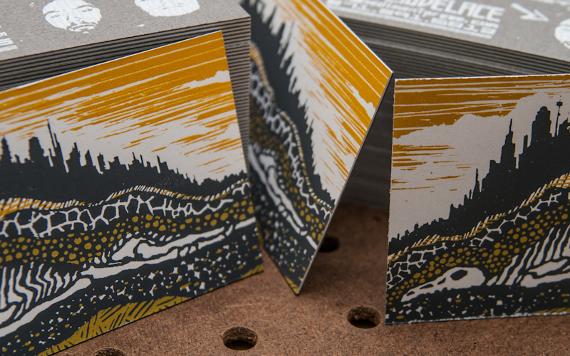
Sediment Press Business Cards
Production Method
Silkscreen
Design
Charles Robertson
Printing
Tim Lovelace & Charles Robertson
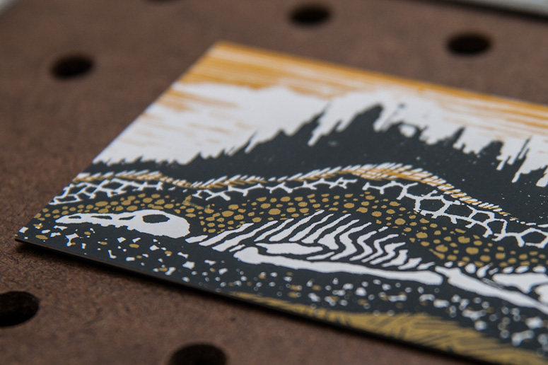
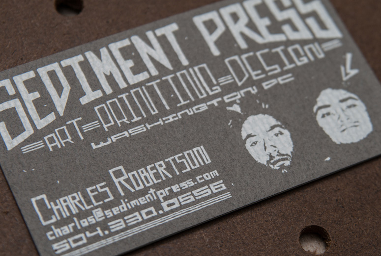
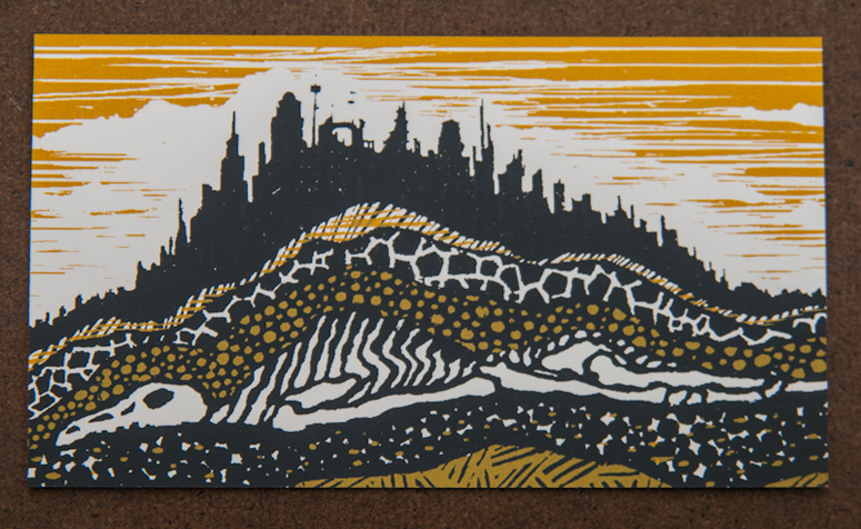
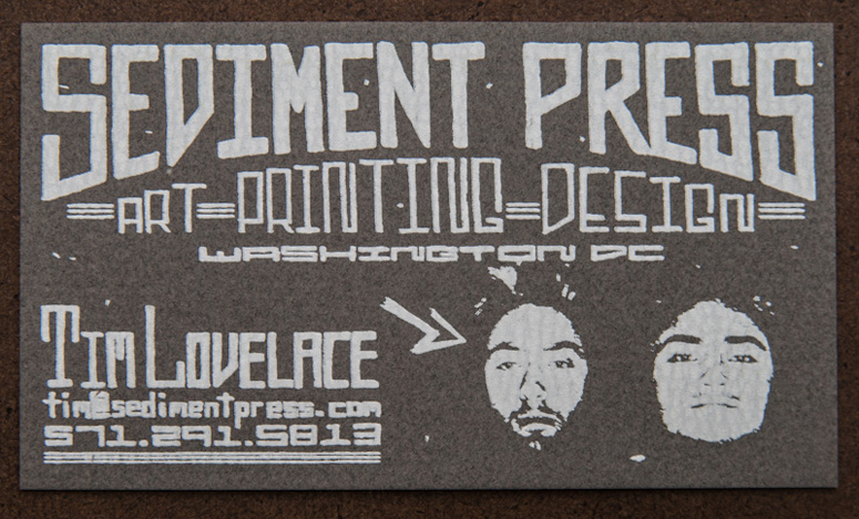
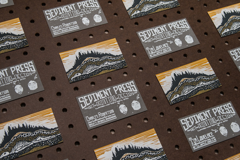
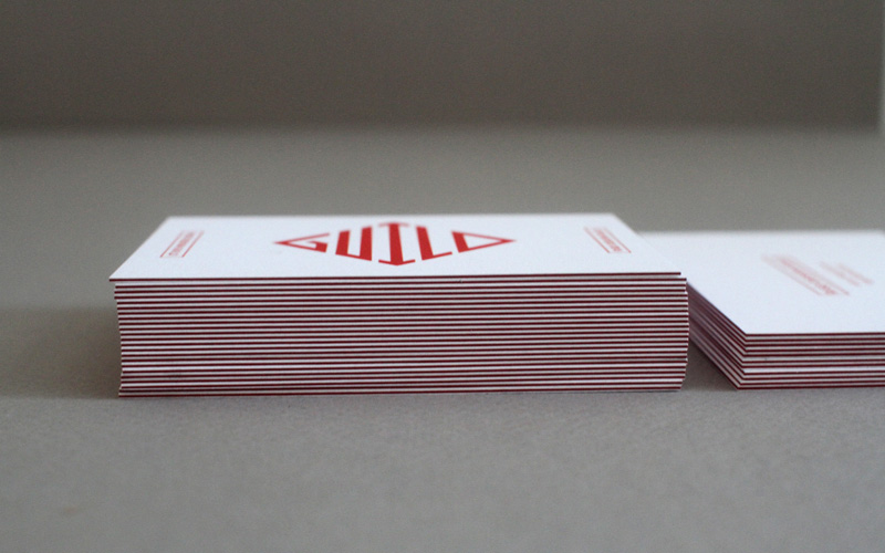
The passage of time has been good to Sediment Press. Alluding to both the progress the business has made and the layering of ink in the silkscreen process, these cards say both “there’s no rush” and “look at what amazing possibilities can come with time.” The hand-lettered type keeps it all light and friendly, with just a touch of heavy metal portraiture. Rock on.
Dimensions (Width × Height × Depth)
3.5 × 2 in
Page Count
–
Paper Stock
Cougar / Super Smooth Cover / 130#DTC
Neenah / Gainsborough / Charcoal / Felt / 80# CVR
Number of Colors
2/1
Varnishes
–
Binding
–
Typography
–
Project Description
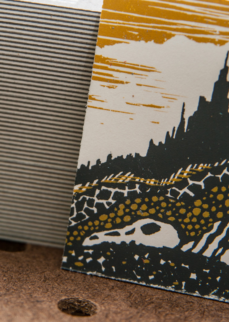
Having over a year of collaborating experience between the two of them, Tim and Charles of Sediment Press set out to create the business cards that would represent the progress they had achieved as an up and coming small business. Duplexing paper, a process Sediment became familiar with on a project from a few months before, was going to be a must in their cards. The paper also needed to have a texture on one side to make the card even more tangible. Sediment's name stems from the idea of layers of rock, or in this case ink, being pressed and flatted down on top of one another. The duplexing procedure added to the idea of layers of print. The business card card was designed so that upon holding the card for the first time, a person might simply say "Wow, that's an awesome card!". Gone are the typical polished typefaces the design community is all too familiar with. The text on the card required a handwritten touch, while still remaining professional. While a project like this might not be suitable (or cost effective!) for the average client, it does portray the diverse landscape of products that both a traditional and contempoary screen printer can achieve.Production Lesson(s)
When duplexing paper, rotate the other stock 90 degrees to avoid any curling. The cards have minimal curling due to the thick paper, but if the sheet grain was perpendicular to one another the curling would be non-existent.
Post Author

Jessica Mullen
Writer for UnderConsideration LLC.
More: Online / On Twitter
Date Published
November 28, 2012
Filed Under
Business Cards
Silkscreen
Tagged with
business card
cougar
duplex
self-promotion
silkscreen
About
FPO (For Print Only), is a division of UnderConsideration, celebrating the reality that print is not dead by showcasing the most compelling printed projects.
FPO uses Fonts.com to render Siseriff and Avenir Next.
FPO is run with Six Apart’s MovableType
All comments, ideas and thoughts on FPO are property of their authors; reproduction without the author’s or FPO’s permission is strictly prohibited
Twitter @ucllc
Sign-up for Mailing List
Mailing list managed by MailChimp
Thanks to our advertisers
About UnderConsideration
UnderConsideration is a graphic design firm generating its own projects, initiatives, and content while taking on limited client work. Run by Bryony Gomez-Palacio and Armin Vit in Bloomington, IN. More…
blogs we publish
Brand New / Displaying opinions and focusing solely on corporate and brand identity work.
Art of the Menu / Cataloguing the underrated creativity of menus from around the world.
Quipsologies / Chronicling the most curious, creative, and notable projects, stories, and events of the graphic design industry on a daily basis.
products we sell
Flaunt: Designing effective, compelling and memorable portfolios of creative work.
Brand New Conference videos / Individual, downloadable videos of every presentation since 2010.
Prints / A variety of posters, the majority from our AIforGA series.
Other / Various one-off products.
events we organize
Brand New Conference / A two-day event on corporate and brand identity with some of today's most active and influential practitioners from around the world.
Brand Nieuwe Conference / Ditto but in Amsterdam.
Austin Initiative for Graphic Awesomeness / A speaker series in Austin, TX, featuring some of the graphic design industry's most awesome people.
also
Favorite Things we've Made / In our capacity as graphic designers.
Projects we've Concluded / Long- and short-lived efforts.
UCllc News / Updates on what's going at the corporate level of UnderConsideration.




Related entries
KitchenAid Limited Edition Cards
Black Sheep Studio Business Cards and Promotional Items
Seegno Business Cards
Fracas Productions Business Cards
Elegante Press Business card