ADV @ UNDERCONSIDERATION Peek here for details
BROWSE
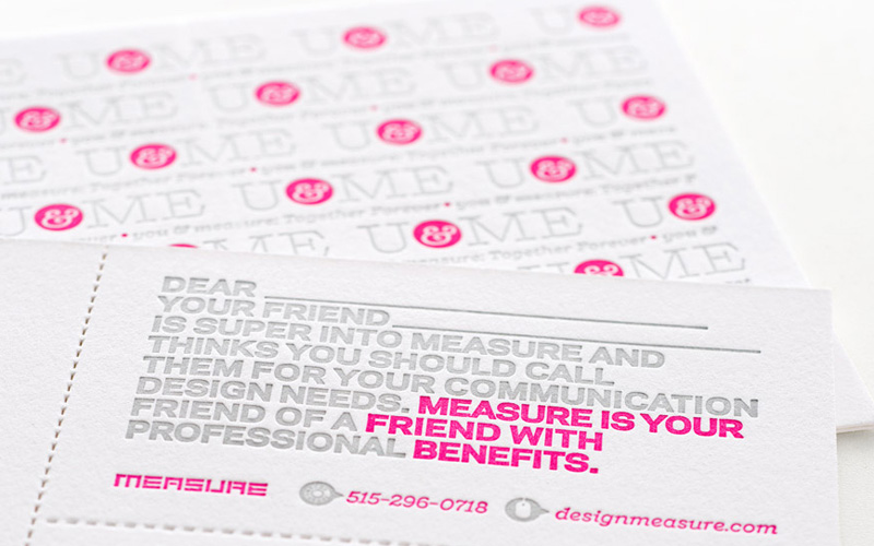
Measure, Inc. U&ME Referral Cards
Production Method
Letterpress
Design
Measure, Inc.
Creative Director: Chad Johnston
Designer and Copywriter: Austin Van Laar
Printing
Studio On Fire
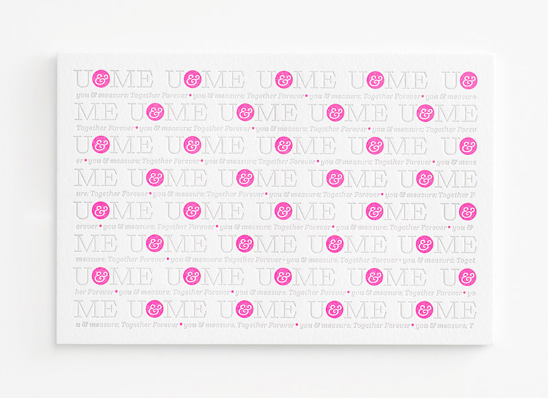
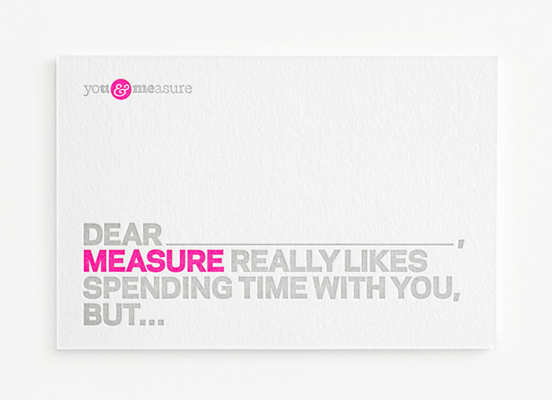
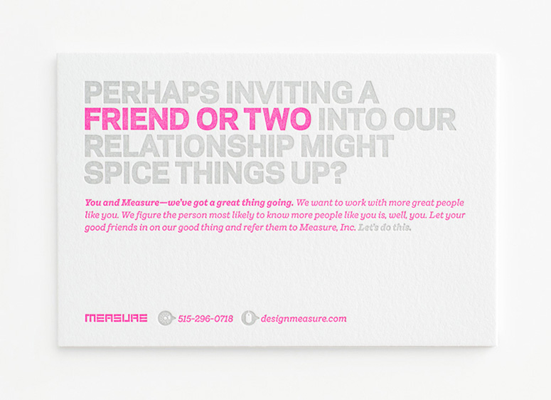
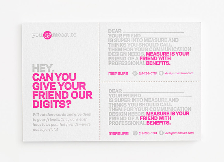
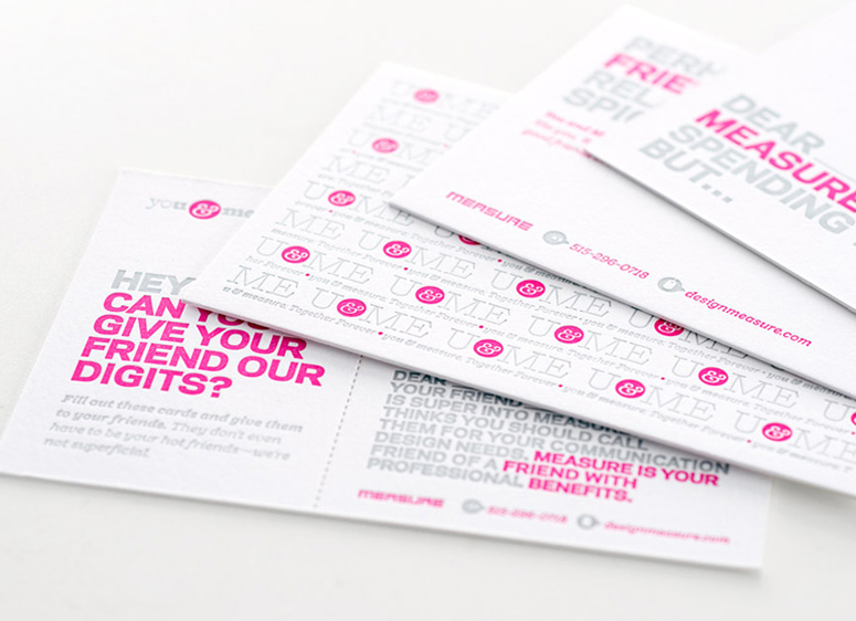
Comparing client referrals to swinging, these slightly-slutty postcards let it all hang out. It never hurts to ask! And I bet that dayglo pink will still look good doing the walk of shame the next day, if the duplexed perf doesn’t get too to’ up.
Client
Self-promotion
Quantity Produced
250 (each of 2 cards)
Production Cost
$1,450
Production Time
2 Weeks
Dimensions (Width × Height × Depth)
–
Page Count
–
Paper Stock
110 C (duplexed to 220 C)
Number of Colors
2
Varnishes
–
Binding
–
Typography
Galaxie Polaris
Shift
Project Description
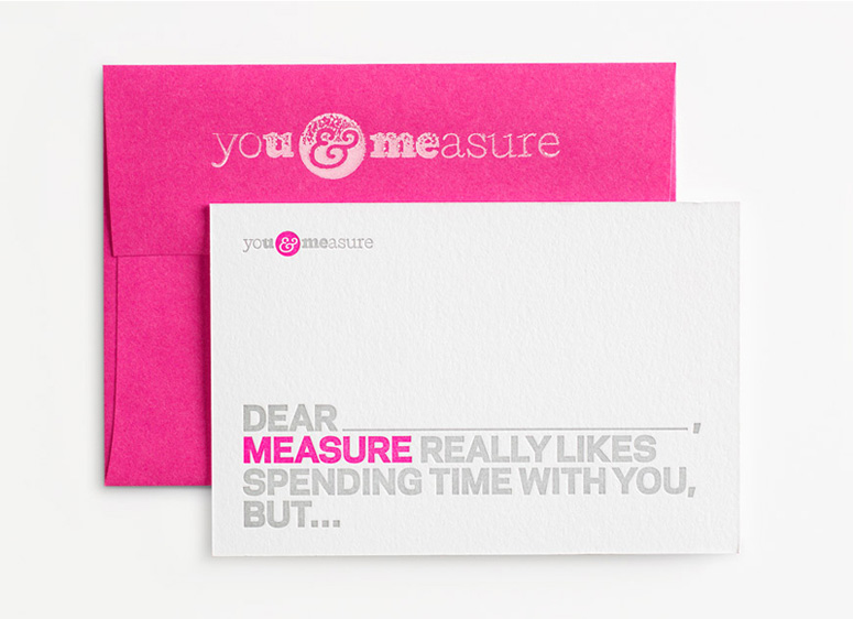
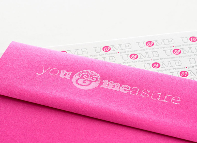
After receiving a letter from a financial advisor asking us to refer friends and family, we wondered if creative professionals could pull off the same stunt—with a little more panache, of course. While debating what memorable approaches might and might not completely offend our current clients, we decided to make this an exercise in idealism: the type of client we want to be working with will not be offended by some some well-crafted (and innuendo-laden) wit. Opting to compare referrals to swingers, we clearly chose a safe path. We kept the format simple with small, clean and striking cards flawlessly rendered in tactile paper with metallic silver and dayglo pink ink via letterpress. We sent the promo off in matching pink envelopes with flaps block-printed (by our own hands) in white. The response to our classy seduction? Positive across the board.Production Lesson(s)
Being newbies to letterpress, we had much to learn about its limitations. The original design for this promotion featured six different cards with unique messages, blind embossing, rounded corners and thin rule borders. The printer informed us of the many terrible—and expensive—things that would likely happen when attempting such a complicated design. The vastly scaled down end result is actually more impactful and refined than the original would have been. To save cost on such low production numbers, we chose not to have the flaps of the pink envelopes silkscreened in white. Every designer imagines that they can have a stamp made and ink the design themselves—except no stamp ink is opaque enough for the job. Before abandoning the idea, we tried water-based block printing ink (discovered in the clearance aisle of a local craft store) as a last-ditch resort. To our surprise it yielded a beautifully imperfect and tactile impression, exceeding our initial expectations.
Post Author

Jessica Mullen
Writer for UnderConsideration LLC.
More: Online / On Twitter
Date Published
November 27, 2012
Filed Under
Letterpress
Postcard
Tagged with
block printing
letterpress
postcard
self-promotion
About
FPO (For Print Only), is a division of UnderConsideration, celebrating the reality that print is not dead by showcasing the most compelling printed projects.
FPO uses Fonts.com to render Siseriff and Avenir Next.
FPO is run with Six Apart’s MovableType
All comments, ideas and thoughts on FPO are property of their authors; reproduction without the author’s or FPO’s permission is strictly prohibited
Twitter @ucllc
Sign-up for Mailing List
Mailing list managed by MailChimp
Thanks to our advertisers
About UnderConsideration
UnderConsideration is a graphic design firm generating its own projects, initiatives, and content while taking on limited client work. Run by Bryony Gomez-Palacio and Armin Vit in Bloomington, IN. More…
blogs we publish
Brand New / Displaying opinions and focusing solely on corporate and brand identity work.
Art of the Menu / Cataloguing the underrated creativity of menus from around the world.
Quipsologies / Chronicling the most curious, creative, and notable projects, stories, and events of the graphic design industry on a daily basis.
products we sell
Flaunt: Designing effective, compelling and memorable portfolios of creative work.
Brand New Conference videos / Individual, downloadable videos of every presentation since 2010.
Prints / A variety of posters, the majority from our AIforGA series.
Other / Various one-off products.
events we organize
Brand New Conference / A two-day event on corporate and brand identity with some of today's most active and influential practitioners from around the world.
Brand Nieuwe Conference / Ditto but in Amsterdam.
Austin Initiative for Graphic Awesomeness / A speaker series in Austin, TX, featuring some of the graphic design industry's most awesome people.
also
Favorite Things we've Made / In our capacity as graphic designers.
Projects we've Concluded / Long- and short-lived efforts.
UCllc News / Updates on what's going at the corporate level of UnderConsideration.




Related entries
Younite Promotional Cards
Latitude Postcard
Oh Christmas Cards
The Department Postcards
Tinta de Verano - Solar Prints