ADV @ UNDERCONSIDERATION Peek here for details
BROWSE
Ask the Experts #4
Submitted By
Daniel Walkington
Cody Thompson
Expert Replies
4
Topic(s)
Foil Stamping
Letterpress
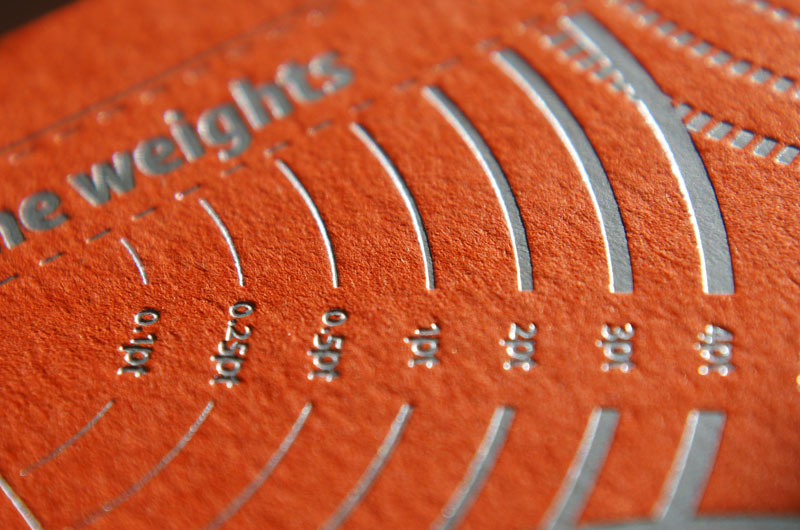
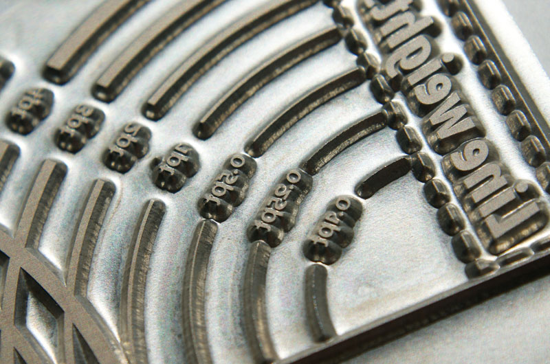
You can get away with a finer line with printing than foil stamping. 0.5 pt would be the thinnest I would go with foil and 0.25 pt with ink although both are pushing things a bit. Foil needs to adhere to the paper so I would even go a little heavier for foil when possible. We have noticed that with some lighter fonts the serifs can look weak.
There is also another variable unique to foil stamping; the proximity of fine lines near one another. For example, if you have an intricate coat-of-arm style logo you want to stamp, you will need to be careful about some detail 'filling in' if there are a lot of fine lines and scroll work in the design. Different foil types perform differently. Specialty foils, especially matte opaques, tend to fill in more than some of the metallic mainstays.
There are a lot of variables, but the finest line we'd foil stamp is probably just a little under 1pt. Even then I'd try to talk you out of it. The finer the line, the quicker the plate wears out and the less predictable the foil area becomes. Over a long-ish press run, the sharpness and consistency of each piece could degrade noticeably. If you're concerned about keeping details sharp, and your design allows for it, I'd strongly suggest engraving over foil stamping. You can get some of the finest printed detail possible and still have access to a variety of metallic inks and effects.
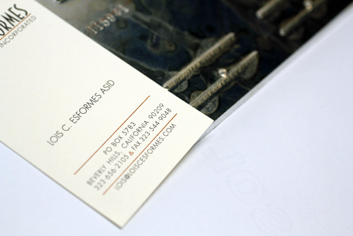
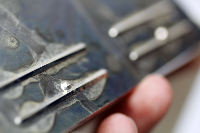
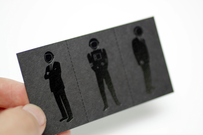
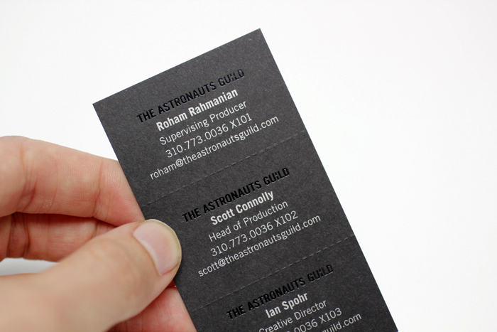
In the images above you can see the copper foiled lines and triangle on Lois' card look sharp, but when you look at the die it's a little chewed up and the edge is not perfectly true anymore. This is not necessarily an issue on small runs. Metallic copper engraving ink would have a similar visual effect, but could be sharper and much more consistent. It's not really the best place to use foil stamping... In contrast, the illustrations and sans-serif type on the Astronaut's Guild cards, below, were a much better candidate for foil stamping.
Yael further asks: What do you suggest for deciding for a copper plate vs. magnesium? Any rule of thumb?
We very rarely use copper plates for foil stamping. Almost everything is magnesium. Depending on pressman technique, we've found magnesium dies can last just as long as copper. If there's a huge run, or a more complicated die (like multi-level embossing or emboss/foil combo dies) we will occasionally use brass dies, but they can be as high as five times the cost of magnesium and totally unnecessary for most projects. The one benefit of copper is that it transfers heat much better. This makes it easier for the pressman to control temperature and could help consistency on projects with large areas of foil.
Andy Brown, editor of the fabulous Print Handbook for Designers shares these two images and says, "We had the same question about how thin a hairline could be when foiled so we tried out a few weights in the Print Handbook."
Post Author

Armin Vit
Editor of FPO and co-founder of UnderConsideration LLC.
More: Online / On Twitter
Date Published
March 30, 2012
Filed Under
Ask the Experts
Foil Stamping
Letterpress
Tagged with
About
FPO (For Print Only), is a division of UnderConsideration, celebrating the reality that print is not dead by showcasing the most compelling printed projects.
FPO uses Fonts.com to render Siseriff and Avenir Next.
FPO is run with Six Apart’s MovableType
All comments, ideas and thoughts on FPO are property of their authors; reproduction without the author’s or FPO’s permission is strictly prohibited
Twitter @ucllc
Sign-up for Mailing List
Mailing list managed by MailChimp
Thanks to our advertisers
About UnderConsideration
UnderConsideration is a graphic design firm generating its own projects, initiatives, and content while taking on limited client work. Run by Bryony Gomez-Palacio and Armin Vit in Bloomington, IN. More…
blogs we publish
Brand New / Displaying opinions and focusing solely on corporate and brand identity work.
Art of the Menu / Cataloguing the underrated creativity of menus from around the world.
Quipsologies / Chronicling the most curious, creative, and notable projects, stories, and events of the graphic design industry on a daily basis.
products we sell
Flaunt: Designing effective, compelling and memorable portfolios of creative work.
Brand New Conference videos / Individual, downloadable videos of every presentation since 2010.
Prints / A variety of posters, the majority from our AIforGA series.
Other / Various one-off products.
events we organize
Brand New Conference / A two-day event on corporate and brand identity with some of today's most active and influential practitioners from around the world.
Brand Nieuwe Conference / Ditto but in Amsterdam.
Austin Initiative for Graphic Awesomeness / A speaker series in Austin, TX, featuring some of the graphic design industry's most awesome people.
also
Favorite Things we've Made / In our capacity as graphic designers.
Projects we've Concluded / Long- and short-lived efforts.
UCllc News / Updates on what's going at the corporate level of UnderConsideration.




Related entries
Ask the Experts #11
Ask the Experts #10
Ask the Experts #9
Ask the Experts #8
Ask the Experts #7