ADV @ UNDERCONSIDERATION Peek here for details
BROWSE
Client
Brandy and Tafari
Quantity Produced
125
Production Cost
$1,488
Production Time
–
Dimensions (Width × Height × Depth)
Cards: 5 × 7 in
Envelope: A7
Die-cut key: 2.8 in × 1 in
Page Count
–
Paper Stock
Uncoated, Crane Letra, Pearl White, 21pt
Number of Colors
1, black or green
Varnishes
–
Binding
–
Typography
Fan Script
Copperplate
We often start a project with key characteristics in mind that end up being very different from what the end result turns out to be. Changes that do not make the project any better than intended, simply different. Such was the case with this wedding invite, where letterpress was substituted by offset which allowed elements of the design to remain untouched.
The key words from my wedding client before I started were: Elegant, Antique, History. Cream and black as the main colors.
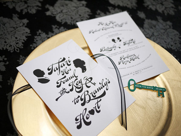
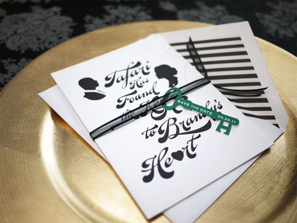
Of course, I had to throw some color in there and suggested an emerald green. It just felt right for the mood she was going for, and it will add that modern feel to the overall look. Also, I wanted her wedding to have a little more edge and playful twist to the European, Victorian vibe that she sought.
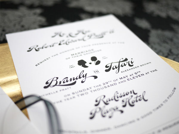
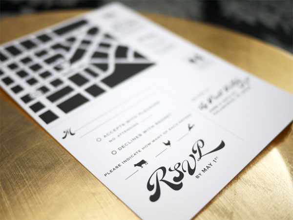
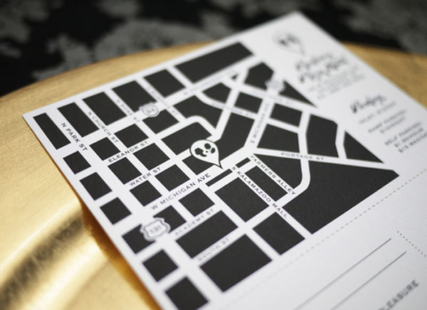
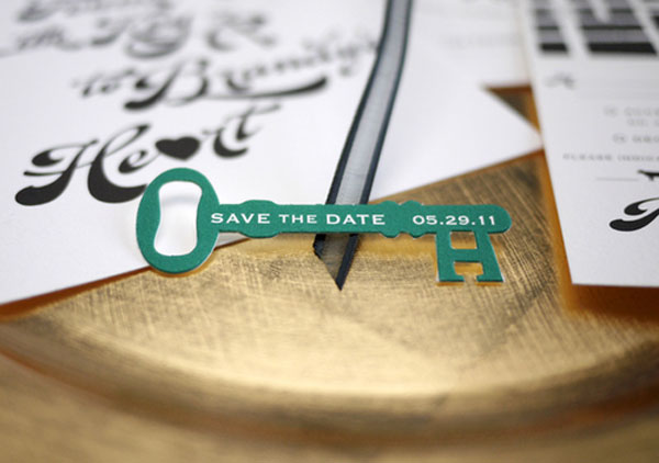
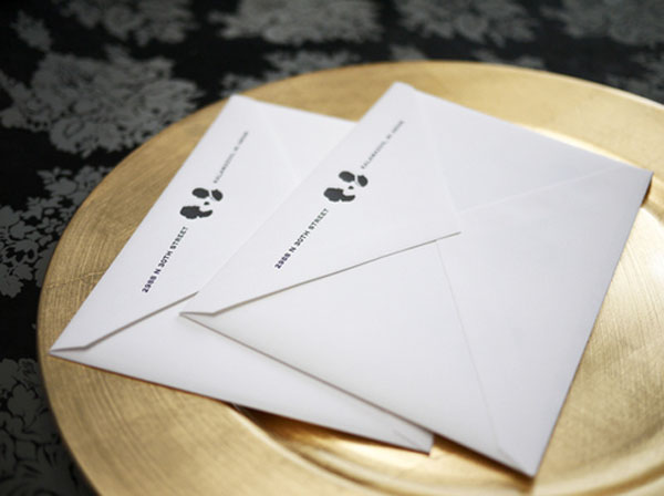
The Victorian flair is supported by the custom cameo portraits that I produced of the bride and groom, and the calligraphic nature of the typography. I contrasted the traditional elements with the not-so-typical typographic arrangement and the bold, yet modern diagonal striped pattern seen in the A7 envelope liner. There are three 5-by-7-inch cards: the cover design, wedding information card, and the map/response card combo. The RSVP is perforated at the top where the guest can tear it off and put it directly into the mail. And to add that punch of color to the overall black and white scheme, the custom die-cut key was printed in a PMS green to finish the whole presentation of the invite set.
Originally, I wanted this whole job to be either letterpress or black foil stamping, but there was going to be an inking coverage on the map area since there was a lot of black space, and the small type areas may have caved in if we inked the press too much to compensate for the map area. So the best bet was to go offset to maintain the design nuances. For the custom die-cut key, I wanted it to be a real hardy, thick paper stock (Crane Letra, Pearl White 179 lb cover), but when the printer was die-cutting the key, it was surprisingly causing the top layer edges of the paper to tear where the green ink was and it created a very unpleasant end product. So we switched over to the 21pt paper, for an improved result.






Brandy and Tafari Wedding Invite
Production Method
Design
Design With Chon, LLC
Printing
AccuColor Plus, Inc
This post was published in the original layout of FPO so all images are smaller. Project descriptions as well as production lessons are quoted in the main content area.
Post Author
Bryony

Bryony Gomez-Palacio
Editor of FPO and co-founder of UnderConsideration LLC.
More: Online / On Twitter
Date Published
August 18, 2011
Filed Under
Wedding materials
Tagged with
black
crane
die-cut
offset
PMS
uncoated
wedding invitation
About
FPO (For Print Only), is a division of UnderConsideration, celebrating the reality that print is not dead by showcasing the most compelling printed projects.
FPO uses Fonts.com to render Siseriff and Avenir Next.
FPO is run with Six Apart’s MovableType
All comments, ideas and thoughts on FPO are property of their authors; reproduction without the author’s or FPO’s permission is strictly prohibited
Twitter @ucllc
Sign-up for Mailing List
Mailing list managed by MailChimp
Thanks to our advertisers
About UnderConsideration
UnderConsideration is a graphic design firm generating its own projects, initiatives, and content while taking on limited client work. Run by Bryony Gomez-Palacio and Armin Vit in Bloomington, IN. More…
blogs we publish
Brand New / Displaying opinions and focusing solely on corporate and brand identity work.
Art of the Menu / Cataloguing the underrated creativity of menus from around the world.
Quipsologies / Chronicling the most curious, creative, and notable projects, stories, and events of the graphic design industry on a daily basis.
products we sell
Flaunt: Designing effective, compelling and memorable portfolios of creative work.
Brand New Conference videos / Individual, downloadable videos of every presentation since 2010.
Prints / A variety of posters, the majority from our AIforGA series.
Other / Various one-off products.
events we organize
Brand New Conference / A two-day event on corporate and brand identity with some of today's most active and influential practitioners from around the world.
Brand Nieuwe Conference / Ditto but in Amsterdam.
Austin Initiative for Graphic Awesomeness / A speaker series in Austin, TX, featuring some of the graphic design industry's most awesome people.
also
Favorite Things we've Made / In our capacity as graphic designers.
Projects we've Concluded / Long- and short-lived efforts.
UCllc News / Updates on what's going at the corporate level of UnderConsideration.




Related entries
Herbst & Spungen Wedding Invitation Suite
Erin and Brian Wedding Invitation
Daniela & Rui Wedding Invitation
Benjamin & Catalina Wedding Announcement
Devon & Mike Wedding Invitation