ADV @ UNDERCONSIDERATION Peek here for details
BROWSE
Client
Self-Promotion
Quantity Produced
85
Production Cost
$300
Production Time
2 weeks
Dimensions (Width × Height × Depth)
10.75 in × 8.25 in
Page Count
–
Paper Stock
Crane's Lettra 110 lb
French Paper 100 lb
Number of Colors
2 per sheet, 4 total
Varnishes
–
Binding
–
Typography
Hand Drawn type
Buttermilk
Prestige Elite Std
Rainscript
I believe I’ve mentioned this before but the color combination of bright red (sometimes red-orange) and any sort of variation of light blue (teal, robin’s egg, etc) will always win me over. Okay, maybe not always, but it’s pretty much a guarantee if the piece is also letterpressed and features vintage inspired typefaces. These are great because they save paper and energy too!
[Ed.’s Note: Yes, we realize it’s a 100° for some of us out there and Holiday cards are out of season.]
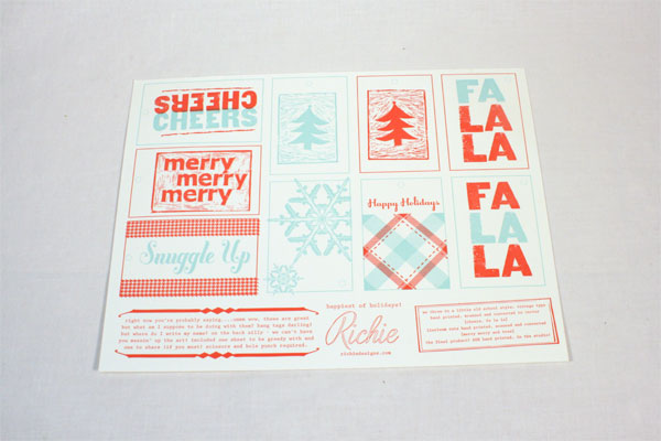
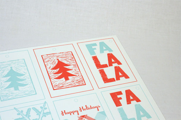
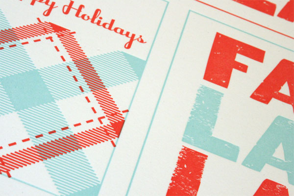
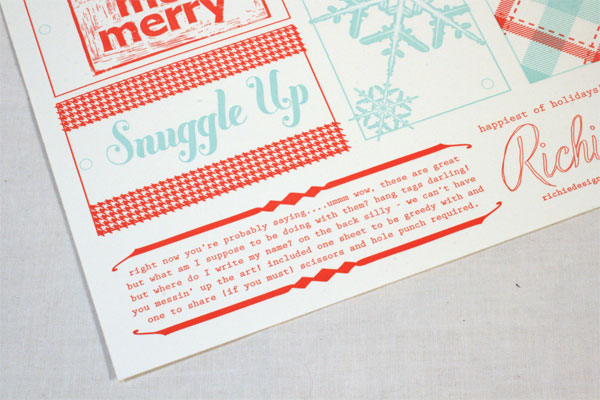
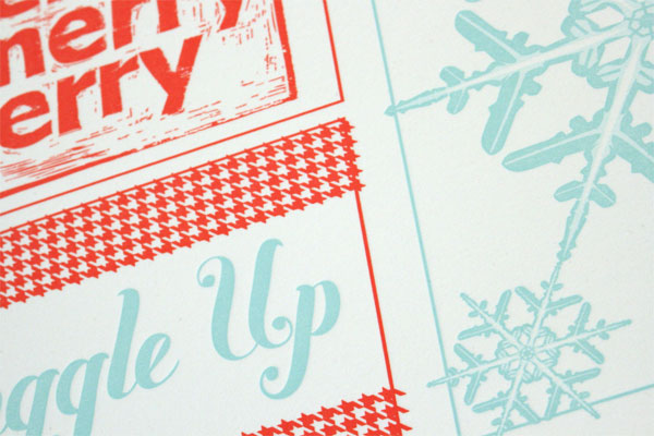
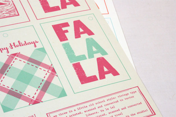
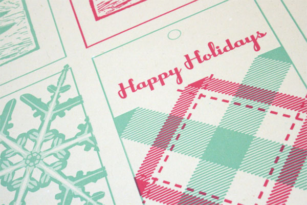
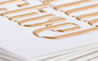
I hate designing Christmas Cards which seems like an oxymoron but it’s true. I talked myself into the project if I could find a way to make the piece functional, as well as show clients potential uses for letterpress in new projects. I decided to use a variety of techniques such as carvings, and wood type along with assistance with some purchased vector art to show options and techniques in printing. My only regret is that I didn’t have the budget to purchase a die to perf the pieces. I felt I got around it with my little instructions along the bottom—it made it a little crafty/interactive is what I told myself.
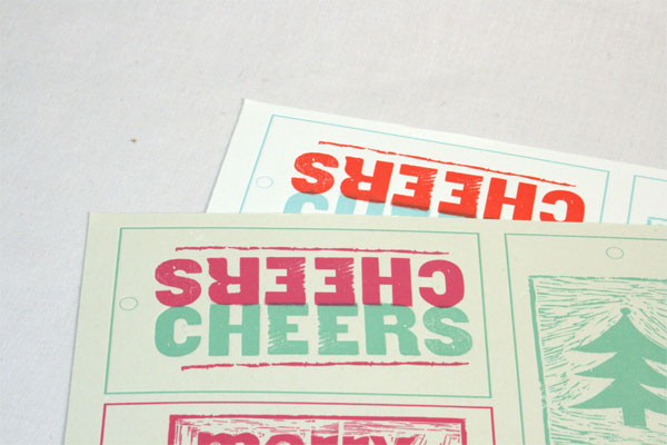
I did attempt a screen of one image (“cheers”) which didn’t work out. I ended up cutting the plate apart and reusing the good side twice to achieve the finished look. I wanted to push myself by trying something new. I would probably test something for a client if I attempted that again BEFORE going to press. In the end it worked out fine, designing on press is sometimes the best way to really challenge yourself.








This post was published in the original layout of FPO so all images are smaller. Project descriptions as well as production lessons are quoted in the main content area.
Post Author
Lauren Dickens

Lauren Dickens
Former intern at UnderConsideration LLC.
More: Online / On Twitter
Date Published
June 15, 2011
Filed Under
Holiday Card
Tagged with
holiday card
letterpress
About
FPO (For Print Only), is a division of UnderConsideration, celebrating the reality that print is not dead by showcasing the most compelling printed projects.
FPO uses Fonts.com to render Siseriff and Avenir Next.
FPO is run with Six Apart’s MovableType
All comments, ideas and thoughts on FPO are property of their authors; reproduction without the author’s or FPO’s permission is strictly prohibited
Twitter @ucllc
Sign-up for Mailing List
Mailing list managed by MailChimp
Thanks to our advertisers
About UnderConsideration
UnderConsideration is a graphic design firm generating its own projects, initiatives, and content while taking on limited client work. Run by Bryony Gomez-Palacio and Armin Vit in Bloomington, IN. More…
blogs we publish
Brand New / Displaying opinions and focusing solely on corporate and brand identity work.
Art of the Menu / Cataloguing the underrated creativity of menus from around the world.
Quipsologies / Chronicling the most curious, creative, and notable projects, stories, and events of the graphic design industry on a daily basis.
products we sell
Flaunt: Designing effective, compelling and memorable portfolios of creative work.
Brand New Conference videos / Individual, downloadable videos of every presentation since 2010.
Prints / A variety of posters, the majority from our AIforGA series.
Other / Various one-off products.
events we organize
Brand New Conference / A two-day event on corporate and brand identity with some of today's most active and influential practitioners from around the world.
Brand Nieuwe Conference / Ditto but in Amsterdam.
Austin Initiative for Graphic Awesomeness / A speaker series in Austin, TX, featuring some of the graphic design industry's most awesome people.
also
Favorite Things we've Made / In our capacity as graphic designers.
Projects we've Concluded / Long- and short-lived efforts.
UCllc News / Updates on what's going at the corporate level of UnderConsideration.




Related entries
Omorovicza Holiday Card
Convier Collective 2016 Holiday Card
UTOKA Holiday Promotion
Fum Fum Fum Christmas Cards
Lesli Ink Holiday Cards