ADV @ UNDERCONSIDERATION Peek here for details
BROWSE
Client
Skyler Lewis
Quantity Produced
20
Production Cost
$25
Production Time
1 week
Dimensions (Width × Height × Depth)
18 in × 22 in
Page Count
–
Paper Stock
Metallic-Colored 4-Ply Poster Board
Number of Colors
4
Varnishes
–
Binding
–
Typography
Hand-Lettered Type
Futura
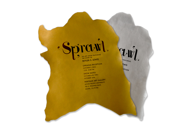
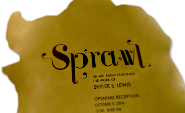
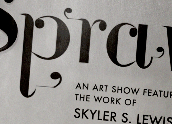
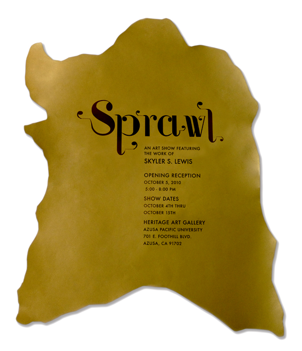
The simplicity of these posters are its strongest attribute. Well, not to mention that they are all hand-cut in the shape of a cowhide (read on for why a cowhide). The hand-rendered letters, intricate and bold, are not overly flamboyant, and you can’t get much more basic than Futura for the auxiliary text.
Skyler is one of my best friends and a sculpture artist who was having an exhibition of her latest body of work. The show was to discuss the concept of animal parts being reconstructed or deconstructed for human aesthetics and then being put on display. Humans constantly reconstruct nature and their environment according to their aesthetics.
I wanted the typographic design to carry this concept of being structured yet decorative. The majority of the sculptures shaped as cowhides covered in sequins. The design was printed on gold and silver paper to allude to the shine of sequins. The poster was then cut into the shape of a cowhide to not only relate to the shape of the sculptures, but also to create visual intrigue through the abstract shape.
A certain challenge was whether or not cutting the poster out into the shape of a cowhide was a good idea. We were afraid if it was too abstract and it would cause more confusion rather then intrigue. We took a chance and in the end got lots of positive feedback.
Aside from the shape of the poster, there was also a long discussion about how to translate the shine of the sequins into the color choice of the paper. We started with neon colors and ended with gold and silver. I think that we made the right choice.
Skyler was also on a tight budget for this project so finding the cheapest solution for the production of the design was a high priority. I did have access to a large format printer so were able to do the printing for free and basically just had to buy the gold and silver poster paper from a local art supply store.




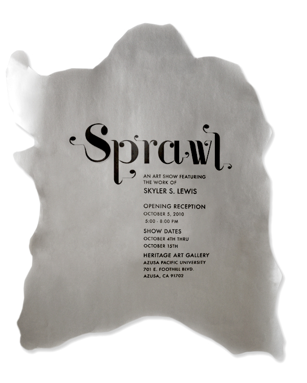

Sprawl Exhibition Poster
Production Method
Design
Marissa Rivera
Printing
Marissa Rivera and Skyler Lewis
This post was published in the original layout of FPO so all images are smaller. Project descriptions as well as production lessons are quoted in the main content area.
Post Author
Lauren Dickens

Lauren Dickens
Former intern at UnderConsideration LLC.
More: Online / On Twitter
Date Published
May 6, 2011
Filed Under
Posters
Tagged with
DIY
hand lettering
offset
reception
About
FPO (For Print Only), is a division of UnderConsideration, celebrating the reality that print is not dead by showcasing the most compelling printed projects.
FPO uses Fonts.com to render Siseriff and Avenir Next.
FPO is run with Six Apart’s MovableType
All comments, ideas and thoughts on FPO are property of their authors; reproduction without the author’s or FPO’s permission is strictly prohibited
Twitter @ucllc
Sign-up for Mailing List
Mailing list managed by MailChimp
Thanks to our advertisers
About UnderConsideration
UnderConsideration is a graphic design firm generating its own projects, initiatives, and content while taking on limited client work. Run by Bryony Gomez-Palacio and Armin Vit in Bloomington, IN. More…
blogs we publish
Brand New / Displaying opinions and focusing solely on corporate and brand identity work.
Art of the Menu / Cataloguing the underrated creativity of menus from around the world.
Quipsologies / Chronicling the most curious, creative, and notable projects, stories, and events of the graphic design industry on a daily basis.
products we sell
Flaunt: Designing effective, compelling and memorable portfolios of creative work.
Brand New Conference videos / Individual, downloadable videos of every presentation since 2010.
Prints / A variety of posters, the majority from our AIforGA series.
Other / Various one-off products.
events we organize
Brand New Conference / A two-day event on corporate and brand identity with some of today's most active and influential practitioners from around the world.
Brand Nieuwe Conference / Ditto but in Amsterdam.
Austin Initiative for Graphic Awesomeness / A speaker series in Austin, TX, featuring some of the graphic design industry's most awesome people.
also
Favorite Things we've Made / In our capacity as graphic designers.
Projects we've Concluded / Long- and short-lived efforts.
UCllc News / Updates on what's going at the corporate level of UnderConsideration.




Related entries
36 Days of Type Poster
Ministry of Environment in Colombia Poster
National Parks Map
eBoy Poster
“Love Your Mother” Print