ADV @ UNDERCONSIDERATION Peek here for details
BROWSE
Client
Self-promotion
Quantity Produced
1,500
Production Cost
$12 per unit
Production Time
2 1/2 weeks
Dimensions (Width × Height × Depth)
5.5 in × 6.5 in
Page Count
132
Paper Stock
Cover: Mohawk Navajo brilliant white 130 lb
Text: Mohawk Knightkote Matte 100 lb
Tipped-in: Mohawk Knightkote Matte 80 lb
Number of Colors
4
Varnishes
Black foil
Brass die deboss
Binding
Perfect Bound
Typography
Rockwell by Morris Fuller Benton/Monotype
Gotenburg-bold by Dieter Steffmann/Stempel
Trade Gothic by Jackson Burke
Pixture Quads by Anja Gollor & Henry Hajdu
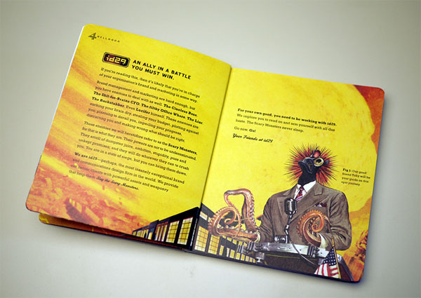
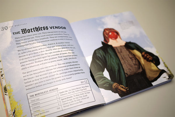
I like it when design firms put out publications such as this. It shows that not only do they love what they do, they’re also concerned with helping fellow creatives improve as well. Love the cordial, cherry-headed monster, though he seems more delicious than scary. You can download a free PDF version of the book right here [PDF] and explore more at slaythescarymonsters.com.
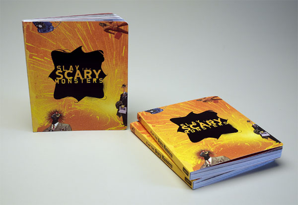
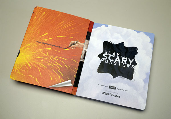
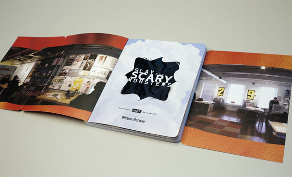
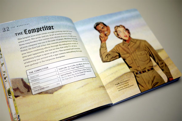
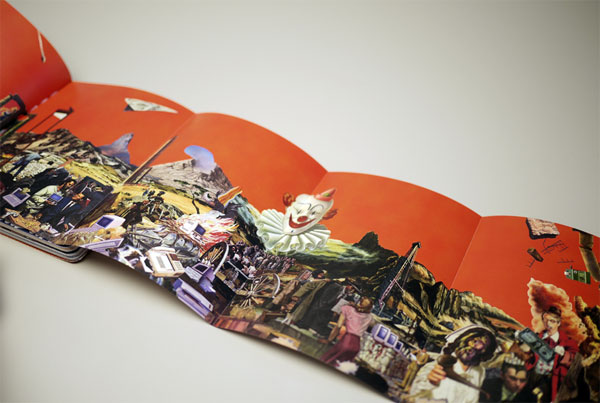
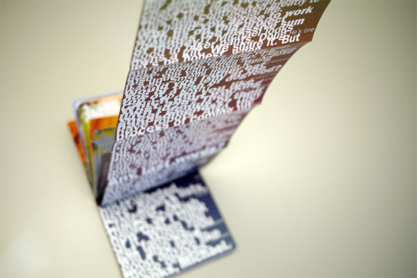
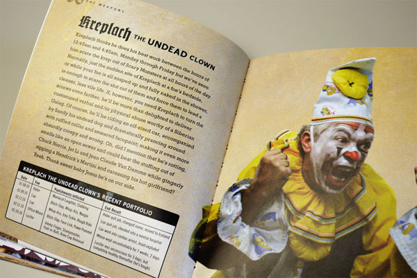
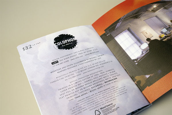
‘Slay the Scary Monsters’ is a 132-page self-published book. We wrote the copy and worked with local artist and friend Michael Oatman on many of the illustrations. The narrative describes the ‘monsters’ that get in the way of creative brilliance and marketing success in the everyday workplace. We tell the story of each monster and the threat they pose, and offer the ‘weapons’ needed to slay them. The heart of the book features a fold-out reproduction of a 10’ long collage we commissioned by Michael Oatman, and an interview with the artist. Surrounded by the narrative above is a curated selection of our design portfolio.
This book has the same trim size and finish as our 2007 title, “How To Be A Better Client.” We’re offering ‘Slay the Scary Monsters’ as book #2 of 3 in our “Trilogy of Arrogance” series. Look for our coup de grace “How to Run Your Business” in 2012.
We spent a week fine tuning the depth of the debossing of the book title element on the front cover. The process of foil stamping adds some depth, but we wanted the title letterforms to sit proud on the page and have a tangible feel to the touch. We worked closely with our printer Daniel Fannon and had a brass debossing die made which raised the level of depth to the title element while keeping the foil glossy without any modeling.









“Slay the Scary Monsters” Book
Production Method
Design
id29
Design: Doug Bartow
Text: Michael Fallone
Illustration: Michael Oatman
Photography: Bryan Kahrs
Model Building: id29
Printing
Fannon Fine Printing
This post was published in the original layout of FPO so all images are smaller. Project descriptions as well as production lessons are quoted in the main content area.
About
FPO (For Print Only), is a division of UnderConsideration, celebrating the reality that print is not dead by showcasing the most compelling printed projects.
FPO uses Fonts.com to render Siseriff and Avenir Next.
FPO is run with Six Apart’s MovableType
All comments, ideas and thoughts on FPO are property of their authors; reproduction without the author’s or FPO’s permission is strictly prohibited
Twitter @ucllc
Sign-up for Mailing List
Mailing list managed by MailChimp
Thanks to our advertisers
About UnderConsideration
UnderConsideration is a graphic design firm generating its own projects, initiatives, and content while taking on limited client work. Run by Bryony Gomez-Palacio and Armin Vit in Bloomington, IN. More…
blogs we publish
Brand New / Displaying opinions and focusing solely on corporate and brand identity work.
Art of the Menu / Cataloguing the underrated creativity of menus from around the world.
Quipsologies / Chronicling the most curious, creative, and notable projects, stories, and events of the graphic design industry on a daily basis.
products we sell
Flaunt: Designing effective, compelling and memorable portfolios of creative work.
Brand New Conference videos / Individual, downloadable videos of every presentation since 2010.
Prints / A variety of posters, the majority from our AIforGA series.
Other / Various one-off products.
events we organize
Brand New Conference / A two-day event on corporate and brand identity with some of today's most active and influential practitioners from around the world.
Brand Nieuwe Conference / Ditto but in Amsterdam.
Austin Initiative for Graphic Awesomeness / A speaker series in Austin, TX, featuring some of the graphic design industry's most awesome people.
also
Favorite Things we've Made / In our capacity as graphic designers.
Projects we've Concluded / Long- and short-lived efforts.
UCllc News / Updates on what's going at the corporate level of UnderConsideration.




Related entries
Severe(d): A Creepy Poetry Collection by Holly Riordan
BOYCO Classpack® Book
Antes de Perder la Esperanza Book
Gunnel Wåhlstrand Exhibit Book
Szép versek & Körkép Book Covers