ADV @ UNDERCONSIDERATION Peek here for details
BROWSE
Dimensions (Width × Height × Depth)
10 in × 14 in
Page Count
–
Paper Stock
Mr. French Whipcream Muscletone 110 lb
Number of Colors
3 Spot (Split Fountian Gold + Black, Red)
Varnishes
–
Binding
–
Typography
Brothers by Emigre
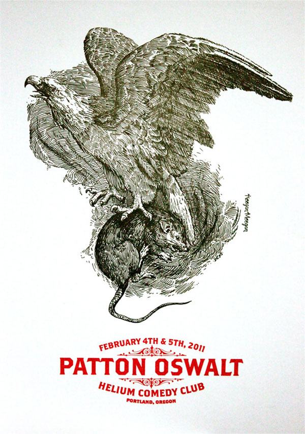
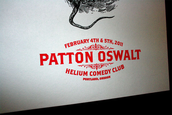
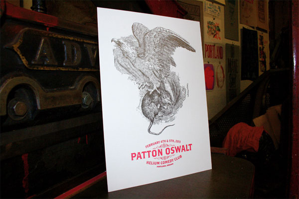
There’s something really offensive yet enthralling about watching animals fight. It’s a primal instinct that is often exploited for entertainment purposes. Maybe not so primal, but often times equally as rash and entertaining is comedy. The type choices on this poster, along with the stunning line drawing make Mr. Oswalt out to be a real class act.
Some people are great, and the rest are amazing. Patton Oswalt falls into the latter category. His talent with comedy is truly a sight to be seen.
We’ve worked for Patton several times now, and each time it’s been a fun challenge to illustrate his mirthful inflections and sidesplitting nuances. We think we’ve started to develop a knack for it.
When we were approached to design and print a poster for his February show at Helium Comedy Club in Portland, OR, we spent countless hours doing auditory research. Our eyes, literally, stung of tears and our cheeks hurt from laughing so hard. We ended up settling on one gem in particular; the prestige from “Rats” from his 2009 release “My Weakness is Strong.”
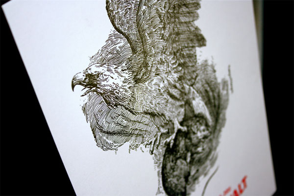
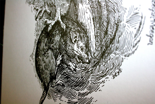
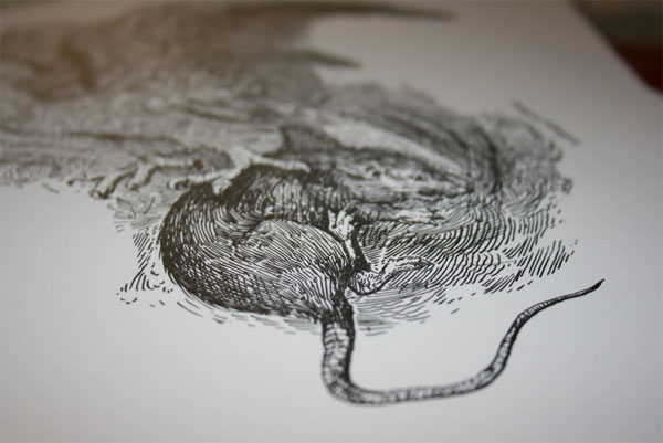
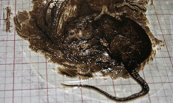
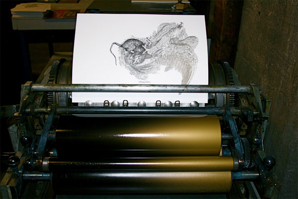
The 10-by-14-inch poster was hand illustrated with pen and ink and relief printed on our Universal I Vandercook Proof Press in 3 colors split-fountain gold to black and a spot-printed red. We used 140# Mr. French Whipcream Muscletone in a 100-count edition that will be available for purchase after February 5th through our store.
Patton just released his new book Zombie Spaceship Wasteland and is on tour as you read this, and I only hope you get out and see him; he just might be the sci-fi fueled Mark Twain of our generation.
I really tried to push the line widths and there dynamic in the context of the drawing, being using various line width to create shading and volume to the subject similar to the engraving process.
The drawing took 6 hours, wish someone would have told me to not to do it in one sitting.







This post was published in the original layout of FPO so all images are smaller. Project descriptions as well as production lessons are quoted in the main content area.
Post Author
Lauren Dickens

Lauren Dickens
Former intern at UnderConsideration LLC.
More: Online / On Twitter
Date Published
May 5, 2011
Filed Under
Posters
Tagged with
drawing
french paper
letterpress
poster
About
FPO (For Print Only), is a division of UnderConsideration, celebrating the reality that print is not dead by showcasing the most compelling printed projects.
FPO uses Fonts.com to render Siseriff and Avenir Next.
FPO is run with Six Apart’s MovableType
All comments, ideas and thoughts on FPO are property of their authors; reproduction without the author’s or FPO’s permission is strictly prohibited
Twitter @ucllc
Sign-up for Mailing List
Mailing list managed by MailChimp
Thanks to our advertisers
About UnderConsideration
UnderConsideration is a graphic design firm generating its own projects, initiatives, and content while taking on limited client work. Run by Bryony Gomez-Palacio and Armin Vit in Bloomington, IN. More…
blogs we publish
Brand New / Displaying opinions and focusing solely on corporate and brand identity work.
Art of the Menu / Cataloguing the underrated creativity of menus from around the world.
Quipsologies / Chronicling the most curious, creative, and notable projects, stories, and events of the graphic design industry on a daily basis.
products we sell
Flaunt: Designing effective, compelling and memorable portfolios of creative work.
Brand New Conference videos / Individual, downloadable videos of every presentation since 2010.
Prints / A variety of posters, the majority from our AIforGA series.
Other / Various one-off products.
events we organize
Brand New Conference / A two-day event on corporate and brand identity with some of today's most active and influential practitioners from around the world.
Brand Nieuwe Conference / Ditto but in Amsterdam.
Austin Initiative for Graphic Awesomeness / A speaker series in Austin, TX, featuring some of the graphic design industry's most awesome people.
also
Favorite Things we've Made / In our capacity as graphic designers.
Projects we've Concluded / Long- and short-lived efforts.
UCllc News / Updates on what's going at the corporate level of UnderConsideration.




Related entries
36 Days of Type Poster
Ministry of Environment in Colombia Poster
National Parks Map
eBoy Poster
“Love Your Mother” Print