ADV @ UNDERCONSIDERATION Peek here for details
BROWSE
Client
Craig Clark and Cranky Pressman
Quantity Produced
350
Production Cost
–
Production Time
2 weeks
Dimensions (Width × Height × Depth)
5.56 × 11 in
Page Count
–
Paper Stock
Cranky Pressman's Stocky Weights "Process Blanks," .056 board weight, 100% recycled
Number of Colors
3 Spot Inks: PMS 144 Orange, PMS 032 Red, PMS Black 7
Varnishes
–
Binding
–
Typography
Handset Wooden Type
Twentieth Century Modern
Champion
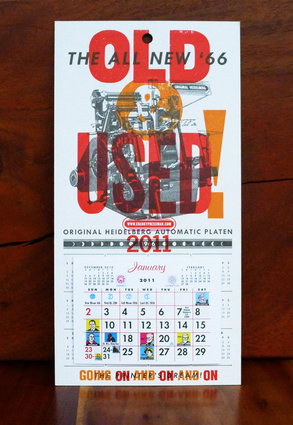
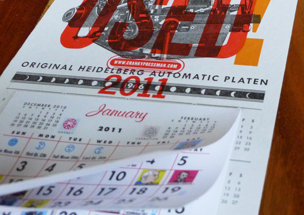
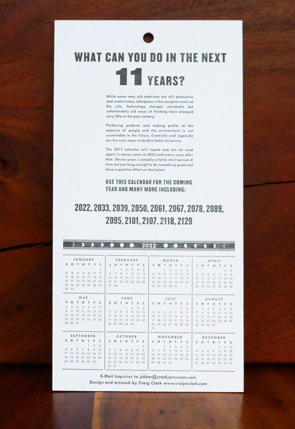
Did you know that you can reuse your calendars every two, six, eleven years—depending on the year… Anyways, turns out that Craig Clark figured this out and he wanted people to think about their lives in 11 year increments (given our 2011 status). What would they be doing 11 years from now or how will things be different? One thing that won’t change is the fundamentals of our industry—creativity, hard work, and ingenuity.
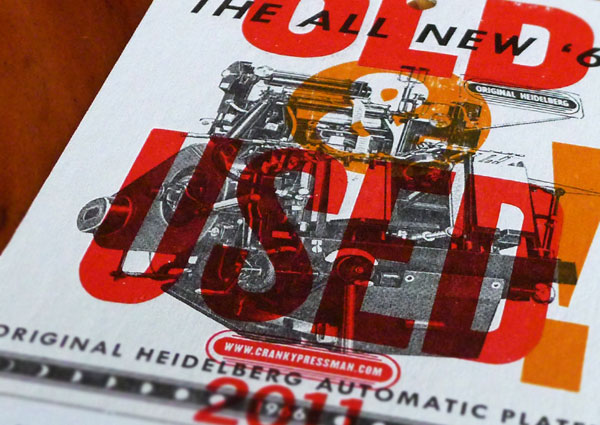
We put this calendar-recycling principle into practice by designing a faux-1966 Heidelberg printing press calendar and overprinted our 2011 messaging on top of it, complete with instructions on how they can reuse the calendar starting in 2022. We also phrased the messaging to remind you that Cranky Pressman’s always been old, used, and crotchety and will be for quite some time.
The entire project was mashup of old and new. A young designer worked online with a well-seasoned art director sharing ideas, images and files. Once a rough digital layout was agreed, it was sent to the letterpress printing shop where they pieced together several variations of the typography using available old wood and metal type. To find a vintage printing press image, Keith Berger, the cranky pressman, was asked to thumb through piles of old printer’s magazines that were in the shop. This did not make him happy. Once an image was found and agreed it was scanned at high resolution. Metal printing plates were made from digital files for the black copy and a final lock-up of the hand-set type was used for the red and orange production.
Old and new do work together.




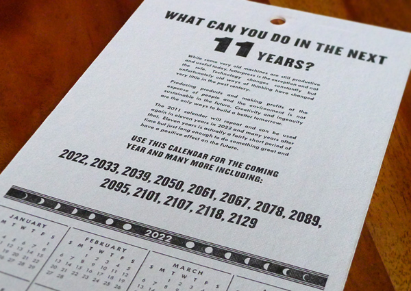
Cranky Pressman 2011 Calendar
Production Method
Design
Design: Craig Clark
Art direction: Cranky Pressman
Printing
Cranky Pressman
This post was published in the original layout of FPO so all images are smaller. Project descriptions as well as production lessons are quoted in the main content area.
Post Author
Bryony

Bryony Gomez-Palacio
Editor of FPO and co-founder of UnderConsideration LLC.
More: Online / On Twitter
Date Published
May 24, 2011
Filed Under
Self promotion
Tagged with
calendar
letterpress
mash-up
new
offset
old
PMS
self-promotion
uncoated
About
FPO (For Print Only), is a division of UnderConsideration, celebrating the reality that print is not dead by showcasing the most compelling printed projects.
FPO uses Fonts.com to render Siseriff and Avenir Next.
FPO is run with Six Apart’s MovableType
All comments, ideas and thoughts on FPO are property of their authors; reproduction without the author’s or FPO’s permission is strictly prohibited
Twitter @ucllc
Sign-up for Mailing List
Mailing list managed by MailChimp
Thanks to our advertisers
About UnderConsideration
UnderConsideration is a graphic design firm generating its own projects, initiatives, and content while taking on limited client work. Run by Bryony Gomez-Palacio and Armin Vit in Bloomington, IN. More…
blogs we publish
Brand New / Displaying opinions and focusing solely on corporate and brand identity work.
Art of the Menu / Cataloguing the underrated creativity of menus from around the world.
Quipsologies / Chronicling the most curious, creative, and notable projects, stories, and events of the graphic design industry on a daily basis.
products we sell
Flaunt: Designing effective, compelling and memorable portfolios of creative work.
Brand New Conference videos / Individual, downloadable videos of every presentation since 2010.
Prints / A variety of posters, the majority from our AIforGA series.
Other / Various one-off products.
events we organize
Brand New Conference / A two-day event on corporate and brand identity with some of today's most active and influential practitioners from around the world.
Brand Nieuwe Conference / Ditto but in Amsterdam.
Austin Initiative for Graphic Awesomeness / A speaker series in Austin, TX, featuring some of the graphic design industry's most awesome people.
also
Favorite Things we've Made / In our capacity as graphic designers.
Projects we've Concluded / Long- and short-lived efforts.
UCllc News / Updates on what's going at the corporate level of UnderConsideration.




Related entries
E.A.S.E. Stationery Set
End of Work iPad and Notebook Cases
Cranky Bucks Promotion
Pizza Box Promo Mailer
Bryan Patrick Todd Mailer