ADV @ UNDERCONSIDERATION Peek here for details
BROWSE
Client
Self-promotion
Quantity Produced
500
Production Cost
–
Production Time
1 month
Dimensions (Width × Height × Depth)
Catalog: 75 in × 10 in
Belly Band: 13.25 in × 4.75 in
Folds To: 6.625 in × 4.25 in
Page Count
32p
12 panel gatefold insert
Paper Stock
Cover: Cougar Natural, 80lb
Text: Lynx Opaque, 80lb
Insert: #2 Starbrite, 80lb
Number of Colors
–
Varnishes
–
Binding
–
Typography
Barbedor by Hans Eduard Meier
Galaxie Polaris by Chester Jenkins
Gill Sans Ultrabold by Eric Gill
Challenge by Martin Wait
Inspiration doesn’t lie. It’s often the ignition for the mechanics of a project. Pulling ideas from other places and filtering them through your own lens gives a certain richness to the work. There are several moments in this project that are so clever you can’t help but smirk. Looks super fun to thumb over.
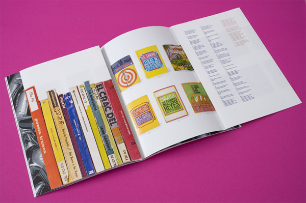
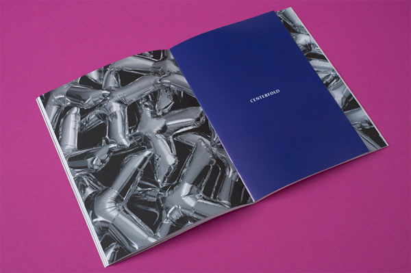
The impetus for the project came initially from some fantastic book covers I stumbled upon during a visit to Cuba a few years ago. They were from the 60s and 70s and I really hadn’t seen anything like them. I took some quick shots of the books and forgot about them for a long time. Rediscovering these images some time later, I thought about how much I’d like to share this work and learn more about its origins — aside from Cuban poster design, there is just very little information available about Cuban design and I thought that was a shame. The initial interest in disseminating these covers (which were eventually published as a centerfold in Gratuitous Type), coupled with a deep-rooted love of editorial design led me to the idea of publishing something on my own.
At the same time, I’ve been seeing all these great and thoughtful design publications coming out of Europe (and even Australia), but less in the United States aside from the very big players like Print and How. I wanted to do something a little less serious, a little more understated, and a little more focused and personal and this is when I really started to think seriously about publishing Gratuitous Type, which I started to affectionately refer to as a “pamphlet of typographic smut.” The idea behind this is that it’s a bit of fun, of type for type’s sake — for the love of design and magazine-making (and print!) — and, unashamedly, a bit of design porn.
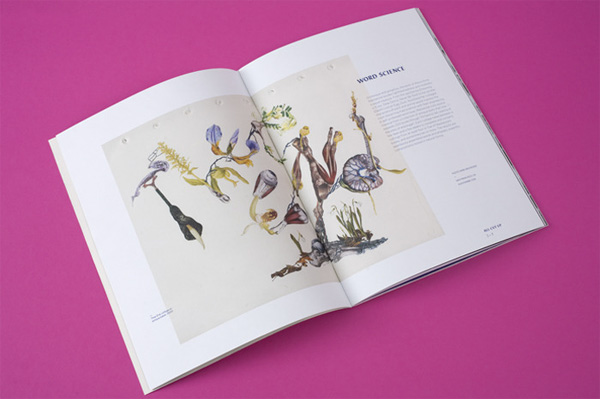
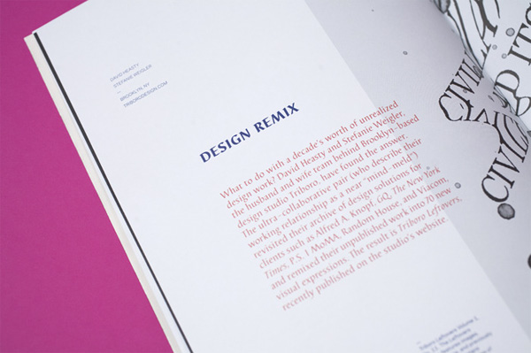
With the help of Chris Young at Westcan I choose uncoated stocks that were weighty, but tactile and welcoming. For my design, I developed a strict, but extremely flexible grid that allowed me to reconfigure the editorial elements on each page so that every spread felt fresh. I selected quirky typefaces that complemented each other and the work featured. Barbedor felt like a really out there choice at first, but it was so unexpected (especially when paired with Gill Sans Ultrabold and Galaxie Polaris) and I just loved that. I tried to make choices that would underscore the editorial approach of the magazine: quirky, nothing too serious or precious. I think that represents me as a designer as well and that was important considering this is a self-initiated piece.
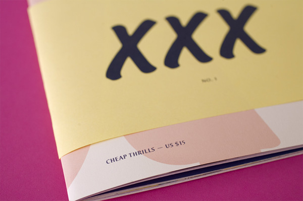
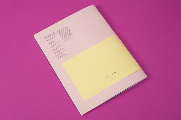
From the beginning I wanted to play off of the idea of pornography and use a belly band to “censor” the large letter published on the cover. I think details like that are what make this magazine special and I’m looking forward to playing with other forms for future incarnations of the publication.
Initially I really wanted to challenge some of the conventions of editorial design and formats by producing one long accordion-folded publication. I was so excited about this, but most printers can only print on a sheet of paper about 40” wide and I was looking to do something at least 3 or 4 times in length, before it was folded. I found a few people nearby who could do it, but the quotes were insane: one was for $15,000 and it was just too much to dump into a personal project. I did find one printer in China who was affordable, but felt that for this first issue I wanted to stay within the continent and work with people I really trusted to guide me through the process so I settled on a more traditional format and worked through my ideas with Chris Young at Westcan.
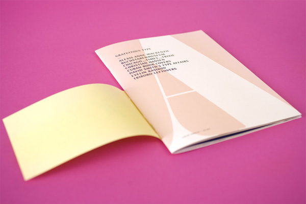
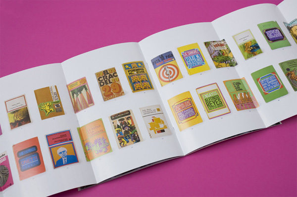
Although it’s quite a different result, I decided to modify the fold out idea and use this for the gatefold insert, which features those Cuban book covers I mentioned. I think those book covers work so well as a group, you just get such a great sense of the designers’ fearless use of color and I loved the idea of being able to see all these covers on one sheet of paper so it just made sense. I wanted the gatefold to fold out twice, but again, I ran into some limitations with available paper length (40”) until Chris suggested that we reduce the width of the folded insert by an inch, allowing us to fit six folded panels onto a sheet instead of 4 or 5. A brilliant suggestion. I went with a coated stock here to change up the physical feeling of the piece, and so that you’d really notice the difference as you were flipping through the issue.
Another interesting challenge was the belly band. Chris was only able to bind it onto the magazine if it were to sit flush with the top of the publication and I really wanted it to wrap at a very specific location around the middle of the cover. He suggested I attach the belly bands myself with a few glue dots and this suggestion has turned out fantastically. I was nervous to do it myself, but it’s proven to be quite easy. The rest of the magazine was printed offset, but the belly bands were done digitally, which was much more cost-effective — instead of $800 for it was only $190. A pretty small price for something that has really enhanced the magazine.
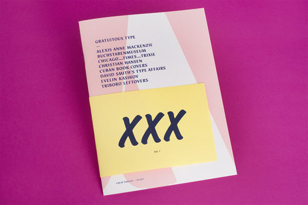



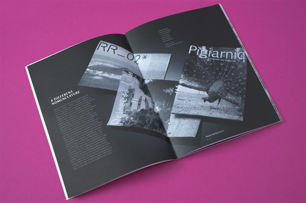






Gratuitous Type Magazine
Production Method
Design
Elana Schlenker
Printing
Chris Young at Westcan Print Group
This post was published in the original layout of FPO so all images are smaller. Project descriptions as well as production lessons are quoted in the main content area.
About
FPO (For Print Only), is a division of UnderConsideration, celebrating the reality that print is not dead by showcasing the most compelling printed projects.
FPO uses Fonts.com to render Siseriff and Avenir Next.
FPO is run with Six Apart’s MovableType
All comments, ideas and thoughts on FPO are property of their authors; reproduction without the author’s or FPO’s permission is strictly prohibited
Twitter @ucllc
Sign-up for Mailing List
Mailing list managed by MailChimp
Thanks to our advertisers
About UnderConsideration
UnderConsideration is a graphic design firm generating its own projects, initiatives, and content while taking on limited client work. Run by Bryony Gomez-Palacio and Armin Vit in Bloomington, IN. More…
blogs we publish
Brand New / Displaying opinions and focusing solely on corporate and brand identity work.
Art of the Menu / Cataloguing the underrated creativity of menus from around the world.
Quipsologies / Chronicling the most curious, creative, and notable projects, stories, and events of the graphic design industry on a daily basis.
products we sell
Flaunt: Designing effective, compelling and memorable portfolios of creative work.
Brand New Conference videos / Individual, downloadable videos of every presentation since 2010.
Prints / A variety of posters, the majority from our AIforGA series.
Other / Various one-off products.
events we organize
Brand New Conference / A two-day event on corporate and brand identity with some of today's most active and influential practitioners from around the world.
Brand Nieuwe Conference / Ditto but in Amsterdam.
Austin Initiative for Graphic Awesomeness / A speaker series in Austin, TX, featuring some of the graphic design industry's most awesome people.
also
Favorite Things we've Made / In our capacity as graphic designers.
Projects we've Concluded / Long- and short-lived efforts.
UCllc News / Updates on what's going at the corporate level of UnderConsideration.




Related entries
Elbow Grease Magazine
Best of Local Magazine
nomad Magazine
ARCMTL + LA SERRES - Objets flottants Arts vivants Edition
Unfiltered Magazine