ADV @ UNDERCONSIDERATION Peek here for details
BROWSE
Client
Andy & Liz Luce
Quantity Produced
Roughly 300 of each piece, 1,200 pieces total
Production Cost
$400
Production Time
3 days
Dimensions (Width × Height × Depth)
Invitations: 12 in × 19 in
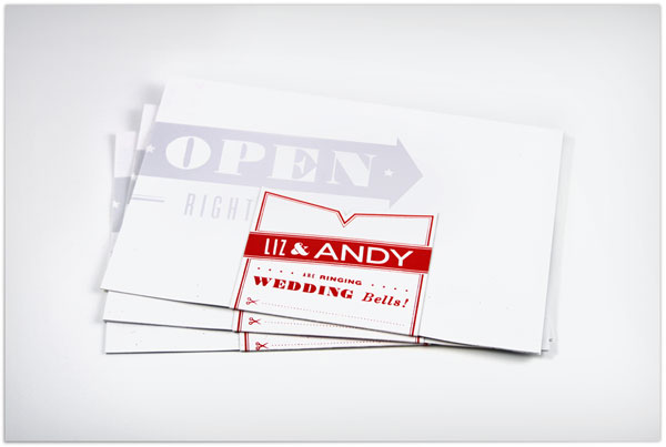
Postcard: 3 in × 5 in
Envelope: 6 in × 9 in
Page Count
–
Paper Stock
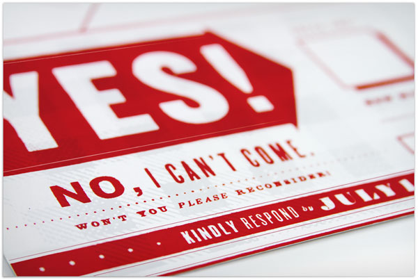
French Paper Starch White, 80 lb text and 100 lb cover
Number of Colors
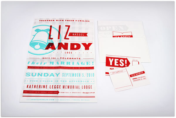
Invitation and Poster: 3
Seals: 1
RSVP Postcard: 1
Varnishes
–
Binding
–
Typography
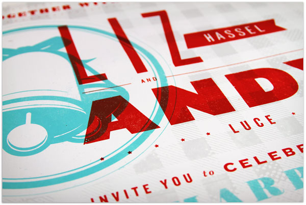
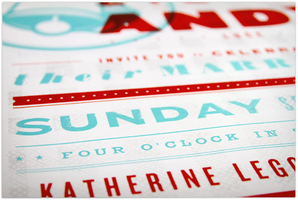
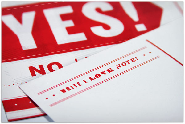
Knockout by Hoefler & Frere-Jones, and other vintage inspired typefaces.
What a beautiful way to give reverence to a truly bold moment in print history. Excuse my pun, but the marriage of vintage type and imagery was inimitably forged during the 1930s. The conglomeration of shapes and colors make this wedding look like a party, which is what every wedding should be. Also, this combination of colors is one of my favorite. Turqoise with coxcomb red. So lovely.
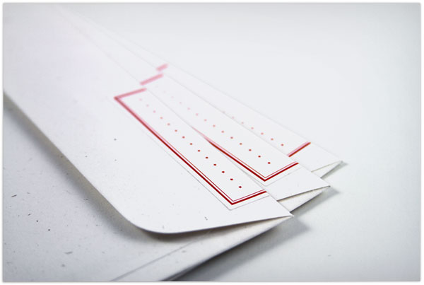
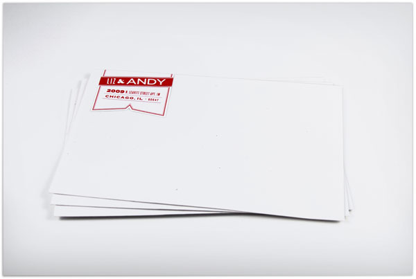
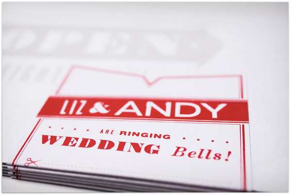
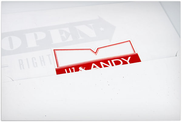
I got married! For our wedding invitations, I designed them to capture and pay homage to the playbills and newspapers of the 1930s and 40s. Our color palette was based off 30s cigarette packaging. The invitation itself was printed oversize, to tangibly feel like the era, and match the vintage time-period we were drawn to for the wedding.
It was all about time and managing it efficiently. I absolutely went above and beyond what I’d originally planned, in a good way, so when it came time to score and trim the seals for the invitations it was insanity! I did learn countless healthy lessons, from printing 2, 4 and sometimes 20 up per print per paper (saving on printing time), to the appropriate way to approach literally so much type per screen. Since everything was done by hand, it came down to folding, trimming and assembling — all taking man hours. I absolutely became a more efficient printer through the experience. It was wonderful having a supportive fiancee through the whole project, when inevitable curveballs were tossed my way.










Andy & Liz Wedding Invitation
Production Method
Design
Visual Armory: AndyLluce
Printing
Andy Luce at Spudnik Press
This post was published in the original layout of FPO so all images are smaller. Project descriptions as well as production lessons are quoted in the main content area.
Post Author
Lauren Dickens

Lauren Dickens
Former intern at UnderConsideration LLC.
More: Online / On Twitter
Date Published
March 23, 2011
Filed Under
Wedding materials
Tagged with
blue
DIY
french paper
red
silkscreen
wedding invitation
About
FPO (For Print Only), is a division of UnderConsideration, celebrating the reality that print is not dead by showcasing the most compelling printed projects.
FPO uses Fonts.com to render Siseriff and Avenir Next.
FPO is run with Six Apart’s MovableType
All comments, ideas and thoughts on FPO are property of their authors; reproduction without the author’s or FPO’s permission is strictly prohibited
Twitter @ucllc
Sign-up for Mailing List
Mailing list managed by MailChimp
Thanks to our advertisers
About UnderConsideration
UnderConsideration is a graphic design firm generating its own projects, initiatives, and content while taking on limited client work. Run by Bryony Gomez-Palacio and Armin Vit in Bloomington, IN. More…
blogs we publish
Brand New / Displaying opinions and focusing solely on corporate and brand identity work.
Art of the Menu / Cataloguing the underrated creativity of menus from around the world.
Quipsologies / Chronicling the most curious, creative, and notable projects, stories, and events of the graphic design industry on a daily basis.
products we sell
Flaunt: Designing effective, compelling and memorable portfolios of creative work.
Brand New Conference videos / Individual, downloadable videos of every presentation since 2010.
Prints / A variety of posters, the majority from our AIforGA series.
Other / Various one-off products.
events we organize
Brand New Conference / A two-day event on corporate and brand identity with some of today's most active and influential practitioners from around the world.
Brand Nieuwe Conference / Ditto but in Amsterdam.
Austin Initiative for Graphic Awesomeness / A speaker series in Austin, TX, featuring some of the graphic design industry's most awesome people.
also
Favorite Things we've Made / In our capacity as graphic designers.
Projects we've Concluded / Long- and short-lived efforts.
UCllc News / Updates on what's going at the corporate level of UnderConsideration.




Related entries
Herbst & Spungen Wedding Invitation Suite
Erin and Brian Wedding Invitation
Daniela & Rui Wedding Invitation
Benjamin & Catalina Wedding Announcement
Devon & Mike Wedding Invitation