ADV @ UNDERCONSIDERATION Peek here for details
BROWSE
Dimensions (Width × Height × Depth)
150 mm (5.9 in) × 100 mm (9.93 in)
Page Count
260
Paper Stock
Color pages: 95gsm gloss art
Text pages: 95gsm woodfree
Number of Colors
CMYK + clear foil on cover
Varnishes
–
Binding
Section sewn perfect binding
Typography
Biographer
Minion
Don’t you just love a small book? The kind that fits in your pocket, even if you never actually put in in your pocket? For me, these books fall into two categories: the fun and quirky, or the dark and mysterious. This project falls in the latter category.
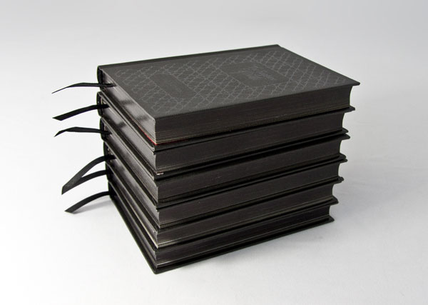
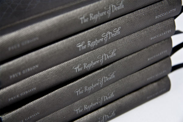
Prue Gibson’s writing is like a 19th century essay. It is an opinion piece and comment on death and contemporary art. With funding from Australia Council to produce the book, Prue came to Boccalatte wanting to produce something small and unique—we felt that it had to be precious and small like a prayer book or a missal. The ribbon, the emboss and the black edges completed the picture.
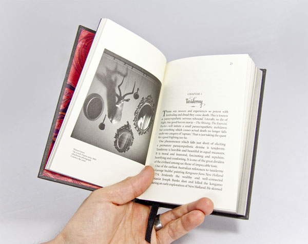
This unusual art book is a philosophical enquiry into the use of deathly imagery in contemporary art. It explores art, literature, film and history to investigate why fear of death is an intrinsic part of life. It is after all, our deepest fear and behind everything we do. Death drives us in life.
The book was to be a sacred book. A prayer book. Something that would feel good in the hand.
The lovely irony is that we wanted to make an object that in itself is threatened with extinction in the 21st century. The book. Technology is making the book in fear of it’s own life. But we believe and have said this many times before, the more we immerse in technology, the more we crave the experiential, the sensual, the tactile. While technology is fine, the pleasure of holding at a book or looking at a work of art will not go away. We crave the personal, sensual and private spaces and that is what makes us human.
Bring back the sensual. Engage people. Create desire for people to touch. So that when we receive something like a book �” we need to seduce and surprise. Giving us a chance to stop and pause … to experience and perceive.
Even small books can come with big production issues, and a lot was learned while attempting something new.
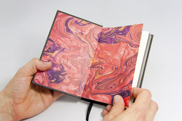
Trying to make end papers by oil marbling in the studio is hard and messy. Almost impossible. Well was impossible. Give yourself time and do research. Looking back, I think our failed marbling attempt was because we used oil based paint mixed with turpentine. In hindsight, we should of just used proper marbling ink!
Finally, check pages when you are working with sections with plates. It can affect the whole job if you get the sections wrong. Always ask for an imposition from the printer.




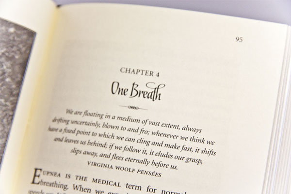

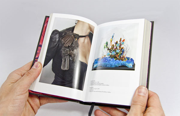

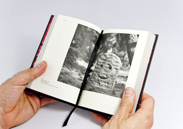
The Rapture of Death Book
Production Method
Design
Boccalatte: Suzanne Boccalatte
Printing
Spitting Image
This post was published in the original layout of FPO so all images are smaller. Project descriptions as well as production lessons are quoted in the main content area.
Post Author
Bryony

Bryony Gomez-Palacio
Editor of FPO and co-founder of UnderConsideration LLC.
More: Online / On Twitter
Date Published
February 14, 2011
Filed Under
Books
Tagged with
book
CMYK
coated
foil
marbleized
offset
perfect bound
ribbon
uncoated
About
FPO (For Print Only), is a division of UnderConsideration, celebrating the reality that print is not dead by showcasing the most compelling printed projects.
FPO uses Fonts.com to render Siseriff and Avenir Next.
FPO is run with Six Apart’s MovableType
All comments, ideas and thoughts on FPO are property of their authors; reproduction without the author’s or FPO’s permission is strictly prohibited
Twitter @ucllc
Sign-up for Mailing List
Mailing list managed by MailChimp
Thanks to our advertisers
About UnderConsideration
UnderConsideration is a graphic design firm generating its own projects, initiatives, and content while taking on limited client work. Run by Bryony Gomez-Palacio and Armin Vit in Bloomington, IN. More…
blogs we publish
Brand New / Displaying opinions and focusing solely on corporate and brand identity work.
Art of the Menu / Cataloguing the underrated creativity of menus from around the world.
Quipsologies / Chronicling the most curious, creative, and notable projects, stories, and events of the graphic design industry on a daily basis.
products we sell
Flaunt: Designing effective, compelling and memorable portfolios of creative work.
Brand New Conference videos / Individual, downloadable videos of every presentation since 2010.
Prints / A variety of posters, the majority from our AIforGA series.
Other / Various one-off products.
events we organize
Brand New Conference / A two-day event on corporate and brand identity with some of today's most active and influential practitioners from around the world.
Brand Nieuwe Conference / Ditto but in Amsterdam.
Austin Initiative for Graphic Awesomeness / A speaker series in Austin, TX, featuring some of the graphic design industry's most awesome people.
also
Favorite Things we've Made / In our capacity as graphic designers.
Projects we've Concluded / Long- and short-lived efforts.
UCllc News / Updates on what's going at the corporate level of UnderConsideration.




Related entries
Severe(d): A Creepy Poetry Collection by Holly Riordan
BOYCO Classpack® Book
Antes de Perder la Esperanza Book
Gunnel Wåhlstrand Exhibit Book
Szép versek & Körkép Book Covers