ADV @ UNDERCONSIDERATION Peek here for details
BROWSE
Client
Texas State Health Information Technology Program
Quantity Produced
2500
Production Cost
$4,300
Production Time
1week
Dimensions (Width × Height × Depth)
Folded: 4 in × 4in
Flat: 9.75 in × 9.75 in
Page Count
–
Paper Stock
Curious Metallic Ice Gold
Number of Colors
5/5: PMS 368, 638, 1585, Cool gray 7, and black
Varnishes
–
Binding
–
Typography
Myriad Pro
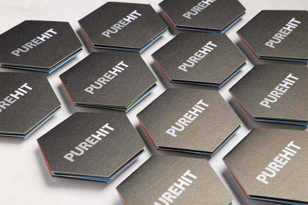
There is something to be said for small fit-in-your-hand brochures that pop amongst the shiniest and flashiest. And when such pieces of design include simple typography, cool colors, well-done graphics and nice printing it is rather likely that I will pocket it for my growing collection.
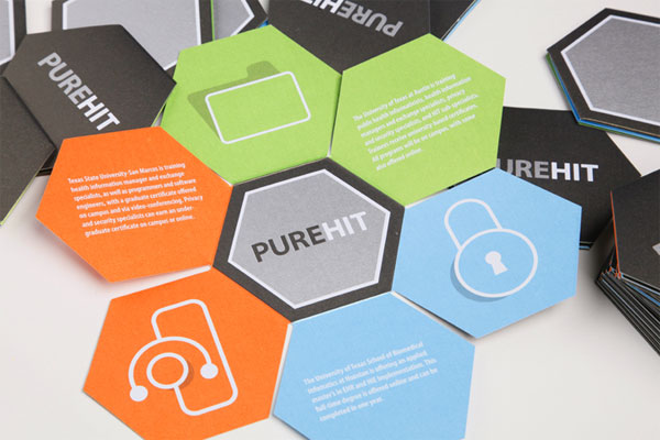
This brochure had to communicate the three universities participating in a PUREHIT consortium. The consortium produces professionals in health information technology and each university has a specific program focus (i.e. education, advancement, & technology).
Health, as in nature, is a system of balances. Enjoying the natural beauty walking around the ponds on campus I found inspiration for the brochure. I wanted to use highly efficient shapes found in nature. A little research lead me to the hexagon shape. When the shape is paired with icons and other elements it connotes technology. Additional pieces in the system used the hexagon shape as a graphic element unifying the system.
Creating the hexagon brochure wasn’t all that hard. Several mockups were used to get the sizing down. Each Hexagon shape in the brochure is roughly 1/32 in smaller than the next, allowing it close properly. The one thing I didn’t account for was the thickness of the layered stock. In order to lay flat, the top hexagon should have included an extra bit to accommodate the layers below. This detail however minor is one I would change if I did it over again.


Texas State Health Information Technology Program Brochure
Production Method
Design
Art Direction: Julie Babler
Writing: Mary Love Bigony
Design: Hoyt Haffelder
Printing
Capital Printing
This post was published in the original layout of FPO so all images are smaller. Project descriptions as well as production lessons are quoted in the main content area.
Post Author
Bryony

Bryony Gomez-Palacio
Editor of FPO and co-founder of UnderConsideration LLC.
More: Online / On Twitter
Date Published
January 11, 2011
Filed Under
Brochures
Tagged with
brochure
curious paper
fold
metallic paper
offset
PMS
About
FPO (For Print Only), is a division of UnderConsideration, celebrating the reality that print is not dead by showcasing the most compelling printed projects.
FPO uses Fonts.com to render Siseriff and Avenir Next.
FPO is run with Six Apart’s MovableType
All comments, ideas and thoughts on FPO are property of their authors; reproduction without the author’s or FPO’s permission is strictly prohibited
Twitter @ucllc
Sign-up for Mailing List
Mailing list managed by MailChimp
Thanks to our advertisers
About UnderConsideration
UnderConsideration is a graphic design firm generating its own projects, initiatives, and content while taking on limited client work. Run by Bryony Gomez-Palacio and Armin Vit in Bloomington, IN. More…
blogs we publish
Brand New / Displaying opinions and focusing solely on corporate and brand identity work.
Art of the Menu / Cataloguing the underrated creativity of menus from around the world.
Quipsologies / Chronicling the most curious, creative, and notable projects, stories, and events of the graphic design industry on a daily basis.
products we sell
Flaunt: Designing effective, compelling and memorable portfolios of creative work.
Brand New Conference videos / Individual, downloadable videos of every presentation since 2010.
Prints / A variety of posters, the majority from our AIforGA series.
Other / Various one-off products.
events we organize
Brand New Conference / A two-day event on corporate and brand identity with some of today's most active and influential practitioners from around the world.
Brand Nieuwe Conference / Ditto but in Amsterdam.
Austin Initiative for Graphic Awesomeness / A speaker series in Austin, TX, featuring some of the graphic design industry's most awesome people.
also
Favorite Things we've Made / In our capacity as graphic designers.
Projects we've Concluded / Long- and short-lived efforts.
UCllc News / Updates on what's going at the corporate level of UnderConsideration.


Related entries
Carta de Exploración Brochure
Paperless Post Wedding 2017 Promotion
Karipidis Winery Brochure
Neenah “Fresh Takes on Classic Type on CLASSIC® Papers” Promo
Faculty of Architecture, Art & Design Brochure