ADV @ UNDERCONSIDERATION Peek here for details
BROWSE
Client
Lan Su Chinese Garden
Quantity Produced
100,000
Production Cost
$39,000
Production Time
4 weeks
Dimensions (Width × Height × Depth)
5 in × 7.5 in
Page Count
12 + cover
Paper Stock
Cover: Classic Crest 80 lb cover, Saw Grass
Interior: Cougar Opaque 80 lb text
Number of Colors
CMYK + 2 spot inks
Varnishes
–
Binding
Saddle stitch
Typography
Hand-lettered
CG Geometric Bold
LHF Garner
Hightower
AT Handle Oldstyle
Communicating with a large group of people is not easy, which is why designers can turn to information graphics to help them deliver the necessary information in ways that can cross barriers such as language and culture.
Designing a new visitor guide for the Lan Su Chinese Garden in Portland, Oregon involved learning about Chinese culture, finding production techniques that worked hard for the money and reinforced the Garden’s purpose, and of course many trips to the Tea House to gaze out upon Lake Zither and ponder one’s existence.
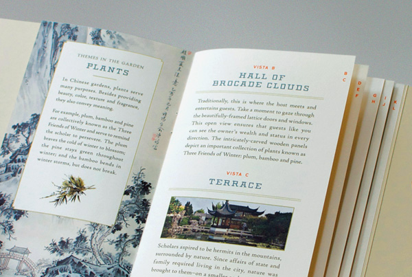
At first glance, the cover has a die-cut window that frames original Chinese scroll artwork and the phrase “Enter the Wonderland”, which is the inscription on the first doorway inside the garden - all cues that the visitor is stepping into another worldview; one that places emphasis on nature to find true meaning. Throughout the guide, specific items such as the bat-shaped tiles and the Lake Tai rocks were illustrated to help visitors identify and understand the purpose behind the individual elements in the garden. Chinese inscriptions were translated to reinforce the use of poetry, and certain pages call out major themes universal to Chinese Gardens.
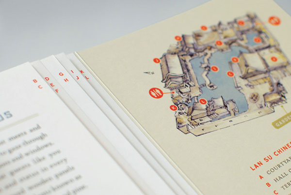
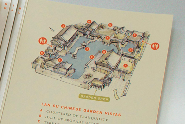
Keeping people oriented in the space was very important, since the garden is a labyrinth both physically and conceptually. A birds eye view map was created to make sure visitors didn’t feel lost and were easily able to explore every nook and cranny of the garden without having a linear path to follow. Key ‘vistas’ could easily be found on the tiered index-style pages, while the map is located on a flap that can always be at the ready without having to flip through the guide. The guide is on the small side so it could easily be put in a purse or be held by a single hand.
Part way through the design process the guide was tested in the garden with visitors to make sure it was both functional and informational. Since rolling out the guide and other collateral for the Garden’s 10th Anniversary Celebration, Lan Su visitors’ comments have been overwhelmingly positive.
If you haven’t had enough of the nicely muted color scheme, and the poetic catchphrases, you can watch a short video of the brochure, which also gives you a sense of proportion.
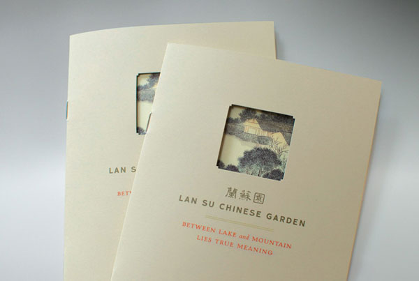

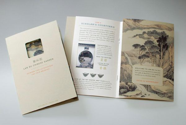

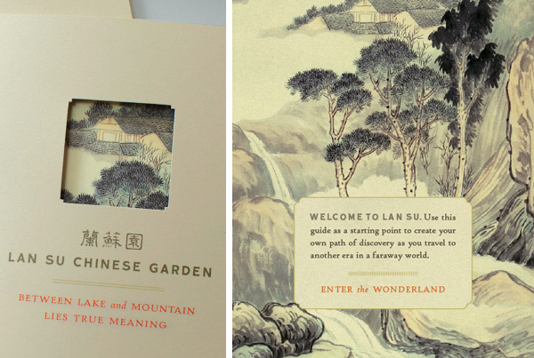

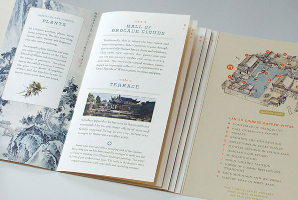



Lan Su Visitor Guide
Production Method
Design
Sockeye Creative
Creative Director: Peter Metz
Account Director: Erin O'Brien
Production Manager: Shellie Anderson
Writing: Norm Sajovie
Design: Bureau of Betterment
Printing
Brown Printing
This post was published in the original layout of FPO so all images are smaller. Project descriptions as well as production lessons are quoted in the main content area.
About
FPO (For Print Only), is a division of UnderConsideration, celebrating the reality that print is not dead by showcasing the most compelling printed projects.
FPO uses Fonts.com to render Siseriff and Avenir Next.
FPO is run with Six Apart’s MovableType
All comments, ideas and thoughts on FPO are property of their authors; reproduction without the author’s or FPO’s permission is strictly prohibited
Twitter @ucllc
Sign-up for Mailing List
Mailing list managed by MailChimp
Thanks to our advertisers
About UnderConsideration
UnderConsideration is a graphic design firm generating its own projects, initiatives, and content while taking on limited client work. Run by Bryony Gomez-Palacio and Armin Vit in Bloomington, IN. More…
blogs we publish
Brand New / Displaying opinions and focusing solely on corporate and brand identity work.
Art of the Menu / Cataloguing the underrated creativity of menus from around the world.
Quipsologies / Chronicling the most curious, creative, and notable projects, stories, and events of the graphic design industry on a daily basis.
products we sell
Flaunt: Designing effective, compelling and memorable portfolios of creative work.
Brand New Conference videos / Individual, downloadable videos of every presentation since 2010.
Prints / A variety of posters, the majority from our AIforGA series.
Other / Various one-off products.
events we organize
Brand New Conference / A two-day event on corporate and brand identity with some of today's most active and influential practitioners from around the world.
Brand Nieuwe Conference / Ditto but in Amsterdam.
Austin Initiative for Graphic Awesomeness / A speaker series in Austin, TX, featuring some of the graphic design industry's most awesome people.
also
Favorite Things we've Made / In our capacity as graphic designers.
Projects we've Concluded / Long- and short-lived efforts.
UCllc News / Updates on what's going at the corporate level of UnderConsideration.




Related entries
Carta de Exploración Brochure
Paperless Post Wedding 2017 Promotion
Karipidis Winery Brochure
Neenah “Fresh Takes on Classic Type on CLASSIC® Papers” Promo
Faculty of Architecture, Art & Design Brochure