ADV @ UNDERCONSIDERATION Peek here for details
BROWSE
Dimensions (Width × Height × Depth)
5 in × 7 in
Page Count
5
Paper Stock
100 lb. Uncoated Finch Fine
Number of Colors
Package: 3 spot inks
Cards: 2 spot inks
Varnishes
–
Binding
–
Typography
Komika Axis, DINOT
Doodles and squiggles lead to design solutions, in the same way that creative exploration can lead to actual projects. Shaun Malinowski, an illustrative designer, loves to silkscreen in the same way you like to doodle.
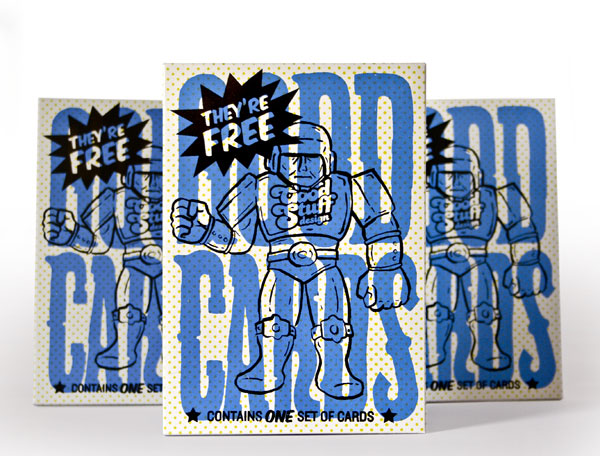
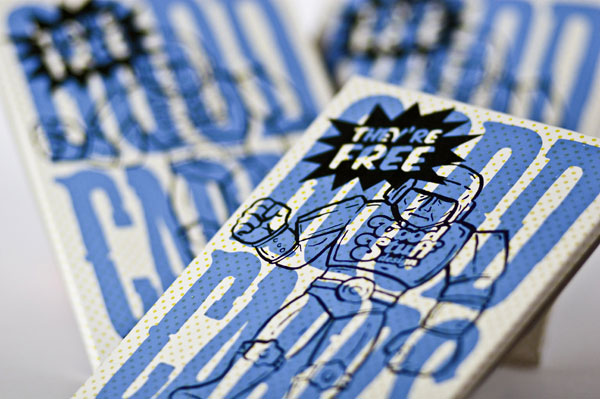
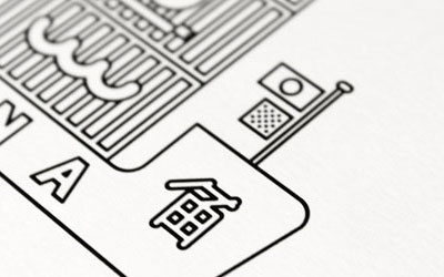
The “Good Cards” came about one day when I was creating a 7in × 5-inch illustration that I intended to silkscreen (the “tastes good” card). I loved the irony of what was unfolding with the illustration and type. And, through the craziness of the creative process, my mind took off thinking about all sorts of images combined with unique sayings. The final goal ended up being a set of five cards that all relate to the idea of word “good”—tastes good, smells good, feels good, looks good, good stuff design. I thought this could be a great way to showcase my illustration, design and printing skills all rolled into one tasty bite for potential new clients—art/creative directors and select new businesses.
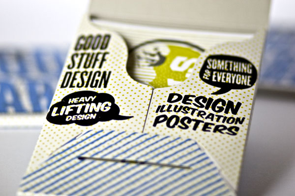
So, thinking that it would be a bit lame to just send the card by themselves, I thought I’d find a nice paper packaging to slide them into. A buddy turned me on to Stumptown Printers. Stumptown offers a pretty slick pre-cut blank product that you can print yourself. I found a precut blank paper fold up that I could use that fit the cards perfectly. The final mailed out product consisted of the packaging with 5 cards, and a business card shrink wrapped and put into a mailing sleeve.
I asked Shaun for some tips on silkscreening on your own, based on his experience, and this is what he had to share:
The best tips I can give are to make sure your screens have a nice crisp exposure on them. I don’t use a press with my screens so registration becomes pretty important. Registration marks are a definite must! Another loophole that I use is that when I create my artwork I plan on it overlapping (like hitting multiply in photoshop). That way, if you’re slightly off, the print isn’t ruined and still looks great!




Good Stuff Design Good Cards
Production Method
Design
Good Stuff Design: Shaun Malinowski
Printing
Good Stuff Design: Shaun Malinowski
This post was published in the original layout of FPO so all images are smaller. Project descriptions as well as production lessons are quoted in the main content area.
Post Author
Bryony

Bryony Gomez-Palacio
Editor of FPO and co-founder of UnderConsideration LLC.
More: Online / On Twitter
Date Published
August 9, 2010
Filed Under
Promotional Cards
Tagged with
card
DIY
envelope
finch fine
self-promotion
silkscreen
uncoated
About
FPO (For Print Only), is a division of UnderConsideration, celebrating the reality that print is not dead by showcasing the most compelling printed projects.
FPO uses Fonts.com to render Siseriff and Avenir Next.
FPO is run with Six Apart’s MovableType
All comments, ideas and thoughts on FPO are property of their authors; reproduction without the author’s or FPO’s permission is strictly prohibited
Twitter @ucllc
Sign-up for Mailing List
Mailing list managed by MailChimp
Thanks to our advertisers
About UnderConsideration
UnderConsideration is a graphic design firm generating its own projects, initiatives, and content while taking on limited client work. Run by Bryony Gomez-Palacio and Armin Vit in Bloomington, IN. More…
blogs we publish
Brand New / Displaying opinions and focusing solely on corporate and brand identity work.
Art of the Menu / Cataloguing the underrated creativity of menus from around the world.
Quipsologies / Chronicling the most curious, creative, and notable projects, stories, and events of the graphic design industry on a daily basis.
products we sell
Flaunt: Designing effective, compelling and memorable portfolios of creative work.
Brand New Conference videos / Individual, downloadable videos of every presentation since 2010.
Prints / A variety of posters, the majority from our AIforGA series.
Other / Various one-off products.
events we organize
Brand New Conference / A two-day event on corporate and brand identity with some of today's most active and influential practitioners from around the world.
Brand Nieuwe Conference / Ditto but in Amsterdam.
Austin Initiative for Graphic Awesomeness / A speaker series in Austin, TX, featuring some of the graphic design industry's most awesome people.
also
Favorite Things we've Made / In our capacity as graphic designers.
Projects we've Concluded / Long- and short-lived efforts.
UCllc News / Updates on what's going at the corporate level of UnderConsideration.




Related entries
“Miniature Views” Promotion
Suspicion
Gap Semester Adventure Quest Folder
MONSTERBOX 150 Illustrated Monster Cards
I AM STERN Laser cut folding banner for NYU