ADV @ UNDERCONSIDERATION Peek here for details
BROWSE
Dimensions (Width × Height × Depth)
26 in × 20 in
Page Count
2 layer poster
Paper Stock
Cougar 80 lb Text and Cougar 100 lb Cover
Number of Colors
Silkscreen: 2 Spot
Inkjet: CMYK
Occasionally we stumble upon a project that is so different from the rest within its category that we just stare. And then we ask lots of questions, and eagerly await the email that will answer our queries. Such is the case with this poster created by a group of friends under the name Excuses Design Collective. There are so many details that I want to share with you, that I am simply posting the email I received from them:
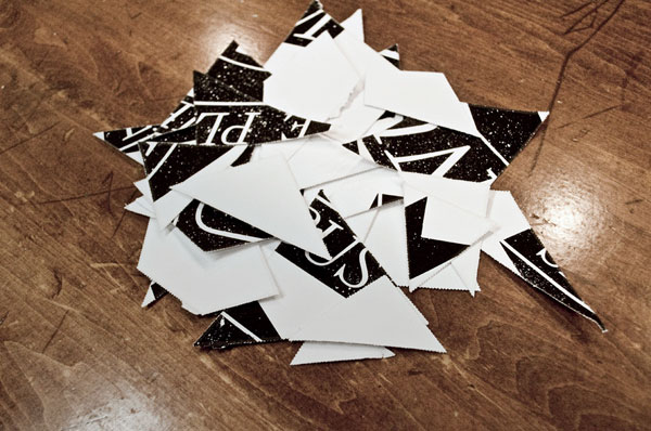
We were invited by Yosi Sergant to create work for the Manifest Equality gallery show that took place in Los Angeles in March 2010. Manifest Equality is a call to action to stand up against discriminatory legislation in the United States. Though Manifest Equality focused specifically on anti same sex marriage legislation, a broader approach was taken with this piece. Anti same sex marriage laws are not just a “gay issue,” but a human rights issue. The top layer features the Latin phrase “e pluribus unum” meaning “out of many, one.” The phrase was adopted by the United States in the late 1700s to represent the unification of the colonies and has since come to represent the melting pot metaphor. However, the antiquated phrase celebrates assimilation rather than diversity. The perforated top layer invites viewers to break down dated thinking to reveal lines of many colors that converge into a singular form. The lines create the word “one,” while maintaining their individual identities.
We wanted to create something that allowed physical interaction between the viewers and the work in order to symbolize how taking action can bring change. The E Pluribus Unum ribbon on the top layer was inspired by the ribbon in the Presidential Seal of the United States, which can also be seen on most American money. The bottom layer was inspired by the rainbow flag that is used in many different cultures to represent diversity. The flag is also widely recognized as a symbol of LGBT pride in the United States.
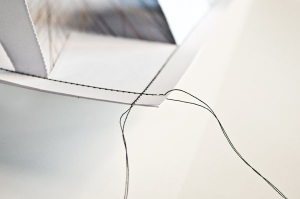
Producing the poster was rather challenging in general. We screen printed two colors and perforated the the top sheet with diagonal lines. We used baby powder to stop out the black ink, giving the ribbon a distressed quality, which worked out pretty well and made each run slightly different. We were originally going to screen print both layers, but printing a six-color rainbow split fountain for the bottom layer proved to be a bit more difficult than we thought it would be. So, we ended up producing the bottom layer digitally, which allowed us to really push the idea of diversity that we wanted to achieve by using thousands of different colors.
So there you have it folks, layers, baby powder, tearing, of-the-moment solutions, metaphors… a lot of thinking, and a lot of doing for a good cause with an awesome outcome.
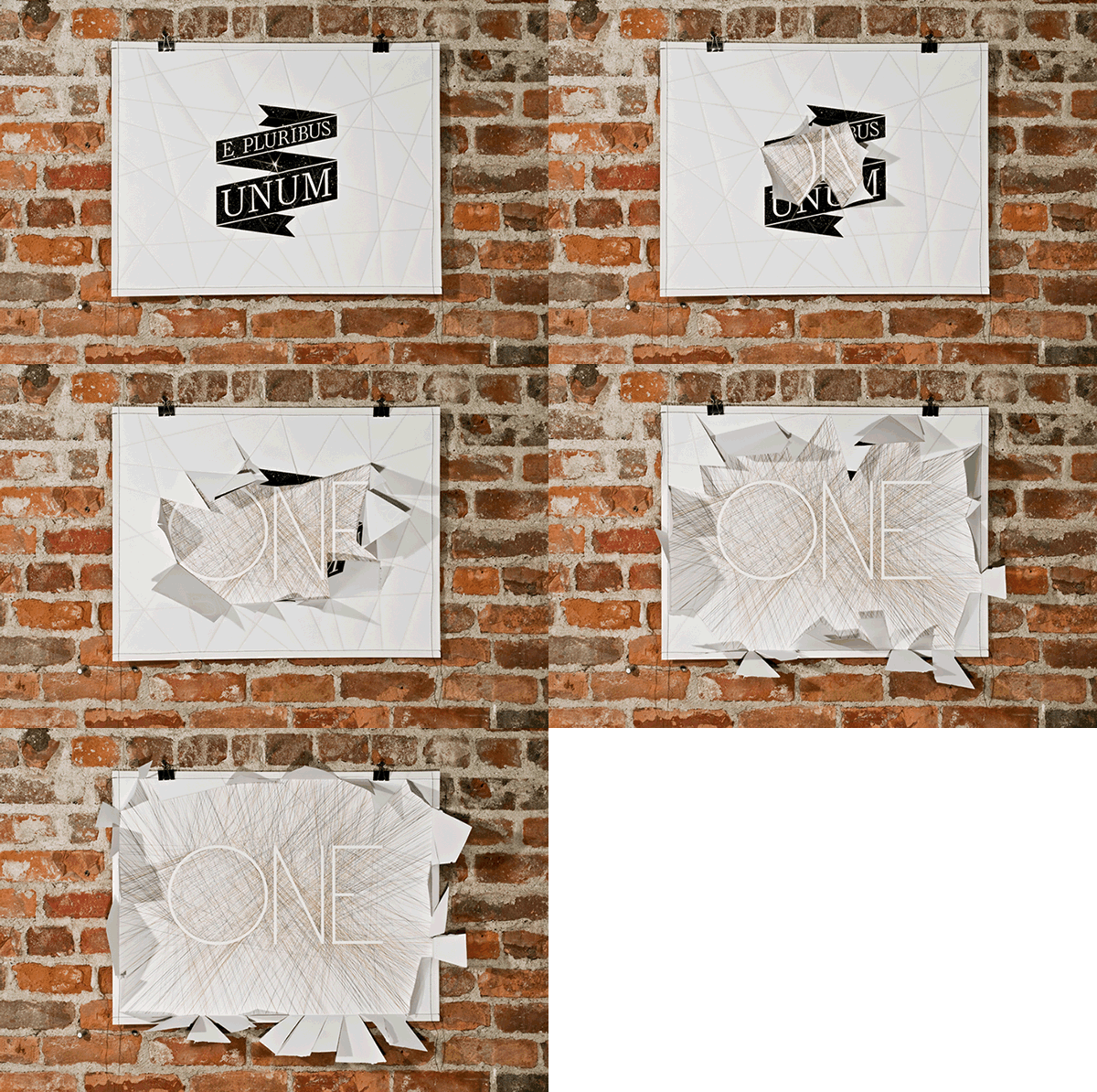



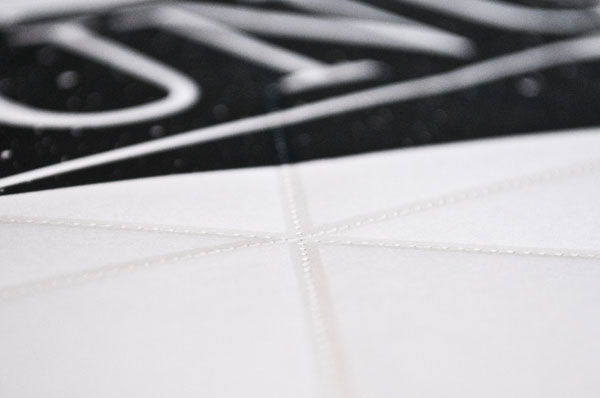

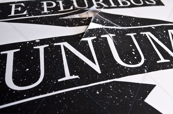

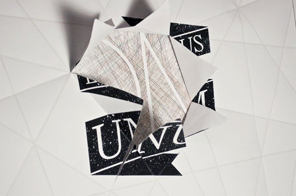




Manifest Equality Poster
Production Method
Design
Collaborative project between Tyler Fortney, Garret Bodette, and Michael Gump under the name Excuses Design Collective
Printing
Silkscreening, perforating, and sewing: Tyler Fortney, Garret Bodette, and Michael Gump
This post was published in the original layout of FPO so all images are smaller. Project descriptions as well as production lessons are quoted in the main content area.
Post Author
Bryony

Bryony Gomez-Palacio
Editor of FPO and co-founder of UnderConsideration LLC.
More: Online / On Twitter
Date Published
May 4, 2010
Filed Under
Posters
Tagged with
baby powder
CMYK
DIY
inkjet
layers
perforation
poster
sewing
silkscreen
tear
tinted gloss varnish
About
FPO (For Print Only), is a division of UnderConsideration, celebrating the reality that print is not dead by showcasing the most compelling printed projects.
FPO uses Fonts.com to render Siseriff and Avenir Next.
FPO is run with Six Apart’s MovableType
All comments, ideas and thoughts on FPO are property of their authors; reproduction without the author’s or FPO’s permission is strictly prohibited
Twitter @ucllc
Sign-up for Mailing List
Mailing list managed by MailChimp
Thanks to our advertisers
About UnderConsideration
UnderConsideration is a graphic design firm generating its own projects, initiatives, and content while taking on limited client work. Run by Bryony Gomez-Palacio and Armin Vit in Bloomington, IN. More…
blogs we publish
Brand New / Displaying opinions and focusing solely on corporate and brand identity work.
Art of the Menu / Cataloguing the underrated creativity of menus from around the world.
Quipsologies / Chronicling the most curious, creative, and notable projects, stories, and events of the graphic design industry on a daily basis.
products we sell
Flaunt: Designing effective, compelling and memorable portfolios of creative work.
Brand New Conference videos / Individual, downloadable videos of every presentation since 2010.
Prints / A variety of posters, the majority from our AIforGA series.
Other / Various one-off products.
events we organize
Brand New Conference / A two-day event on corporate and brand identity with some of today's most active and influential practitioners from around the world.
Brand Nieuwe Conference / Ditto but in Amsterdam.
Austin Initiative for Graphic Awesomeness / A speaker series in Austin, TX, featuring some of the graphic design industry's most awesome people.
also
Favorite Things we've Made / In our capacity as graphic designers.
Projects we've Concluded / Long- and short-lived efforts.
UCllc News / Updates on what's going at the corporate level of UnderConsideration.




Related entries
36 Days of Type Poster
Ministry of Environment in Colombia Poster
National Parks Map
eBoy Poster
“Love Your Mother” Print