ADV @ UNDERCONSIDERATION Peek here for details
BROWSE
Client
Isaac Spiewak & Sons
Quantity Produced
50,000
Production Cost
–
Production Time
3 months (November 2009-January 2010)
Dimensions (Width × Height × Depth)
5 in × 5 in
Page Count
76
Paper Stock
Cover: 120 lb. silk cover
Inner Pages: 120 lb. silk text
Belly Band: 100 lb. gloss text
All papers FSC certified.
Number of Colors
Cover: 1 Metallic + 1 Spot Color/ 1 Metallic Spot Color
Interior: CMYK + 1 Metallic Spot Color
Bellyband: 1 Metallic + 1 Spot Color
Varnishes
Cover: Silk aqueous coating with a spot gloss varnish
Interior: Silk aqueous coating
Bellyband: Gloss aqueous coating
Binding
Perfect binding
Typography
Neutra Display Drafting
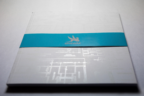
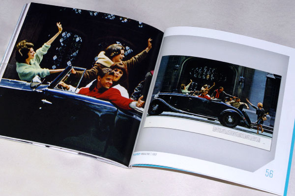
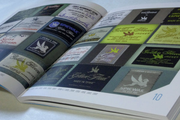
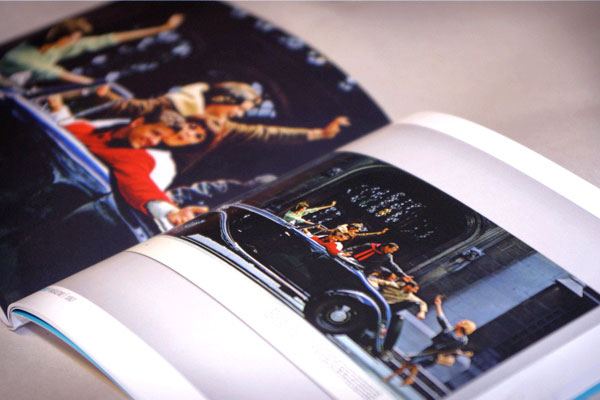
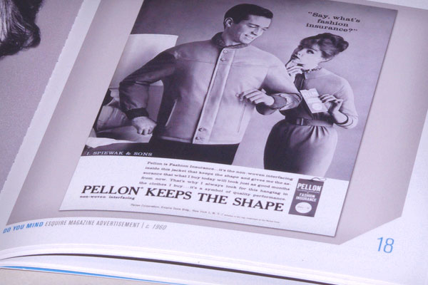
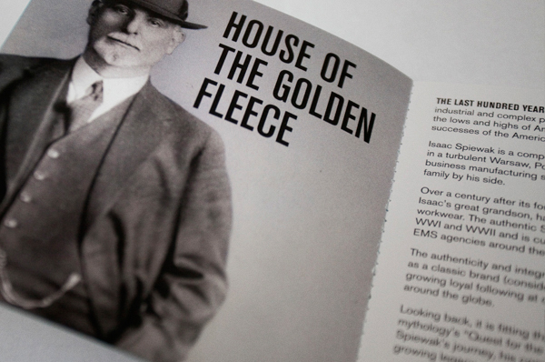
Since 1904: House of the Golden Fleece is a book that spans the
history of the Isaac Spiewak & Sons company, a promotional piece that would teach, stimulate, and promote the brand within its own group. With the wealth of materials available in the company archives, it began to be conceived more as an art
exhibition than a brand piece.
A volume such as this one usually includes at least one production detail that stands out. More often than not, it strikes the match that lights the fire of what can become a production nightmare if the proper solution can’t be found.
Working closely with the print manager, we explored several options for the cover. One process involved laying down a spot UV and overlaying the hydrophobic Soft Touch aqueous to settle where the UV wasn’t, providing two distinct textures. Unfortunately, the fine lines were getting lost. We also attempted a clear foil stamp but due to the reflective white paper, the indentation didn’t create the level of contrast that we had in mind. Ultimately, we decided to go with something far more hands-on: A
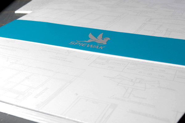
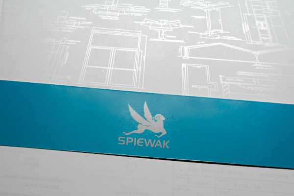
clear spot varnish, tinted with a Metallic PMS directly on press.
The cover features a subtle spot gloss varnish over an overall Silk aqueous coating. The varnish was hand-mixed with a Metallic PMS color to a final value of around 10%. The subtle metallic ink causes light to absorb differently, effectively making it legible in an unassuming way. This solved the problem of allowing the spot gloss to be readable on solid white without the alignment issue that presents itself when printing gloss over a color. It was quite an experiment, but the results are outstanding. The graphic appears very slight in low light and vibrant in direct light.
An ingenious solution to a common problem, and a good inspiration for a future project.
A digital version of the book is available in the history section of the Spiewak website.








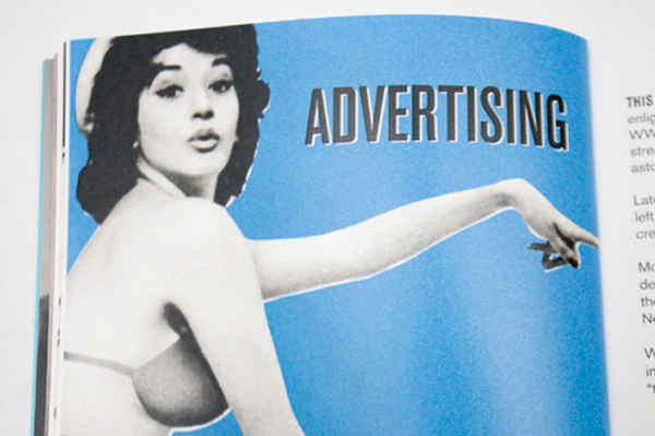
Isaac Spiewak & Sons Book
Production Method
Design
Creative direction: Josh Chapman
Art direction and design: Michelle LeClerc
Printing
Trade Secret Press
This post was published in the original layout of FPO so all images are smaller. Project descriptions as well as production lessons are quoted in the main content area.
Post Author
Bryony

Bryony Gomez-Palacio
Editor of FPO and co-founder of UnderConsideration LLC.
More: Online / On Twitter
Date Published
April 26, 2010
Filed Under
Books
Tagged with
bellyband
book
CMYK
neutraface
offset
perfect bound
PMS
spot varnish
square
varnish
vista sans
About
FPO (For Print Only), is a division of UnderConsideration, celebrating the reality that print is not dead by showcasing the most compelling printed projects.
FPO uses Fonts.com to render Siseriff and Avenir Next.
FPO is run with Six Apart’s MovableType
All comments, ideas and thoughts on FPO are property of their authors; reproduction without the author’s or FPO’s permission is strictly prohibited
Twitter @ucllc
Sign-up for Mailing List
Mailing list managed by MailChimp
Thanks to our advertisers
About UnderConsideration
UnderConsideration is a graphic design firm generating its own projects, initiatives, and content while taking on limited client work. Run by Bryony Gomez-Palacio and Armin Vit in Bloomington, IN. More…
blogs we publish
Brand New / Displaying opinions and focusing solely on corporate and brand identity work.
Art of the Menu / Cataloguing the underrated creativity of menus from around the world.
Quipsologies / Chronicling the most curious, creative, and notable projects, stories, and events of the graphic design industry on a daily basis.
products we sell
Flaunt: Designing effective, compelling and memorable portfolios of creative work.
Brand New Conference videos / Individual, downloadable videos of every presentation since 2010.
Prints / A variety of posters, the majority from our AIforGA series.
Other / Various one-off products.
events we organize
Brand New Conference / A two-day event on corporate and brand identity with some of today's most active and influential practitioners from around the world.
Brand Nieuwe Conference / Ditto but in Amsterdam.
Austin Initiative for Graphic Awesomeness / A speaker series in Austin, TX, featuring some of the graphic design industry's most awesome people.
also
Favorite Things we've Made / In our capacity as graphic designers.
Projects we've Concluded / Long- and short-lived efforts.
UCllc News / Updates on what's going at the corporate level of UnderConsideration.




Related entries
Severe(d): A Creepy Poetry Collection by Holly Riordan
BOYCO Classpack® Book
Antes de Perder la Esperanza Book
Gunnel Wåhlstrand Exhibit Book
Szép versek & Körkép Book Covers