ADV @ UNDERCONSIDERATION Peek here for details
BROWSE
Client
Self-promotion
Quantity Produced
87
Production Cost
"A couple hundred bucks"
Production Time
2 Weeks
Dimensions (Width × Height × Depth)
18 in × 24 in
Page Count
–
Paper Stock
–
Number of Colors
16 Spot
Varnishes
–
Binding
–
Typography
–
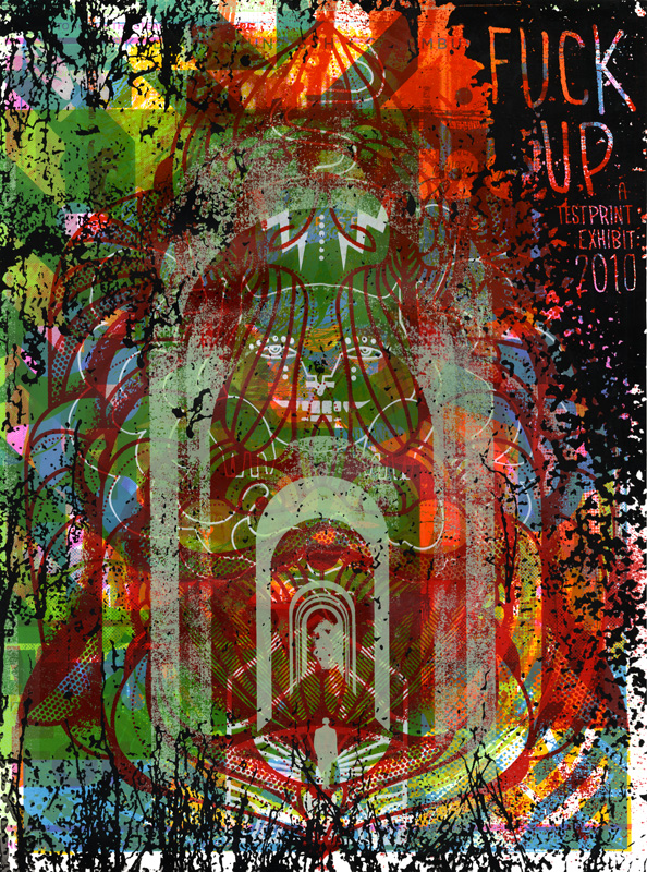
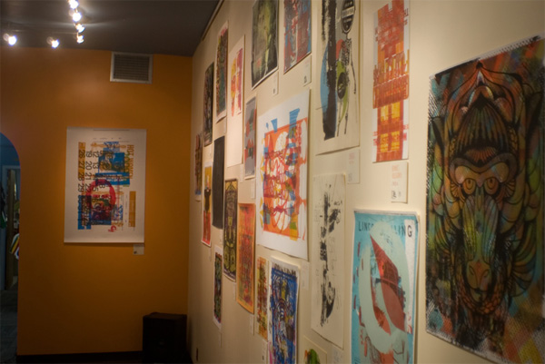
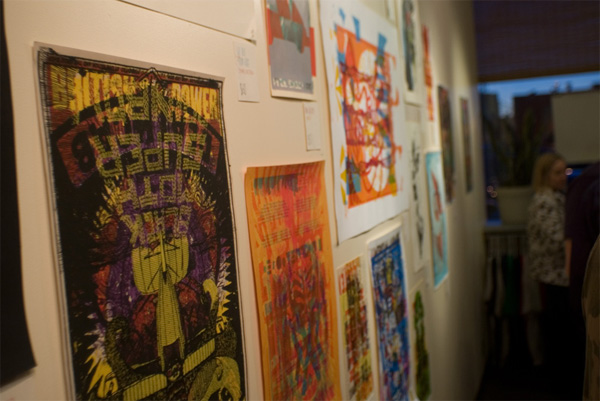
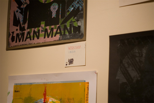
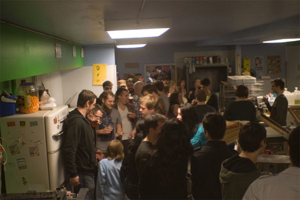
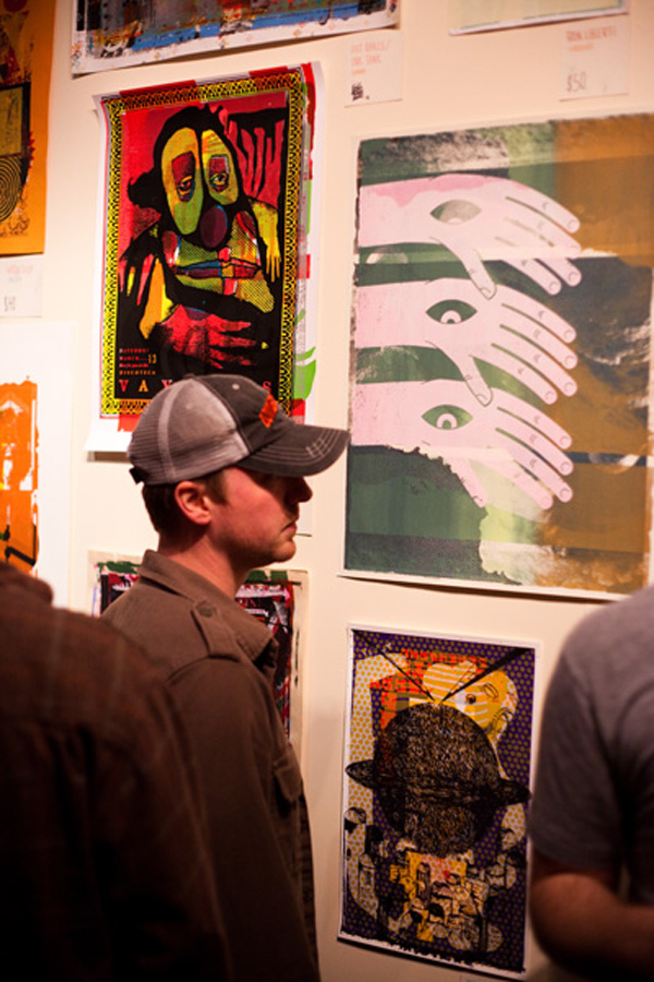
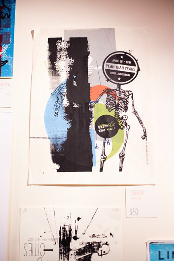
Earlier this month, the space of Screen Ink in Lincoln, Nebraska was host to a fairly cool exhibition called “Fuck Up,” an ode to the art of the “test print,” which has risen to cult-like status in recent years. The curators Eric Nyffeler and Michael Nielsen, explain:
One of the hidden gems of screen-printing is the beauty of the “test print.” Because screen prints are created one color, one layer at a time, the artists often test each layer before they start the print run. They often use left over prints, pages from old runs, and even misprinted paper. The test prints slowly gather more and more layers of color and artwork from dozens of different jobs. It’s not unusual for a test print to find itself run through the press more than two dozen times. The resulting prints are always unique and are always surprising. Because test prints are a pragmatic by-product of the actual printing process, these pieces of art contain a spontaneous and reckless emotion that is impossible for an artist to plan. Once a print is started no one knows exactly what the end results will look like. The process itself allows for so much randomness that the imperfections are embraced rather than shunned and accidents frequently become the highlight of the piece.
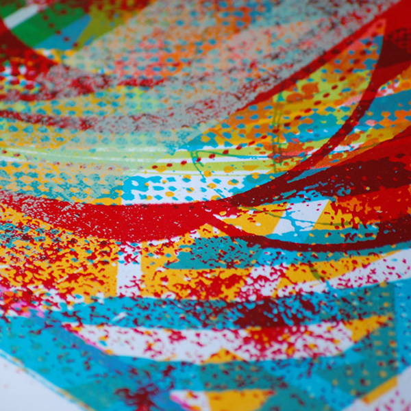
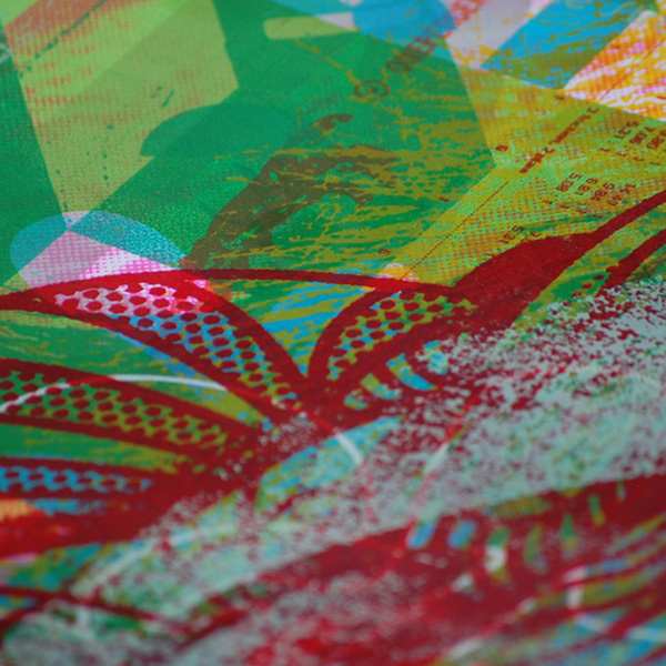
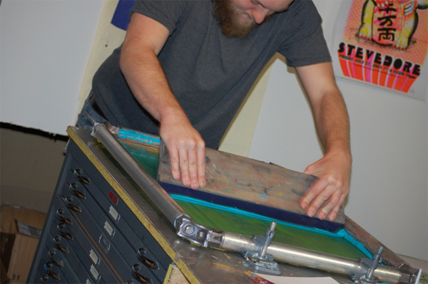
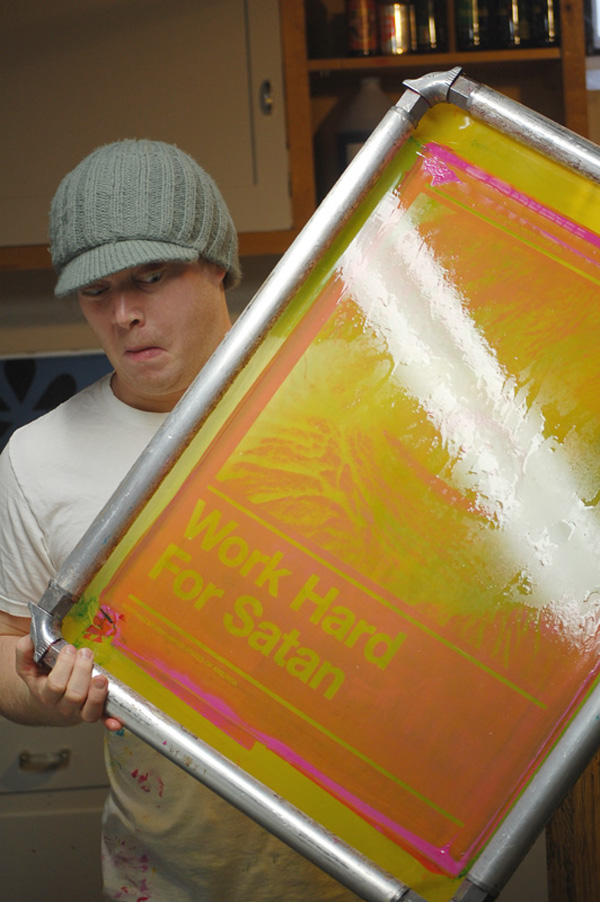
While the exhibit had its share of test prints on display, Eric and Michael decided to do a semi-controlled test print of their own to promote the poster. With the help of some of the featured artists in the exhibit, they put together a 16-layer poster silkscreen poster with random pieces of artwork they submitted — in the order that artists submitted the art was the order Eric and Michael layered the poster.
More than the mind-bending resulting image, I am most intrigued by how much heavier the paper is after undergoing 16 layers of ink.

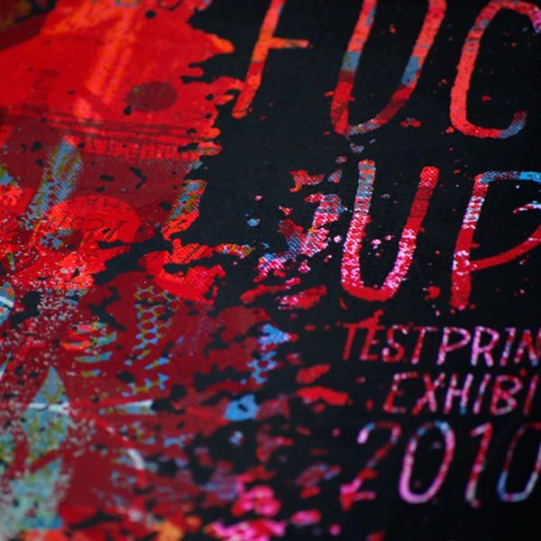



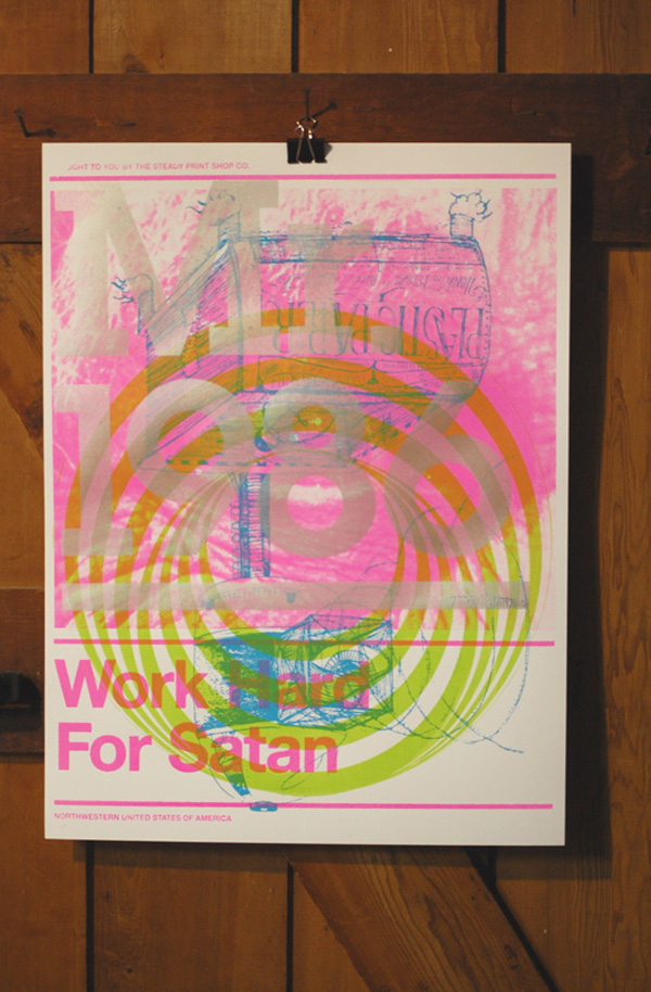
Layer four.

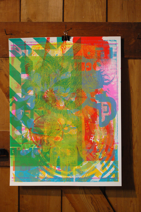
Layer eleven.

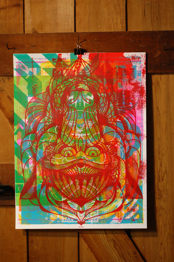
Layer fourteen.

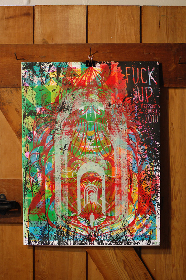
Layer sixteen.










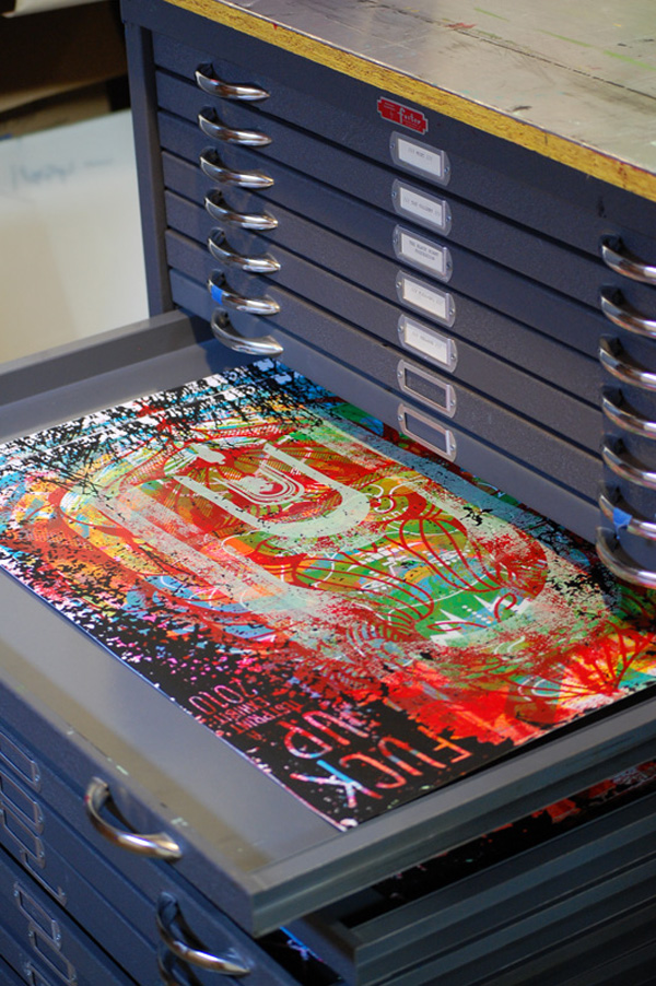
“Fuck Up” Exhibit Poster
Production Method
Design
Michael Nielsen and Eric Nyffeler
Includes art from:
Delicious Design League, Doe Eyed, Bennett Holzworth, Ron Liberti, Micah Max, Sidekick, Steady Print Shop Co, Dan Stiles, Strawberryluna, The Bubble Process, The Silents Giants, Pat Oakes/Ink Tank Merch, Young Monster, We Buy Your Kids, and Workshop
Printing
Michael Nielsen and Eric Nyffeler
This post was published in the original layout of FPO so all images are smaller. Project descriptions as well as production lessons are quoted in the main content area.
Post Author
Armin

Armin Vit
Editor of FPO and co-founder of UnderConsideration LLC.
More: Online / On Twitter
Date Published
April 28, 2010
Filed Under
Posters
Tagged with
exhibit
layers
poster
silkscreen
test print
About
FPO (For Print Only), is a division of UnderConsideration, celebrating the reality that print is not dead by showcasing the most compelling printed projects.
FPO uses Fonts.com to render Siseriff and Avenir Next.
FPO is run with Six Apart’s MovableType
All comments, ideas and thoughts on FPO are property of their authors; reproduction without the author’s or FPO’s permission is strictly prohibited
Twitter @ucllc
Sign-up for Mailing List
Mailing list managed by MailChimp
Thanks to our advertisers
About UnderConsideration
UnderConsideration is a graphic design firm generating its own projects, initiatives, and content while taking on limited client work. Run by Bryony Gomez-Palacio and Armin Vit in Bloomington, IN. More…
blogs we publish
Brand New / Displaying opinions and focusing solely on corporate and brand identity work.
Art of the Menu / Cataloguing the underrated creativity of menus from around the world.
Quipsologies / Chronicling the most curious, creative, and notable projects, stories, and events of the graphic design industry on a daily basis.
products we sell
Flaunt: Designing effective, compelling and memorable portfolios of creative work.
Brand New Conference videos / Individual, downloadable videos of every presentation since 2010.
Prints / A variety of posters, the majority from our AIforGA series.
Other / Various one-off products.
events we organize
Brand New Conference / A two-day event on corporate and brand identity with some of today's most active and influential practitioners from around the world.
Brand Nieuwe Conference / Ditto but in Amsterdam.
Austin Initiative for Graphic Awesomeness / A speaker series in Austin, TX, featuring some of the graphic design industry's most awesome people.
also
Favorite Things we've Made / In our capacity as graphic designers.
Projects we've Concluded / Long- and short-lived efforts.
UCllc News / Updates on what's going at the corporate level of UnderConsideration.




Related entries
36 Days of Type Poster
Ministry of Environment in Colombia Poster
National Parks Map
eBoy Poster
“Love Your Mother” Print