ADV @ UNDERCONSIDERATION Peek here for details
BROWSE
Client
Student Project
Quantity Produced
1
Production Cost
Not Applicable
Production Time
1 Week
Dimensions (Width × Height × Depth)
135 × 210 mm, 17 mm spine (5.3 in × 8.25 in, 0.65 in spine)
Page Count
–
Paper Stock
Coated, matte, 210 gsm (80 lb)
Number of Colors
2 spot (black and PMS 179)
Varnishes
–
Binding
–
Typography
Hand-drawn Type
Found Metal Type
I think this is the first time we feature a student project here on FPO. Our thinking is that simply outputting posters in an Epson doesn’t quite constitute the kind of projects we all like to see here. We have also not shown a lot of “one-off” productions, since part of the challenge of printing is figuring out how to reproduce any given thing as lovingly as possible in a cost-efficient manner.
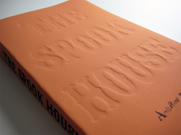
But after seeing this one-off solution by Tom Petty, a second year student at Brighton University and Hastings College of Arts, as a student project we are more than happy to reconsider — we’ve even added One-off as a main category. Tom explains how he went about creating a cover for The Spook House by Ambrose Bierce as part of a new “Modern Gothic” series to be published by Penguin Books:
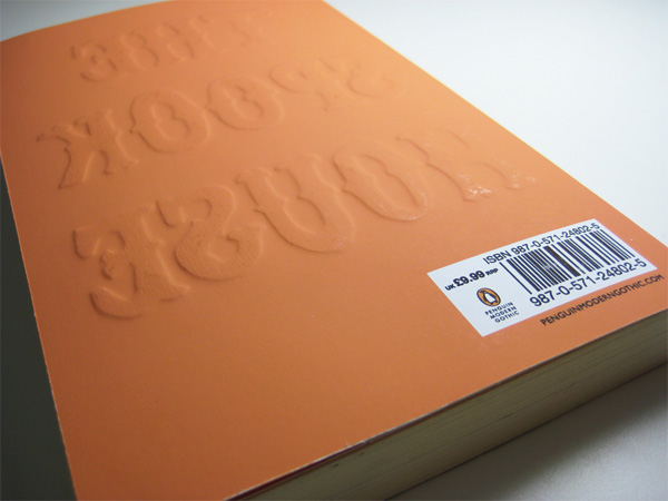
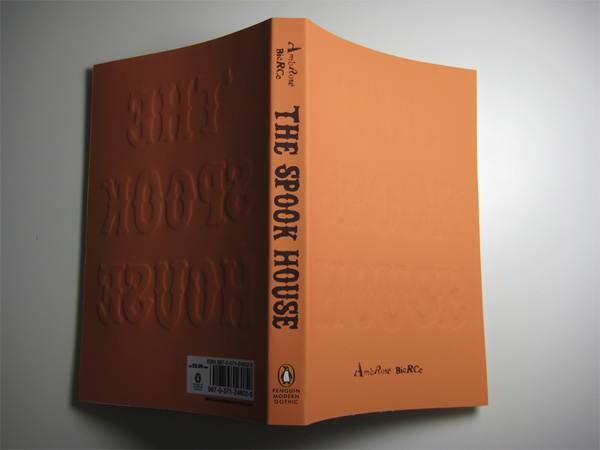
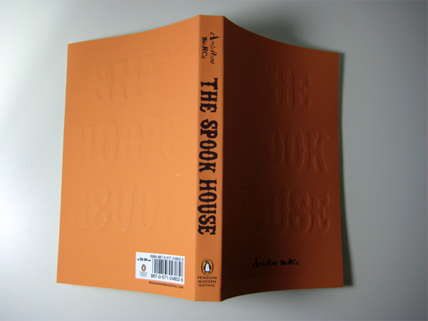
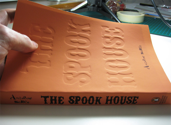
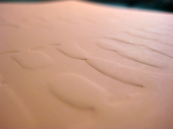
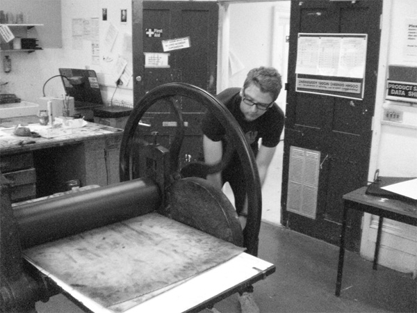
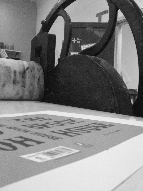
The book is set in nineteenth-century-America and I wanted the cover to allude to the period and context as a whole, as opposed to a literal element within the story. I therefore decided to hand-draw the type in a traditional style seen on signs of the period, so I had to cut all of the letters by hand with a scalpel out of 400 gsm (140 lb) board and run it through a traditional press. These hand-drawn letters were then mirrored exactly on the back cover, with the front blind debossed and the back blind embossed to give the impression of the text having been ‘pushed’ through the book. This ties in with an element of the story in which a man becomes locked in a room and bangs for help on the door, leaving a hand print that would be “pushed” through.
The effect is simply amazing, and the pumpkin-like texture of the paper with the ridges of the letterforms would look great in bookstores around the world. The final detail of the book is the author’s name:
“Ambros Bierce” was created using found hot-metal letters, inking them up and pressing them to keep the typography consistent with the period.
Dear Penguin Books, please print this!







This post was published in the original layout of FPO so all images are smaller. Project descriptions as well as production lessons are quoted in the main content area.
Post Author
Armin

Armin Vit
Editor of FPO and co-founder of UnderConsideration LLC.
More: Online / On Twitter
Date Published
November 23, 2009
Filed Under
One-off
Tagged with
book
book cover
deboss
DIY
emboss
orange
About
FPO (For Print Only), is a division of UnderConsideration, celebrating the reality that print is not dead by showcasing the most compelling printed projects.
FPO uses Fonts.com to render Siseriff and Avenir Next.
FPO is run with Six Apart’s MovableType
All comments, ideas and thoughts on FPO are property of their authors; reproduction without the author’s or FPO’s permission is strictly prohibited
Twitter @ucllc
Sign-up for Mailing List
Mailing list managed by MailChimp
Thanks to our advertisers
About UnderConsideration
UnderConsideration is a graphic design firm generating its own projects, initiatives, and content while taking on limited client work. Run by Bryony Gomez-Palacio and Armin Vit in Bloomington, IN. More…
blogs we publish
Brand New / Displaying opinions and focusing solely on corporate and brand identity work.
Art of the Menu / Cataloguing the underrated creativity of menus from around the world.
Quipsologies / Chronicling the most curious, creative, and notable projects, stories, and events of the graphic design industry on a daily basis.
products we sell
Flaunt: Designing effective, compelling and memorable portfolios of creative work.
Brand New Conference videos / Individual, downloadable videos of every presentation since 2010.
Prints / A variety of posters, the majority from our AIforGA series.
Other / Various one-off products.
events we organize
Brand New Conference / A two-day event on corporate and brand identity with some of today's most active and influential practitioners from around the world.
Brand Nieuwe Conference / Ditto but in Amsterdam.
Austin Initiative for Graphic Awesomeness / A speaker series in Austin, TX, featuring some of the graphic design industry's most awesome people.
also
Favorite Things we've Made / In our capacity as graphic designers.
Projects we've Concluded / Long- and short-lived efforts.
UCllc News / Updates on what's going at the corporate level of UnderConsideration.




Related entries
Pantheon Anniversary Poster
“Communication-Elevation” Book
Rongfei Geng Handcrafted Book
“Poetics of Harmony” Experimental Publication
Counting Sheep Poster