ADV @ UNDERCONSIDERATION Peek here for details
BROWSE
Dimensions (Width × Height × Depth)
7 in × 5.125 in
Page Count
–
Paper Stock
Mohawk Genesis, 100 PCW White Smooth, 160dtc
Number of Colors
2 spot inks
Varnishes
–
Binding
–
Typography
Based on Interstate Black and 22 different leaves
More and more I notice designers and firms choosing an alternate holiday in which to contact their clients. Be it the traditional December celebrations, Chinese New Year, Valentines Day or as in the case of Suka, Thanksgiving.
One thing that I had never done before, but wanted to try, was printing on clear plastic. This would allow me to play with the transparency of the inks in some new creative ways. My first idea was to design a single fold card, that when closed would read as one message and when opened revealed another message. You know, kind of like the secret decoder rings that you get in a Kracker Jack box. After tons of exploration and in taking with my creative director Brian Wong, he suggested using a colored vellum envelope and making the card more like a postcard rather than a greeting card. It took a lot of trials and errors to find the right colors that would create the “secret message” effect but still have a Thanksgiving feel to them.
When it finally came to sending the card to the printer, we wanted to do little something to make the card special, but still stay with our budget. We explored a few different printing techniques such as debossing, embossing and guilded edges but we ended up using letterpress and offset. It proved to be a nice balance between style and price. We had done pieces with offset and letterpress before, but we had never done something with registration that was this tight. The printers were confident that they could do it but I did have a bit of anxiety about the registration. I went on press for the offset and letterpress process and everything went very smoothly. One thing we learned from this experience was, if you going to print offset and letterpress in tight registration it’s better to print them as one up on a sheet, rather than two up on a sheet. Our offset printer had already run the cards as two up and so our letterpress printer tried doing the letterpress as two up, but it lead to an uneven impression and registration. This wasn’t a huge problem, but they just ran the cards as if it was a one up sheet. They split two up sheet into two separate runs.
And I am thankful for those designers who spend the time testing and exploring ideas that will translate into beautful items I want to hold in my hands and share with those around me. And if you want to share in thankfulness, email info@sukacreative.com and you might be able to get a card to call your own.
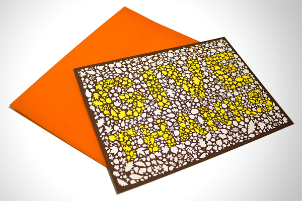

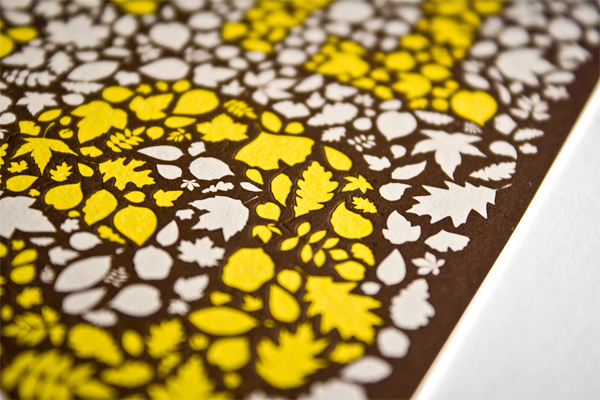

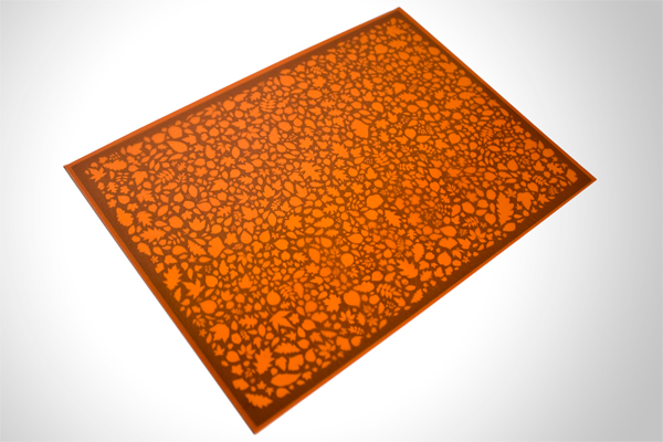

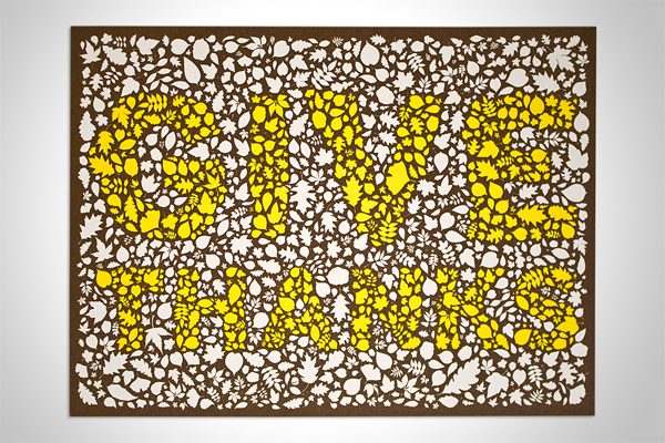
Thanksgiving Card
Production Method
Design
Link
Suka
Creative direction: Brian Wong
Design: Matthew Carl
Printing
Offset: Artale Graphics
Letterpress: Press (NY)
This post was published in the original layout of FPO so all images are smaller. Project descriptions as well as production lessons are quoted in the main content area.
Post Author
Bryony

Bryony Gomez-Palacio
Editor of FPO and co-founder of UnderConsideration LLC.
More: Online / On Twitter
Date Published
November 26, 2009
Filed Under
Postcard
Tagged with
letterpress
offset
postcard
promotion
vellum envelope
About
FPO (For Print Only), is a division of UnderConsideration, celebrating the reality that print is not dead by showcasing the most compelling printed projects.
FPO uses Fonts.com to render Siseriff and Avenir Next.
FPO is run with Six Apart’s MovableType
All comments, ideas and thoughts on FPO are property of their authors; reproduction without the author’s or FPO’s permission is strictly prohibited
Twitter @ucllc
Sign-up for Mailing List
Mailing list managed by MailChimp
Thanks to our advertisers
About UnderConsideration
UnderConsideration is a graphic design firm generating its own projects, initiatives, and content while taking on limited client work. Run by Bryony Gomez-Palacio and Armin Vit in Bloomington, IN. More…
blogs we publish
Brand New / Displaying opinions and focusing solely on corporate and brand identity work.
Art of the Menu / Cataloguing the underrated creativity of menus from around the world.
Quipsologies / Chronicling the most curious, creative, and notable projects, stories, and events of the graphic design industry on a daily basis.
products we sell
Flaunt: Designing effective, compelling and memorable portfolios of creative work.
Brand New Conference videos / Individual, downloadable videos of every presentation since 2010.
Prints / A variety of posters, the majority from our AIforGA series.
Other / Various one-off products.
events we organize
Brand New Conference / A two-day event on corporate and brand identity with some of today's most active and influential practitioners from around the world.
Brand Nieuwe Conference / Ditto but in Amsterdam.
Austin Initiative for Graphic Awesomeness / A speaker series in Austin, TX, featuring some of the graphic design industry's most awesome people.
also
Favorite Things we've Made / In our capacity as graphic designers.
Projects we've Concluded / Long- and short-lived efforts.
UCllc News / Updates on what's going at the corporate level of UnderConsideration.




Related entries
Younite Promotional Cards
Latitude Postcard
Oh Christmas Cards
The Department Postcards
Tinta de Verano - Solar Prints