ADV @ UNDERCONSIDERATION Peek here for details
BROWSE
Client
The Painted Pretzel
Quantity Produced
1,500
Production Cost
$1,500
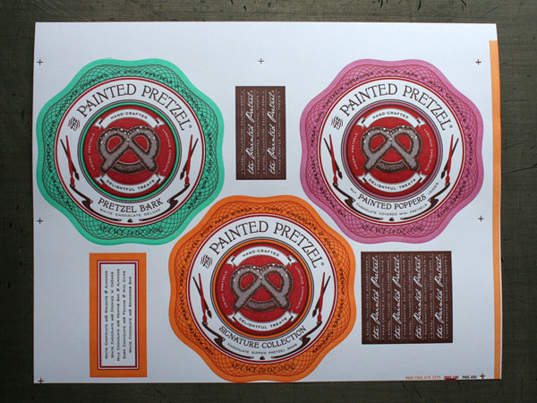
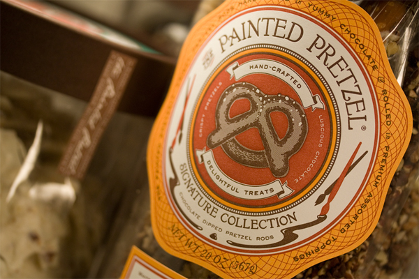
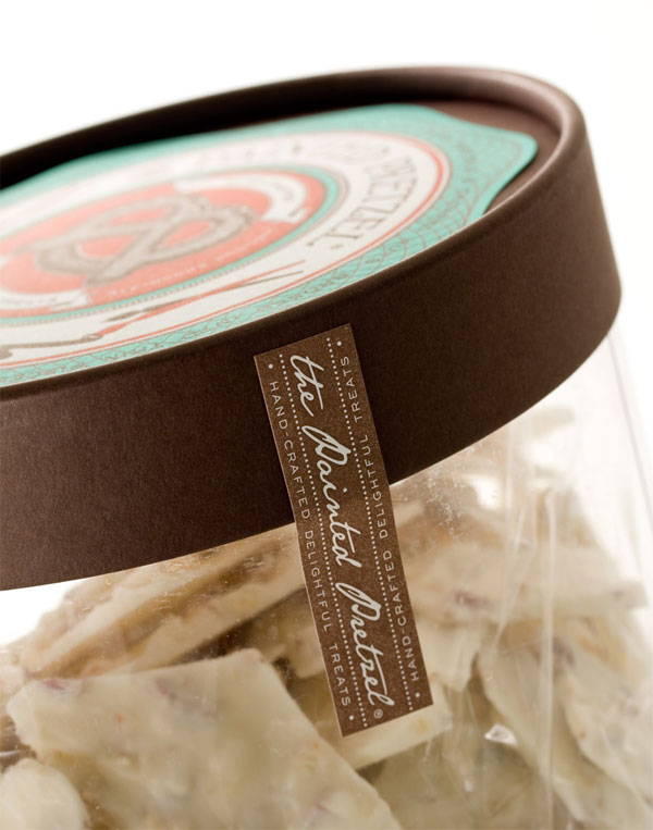
About $1 per 8.5 in × 11 in sheet that contained: 3 round labels, 6 side labels, and 1 info label
Production Time
4 weeks
Dimensions (Width × Height × Depth)
4 in. in diameter
Page Count
–
Paper Stock
Uncoated Strathmore
Number of Colors
5 spot inks
A beautiful set of colors that complement each other from one label to the next was not as easy to achieve as one might think. Nor was it the most challenging task:
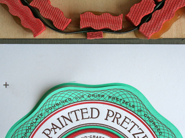
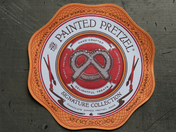
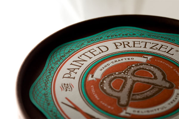
This was not the first time I did letterpress, but it was a first in that it required a ton of colors, so it was more complex. Setting up the files required more time and concentration—you have to do separations for plates yourself—and I, like a lot of designers was used to letting the printer do this part. Doing separations means deciding what overprints and what doesn’t, too. This can get interesting when you use the overprint option to create special color combinations and effects. We also had to include a half-toned pretzel image to get a two-toned brown pretzel—this was challenging to get right and even the final result wasn’t what I expected.
The good thing I keep seeing across letterpress jobs posted here on FPO, is the efficient use of space on the page. Usually seeking and attaining the best possible arrangement of elements.
Letterpress prints on a single sheet—it’s to your advantage to get all your labels to fit out of the one sheet if possible, thus minimizing waste and reducing per-unit cost.
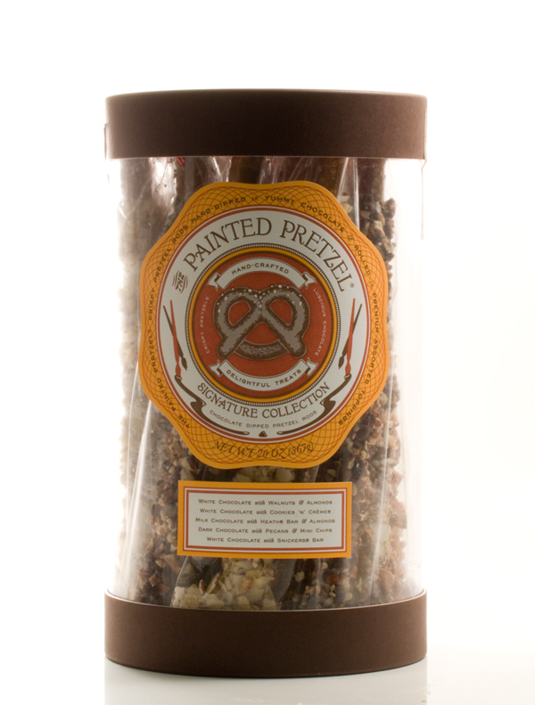
Now, how about getting some pretzels to go along my labels?






This post was published in the original layout of FPO so all images are smaller. Project descriptions as well as production lessons are quoted in the main content area.
Post Author
Bryony

Bryony Gomez-Palacio
Editor of FPO and co-founder of UnderConsideration LLC.
More: Online / On Twitter
Date Published
September 14, 2009
Filed Under
Packaging
Tagged with
label
letterpress
PMS
strathmore
unique shape
About
FPO (For Print Only), is a division of UnderConsideration, celebrating the reality that print is not dead by showcasing the most compelling printed projects.
FPO uses Fonts.com to render Siseriff and Avenir Next.
FPO is run with Six Apart’s MovableType
All comments, ideas and thoughts on FPO are property of their authors; reproduction without the author’s or FPO’s permission is strictly prohibited
Twitter @ucllc
Sign-up for Mailing List
Mailing list managed by MailChimp
Thanks to our advertisers
About UnderConsideration
UnderConsideration is a graphic design firm generating its own projects, initiatives, and content while taking on limited client work. Run by Bryony Gomez-Palacio and Armin Vit in Bloomington, IN. More…
blogs we publish
Brand New / Displaying opinions and focusing solely on corporate and brand identity work.
Art of the Menu / Cataloguing the underrated creativity of menus from around the world.
Quipsologies / Chronicling the most curious, creative, and notable projects, stories, and events of the graphic design industry on a daily basis.
products we sell
Flaunt: Designing effective, compelling and memorable portfolios of creative work.
Brand New Conference videos / Individual, downloadable videos of every presentation since 2010.
Prints / A variety of posters, the majority from our AIforGA series.
Other / Various one-off products.
events we organize
Brand New Conference / A two-day event on corporate and brand identity with some of today's most active and influential practitioners from around the world.
Brand Nieuwe Conference / Ditto but in Amsterdam.
Austin Initiative for Graphic Awesomeness / A speaker series in Austin, TX, featuring some of the graphic design industry's most awesome people.
also
Favorite Things we've Made / In our capacity as graphic designers.
Projects we've Concluded / Long- and short-lived efforts.
UCllc News / Updates on what's going at the corporate level of UnderConsideration.





Related entries
Alivu EVOO Packaging
Dutch Harvest Hemp Tea Packaging
GoSimple Packaging
The Farmer’s Daughter Hot Pepper Jelly
Calyx Wellness Centre Package Design