Alagio Trend Starter by Hayley Martell
ASSIGNMENT
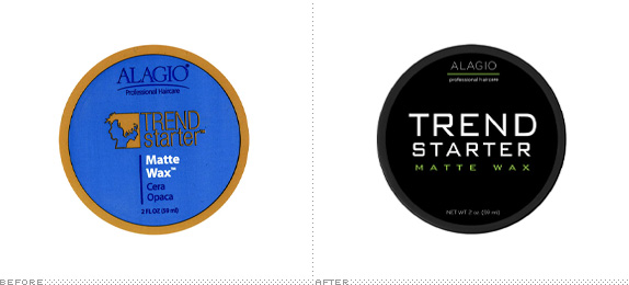
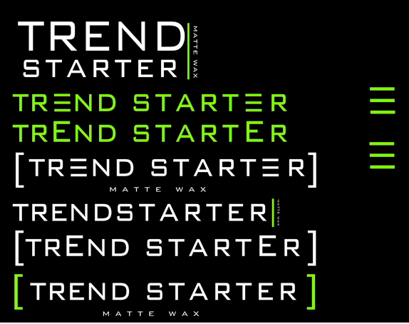
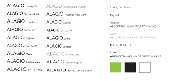
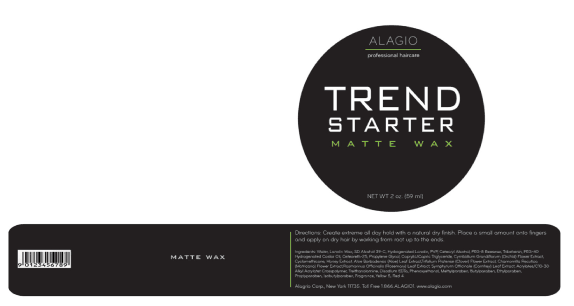
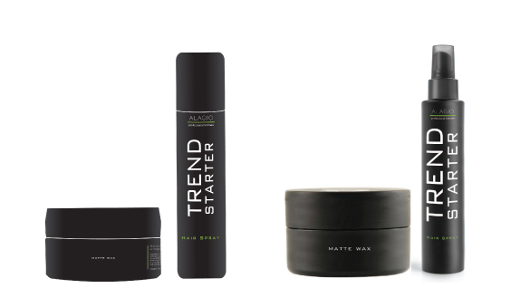
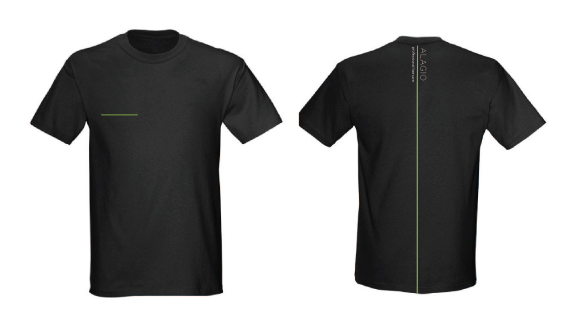
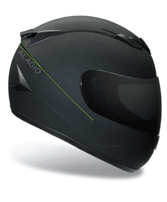
The assignment was to select a product that you actually use and enhance the visual design to make a product that is more appealing to college-age users. The process involved redesigning the logotype as well as the overall package design.


The assignment was to select a product that you actually use and enhance the visual design to make a product that is more appealing to college-age users. The process involved redesigning the logotype as well as the overall package design.

SCHOOL
Maryland Institute College of Art
Baltimore, MD
Maryland Institute College of Art
Baltimore, MD
COURSE
Graphic Design I
Graphic Design I
INSTRUCTOR
Ellen Lupton
Ellen Lupton

Approach
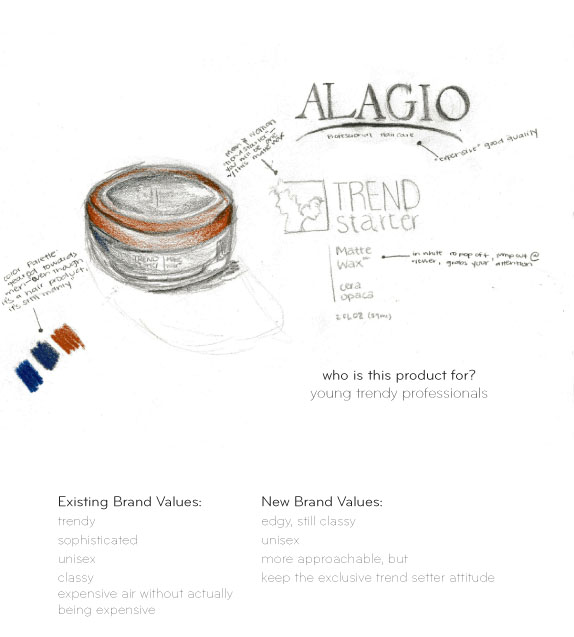
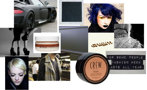
I found this product on a whim from standing in a grocery store smelling hair products for far too long. I wanted to keep the expensive air that this product was attempting to emulate, but I also wanted to make it stand out more from a crowd, and be more accessible to consumers. I aimed to make the design more sleek and edgy. Something more “trend starter” than “trend follower”.

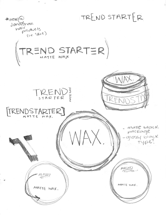
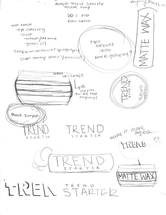
Sketches and Process
Solution


DATE: Feb.15.2011 POSTED BY: Lauren Dickens
 CATEGORY: Consumer Product
 COMMENTS:

TAGS:

Comments › Jump to Most Recent


