
CLIENT
A new sports management company whose beginnings are rooted in charity running events such as 5Ks, walk for a cure, half marathons, etc., for charities, high schools, colleges, and athletic clubs in the northeastern U.S.
BRIEF
Design an icon/logo that embodies all sports, has strong imagery, and will not be subject to changes in design trends. The purpose is to encompass not just running but all sports, beginning with high school and collegiate events.
APPROACH
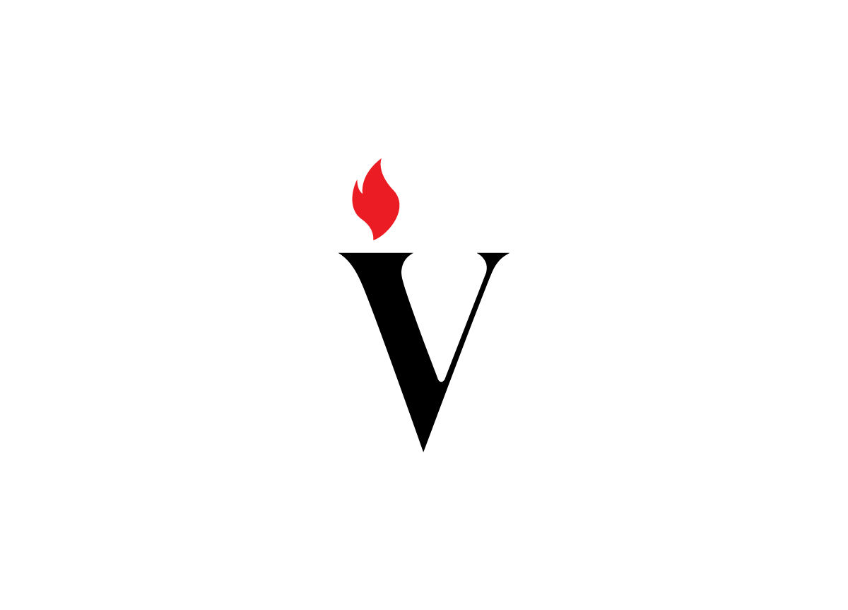
For the solution I began with a typographic approach for the logo. Victory would undoubtedly become the shortened name of the brand, so the imagery from its definition drove the final design. Encompassing all sports triggered the idea of the olympics and the torch. Being that his business model was that of working together to carry out an event, it fit nicely with “passing the torch”. Using the V, I based its design from the typeface Lust by Positype with some slight terminal and stroke weight changes. Adding the flame above the stronger down stroke of the V simulated a torch nicely. The sharp terminals toe the line between a stronger serif, and none at all.


