CLIENT
An annual competition and exhibition made possible by the joint efforts of the Type Directors Club and the National Taiwan University of Science and Technology (Taiwan TECH).
BRIEF
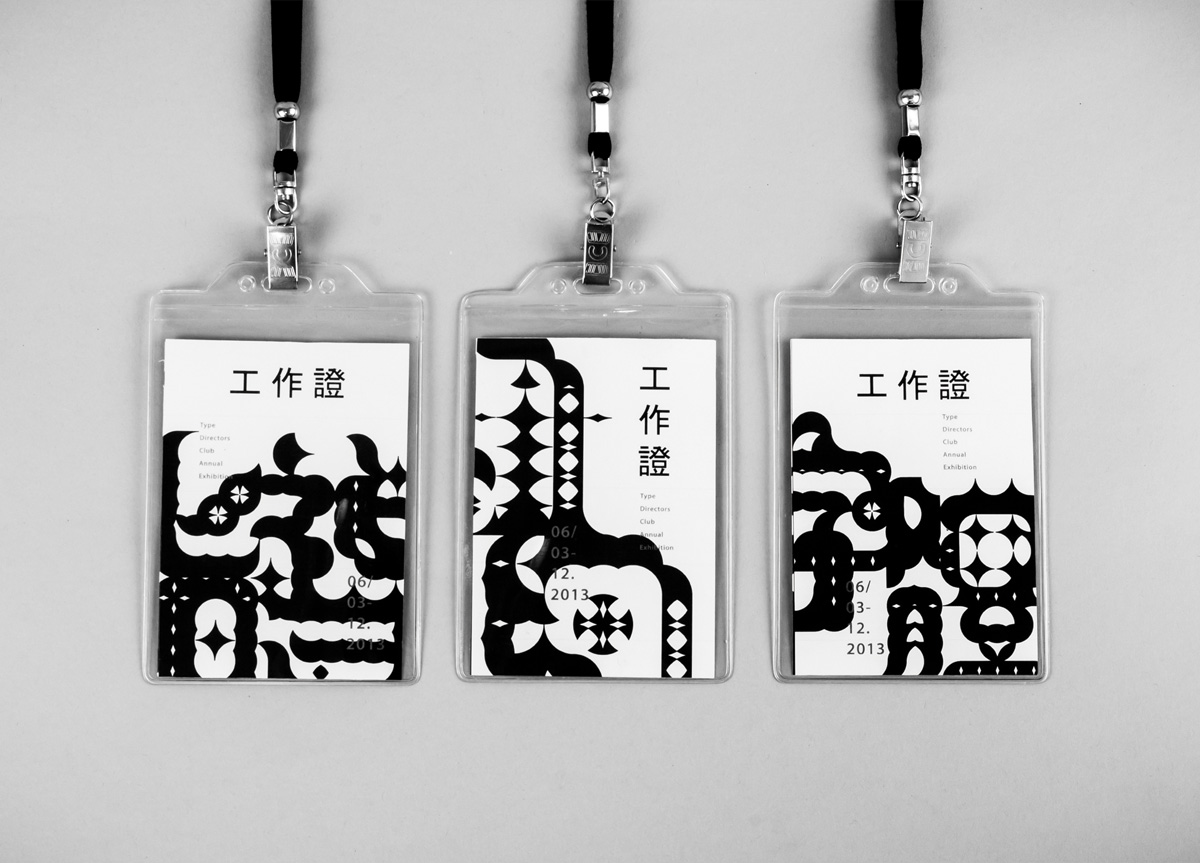
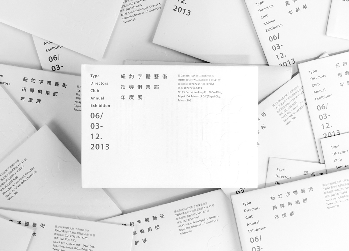
To design the identity and collateral materials necessary for the annual exhibition.
APPROACH
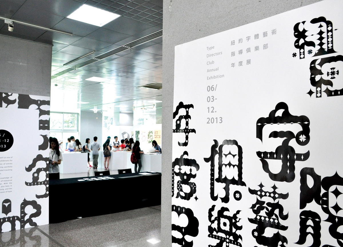
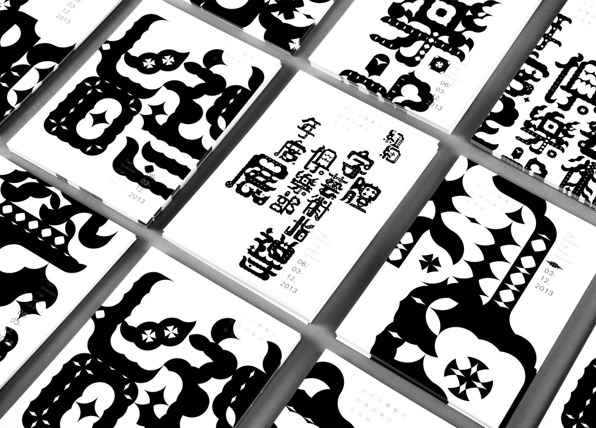
We created a geometric grid that allowed Taiwan TECH’s students to design the Type Directors Club Annual Exhibition in Chinese characters—one of the students designed the Type image as Chinese Calligraphy. In order to combine the western design with Chinese culture together, we used the type as a key visual and applied it across the entire branding system.


