CLIENT
Established in 1925, it is Israel’s first and most prestigious university and its leading research institution—it is ranked internationally among the 100 leading universities. Its audience is potential and present students, researchers, faculty, alumni, and donors.
BRIEF
To rebrand the Hebrew University which regards itself as a symbol of Israeli culture, as an educator of Israel’s future generation and as Israel’s largest center of knowledge. However all this is often obscured due to HUJI’s controversial location on the border of East and West Jerusalem, an archaic perception amongst young Israelis, multiple campuses and faculties, and an obsolete and inconsistent appearance.
APPROACH
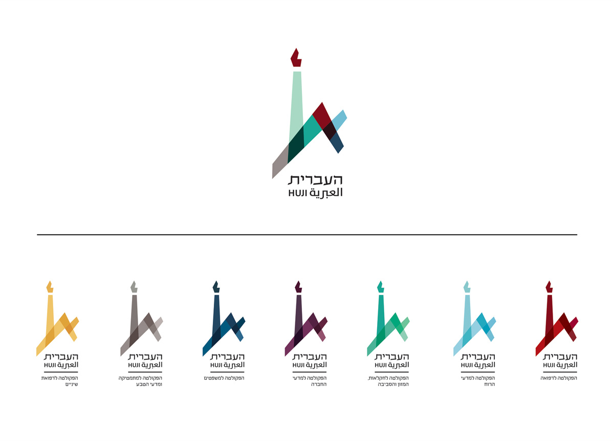
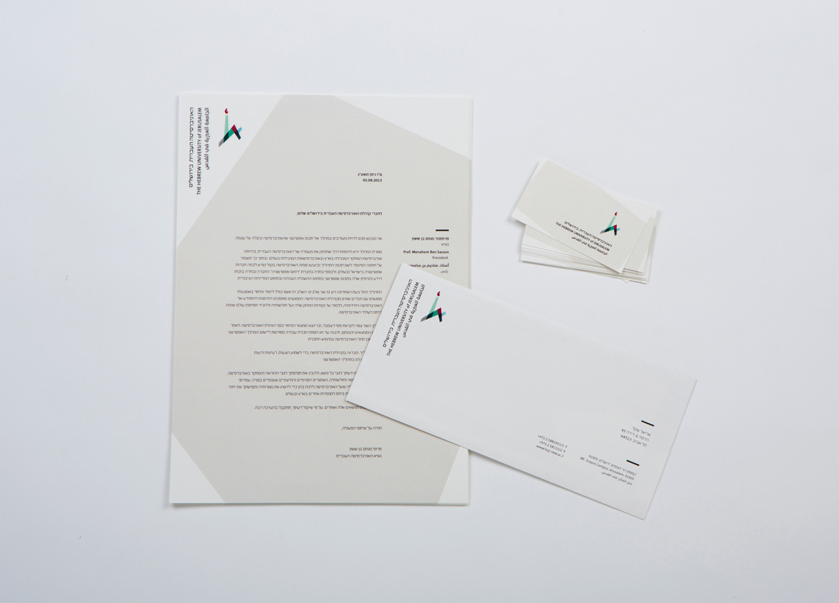
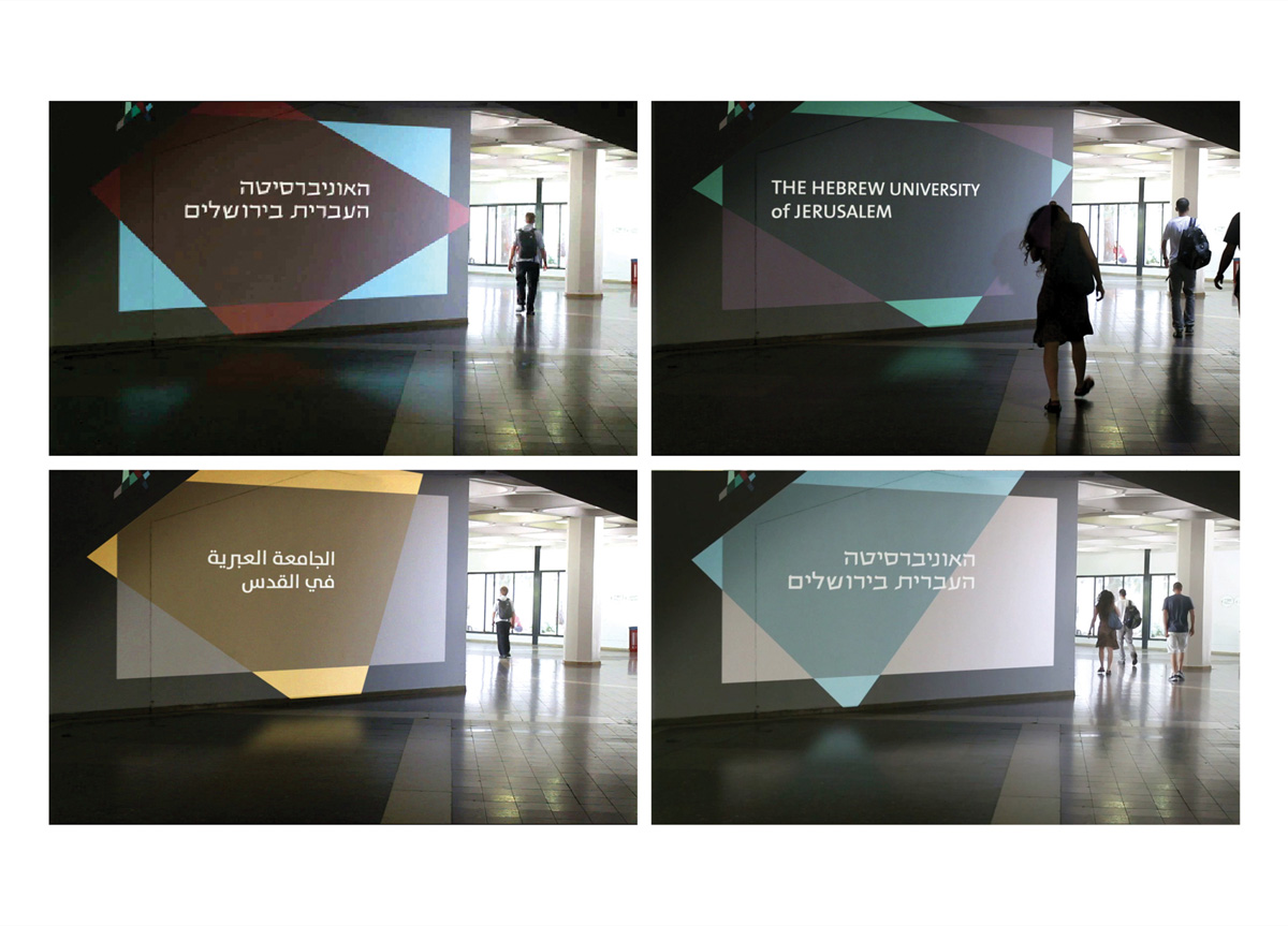
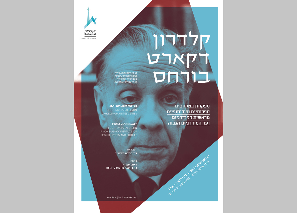
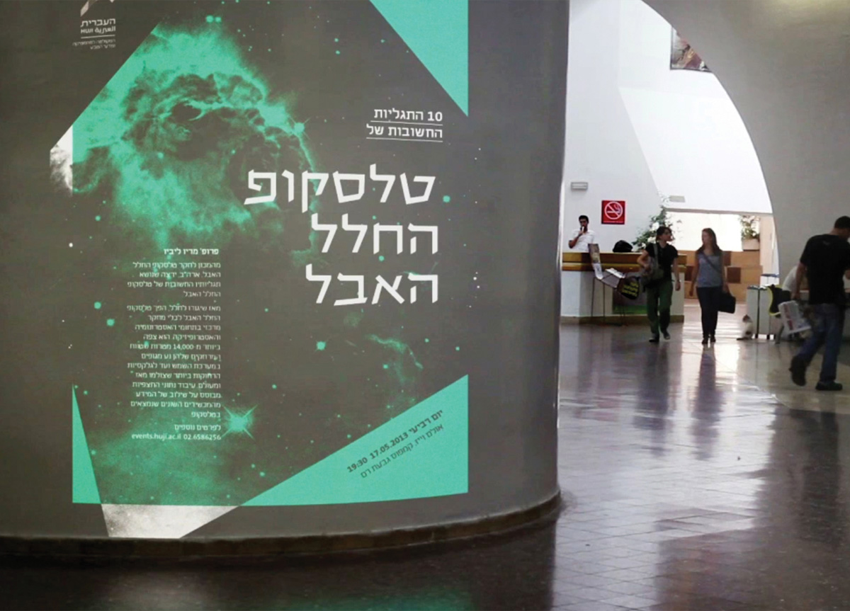
Due to the University’s significant history, the initial approach was to research the design heritage of the institution. Upon discovering its rich and neglected graphic legacy, it became clear that the design concept should revive the beautiful typography and aesthetic of the past, while creating a new and innovative identity. The historic symbol was geometrically deconstructed and new colors were assigned creating a fresh and updated symbol, graphic system, and visual language that combines old and new, past, present, and future.


