CATEGORY

Basic Identity Applications

LEVEL

Professional

RANK

Salvage

DESIGN CREDITS

Art Director

Carlos Martínez

Designer

Juventino Vázquez


TAGS

, , , , , ,


LINKS

Bienal Comunicación
Sarur Arquitectura

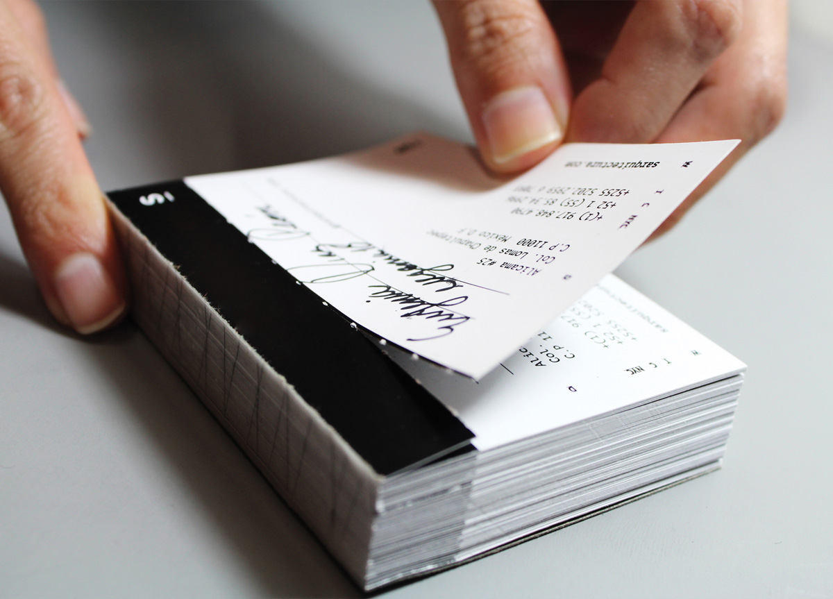
Sarur Arquitectura by Bienal ComunicaciónSarur Arquitectura by Bienal ComunicaciónSarur Arquitectura by Bienal ComunicaciónSarur Arquitectura by Bienal ComunicaciónSarur Arquitectura by Bienal ComunicaciónSarur Arquitectura by Bienal Comunicación


CLIENT

An archi­tec­tur­al stu­dio based in Mex­i­co City, Mex­i­co, found­ed by Ger­ar­do Sarur in 2010.


BRIEF

The client want­ed to rein­vig­o­rate their image in order to take it to a more con­gru­ent ter­rain of what archi­tec­ture means for him.


APPROACH

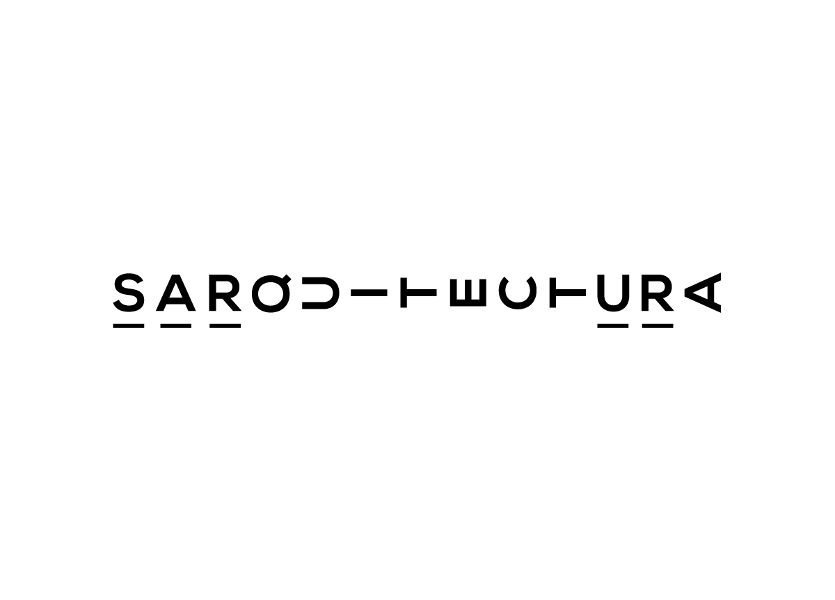
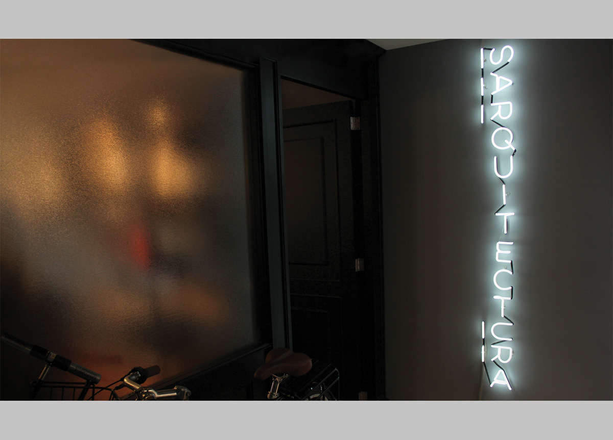
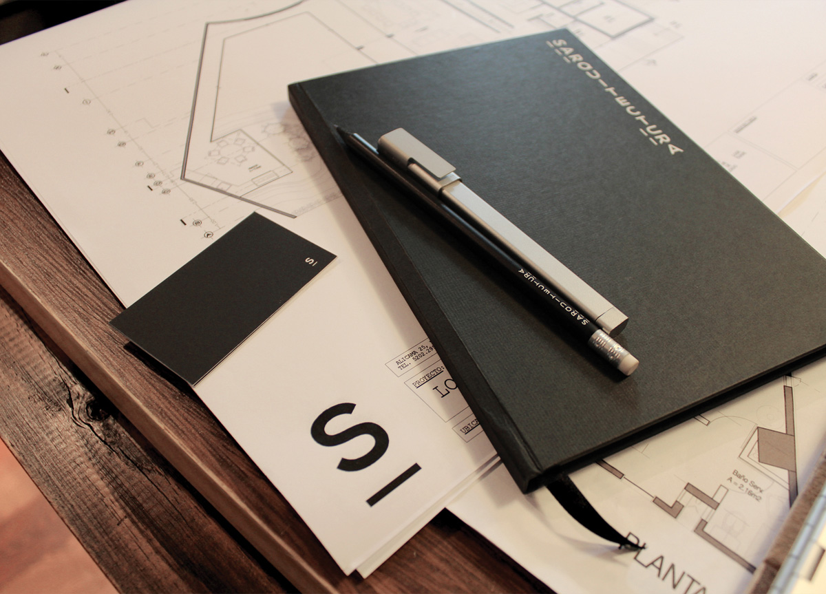
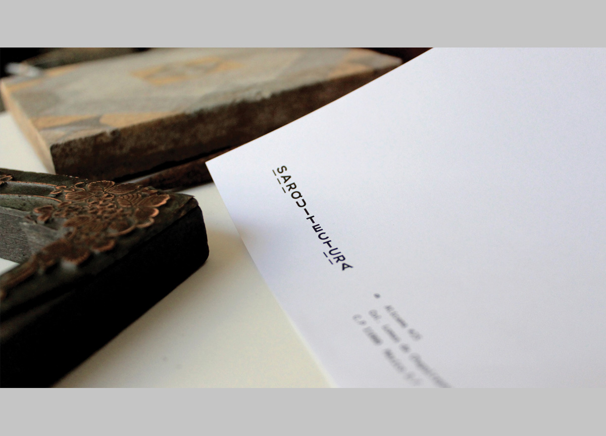
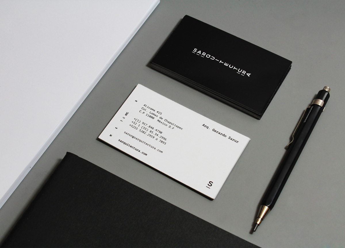
For the graph­ic solu­tion we chose to cre­ate two ways of read­ing it which can trans­late into the dual­i­ty that exists in this dis­ci­pline: space and time, base and height. It’s about com­mu­ni­cat­ing two mes­sages in only one bidi­men­sion­al time­line, which works as a remem­brance of an archi­tec­tur­al plan. The result is a sober logo­type that embeds the last name of the archi­tect into the very dis­ci­pline, and plays a lit­tle with the con­cept of per­spec­tive, in such way that one can read it hor­i­zon­tal­ly or vertically.

I have always had in mind the characteristics that I wanted to project to my clients: sober, timeless, international, minimalist, clean, and smart. When Bienal Comunicación presented me the graphic solution for SARQUITECTURA, I was fascinated by its conceptualization of space and perspective. To rotate the letters that corresponded to my last name inside the firm’s name was an excellent mental smile, and the perfect smart wink to reflect the way we work in all of our projects. — Gerardo Sarur, Architect at SARQUITECTURA

Browse entries