CLIENT
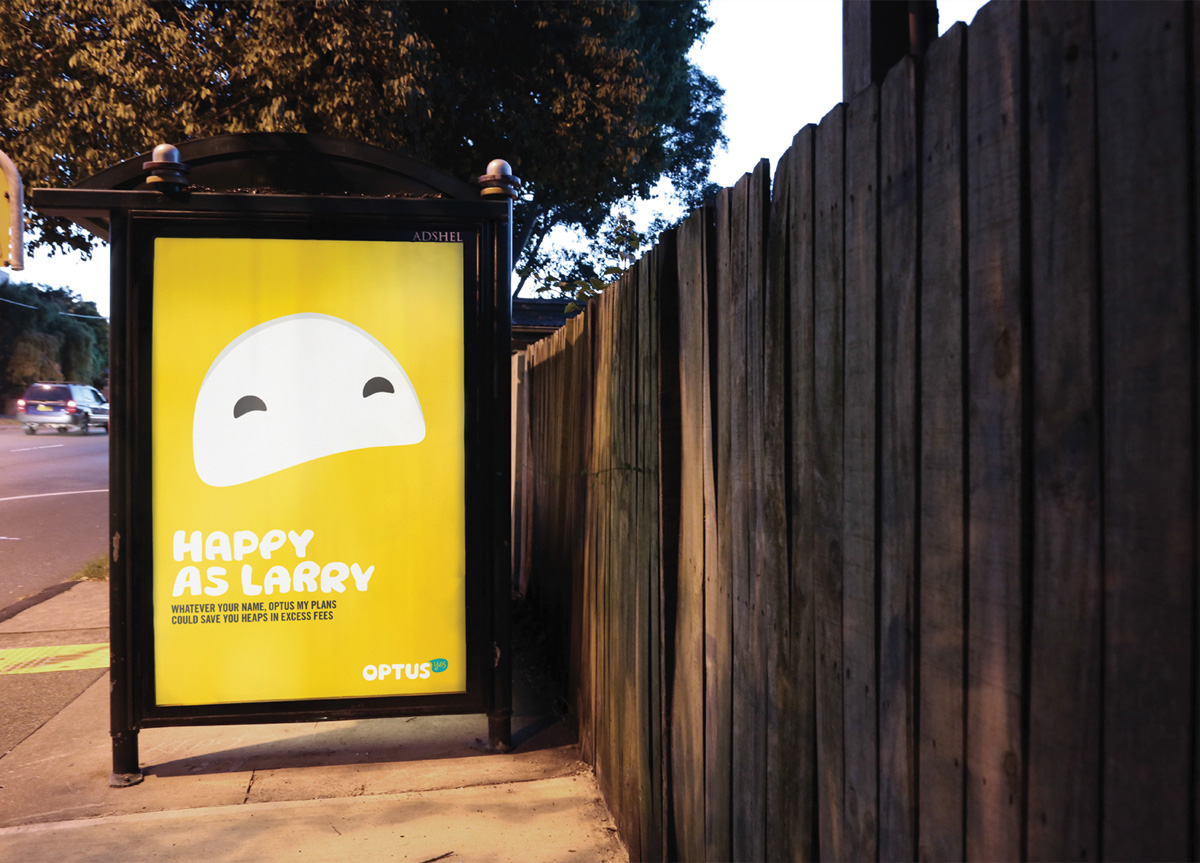
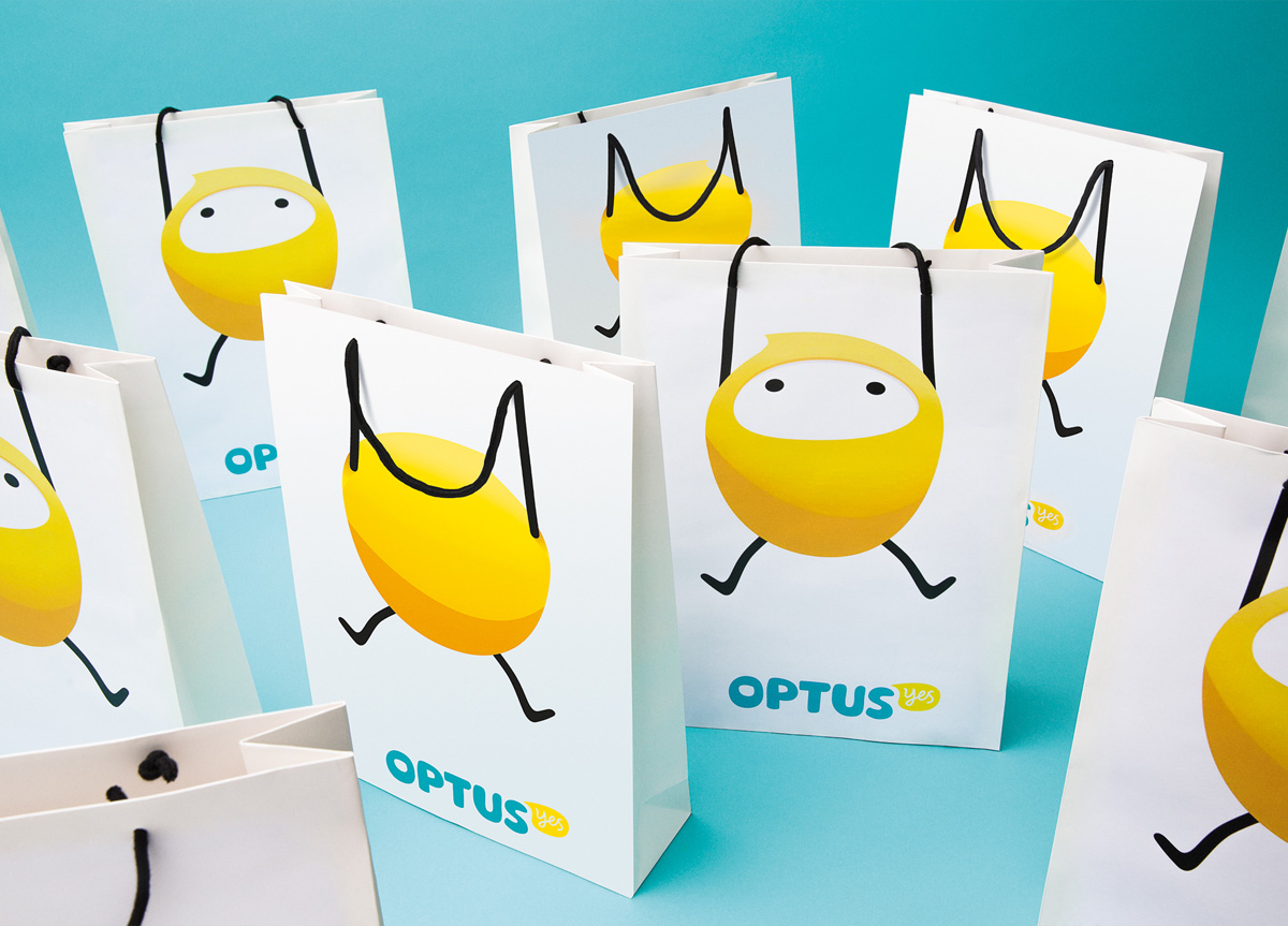
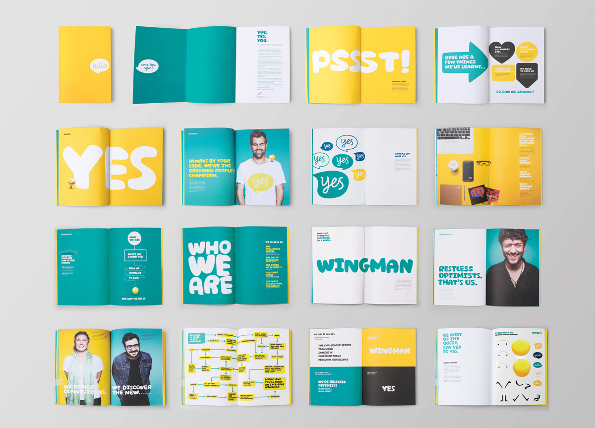
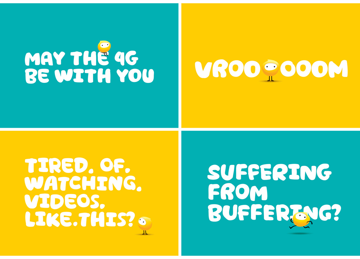
The second largest telecoms provider in Australia, the brand originally set out to offer choice in a monopolised industry, regularly introducing gamechanging innovations to help customers. In recent years, as the market reached saturation, the company lost sight of its purpose, and it declined in relevance and brand consideration.
BRIEF
To change the perception and feeling around AGDA—from an association perceived as behind, corporate, and closed off, to one fully open to new technology, new opportunities, new ideas, and of course new members. It also needed to be open to new disciplines—such as digital design, motion design, writing for design, and branding.
APPROACH
AGDA is the connecting force that unites our industry. It celebrates the things that make us different and the things that pull us together. The perfect balance between unity and diversity. The logo connects at either end, representing a chain-link of the industry coming together. The idea was to keep the core brand elements timeless; to resist the urge to make the identity too trendy or cool. That way, there is space for different designers to be more expressive around the logo and typography, while the core elements remain for years to come.


