CLIENT
An art gallery, creative space, and non-profit organization previously known as the City Arts Centre. By encouraging all forms of creativity, and offering progressive and innovative art exhibits, workshops, and educational sessions, it has been a focal point for creatives in the city.
BRIEF
With a move to more appropriate premises imminent, and a desire to grow in size and stature, the challenge for Saffron was to review the brand, rethink its positioning and create a visual system to convey the Oklahoma Contemporary’s broad purpose and appeal—locally and further afield.
APPROACH
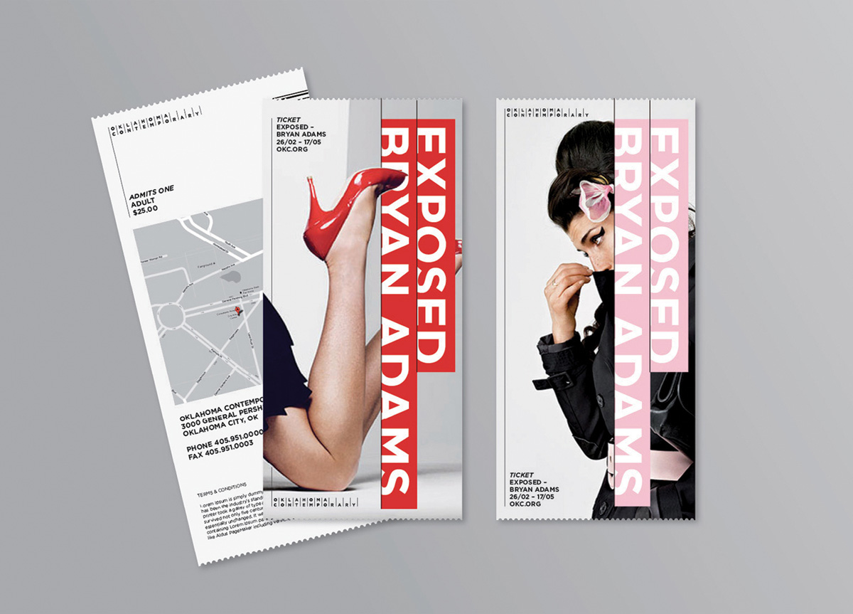
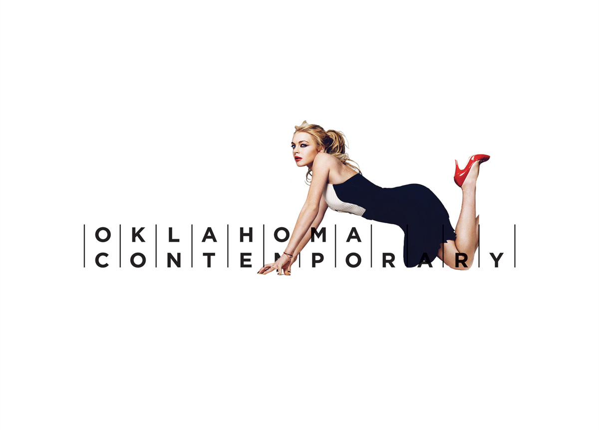
What became clear was the Oklahoma Contemporary’s role in connecting the local community with contemporary art, art with the individual, and the conventional with the unfamiliar. This inspired the idea of Creative Connections, made visible through a powerful visual language, and an iconic visual system that allows the work of exhibited artists and the educational mission of Oklahoma Contemporary to take centre stage—alongside a clean Gotham logotype. The new visual identity is being brought to life across Oklahoma Contemporary’s communications and built environment. It has helped renew a sense of purpose within Oklahoma Contemporary, encouraging them to continue connecting all things art.


