CATEGORY

LEVEL

Student

RANK

DESIGN CREDITS

Designer

Zipeng Zhu

Instructor

Carin Goldberg 


TAGS

, , , , , , , , , ,


LINKS

Zipeng Zhu
School of Visual Arts

Museum of The Moving Image by Zipeng Zhu of School of Visual ArtsMuseum of The Moving Image by Zipeng Zhu of School of Visual ArtsMuseum of The Moving Image by Zipeng Zhu of School of Visual ArtsMuseum of The Moving Image by Zipeng Zhu of School of Visual ArtsMuseum of The Moving Image by Zipeng Zhu of School of Visual ArtsMuseum of The Moving Image by Zipeng Zhu of School of Visual ArtsMuseum of The Moving Image by Zipeng Zhu of School of Visual ArtsMuseum of The Moving Image by Zipeng Zhu of School of Visual ArtsMuseum of The Moving Image by Zipeng Zhu of School of Visual ArtsMuseum of The Moving Image by Zipeng Zhu of School of Visual ArtsMuseum of The Moving Image by Zipeng Zhu of School of Visual ArtsMuseum of The Moving Image by Zipeng Zhu of School of Visual ArtsMuseum of The Moving Image by Zipeng Zhu of School of Visual ArtsMuseum of The Moving Image by Zipeng Zhu of School of Visual Arts


CLIENT

A muse­um that advances the pub­lic under­stand­ing and appre­ci­a­tion of the art, his­to­ry, tech­nique, and tech­nol­o­gy of film, tele­vi­sion, and dig­i­tal media. It is locat­ed in Asto­ria, Queens, in New York, NY.


BRIEF

Cre­ate a unique visu­al iden­ti­ty for a cul­tur­al insti­tu­tion. The Muse­um of The Mov­ing Image, a muse­um about film, tele­vi­sion, and video games, was selected.


APPROACH

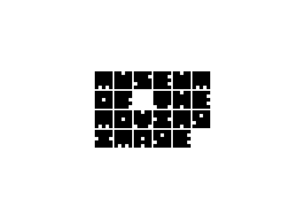
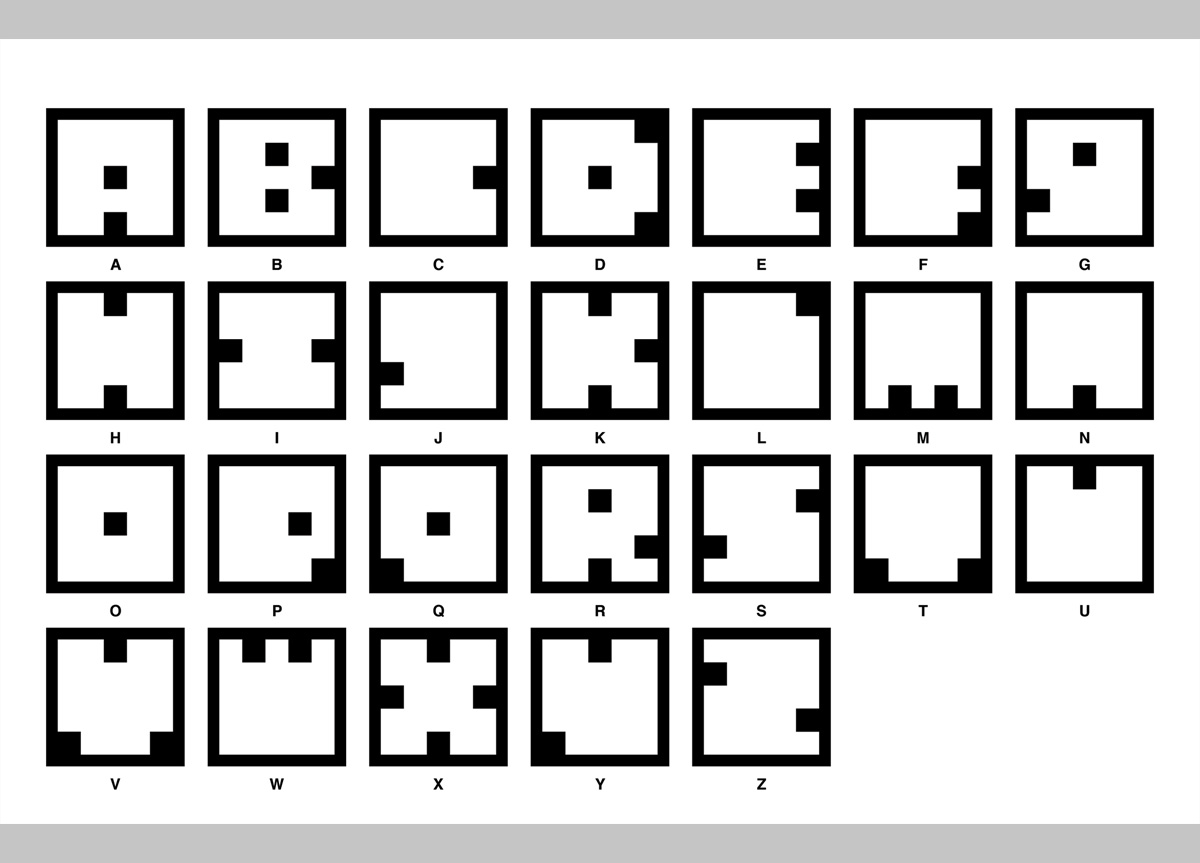
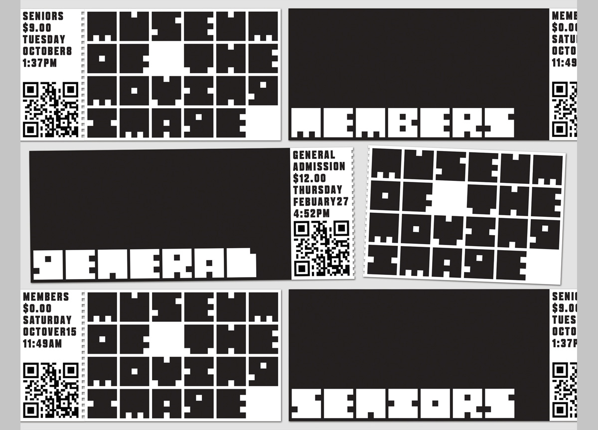
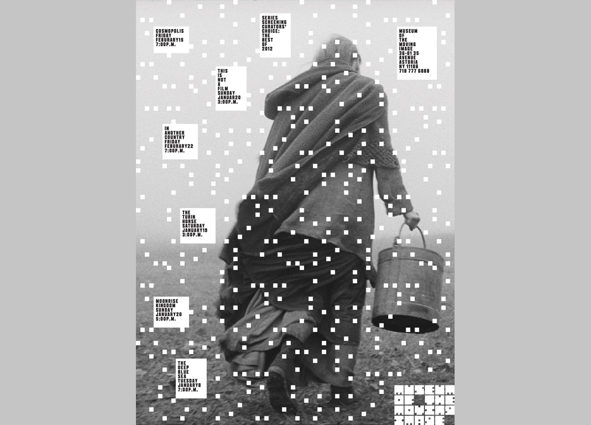
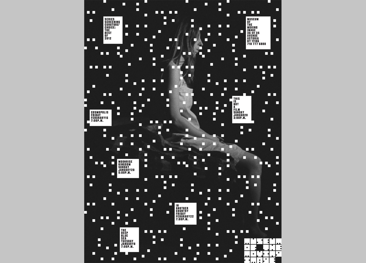
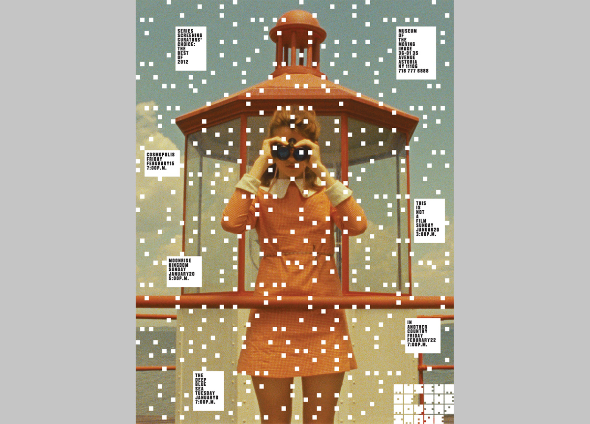
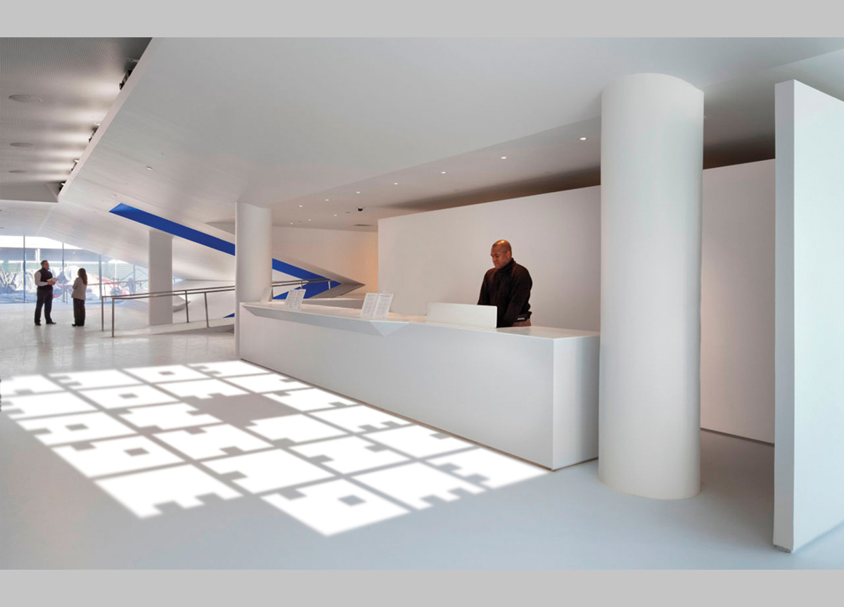
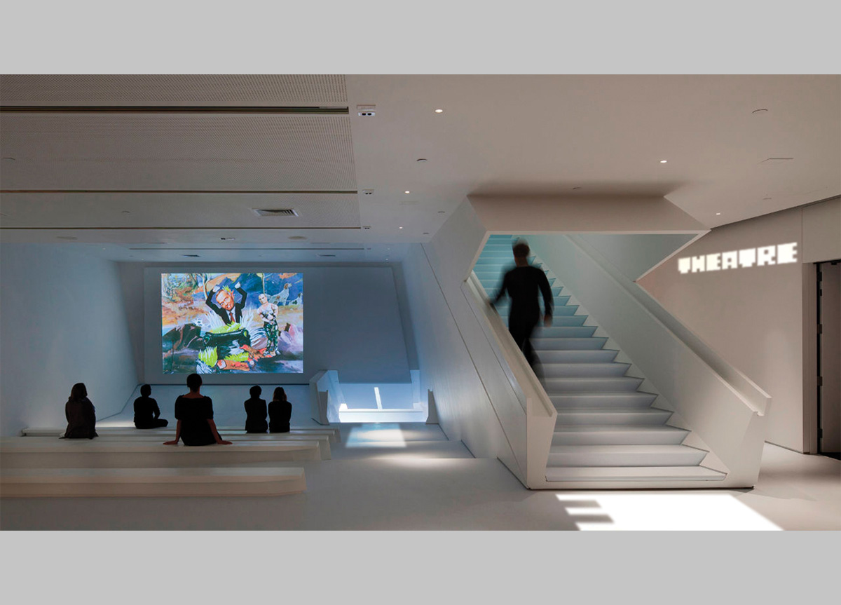
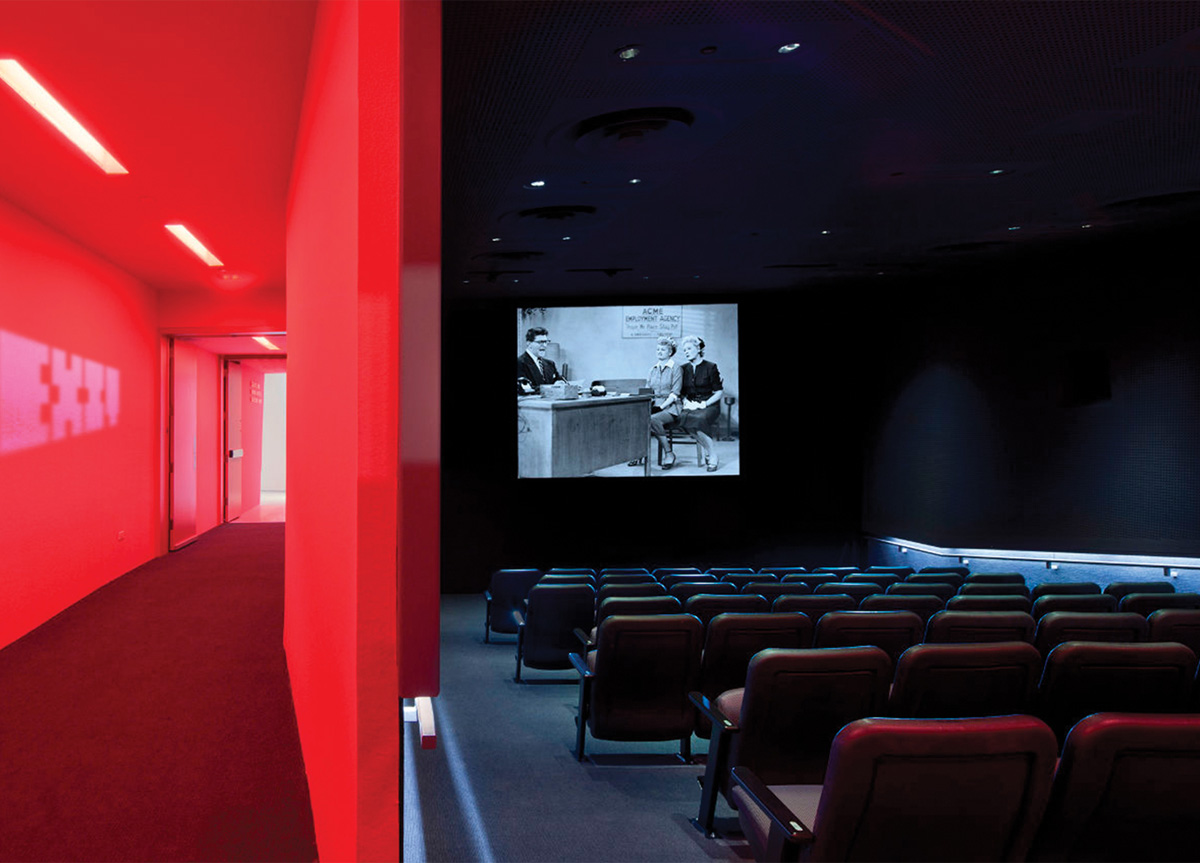
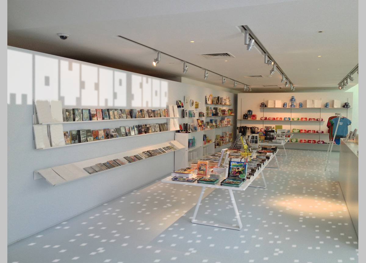
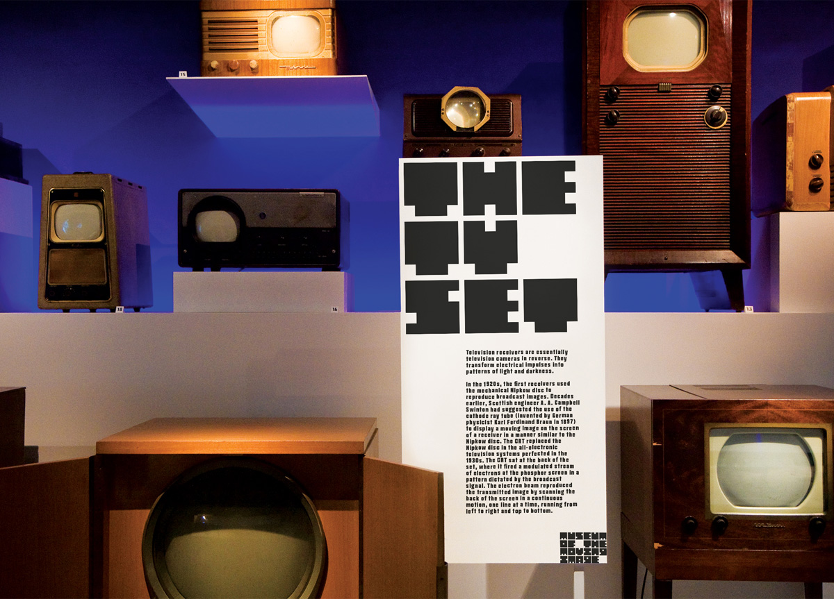
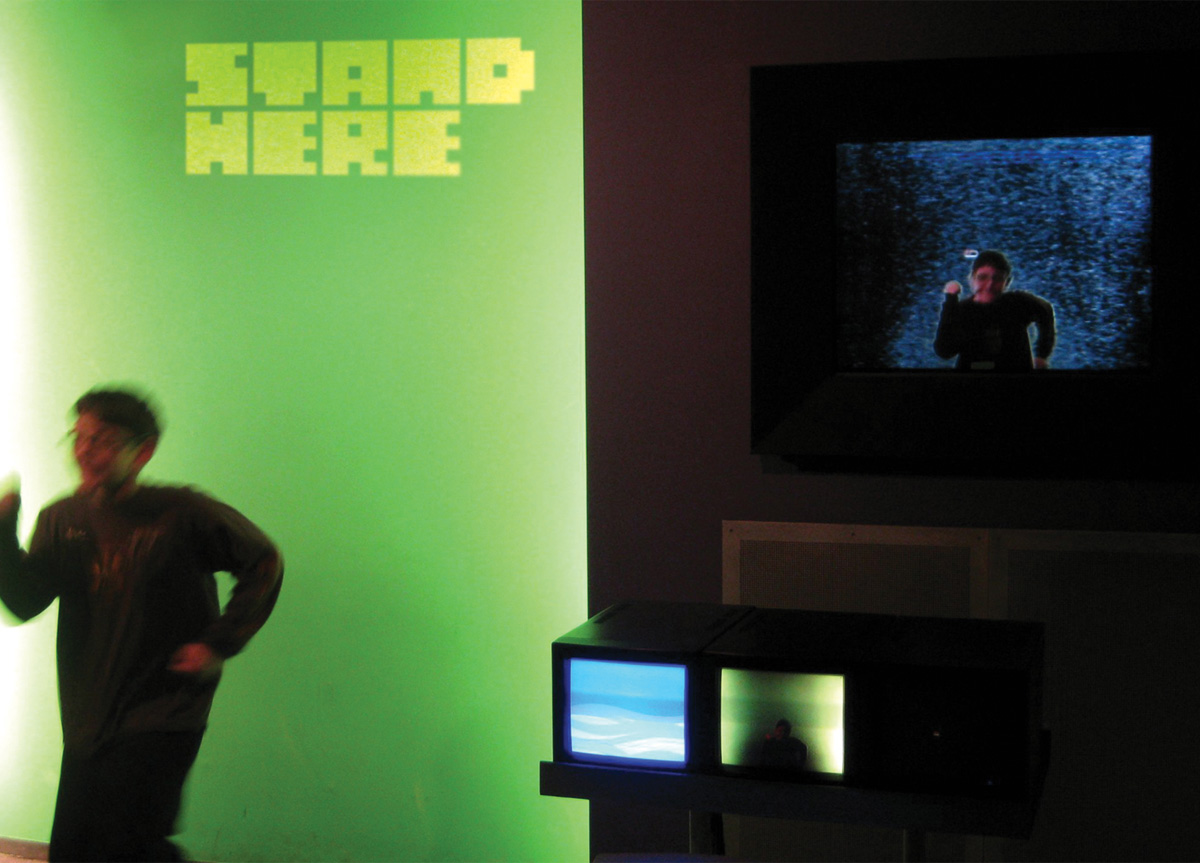
Using the square cutout on the film strip as inspi­ra­tion, a set of square-shaped char­ac­ters with pos­i­tive and neg­a­tive ver­sions was cre­at­ed. The logo­type, when put togeth­er, forms a pat­tern that is used in the visu­al iden­ti­ty through­out the cam­paign. Inside the muse­um, every­thing is pro­ject­ed, sig­nage, stair­cas­es, even the gift shop—everything with­in the muse­um is movable.

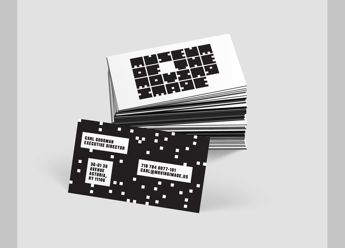
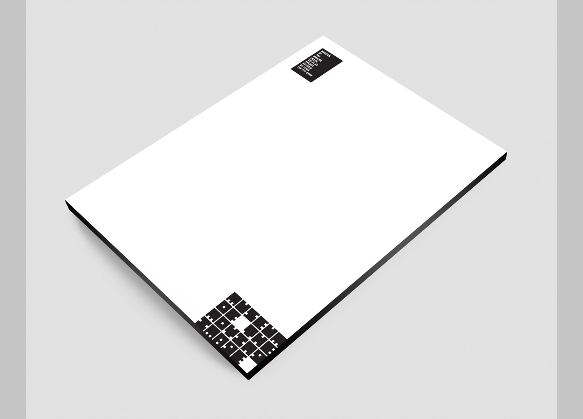
Zipeng Zhu’s design/concept uses the square cutouts from film strips as inspiration, forming an identity that is cohesive and appropriate for many applications including stationery, animation, advertising, posters, website, and signage systems. Zipeng created the square typeface and pattern system (based on the logo) as his core visual and expanded on this to create a beautifully cohesive indentity for the museum. — Carin Goldberg, Professor at School of Visual Arts

Browse entries